Adam 1
Mission, Space Settlement
Distant Future
The Adam 1 Terran Resettlement Program was a failed attempt by Martian colonists to re-establish a human settlement on the planet Earth, after the homeworld's human inhabitants were wiped out.
Overview
Intro
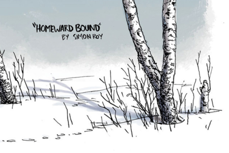
In the short science fiction comic “Homeward Bound” by Simon Roy, we learn the unfortunate fate of a human space mission as seen through the eyes of curious animals.
Before I reveal anything more than that though, in the event that you’re unfamiliar with the story, I’d really recommend giving it a quick read. The comic was published by Image Comics in a 2014 collection of Simon’s work titled Jans Atomic Heart and Other Stories, but you can read it for free (and in full-color) over on Coredoor. Once you’ve done that, you can bounce back to this entry for the logo analysis.
A big thanks to Simon Roy for answering my questions and sharing his thinking concerning the logo and its place in the story.
Analysis
With no surviving human crew, and the birds’ limited understanding of human activities and motives, it’s on us as the reader to put the pieces together and determine what the human side of the story is in “Homeward Bound.” And a big part of how we get there is by looking at instances of a visual identity, which makes this comic a great case for analysis.
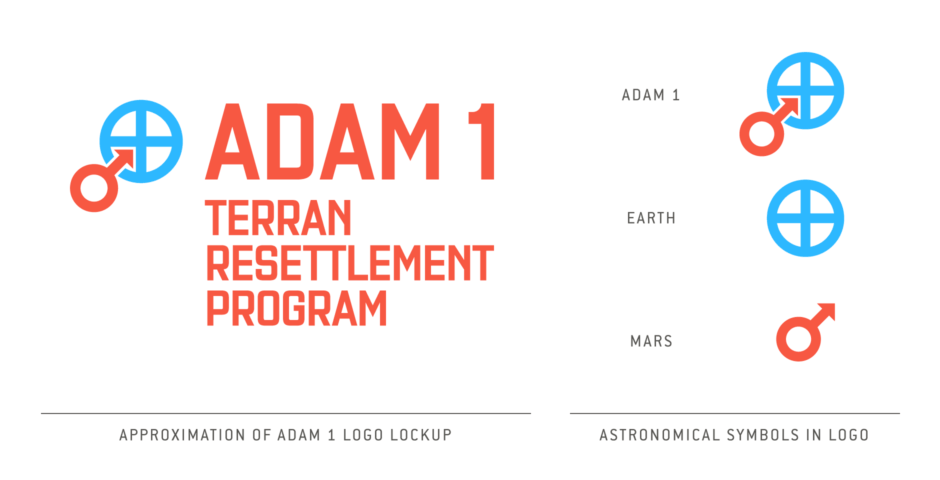
As the story unfolds and the birds move through the scene, we get more and more pieces of the puzzle. First, the crashed shuttle, bearing the number 01 on its wing. In the next panel, we see the logo lockup on the side of the spacecraft, which reads “Adam 1 Terran Resettlement Program” (Figure 1.1) Even before we see the dead human crew, the visual identity tells us the astronauts’ story, and at this point we know we are looking at the first attempt at resettling a planet, very likely Earth — terra being the Latin name for Earth and a popular name for our homeworld in science fiction. The choice to name their mission Adam 1 also points to an effort to repeople the Earth from a population of zero, similar to the role of “Adam” in the Bible’s story of Genesis.
If the reader is familiar with astronomical symbols (Figure 1.2), then things are even clearer, and at this point they can grasp with certainty where the astronauts have come from as well. What we see in the symbol for Adam 1 is, in the words of Simon Roy, “the planetary symbol for Mars, phallically jamming into the planetary symbol for Earth!”
That symbol for the planet Mars, a circle with diagonal arrow pointing up and to the right, has its origins as a symbol for the Roman god Mars, with the two elements representing his spear and shield. It is also a symbol for the Male sex. In the context of the Adam 1 logo, the arrow also implies the astronauts’ journey from the planet Mars to the Earth homeworld — Earth being represented by its astronomical symbol, which consists of a circle with cross inside it.
Color also reinforces the representations, with red used for Mars, the Red Planet, and blue for Earth, that we’ve come to know as the Blue Marble or Pale Blue Dot, as seen from space.
The use of astronomical symbols in the context of real-world space travel is not unprecedented either. For NASA’s Project Mercury, which was the first human spaceflight program of the United States, the planet Mercury’s symbol was used in the retroactive logo for the project (Figure 1.3). It was combined with a 7, representing the project’s astronauts who were collectively known as the “Mercury Seven.” Astronomical symbols were used for uncrewed robotic missions as well, and the Mars symbol saw use as the logo for NASA’s Viking I (Figure 1.4), where it was combined with a V. So what I’m getting at with these examples, is this is a believable visual identity and a solid bit of worldbuilding.
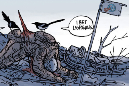
Returning to the comic, we follow the birds’ investigation as it leads to a dead astronaut impaled on a broken branch (Figure 1.5). Within arm’s reach, a flag is planted in what was probably his dying act, and on it we see the Adam 1 logo again. A close-up panel of the birds perched on his back, gives us a look at shoulder patches on his pressure suit. One reads “LT GRANT” and below, we see a patch with just the Mars symbol, with type above and below reading “MARTIAN SPACE AGENCY.” If the reader didn’t get it in panels prior, with this revealing detail things should now make sense.
As Simon described it, “Basically, mankind settled Mars, to some extent, and then something cataclysmic eliminated humans (but not animals) from Earth — and that crashed shuttle, in 'Homeward Bound,' was a sad attempt to reclaim the homeworld.”
So there are still question marks around what happened to Earth and its human inhabitants, but that’s the sort of thing good science fiction will often do… it leaves some things hanging in the air. And from the angle we’re looking at it here, with an eye on the visual identity design and its role in the story, we’ve definitely got something good. To illuminate my reasoning, I’ll pose the question: Would this story work as well, or at all, without the visual identity? In this instance, I’d say no, the logo is an essential storytelling device, and that is something I’ve yet to really come across in the my analysis of other identities in science fiction. Without it, we’d have a crashed space shuttle and astronauts, and a simple guess at when it happened and where they came from could easily have put them in the near future crashing after an Earth-based orbital mission or something like that. In this story, it’s the mission’s graphics that supply the truly futuristic and science fiction nature of the event, rather than just decorating the science fiction with graphics.
It’s also interesting that as a consequence of the crash's backstory being conveyed by a visual identity, everything isn't spelled out for you as a reader, forcing you to pick over the scenes alongside the bird detectives — which are even funnier as a result, because of what they are focusing on and how much their assessments are informed by the concerns of birds. Visual identities are always designed for and rely on context, and we didn’t get a ton to go on here, with just a few short panels and no captions or human dialogue to prime us with the who, what, when or why. So I think that says something about how successful the mark and accompanying typographic identifiers are, that a person can rely on the graphics for info in such a situation and gain a pretty good understanding of what they identify… and what that means for the future of humankind, once you learn what the identity represents.
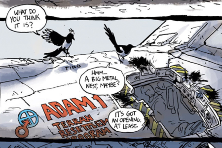
Figure 1.1 On the side of the crashed Martian spacecraft, to the left of a blown hatch, we see the logo (lower left) locked up with type that reads “ADAM 1 TERRAN RESETTLEMENT PROGRAM.”
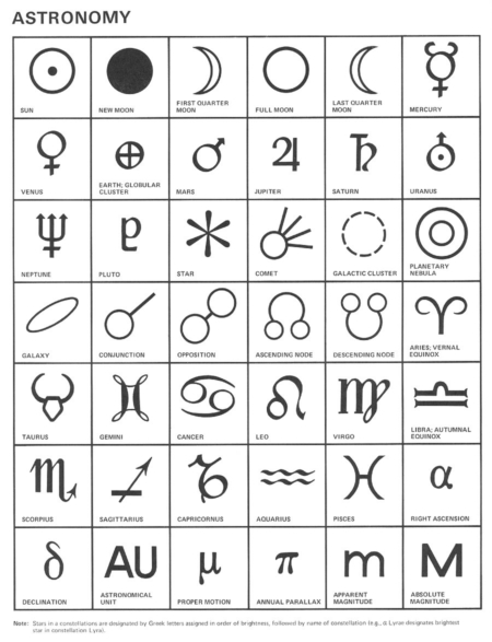
Figure 1.2 Astronomical symbols, including those for the planets Earth and Mars. Source: Symbol Sourcebook by Henry Dreyfuss, 1972
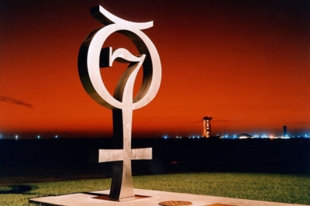
Figure 1.3 In 1964, the logo for Project Mercury was created as a metal commemorative monument, standing near Launch Complex 14 at Cape Canaveral. Source: NASA
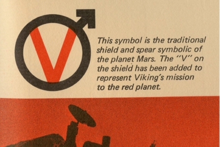
Figure 1.4 The logo for Viking I, which achieved the first successful landing on Mars on July 20, 1976, uses the symbol for Mars combined with a V. Source: Viking Overview Booklet by Martin Marietta, via VMMEPP
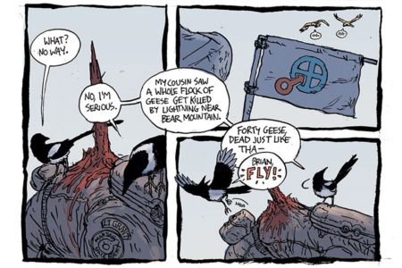
Figure 1.5 We also see the logo on a flag planted outside the craft (top right) — the last act of a dying member of the Martian Space Agency (which can be read on the astronaut’s patch with Mars symbol on the lower left).

The Designer: Simon Roy
Wayward son of Vancouver Island, Simon Roy cut his comics teeth in 2009 with Jan's Atomic Heart, and has been vigorously gnawing ever since. His comics work includes Habitat, Tiger Lung, Prophet, and The Field, among other titles and short stories.
To learn more, visit:
View more identities designed by Simon Roy