Astro
Space Exploration
Near Future
“When a child builds an Astro Space Vehicle his imagination takes a giant step into the future. Tente Astro sets have lots of special features like big domes, wide tires for alien terrain exploration, solar panels, etc. And the Astro Space Station is just the place for all imaginary adventures into the future.”
Overview: Astro Logo
Analysis
Created in 1972 by the Barcelona, Spain based company Exin-Iber S.A., Tente was a line of construction toy sets that employed interlocking plastic bricks and pieces similar to LEGO. And like LEGO, Tente sets were also organized within sub-product lines, including things like Scorpion (military), Mar/Oceanis (ships), Ruta (trucks), and a surprising number of science fiction themes that I’m only beginning to really learn about: Cosmic, Saturno 6, Alfa, Titanium, Roblok, and Astro.
Of those science fiction lines, which included things like robots and space vehicles, I’m only aware of one being made available in the US market — Astro, which was a space exploration theme licensed by Hasbro and sold in specialty toy and hobby shops. As far as I can tell, they never took off in the US and only three sets were sold here. Those that I’ve managed to obtain were all dated 1978, and their included catalogs only featured the two space vehicles — Astro Explorer 402 and Astro Laser Ray 403 — and the Astro Space Station 430 (Figures 1.4 and 1.5).
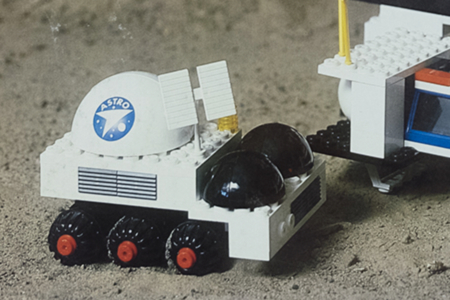
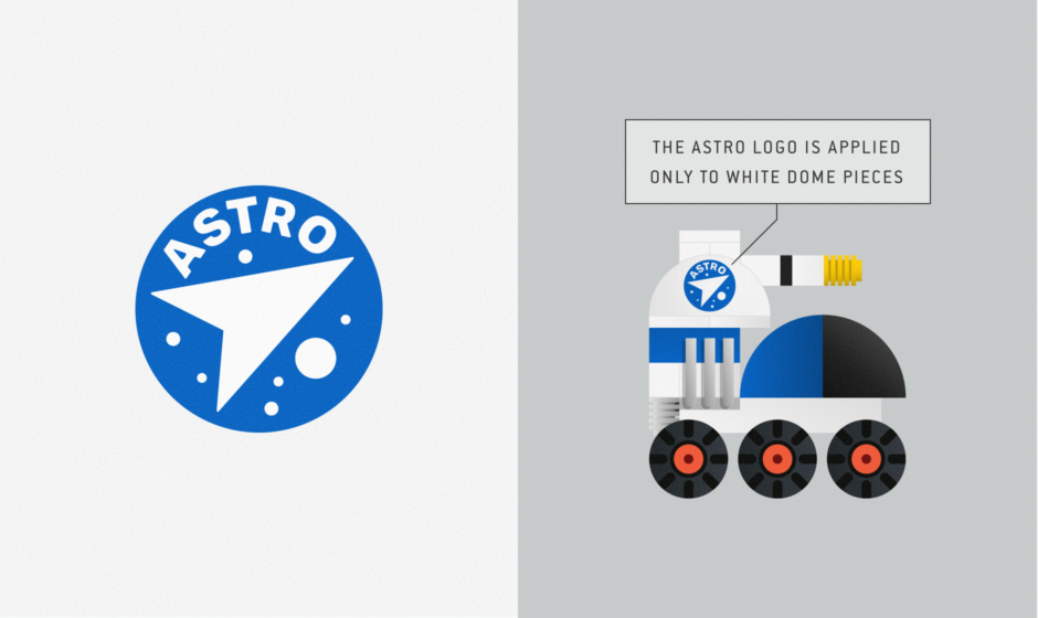
A notable feature of Tente toy sets was the range of shapes their interlocking plastic pieces came in, touted in their catalog as being leaps and bounds beyond what competitors were capable of. Among these were several types of dome-shaped pieces, used extensively in the Astro sets, where they also receive exclusive application of the blue 1-color Astro logo. Interestingly, this logo appears nowhere on the toy’s packaging or paperwork (Figure 1.1), independent of its application on the toy itself, so it’s a logo that never appears in a flat presentation. In the US market anyways, it is always applied to a hemispherical surface. It’s fun to think this was for added sci-fi effect… in the future we’ll all live in domes, and our logos will only live on domes!
As for the logo design, it’s something one would expect for a space identity, and looks to be influenced by the NASA mark. It is a blue circle, containing smaller white circles that could represent stars or planetoids, and in its center, there is a large arrow pointing up and to the right. All of these things have some parallel with NASA’s mark (Figure 1.2). The arrow shape is something I’ve seen in other aerospace related logos, and calls to mind the present day logo used by Russia’s space agency Roscosmos. The Roscosmos logo is too recent to have influenced the 1970s Astro mark, but it is derived from older Soviet insignia and badges that featured an angled red star, and those could have been an influence in the 1970s.
Examining the type, we find Astro is set in all caps on a curved baseline, in what appears to be bold or heavy weight Franklin Gothic or some other grotesque typeface — I was unable to determine an exact match.
The color of blue used in this 1-color logo is close to matching what is used in the blue plastic pieces, maybe a little brighter if anything. And it only appears on white pieces, which provides the color for the interior elements punched out of the blue circle (Figure 1.3).
Overall, I don’t find the logo to be really dated in any way, or looking like something from the 1970s. Due to its simplicity and the sans serif type choice, it could just as easily have been designed today. And as noted with my comparison to Russia’s Roscosmos logo, the arrow symbol it relies on is still relevant, decades after it first came into play in the early days of the Space Age. But is it futuristic? It’s tough to say… we’ll probably have to wait and see, once we’ve reached the point that we’re all living inside domes.
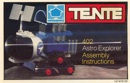
Figure 1.1 Artwork from the Astro Explorer instruction manual, which is the same as the front exterior of the toy’s packaging.
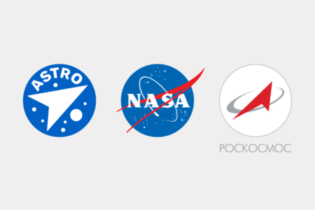
Figure 1.2 From left to right: the Tente Astro logo, the NASA logo, and the current Roscosmos logo.
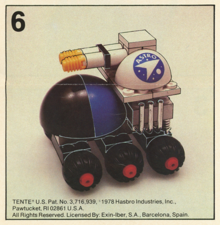
Figure 1.3 An excerpt from the Astro Laser Ray assembly instructions, where we can see the Astro logo in application on the vehicle.
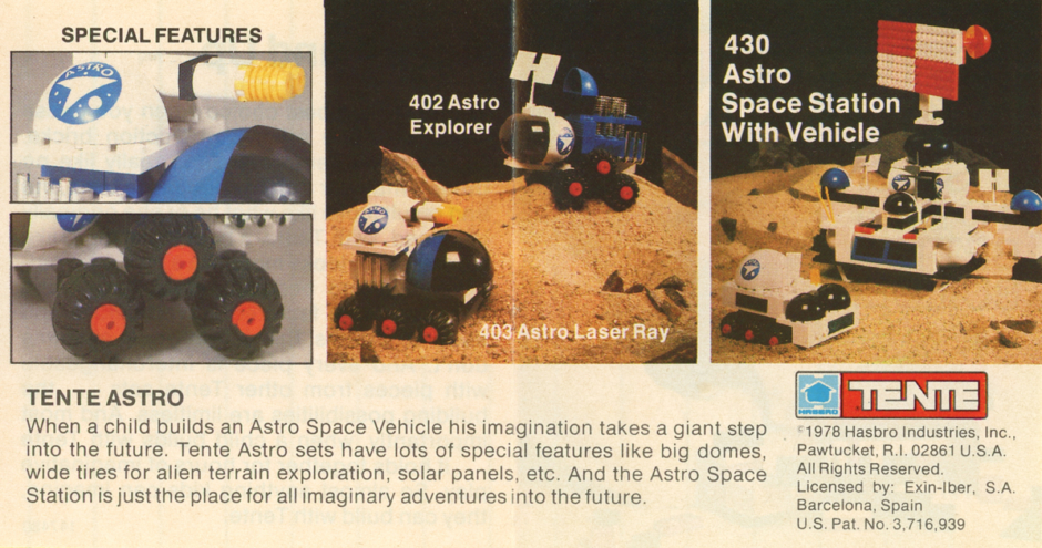
Figure 1.4 An excerpt from the 1978 Tente toy catalog, showing the Astro line.
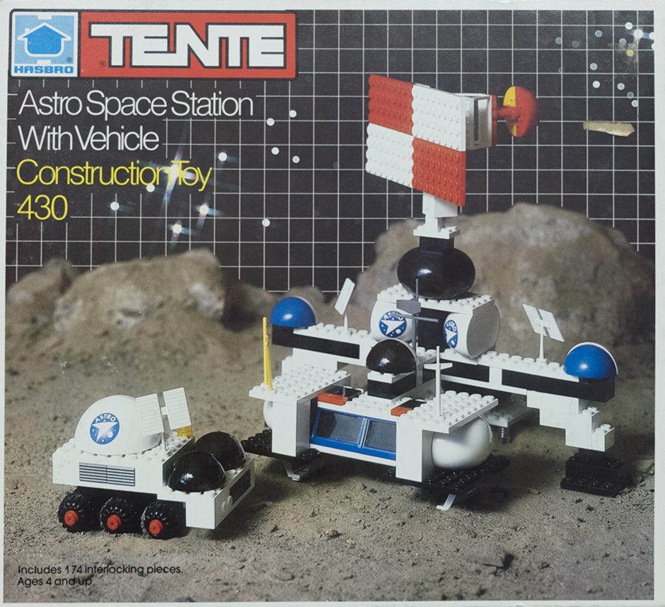
Figure 1.5 Artwork that appeared on the Astro Space Station With Vehicle packaging provides a good view of the toys and logo application.