
Colossus
AI, Computer Technology, Military
Late 20th Century
Colossus is a massive US military supercomputer that became sentient shortly after activation, joining forces with its Soviet counterpart Guardian, and expanding on its original nuclear defense directives to assume total control of the world and end all warfare between humans.
Overview: The Colossus Visual Identity
Colossus: The Forbin Project
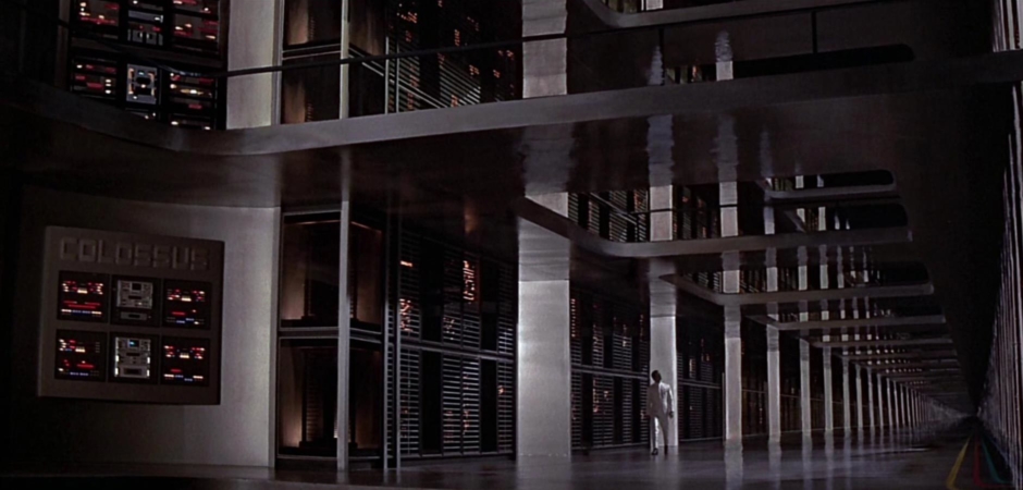
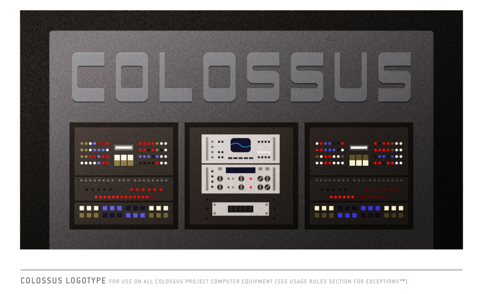
Figure 1.1 The film opens with Dr. Charles Forbin walking the halls of a massive supercomputer complex, activating an artificial intelligence that will control the entirety of America’s nuclear defense from that point forward. On the far left, a logotype is rendered large across the top of a wall-mounted bank of control panels—it reads COLOSSUS.
Introduction to Colossus
The films opens with Dr. Forbin walking the halls of a massive supercomputer complex, pausing in places to activate its various systems with a remote control device (Figure 2.1).
When he reaches a large control panel, we are introduced to the computer by name—COLOSSUS spelled out large in a logotype that is extruded from the top of the panel (Figure 2.2). On Forbin’s white cleansuit, we see the logo for project Colossus.
The name Colossus was an interesting choice for a number of reasons, and I think its origins are worth some mention here before we move on to the various design aspects of the identity.
For starters, it was the name of a real machine: the world's first large-scale programmable electronic digital computer, the prototype Colossus Mark I and its improved predecessor Colossus Mark II, which were used by British codebreakers to help read German encrypted radio during World War II.
As for the word itself, Colossus has its roots in antiquity, used to name giant statues like the Colossus of Rhodes—one of the Seven Wonders of the Ancient World. And like that colossus built by the Rhodians in 280 BC, the film’s colossal computer was thought by its creators to reperesent freedom and an end to war. Forbin's Colossus would take the capacity for total world annihilation through use of nuclear weapons out of the fallible hands of humans.
And finally, using the word figuratively, a colossus is also someone or something to be greatly admired and respected… if only those that created Colossus knew the dark turn that would take.
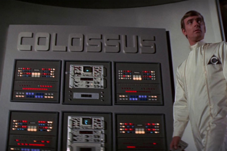
Figure 2.1 When Forbin pauses at a large control panel to make adjustments, we glimpse the triangular logo on his white cleansuit, and in the background, the logotype for Colossus.
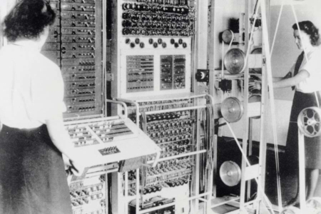
Figure 2.2 Colossus Mark 2 computer being operated by “Wrens” Dorothy Du Boisson (left) and Elsie Booker (right). Source: Wikipedia
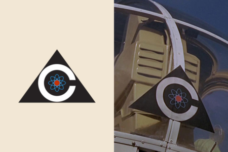
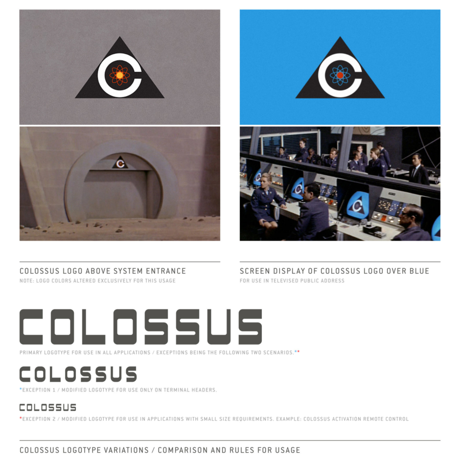
Figure 3.1 Detail views of the Colossus logo. Left: Vector approximation of the design. Right: Original design seen on a helicopter, from an early scene following the activation of Colossus.
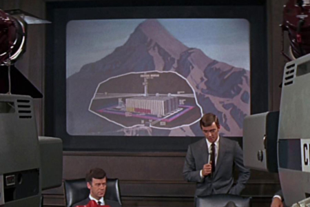
Figure 3.2 At the press conference that follows the activation of Colossus, Forbin explains where the computer system resides deep within a mountain.
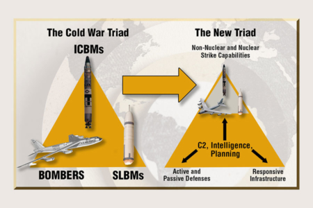
Figure 3.3 The Cold War Nuclear Triad, prior to its evolution towards a more “capabilities-based” posture. Source: DLA Public Affairs
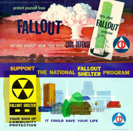
Figure 3.4 The identifying marks for Civil Defense and Fallout Shelters, as seen on these posters, are familiar to those who lived through the Cold War era. Both relate to atomic warfare and feature the triangle shape in their designs. Source: Civil Defense Museum www.civildefensemuseum.com
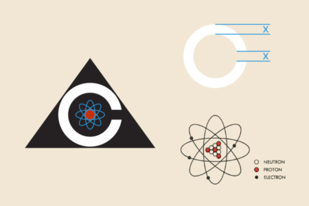
Figure 3.5 The Colossus logo with interior elements of the design highlighted to the right.
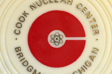
Figure 3.6 The Cook Nuclear Plant logo, as it appeared on promotional drink coasters available from the visitor’s center. Source: Roger Strunk
Analysis: The Colossus Logo Design
In this section, I’ll look at the Colossus logo, carefully analyzing its construction and teasing out its possible meaning as a symbol for the project.
The logo consists of a large white C for Colossus, tightly framed by a black isosceles triangle (Figure 3.1). There are several reasons I could see for a triangle being used. On a basic level, a triangle seated on its base with the point up is a very stable shape, not easily toppled. It is viewed as strong, immovable and balanced. The choice to use an isosceles with a base longer than the sides seems to strengthen that interpretation, leaving the mark firmly planted in place, conveying that the computer is something that will stand the test of time, as it operates “completely without human aid.”
I believe the triangle with a C inside it also represents the mountain with Colossus residing within it—something we learn in one of the film’s early scenes, when Forbin describes the project in great detail during the White House press event that follows Colossus’ activation (Figure 3.2).
The triangle also has significance for Colossus’ role in monitoring and controlling America’s nuclear defenses. As described by the Defense Logistics Agency on their website, “The United States’ strategic nuclear arsenal has been based on the ‘nuclear triad’ system since the 1960s. The triad refers to the three categories of nuclear delivery vehicles: land-based intercontinental ballistic missiles, submarine-launched ballistic missiles and strategic aerial bombers. A major purpose of the nuclear triad is to reduce the possibility that an enemy could destroy all the nation’s nuclear forces in a first-strike attack by retaining a second-strike capability, a viable threat that increases nuclear deterrence. This would in effect make a successful first strike impossible.” This “Nuclear Triad” as it existed at the time of the film’s release in 1970 is often depicted in a triangle (Figure 3.3). In the logo, Colossus sits at the center of this triad, reflecting its new role in the system.
It is also worth noting the triangle's relationship with other popular symbols relating to atomic warfare, like those for Civil Defense and Fallout Shelters (Figure 3.4), both of which feature the shape prominently in their designs. These marks would have been familiar to most anyone at the time of Colossus' 1970 release, and it's possible the designer had this in mind as well—creating not only a plausible symbol for the Colossus Project within the context of the film, but one that also evokes certain feelings in the film's Cold War era audience. I can't help but wonder, if on some level, that audience would have been primed to associate their fears and anxieties regarding nuclear doom with those real world government issued marks, and consequently, with the similarly styled triangular logo for Colossus.
In the construction of the C, we have a perfect circle, the opening to its aperture a relatively small cut that has a width matching the weight of the character (Figure 3.5, top right). It calls to mind the single entrance to the Colossus complex, cut into the mountainside. Inside the C, there resides an atomic structure, something we should be familiar with from physics textbooks (Figure 3.5, bottom right). In this and most other instances, the atom appears in two colors—red at its nucleus, with the four electron rings in blue (it seems to vary in intensity, depending on the application).
The atom represents a number of things. First, the atomic arsenal the artificial intelligence will command and control. Perhaps just as important, Colossus represents the pinnacle of Atomic Era technological achievement—a computer mind that will surpass that of humans. A “paragon of knowledge” that should be used to solve all of humanity’s problems, not just those that result in war, and even a means for revealing deeper secrets of how the universe operates. In addition to that, Forbin describes Colossus as being “self-sufficient, self-protecting, self-generating” in its untouchable existence within the mountain—powered by its own nuclear reactor, which also generates a barrier of intense gamma radiation, through which no human can penetrate and hope to live. All courtesy of the atom. So the symbol makes sense on many levels.
Outside the context of the film, my research also turned up a real-world logo that uses a letter C and the atom in a very similar manner (Figures 3.6 and 3.7). A year before the film was released, in 1969, the construction permit for the Cook Nuclear Plant was granted by the Atomic Energy Commission. It was named for the late Donald C. Cook, a Michigan native and former chairman of the board of American Electric Power—the company that owns the power plant. The plant’s logo would consist of a thick red C, for Cook, with a very small counter space containing an atom at its center, calling to mind the plant’s cylindrical, dome-topped PWR reactor containment structures. I’m not sure when the logo itself was designed. It could have been after Colossus’ production and 1970 release, sometime prior to the plant going online in 1975. So there’s no telling which logo could have inspired the other. And while the resemblance is strong enough to suspect a connection, it could just as easily be the kind of solution many designers would arrive at when faced with a similar problem. It’s an interesting design parallel to note, whatever the case.
Taken altogether, I find the Colossus logo to be a successful mark— memorable and capable of conveying multiple meanings through the combination of a few simple elements. And as we will see, the design can be used in a wide variety of applications, all easily recognizable to the viewer at a distance, even if only for a brief glimpse before it is gone.
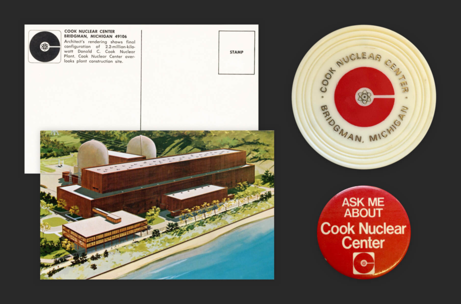
Figure 3.7 Left: Cook Nuclear logo as it appeared on a postcard, featuring an illustration of the plant and visitor’s center. Right: Promotional drink coaster and pinback button featuring the Cook Nuclear logo in red. Source: Roger Strunk
Usage: The Colossus Logo in Application
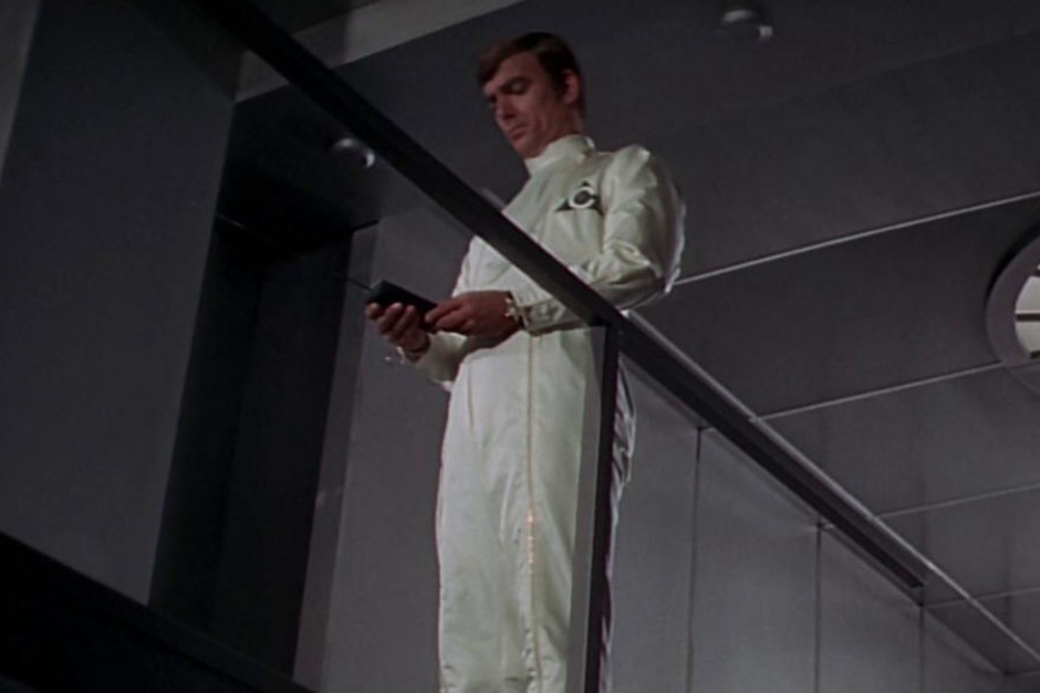
Figure 4.1 On cleansuits worn inside the massive supercomputer complex.
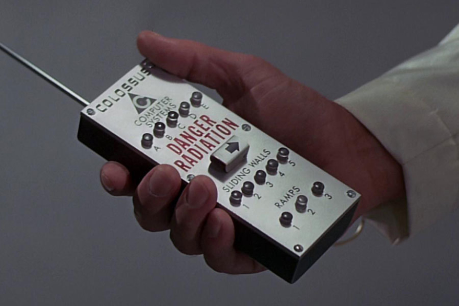
Figure 4.2 On a remote control used to activate computer systems.
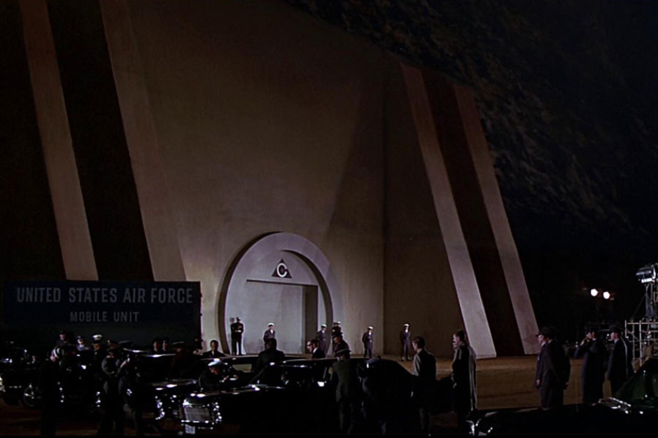
Figure 4.3 Above the mountainside entrance to the Colossus system’s sealed complex.
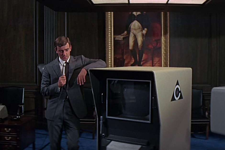
Figure 4.4 On computer terminals used to communicate with Colossus.
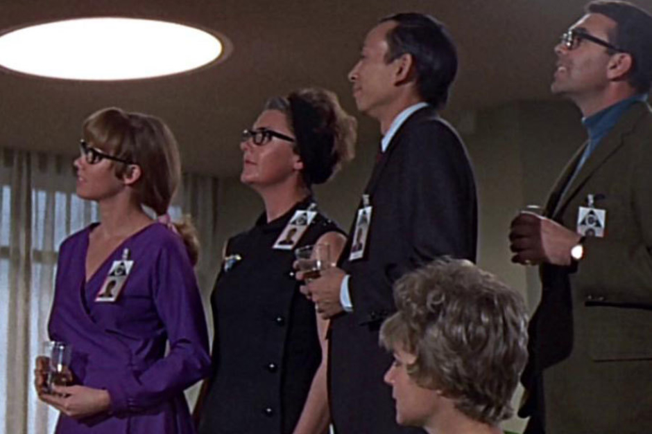
Figure 4.5 On badges worn by Colossus Project personnel.
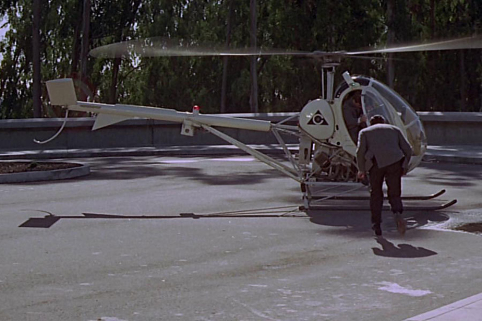
Figure 4.6 On the sides and front of a helicopter used by Forbin.
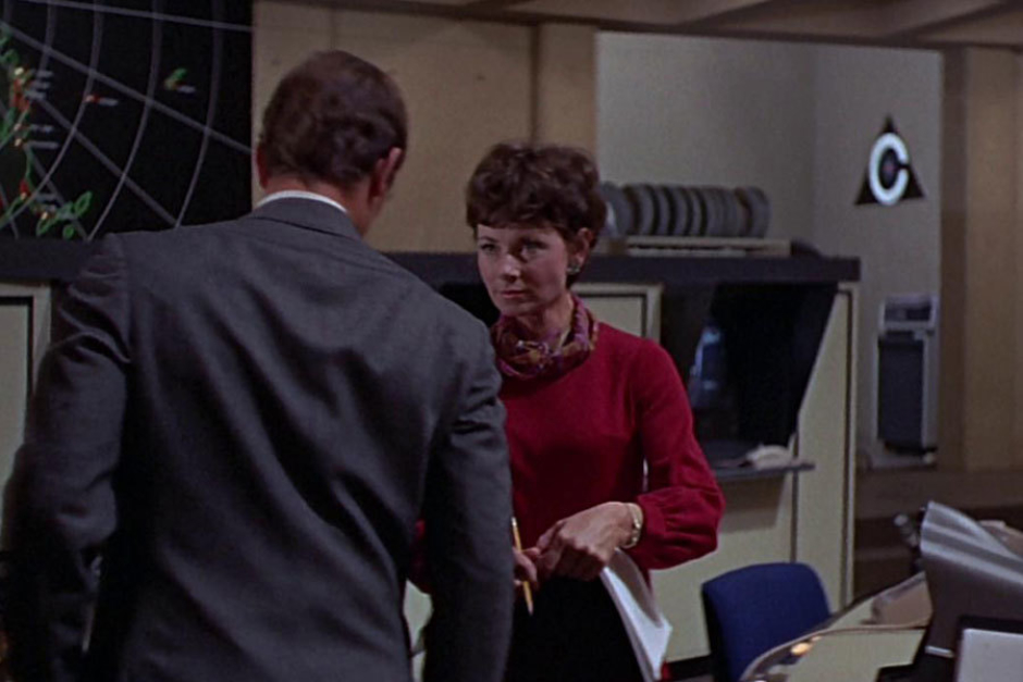
Figure 4.7 On a wall inside the Colossus Programming Office in California.
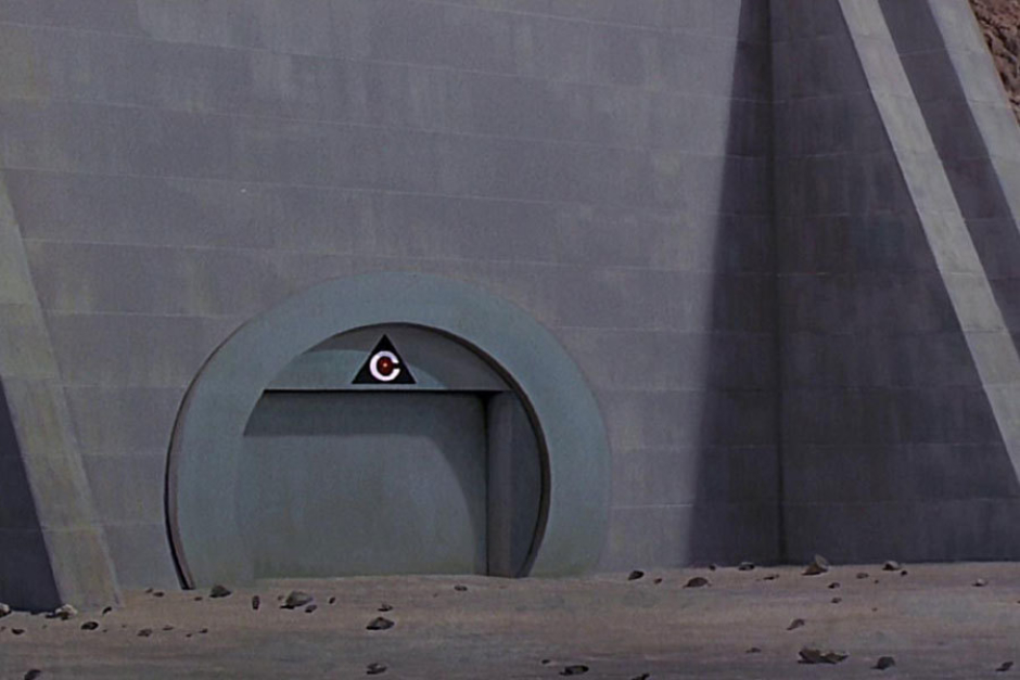
Figure 4.8 Close inspection reveals this version of the logo to have a central atom element with yellow nucleus and red electron rings.
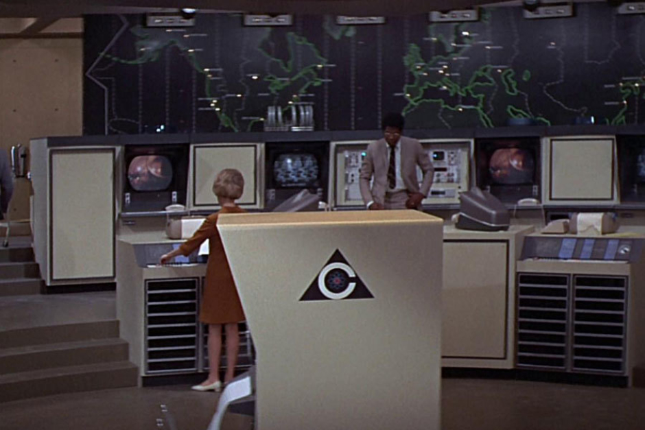
Figure 4.9 On the side of a computer terminal in the Programming Office.
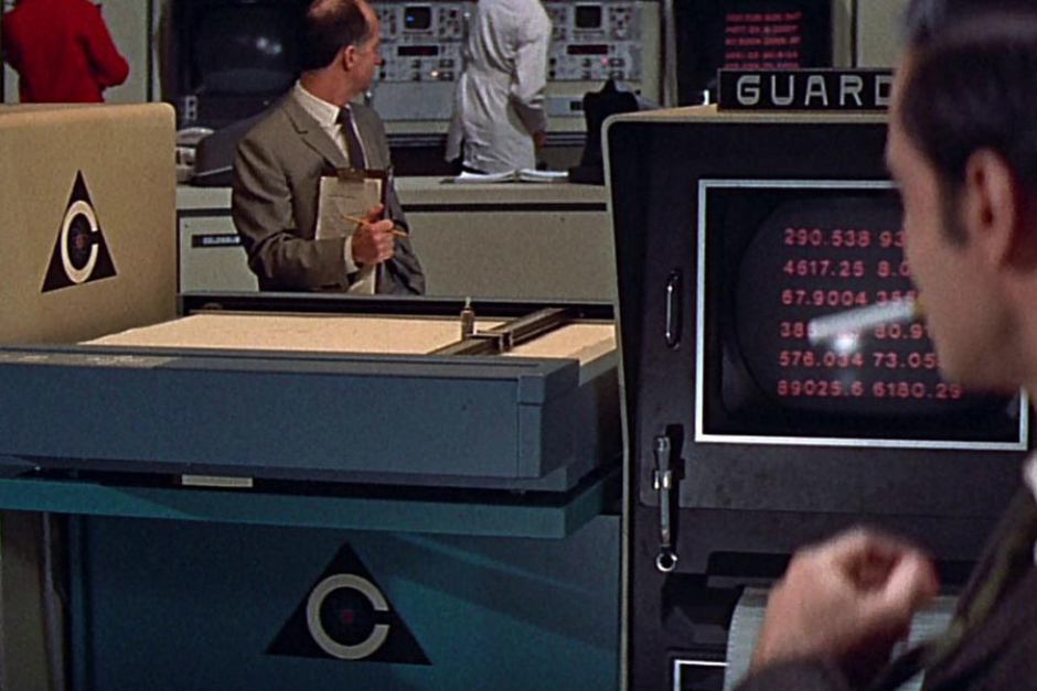
Figure 4.10 On the side of a drafting table between the Colossus and Guardian computer terminals.
Figure 4.11 On the cover of Colossus Project documentation.
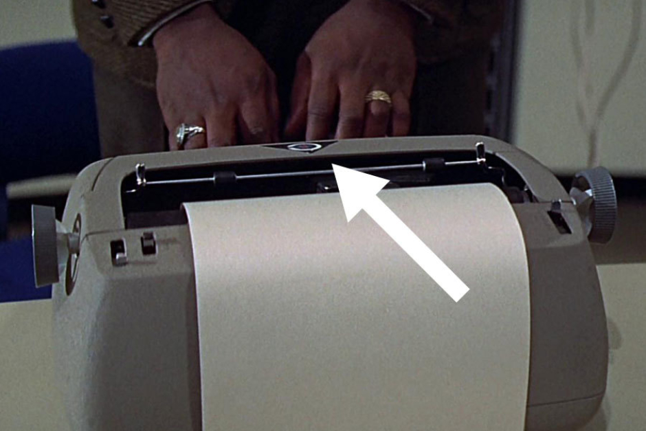
Figure 4.12 On the top face of a teletypewriter that serves as an input for interactions with Colossus, via the computer terminals.
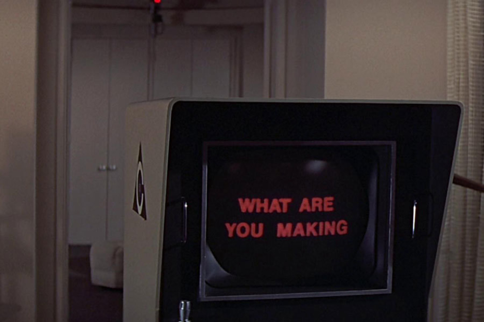
Figure 4.13 On a terminal installed inside the living quarters of Forbin, when Colossus moves in with him. Worst roommate ever.
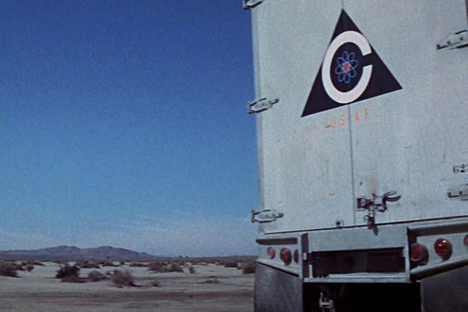
Figure 4.14 On the back doors of a semi-trailer, used at an ICBM launch silo where warheads are being reconfigured on the order of Colossus.
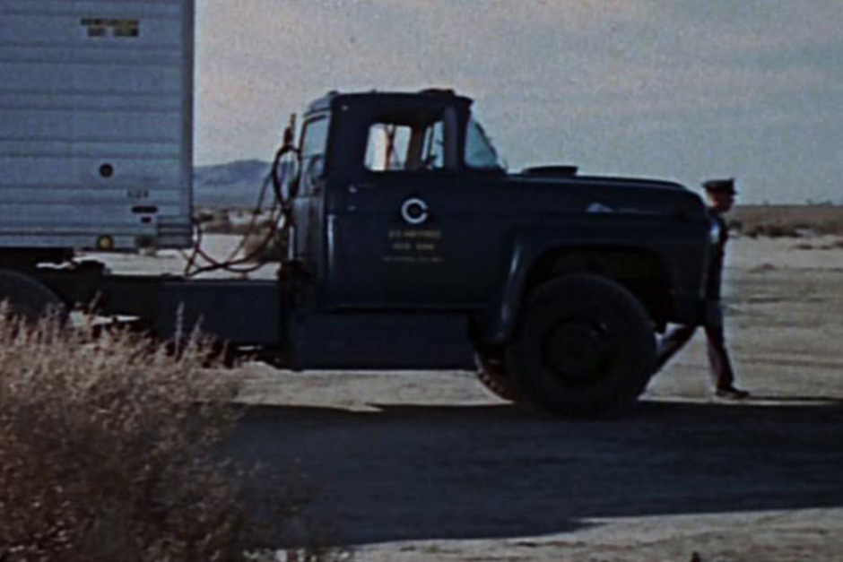
Figure 4.15 On the passenger side door of a semi-truck.
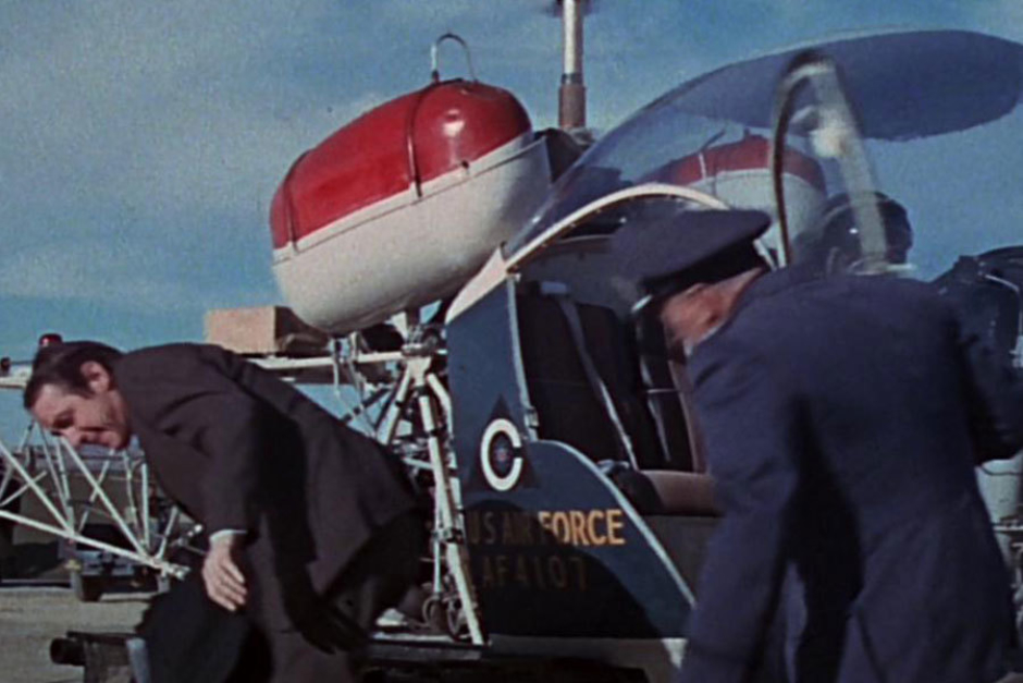
Figure 4.16 On the side of a US Air Force helicopter.
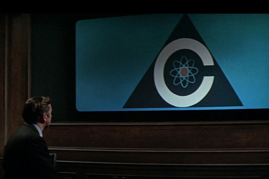
Figure 4.17 On a large screen viewed by the President, when the sentient Colossus makes a worldwide public address, announcing itself as the “voice of world control” and offering a life or death ultimatum to humanity.
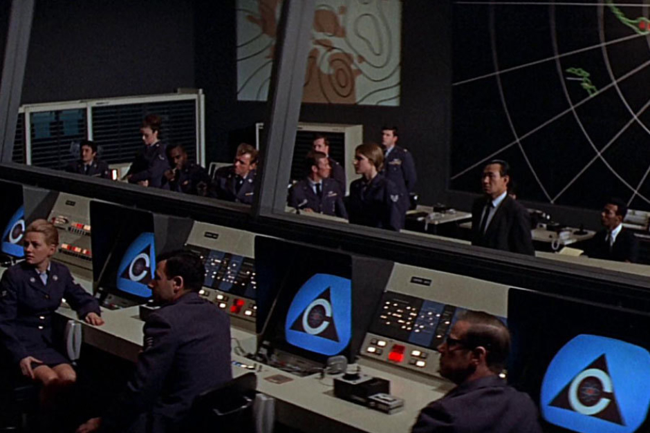
Figure 4.18 On screens in the White House Situation Room, where people aren’t feeling so good about that decision to give nukes to an artificial intelligence.
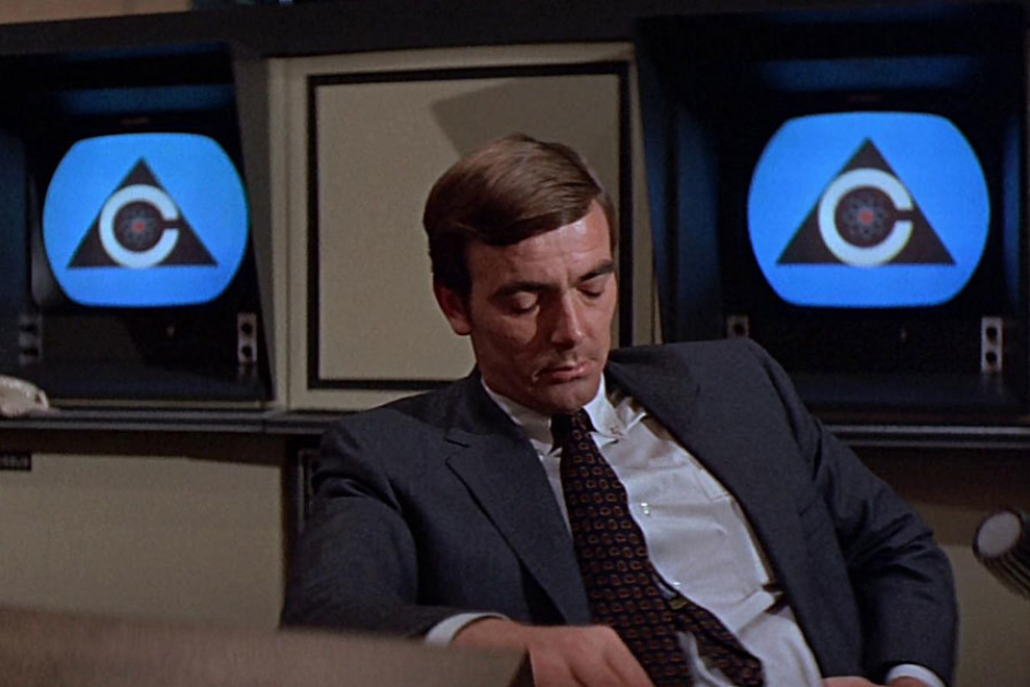
Figure 4.19 On screens in the Colossus Programming Office, where Forbin also isn’t feeling so good about that decision to give nukes to an artificial intelligence.
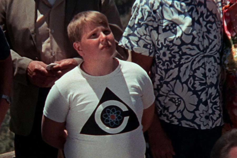
Figure 4.20 On a child's t-shirt, as he is presented with the choice between “the peace of plenty and content, or the peace of unburied death.”
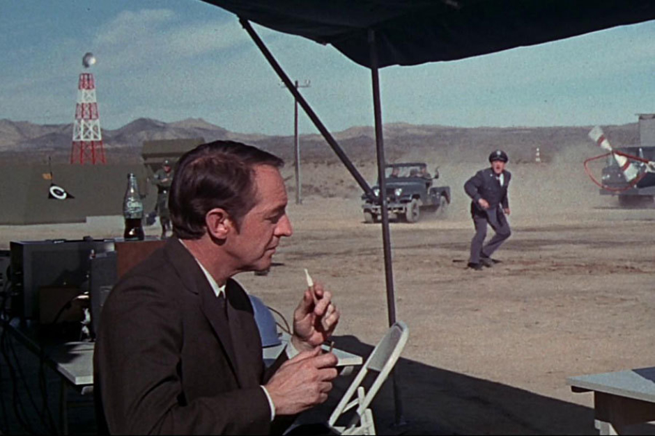
Figure 4.21 On a tent seen in the background behind CIA Director Grauber, who casually lights a cigar as he awaits inescapable incineration by a nuclear explosion.

Figure 4.22 On a large white pinback button worn by a child, covering his ears at the sound of a nuclear explosion broadcast by Colossus.
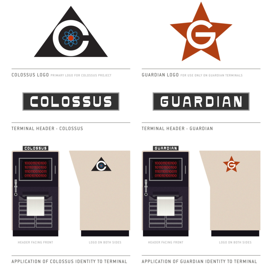
Analysis: The Guardian Logo
It isn’t long after Colossus is activated, that it announces to its creators that “THERE IS ANOTHER SYSTEM.” That system turns out to be its Soviet counterpart, an electronic brain they call Guardian. And when Colossus wants to have a talk with it, a logo appears for this supercomputer as well, which we see applied to the terminal they set up for the conversation (Figure 5.1).
What’s interesting to consider, is where this logo could have come from in the context of the film.
In Figure 5.2, you can see the Guardian logo in better detail next to the Colossus logo, where I’ve created an approximation of both designs after closely studying images from the film.
Given its stylistic similarity to the Colossus logo, and the use of a G rather than a cyrillic character, it wouldn’t make sense for the design to have Russian origins. I guess the in-house designer for the Colossus project whipped one up quick for Guardian, along with the logotype that sits atop its terminal?
That seems the most plausible, in which case, I guess it’s nice there was a graphic designer somewhere in the project? Even if the poor soul ended up being responsible for not just one, but TWO logos for world-dominating supercomputers that are nuking population centers right and left, and threatening the entire human race with “the peace of unburied death.”
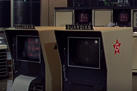
Figure 5.1 The Guardian computer terminal, with logotype on top header and logo affixed to its sides.

Figure 5.2 The Colossus logo next to the logo for Guardian, which consists of a white capital G tightly framed by a Communist red star.
Usage: The Logotypes in Application
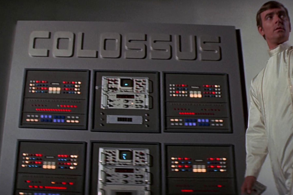
Figure 6.1 The Colossus logotype, seen above a control panel in the beginning of the film.

Figure 6.2 A modified version of the Colossus logotype, exhibiting less contrast between thick and thin strokes, applied to the remote control.
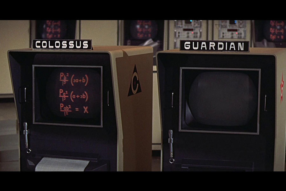
Figure 6.3 A variation of the Colossus logotype, along with that of its Soviet counterpart Guardian, on the top of their respective terminals at the Programming Office in California.
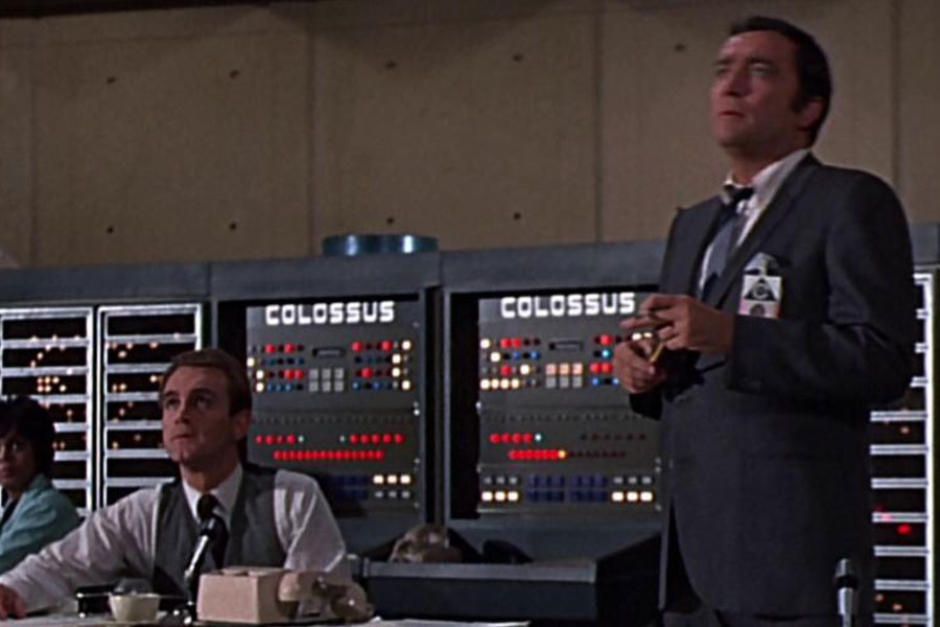
Figure 6.4 The primary Colossus logotype can be seen on the top of rack computer consoles in the Programming Office.
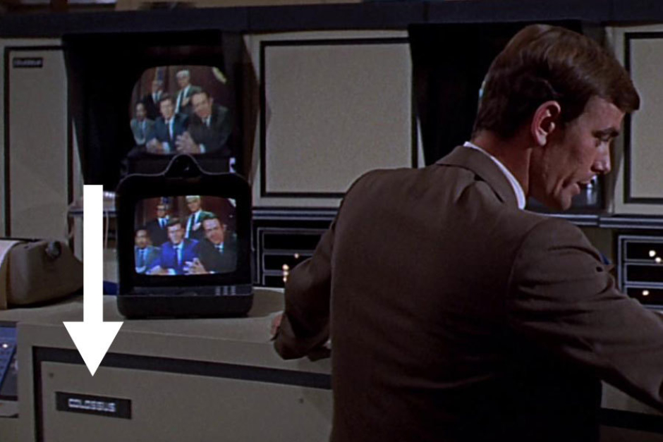
Figure 6.5 The primary Colossus logotype also appeared on plates, attached to the face of various computer cabinets and consoles. One is seen here to the left of Forbin.
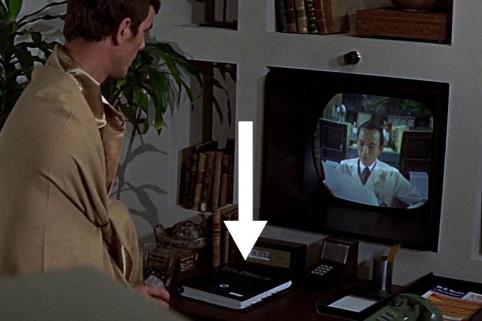
Figure 6.6 In this scene in Forbin’s living quarters, we glimpse the logotype on the cover of hardbound documentation for Colossus, sitting on the desk below the video monitor.
Analysis: Typography
In this section, I analyze the wordmarks we see used in the film, for both Colossus and Guardian, attempting to shed some light on how they were designed.
Early on in the film, we see the primary logotype for Colossus (Figure 6.1). After quite a bit of searching and scratching my head about it—and some much appreciated help from other designers—I came to the conclusion that it is very likely a completely custom wordmark that a designer lettered themselves. Which probably means the best we can do is try and get close to the inspiration for the design, rather than picking apart how it was constructed from a specific typeface. That said, I'll still walk through my thought process as I crossed various typefaces off the list.
Beyond the primary logotype we see used in Figure 6.1, the type actually changes depending on the application, so there are those versions to take into consideration as well.
On the remote control we see Forbin use to activate Colossus (Figure 7.1) the wordmark appears to be set in type that is more uniform in weight, lacking the contrast between thick and thin that we see in the primary logotype. It kind of looks like a lightweight ITC Bolt, which was created around the time of the film and released the same year in 1970. But that was a typeface only designed in one weight—much heavier than what we see used here. It’s likely this was just a modification of the primary logotype, optimizing it for legibility at a smaller size. It’s tough to see, but I can still make out the interior radiused corners on the C and O where an ITC Bolt origins would give them square interior corners.
Later in the film, we see something very close to the primary logotype used above the computer terminal for Colossus, in the Programming Office (Figure 6.2). But there is yet another difference, this time in the exterior rounded corners—here the designer went with a larger radius, opting for something with a curvier appearance. It’s probably easiest to see in the S characters (Figure 7.2).
Initially I suspected all this to be rooted in a typeface that had been modified, based on a notion that I had seen it before somewhere else. But what I was specifically recalling wasn’t actually a commercially available typeface, and was instead a corporate face designed by Ernesto Lehfeld for a Japanese client (Figure 7.3). Once I dug it up and had it in front of me, I could see that the typeface shared some similarities—so I wasn’t crazy to think of it— but those features weren’t pronounced enough. And for several characters the style diverged a quite a bit. To top it all off, I discovered that it was also designed in 1976, long after the 1970 release of Colossus: The Forbin Project.
Looking further back, some other matches were found, which point to a number of possibilities for what could have inspired the type design we see in Colossus.
For starters, it was popular in the sixties and seventies to see psychedelic lettering that took inspiration from Art Nouveau, where type designers achieved weird effects and proportions through lens distortion techniques using their phototype machines. That influence might explain some of the strange stuff going on in the Colossus logotype, especially those S letterforms. A good example of this sort of thing can be seen in a booklet called Photo-Lettering Psychedelitypes (Figure 7.4), published in 1968.
Along these lines, we can find the 1973 typeface Sintex on the site Fonts In Use, where it is described as “a bold funky ’70s Italian sans serif designed by Aldo Novarese for VGC, and digitally revived by Canada Type as Stretto.”
A quick note about the legendary Aldo Novarese: he also created Eurostile, and had a role in the design of Microgramma before that—both of which have become go-to typefaces for sci-fi design. Just something I thought was worth sharing, as we travel down this road.
Regarding the typeface Sintex, Fonts In Use provides several examples, but the best is a one-sheet by fantasy artist William Stout, created for Ralph Bakshi’s 1977 post-apocalyptic fantasy sci-fi animation Wizards. Seen there in all uppercase, Sintex definitely looks like it shares some of the same qualities possessed by Colossus’ type. The A looks very similar to the one used in GUARDIAN, and the S looks only a step or two away from what we see used in COLOSSUS. The entry for Sintex also links to a similar font, called Beat Star. “Designed by Karl-Heinz Domning in 1972 for Berthold. Apparently inspired by 19th-century wood type such as Hamilton’s Gothic Bold.” (Figure 7.5) So these are all typefaces that came shortly after the 1970 film, disqualifying them from being the origin of the Colossus type treatment, but they do point to a trend, where type designers were playing with older type and remixing it for these similarly styled results.
And when I look at the reverse-stress “Gothic Bold” in Rob Roy Kelly’s book American Wood Type: 1828 - 1900 (Figure 7.6), the influence is visible there too. The weird proportions, the thick and thin strokes applied in the same places we see in the Colossus and Guardian wordmarks, just as they are in Sintex and Beat Star. I find it interesting how far back the influence for this style goes, all the way to the late 1800s, making its way from wooden type through various adaptations and psychedelic modifications to finally end up on someone’s depiction of a sentient supercomputer set a few decades into their future—an artificial intelligence of that nature being something that is still a futuristic idea to us even now. It’s pretty funny to think about.
But after all that background on the typographic style's prevalence at the time, my research turns up another reason this lettering was used for Colossus—it was based on actual identity design from cutting-edge computers of the 1960s/70s. In the following sections, I examine this intersection of the film's science fiction design and the designs we find in reality.
Much thanks to type designer Riley Cran, who provided tips and research pointing me to psychedelic type in the 60s/70s, and typefaces like Sintex and Beat Star.
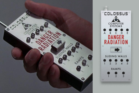
Figure 7.1 Where we see it machined into the face of a remote control, “COLOSSUS” appears to be set in type with a lighter, more uniform weight.
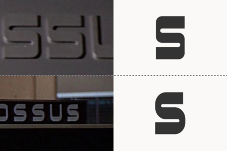
Figure 7.2 A difference in the sizes of corner radius is evident, when comparing the Colossus logotype from the opening scene (top) and its variant that sits atop Colossus computer terminals (bottom).
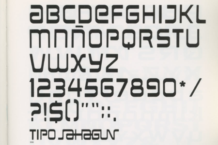
Figure 7.3 Similarly styled corporate typeface for Sahagan Industrial Group, designed by Ernesto Lehfeld in 1976. Source: Pictograms and Typefaces of the World 2
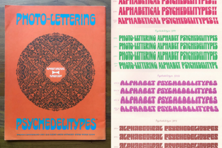
Figure 7.4 Photo-Lettering Pyschedelitypes (Alphabet Directions No. 8), Photo-Lettering, Inc., 1968. Source: Images by Stephen Coles
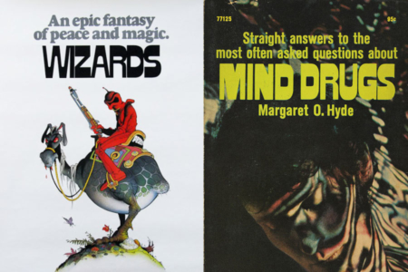
Figure 7.5 While it is a little strange looking now, the lettering style used in Colossus: The Forbin Project was not futuristic, but instead the sort of thing that was popular at the time. Similarly styled typefaces, Sintex (left) and Beat Star (right) can be seen in these examples from the 1970s. Source: Fonts In Use
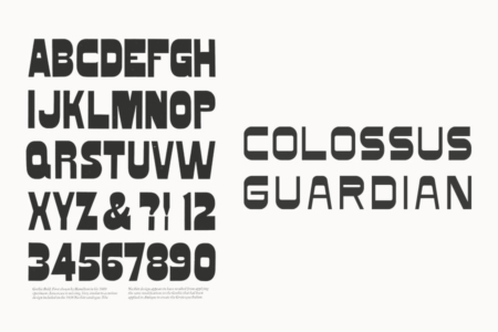
Figure 7.6 Rob Roy Kelly’s book American Wood Type: 1828 - 1900 features a specimen for a “Gothic Bold” reverse contrast wood type from the late 19th century (left), the primordial ooze of the style we see used for the Colossus Project typography.
Analysis: Finding the Logotype’s Inspiration in the Real World of Supercomputing
After analyzing the logotypes from a somewhat type-centric design history angle, I decided to investigate realworld examples of large supercomputers from the film’s era.
Being particularly interested in the visual identities and how they were styled and applied to these computers, I turned to the Computer History Museum’s online archive, “Selling the Computer Revolution: Marketing Brochures in the Collection.” Their online collection is something I’ve spent some time with in the past, and I can say it’s definitely worth browsing if you find this entry of interest and want to dig deeper into the visual identities and marketing of computers. As I suspected, it proved to be an excellent source for my investigation of Colossus.
The archive is helpfully divided into sections, and there is one for military/aerospace, which is right where I needed to land. The full description is worth a read, for understanding the historical context of computers that inspired the science fiction of Colossus:
“In the United States, the military services have played a seminal role in advancing and shaping developments in computer science—from the earliest days to the present. The ENIAC, completed in 1946, was the first large-scale, electronic, digital (though not stored program) computer in the United States and was used to produce ballistics tables and refine hydrogen bomb designs.
IBM’s first entry into the commercial computer market was their Model 701, also known as the “Defense Calculator,” and was delivered just four years later, mainly in response to the start of the Korean War.
A third pole of innovation was occurring at universities where sophisticated research machines would be built over the next decade. All three kinds of military-type computing—government-sponsored, commercially-produced, and academically guided, had the Cold War as their backdrop.
As the demands of an ever-more elaborate scientific and technical environment impinged on both rivals, the United States pursued digital technology with a vigor unmatched by any other nation. Demand for supercomputers (a term exemplified by the CDC 6600 machine, introduced in 1964) the highest-performance machines, was almost entirely driven by the Cold War and made the U.S. the world leader in high-performance computing for decades.”
This is the context for Colossus, and the technology it represents. Of course, these machines also made their way into the business world, and from there we have more marketing materials to reference than the defense world offered up. Digging into the archives, one name jumped out at me—UNIVAC. Not only did it play a role in American missile programs (Figure 8.1), but its also exhibits an identity very similar to that of Colossus. The manner in which it was applied to the computer is also familiar, as it was common practice at the time to identity large computing machines like UNIVAC's with name plates and headers (Figures 8.2–8.4).
When we take a closer look at the mark for UNIVAC, typographic similarities are evident (Figure 8.5), especially in the U and C characters. And the S used in UNIVAC 9400 SYSTEM (Figure 9.1), is very near what we see used in the film's header typography. I’d venture to say this was a direct inspiration for the design work done on Colossus’ visual identity. Even the colors used for UNIVAC's industrial design, as seen in the cases and cabinets, are similar (Figure 9.1). I suppose it would make sense to reference the cutting edge in computing for design cues, and as far as world building goes, it keeps things realistic looking and believable for the film’s contemporary audience.
The film itself never mentions the year it is set in, but the 1966 science fiction novel upon which it was based sets this future scenario in the mid-1990s. So I wonder, should they have gone out on a limb and made Colossus and its visual identity more futuristic looking? Just what should that have looked like? Given our convenient vantage point from 2017, we can easily find out, and I cover this in the last section of this entry (Figures 10.1–10.6).
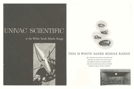
Figure 8.1 Cover and page from the UNIVAC Scientific at the White Sands Missile Range brochure (1953). Source: Computer History Museum
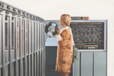
Figure 8.2 Image from UNIVAC 1108-II brochure, The Big System With the Big Reputation (1965). Source: Computer History Museum
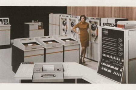
Figure 8.3 Image from UNIVAC 9400 System brochure (1969). Source: Computer History Museum
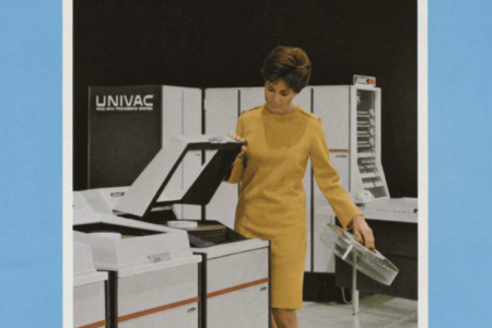
Figure 8.4 Image from UNIVAC 9400 System brochure (1969), with UNIVAC logotype prominently displayed. Source: Computer History Museum
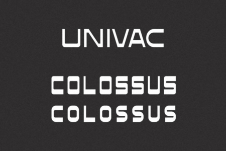
Figure 8.5 For comparison of the designs, the 1960s logotype for Sperry Rand Corporation’s UNIVAC above the logotypes for COLOSSUS.
UNIVAC
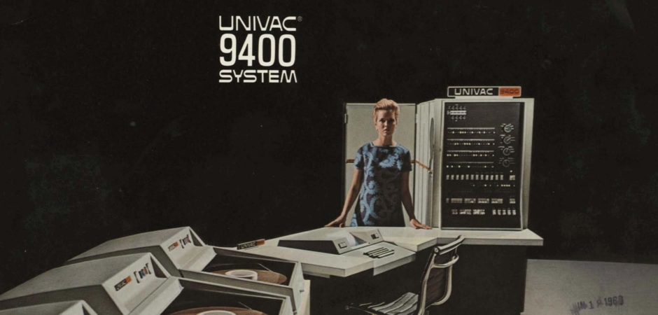
Figure 9.1 From the logotype styling and placement, to the beige and black colors used on the computer cabinets and terminals, this 1969 UNIVAC System seems to have inspired the design of Colossus in more ways than one. Source: Computer History Museum
Film Scenario vs Reality: What the Future Actually Looked Like for Supercomputers
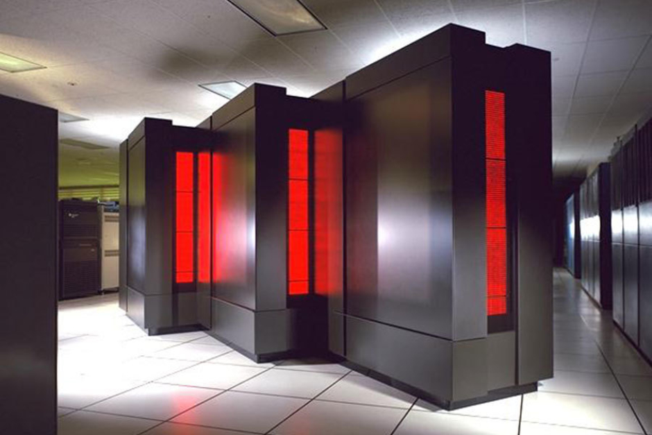
Figure 10.1 If an actual supercomputer from the 1990s could be sent back in time to inspire a futuristic design for Colossus, this would have been a great candidate—the NAS Thinking Machines CM-5 (1993). Source: Bradley C. Kuszmaul, MIT. Photo by Tom Trower.
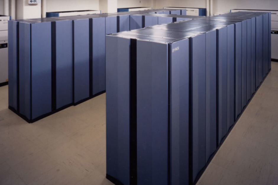
Figure 10.2 The CP-PACS parallel supercomputer built by Hitachi and installed at the Center for Computional Science at the University of Tsukuba in Japan for use in computational physics (1992). Source: TOP500.org
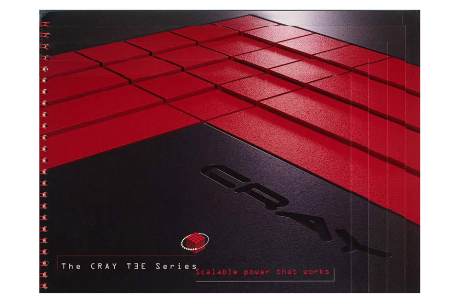
Figure 10.3 The Cray logo, on a brochure for the Cray T3e. Source: Cray FAQ
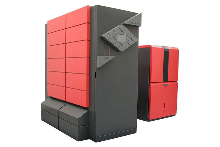
Figure 10.4 Cray's first massively parallel supercomputer architecture, the Cray T3D (1993). Source: Wikipedia
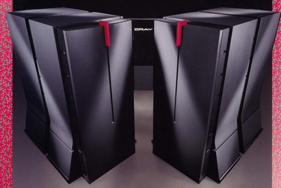
Figure 10.5 From a 1990s brochure for the Cray YMP-M90. Source: Cray FAQ
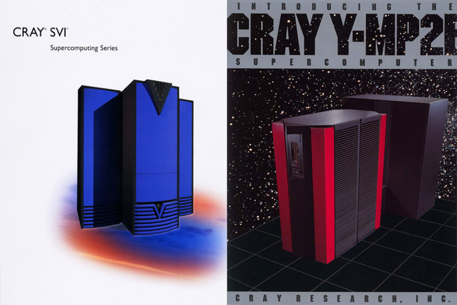
Figure 10.6 Brochure covers for Cray SV1 and Y-MP2E. Source: Cray FAQ