Omni Consumer Products
Defense Industry, Law Enforcement, Manufacturer, Megacorporation
Near Future
Omni Consumer Products (OCP) is a megacorporation that creates products for virtually every consumer need, with divisions contracting in nearly every industry. This includes highly profitable business in areas like defense and automation, in addition to entering markets typically deemed non-profit, like hospitals, prisons and space exploration. OCP even aims to build its own privatized Delta City, over the ruins of Old Detroit.
To pave the way for Delta City's construction, OCP's Security Concepts division entered into a contract with the City of Detroit, privatizing the Detroit Police Department. Security Concepts is also responsible for projects producing the RoboCop cyborg, and the ED-209 enforcement droid.
Overview: The OCP Visual Identity
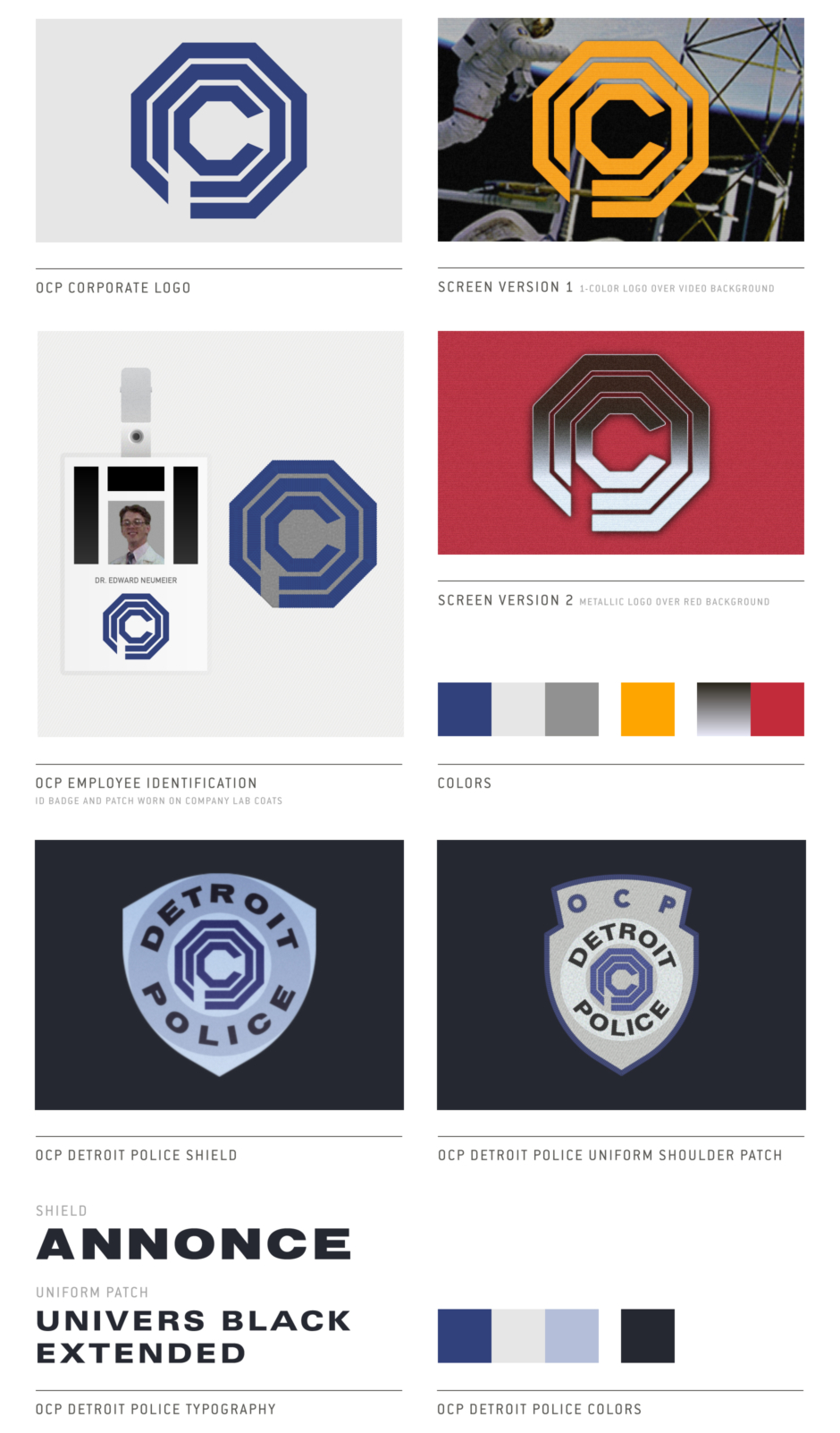
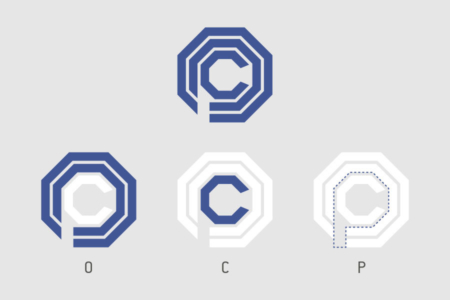
Figure 1.1 Breakdown of OCP logo into independent letterforms.
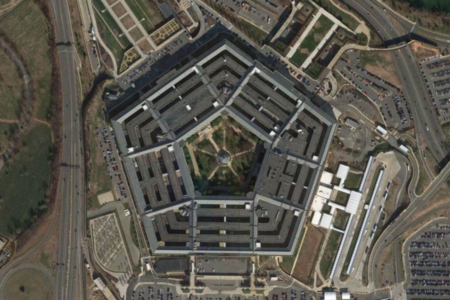
Figure 1.2 The OCP logo’s polygon shape and interior concentric lines call to mind the rings of The Pentagon—a nod to its defense industry status?
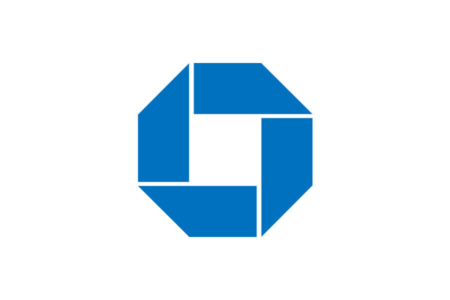
Figure 1.3 The Chase Bank logo designed by Chermayeff and Geismer in 1961. Probably one of the world’s most recognizable abstract logos, as far as faceless corporate identities go. Source: Chermayeff and Geismer
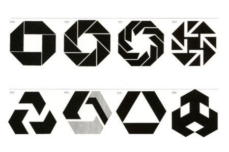
Figure 1.4 The trend initiated in 1961 by Chermayeff and Geismer’s Chase logo design, where similar abstract geometric forms are used in the visual identities of large corporate banks. Source: Marks of Excellence
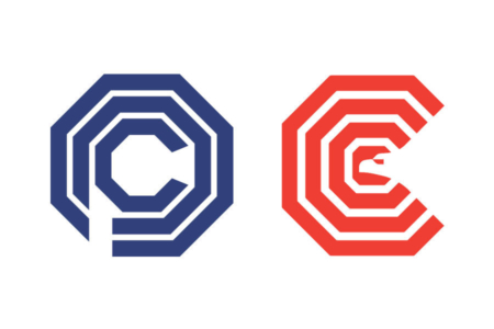
Figure 1.5 OCP’s corporate logo next to the similarly styled logo for the original Washington Convention Center, which opened in opened in 1983.
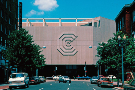
Figure 1.6 The logo for the Washington Convention Center created in stone and mounted to its exterior facade. The octagonal building was imploded in 2004. Source: Lance Wyman: The Monograph
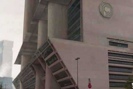
Figure 1.7 OCP’s logo reproduced (inaccurately, if you’ll note where the descender on the P drops) in stone/concrete and applied to the exterior facade of its hi-rise corporate headquarters.
Analysis: The OCP Logo Design
The logo for Omni Consumer Products (OCP) consists of three concentric thick line octagons, combined with breaks and negative space to define the letters that make up OCP's initials (Figure 1.1). The O is implied by the outer octagonal rings. The C is the innermost octagonal ring, broken on the right side. And the P is an oddball, implied by the negative space of the second octagonal ring—a negative space that also breaks through the second and outermost ring, to form the stem of the P letterform.
Regarding the name, Omni is defined as “a combining form meaning ‘all,’ used in the formation of compound words: omnifarious; omnipotence; omniscient.” This makes sense, as OCP has its hands in everything, operating within all sectors of society. To reinforce this, the logo design’s concentric rings seem to imply OCP’s all-encompassing reach as a megacorporation, with the Omni O encircling Consumer C and Products P.
Stylistically, the mark definitely has the faceless corporate look nailed, so it’s not a warm and friendly logo—all hard-edged, heavyweight, angular geometry—like it was built to withstand having a bomb dropped on it. In fact, it really calls to mind The Pentagon, with its iconic polygon architecture and concentric rings as seen from an aerial view (Figure 1.2). Without knowing the designer’s intent, I can’t say if this was something they were after, but it makes total sense as a nod to OCP’s status as a major player in the defense industry… in their outsized role, OCP could just about be mistaken as the Pentagon. The corporate/military blurring of the lines is spelled out in myriad ways throughout RoboCop, but this exchange puts it bluntly:
Clarence Boddicker, Crime Boss: “Gonna need some major firepower. You got access to military weaponry?”
Dick Jones, OCP Exec: “We practically are the military.”
So that’s one possible inspiration for the design.
As far as logos go though, I think the OCP identity has a strong stylistic connection with one in particular, that being the Chase Bank logo originally designed by Chermayeff and Geismer in 1961 (Figure 1.3). As they note in their online portfolio of work, “At the time, few American corporations used abstract symbols for their identification. Radical for its time, the Chase symbol has survived a number of subsequent mergers, and is currently the property of JPMorgan Chase & Co. It has become one of the world’s most recognizable trademarks.”
What was radical at the time—this use of an abstract, non-figurative mark— had by the time of RoboCop’s filming in the 1980s, become common practice for the identities of large corporate entities, and arguably contributes to the perception among many people that these are “faceless” institutions, masking the roles of the individual humans who serve as cogs in cold, amoral, profit-driven machines. In the financial industry, this trend took hold in such a way that abstract octagonal trademarks are now a generic design solution for banks (Figure 1.4). In similar fashion, OCP’s mark comes across as a generic or stereotypical corporate logo, which was likely a goal of the designer.
Going this route for the modern corporation does make practical sense though, as these types of logos serve as empty vessels for a company’s brand, and lend themselves to the amorphous nature of large corporations, which can operate across a multitude of industries at once. And with OCP being a “megacorporation,” it would realistically be expected to go this route as well. Technically, what they have is a non-acronym initial abbreviation mark, but it definitely steers towards corporate identities that fall into the non-figurative symbol realm. So much so, that it would probably be difficult to fully read OCP in the mark without the priming one gets from the film, where we are familiarized with the company’s name and its abbreviation as spoken by characters.
Beyond the possible Pentagon inspiration and its strong leaning towards a popular trend in corporate trademark design, I did find one specific logo that bears notable similarities in appearance and application, that I’ll throw in the mix here.
It’s a logo designed by Lance Wyman in 1979, for the original octagonal-shaped Washington Convention Center (Figure 1.5). In addition to the construction of the two logos—both consisting of similarly weighted concentric octagonal rings—they also receive similar treatment in their application to the exterior facades of a building (Figures 1.6 and 1.7).
Coincidence? Difficult to say. Good designers are familiar with a lot of existing work that is out there, taking inspiration from it, and remixing styles and elements for their own solutions. And with the Convention Center opening in the early 1980s, its identity would have been published in design books contemporary to the film. But designers also come up with some of the same graphic solutions independently, when working with simple geometric shapes and popular trends… as the saying goes, there’s nothing new under the sun. And lots of corporations featured their logos in stone on the side of their buildings, especially in the 1970s and 80s, so that at least is very likely just a coincidence.
While that covers most of the logo’s basic design aspects, not to be excluded or forgotten is the identity’s use of color, which is something I found worthy of examining in its own section following this one.
Analysis: Corporate Colors and the True Colors of Corporate Power
The OCP corporate identity appears in a variety of colors throughout the film, but two color treatments stand out for me. Both appear in the film’s early OCP boardroom scene.
First, the one-color version in blue (Figure 2.1), which is a very common and conservative color choice for corporate entities, that communicates truth and honesty (laughable given the way OCP operates), authority, professionalism, and power. This is what you would expect in the real world, from a company like OCP.
Also, in examining 1980s era identities for corporations heavily engaged in defense work (Figure 2.2), along the lines of OCP’s proclaimed products and services, one finds blue to be the dominant color choice by a large degree, seconded by red. Again, reinforcing what you would expect from a corporation like OCP and the image it wants to project to the public and its consumers.
But then, we see the second color treatment I referred to. When OCP Executive Dick Jones addresses the boardroom from the podium, the logo arrayed beside him on a wall of monitors, the identity has shifted to an aggressive color scheme of metallic chrome/silver over red. While this display is relatively brief, perhaps it reminds you of something? Maybe one of the most notorious and reviled visual identities in history? In Figure 2.3, a side-by-side comparison with what I'm referring to exposes the fascist tone the design takes on in this scene.
And given the statements the film is making about corporations and their relationship with American society, it’s safe to say these design choices are no accident. The shift from the mundane and formulaic corporate color choices to something paralleling the Nazi identity’s colors and display tactic of repetition, when it comes time to rally the board, is a subtle message early on in the film about where pervasive and seemingly innocuous corporate power can take things as it grabs the reigns to democratic society and supplants its public institutions.
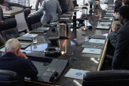
Figure 2.1 The color blue is a popular color choice for corporate identities. In this scene, we see OCP uses it as well, in its primary color treatment.
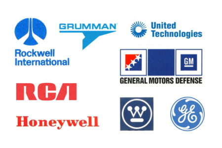
Figure 2.2 Examples of 1980s era corporations operating as defense contractors, many of which are household names in American society. Use of the color blue seems to be the most popular, followed by red.
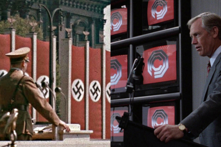
Figure 2.3 Left: Hitler addressing a crowd, with banners bearing the Nazi symbol arrayed beside him. Right: Dick Jones addressing the boardroom, with monitors bearing the OCP logo arrayed beside him.
Usage: The OCP Logo in Corporate Applications
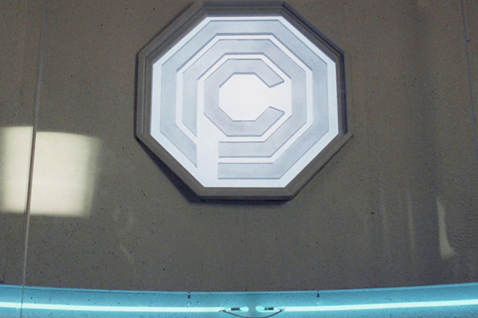
Figure 3.1 Above entrances in the OCP corporate headquarters, we see illuminated signage in the form of the logo.
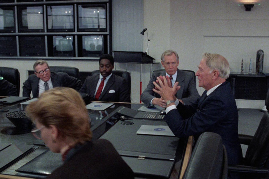
Figure 3.2 The OCP logo appears in one-color blue on gray folders in the corporate boardroom.
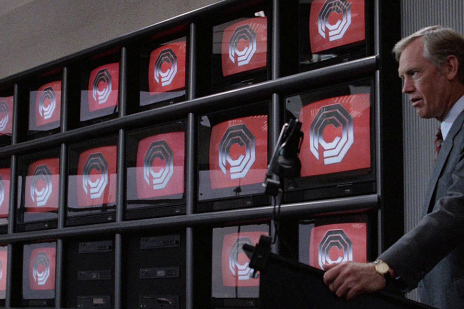
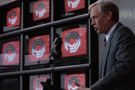
Figure 3.3 As OCP Senior President Dick Jones addresses the boardroom, we see a screen version of the logo arrayed in metallic chrome on red.
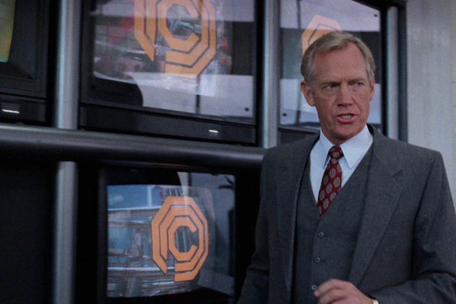
Figure 3.4 As OCP Senior President Dick Jones addresses the boardroom, we also see the logo used in one-color orange against a video backdrop.

Figure 3.5 As the ED-209 is prepared for demonstration, we see OCP’s logo applied to lab coats, name badges and binders.
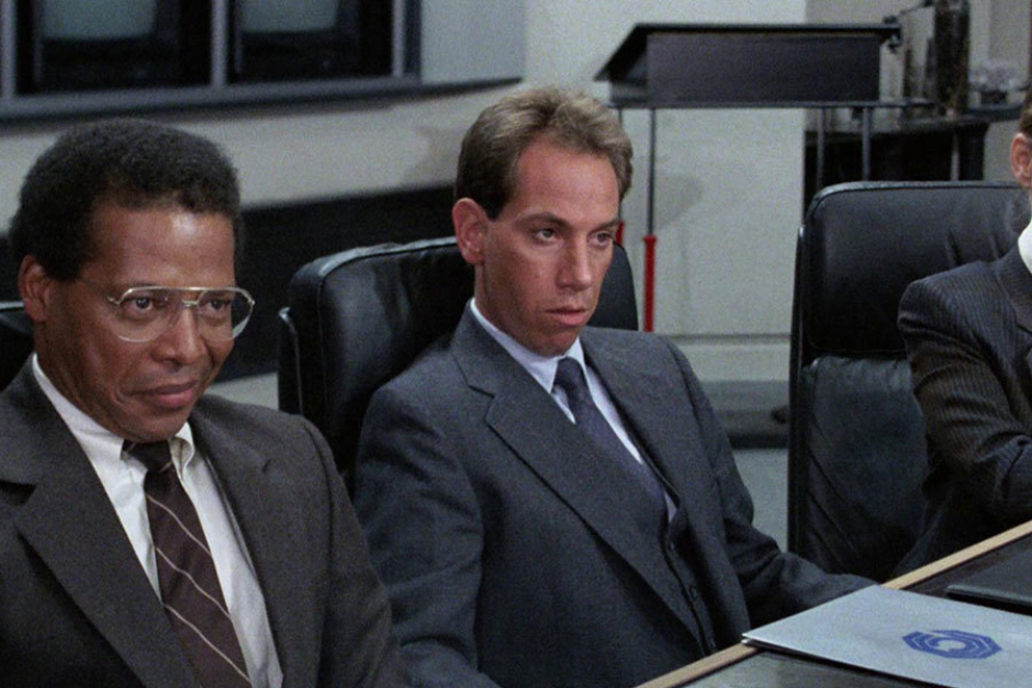
Figure 3.6 A closer look at the OCP logo on Bob Morton’s folder.
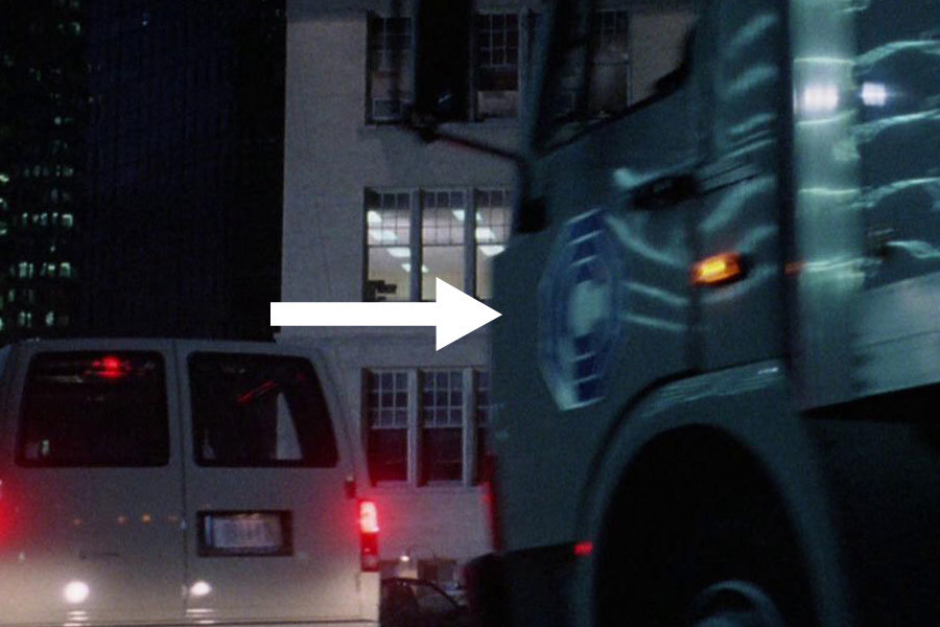
Figure 3.7 In the scene where RoboCop arrives at the police station, we see the OCP logo on the sides of vans and a truck.
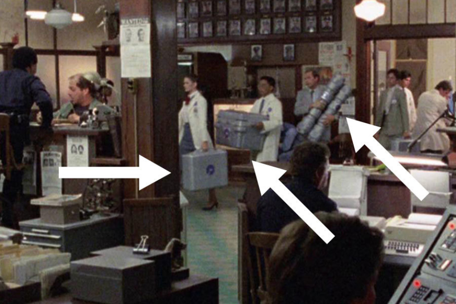
Figure 3.8 It's a bit difficult to see, but the logo is applied to all OCP gear, luggage and containers.
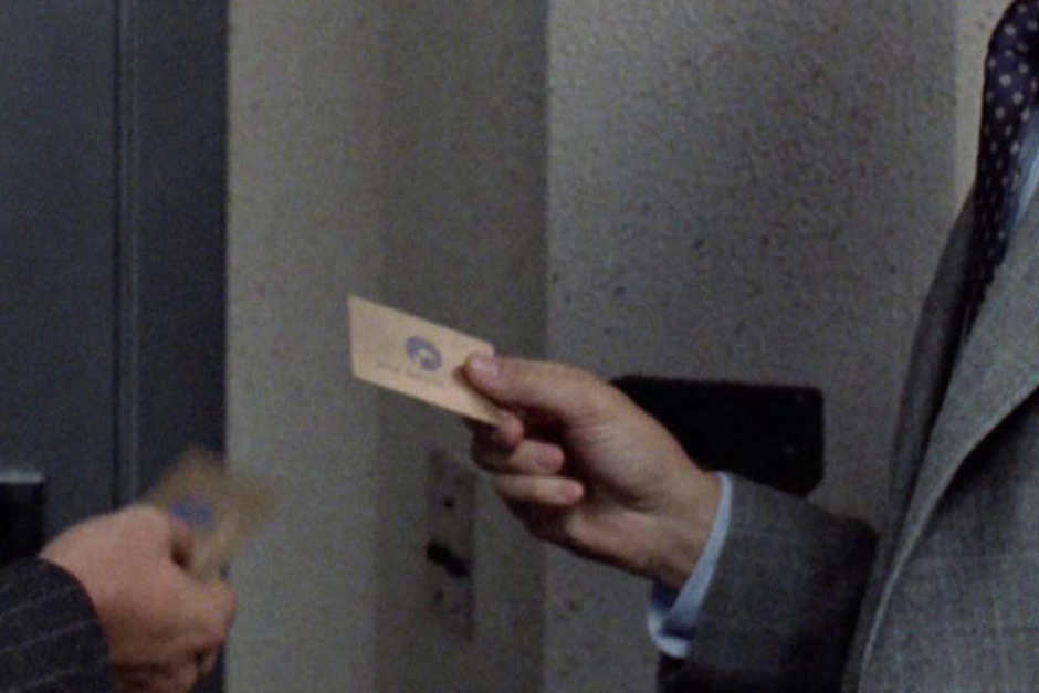
Figure 3.9 Bob Morton and a colleague share a moment in front of the executive restrooms, where we get a glimpse of their gold OCP pass cards.
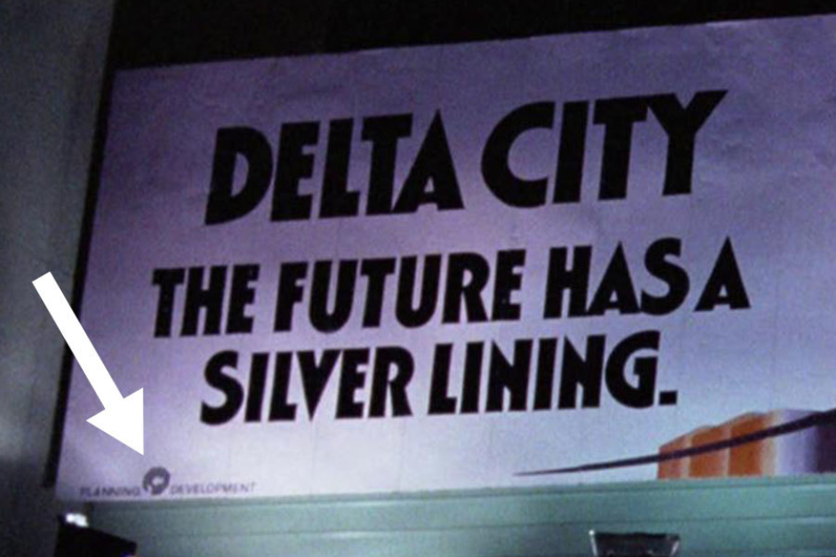
Figure 3.10 In the scene where two thugs are attacking a woman, we see a billboard for OCP’s proposed Delta City. In the lower left corner, the OCP logo is locked up between the words “PLANNING” and “DEVELOPMENT.”
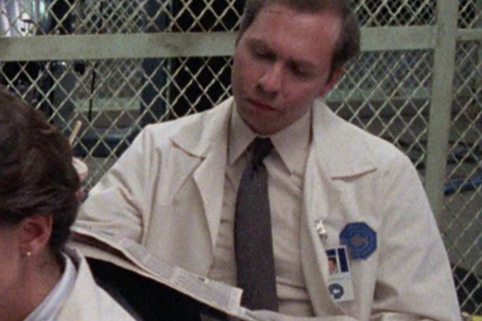
Figure 3.11 A closer view of the OCP logo as it appears on personnel lab coats and identification badges.
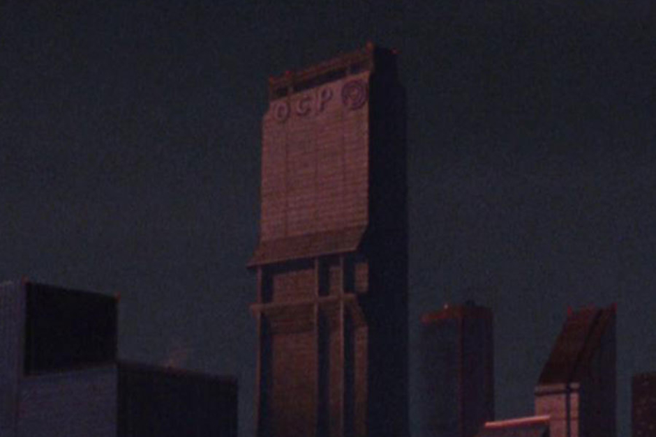
Figure 3.12 This is the only instance in corporate applications of the logo that we see it in a lockup with the OCP initials, on the upper exterior of the corporate headquarters.
Figure 3.13 As RoboCop exits the OCP corporate headquarters at the parking garage level, we see newspaper machines bearing the OCP mark.
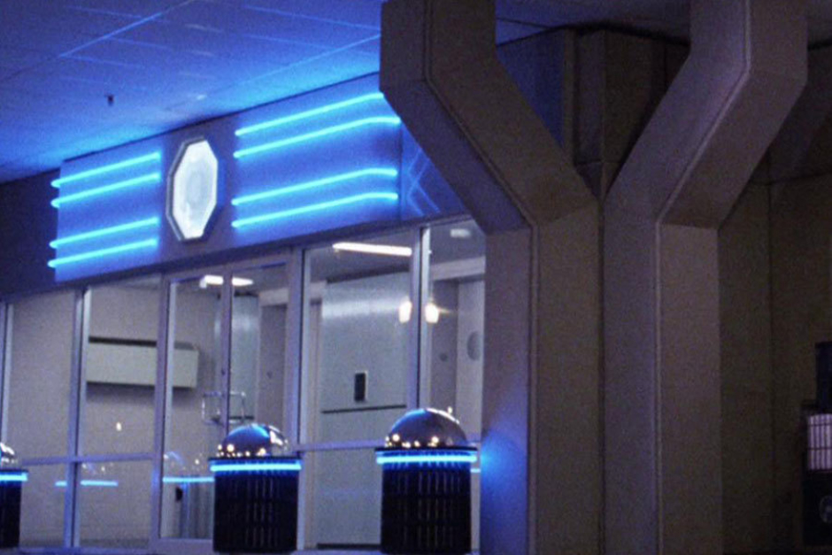
Figure 3.14 Another look at illuminated OCP logo signage that appears in the parking garage level.
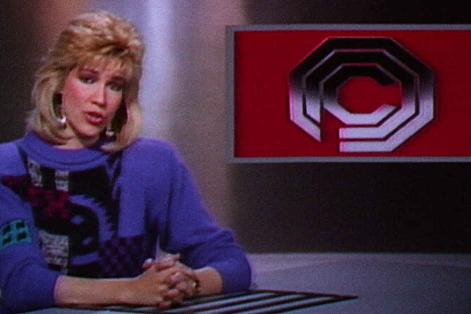
Figure 3.15 The screen version of OCP’s logo that appears on news broadcast’s referring to the company.
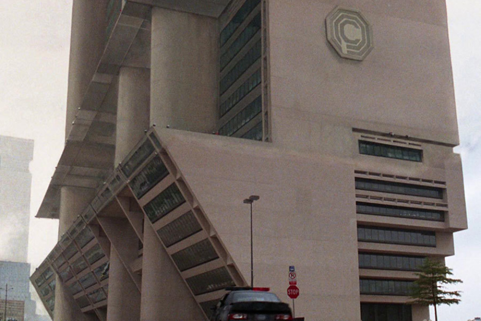
Figure 3.16 On a lower part of the OCP corporate headquarters, we see the OCP mark applied to its Brutalist concrete facade.
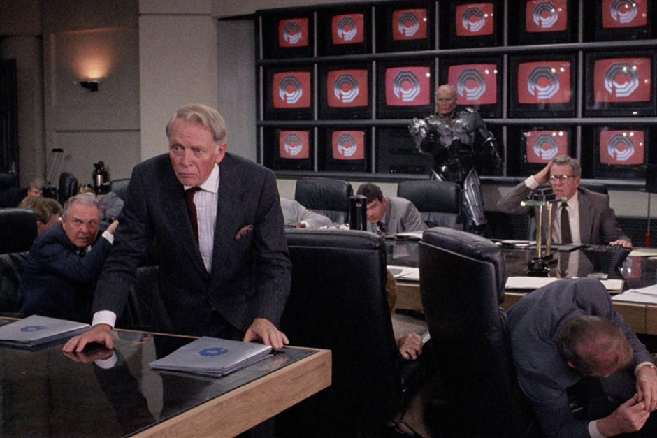
Figure 3.17 The boardroom at OCP features a wall of television screens, which regularly display a beveled chrome OCP logo over a red background.
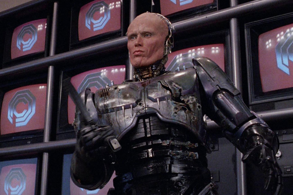
Figure 3.18 A closer look at the logo wall after RoboCop has shown Dick Jones, former employee of OCP, out of the building.
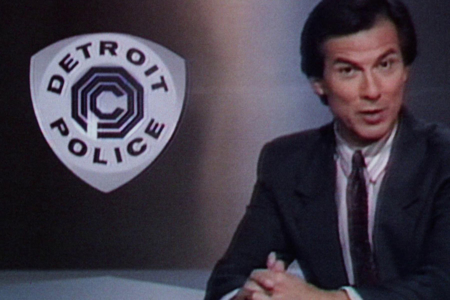
Figure 4.1 The OCP Detroit Police shield, with type set (and very poorly kerned) in Annonce Grotesque.
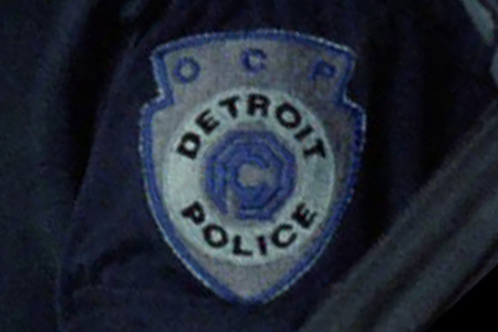
Figure 4.2 The OCP Detroit Police shield used as a uniform patch, modified in form to accommodate “OCP” above the shield’s logo/type lockup.
Analysis: The OCP Logo and The Detroit Police
In the near future world of RoboCop, the Detroit Police Department is privately owned and operated by OCP. As a result, we see the OCP logo in a shield lockup, which is featured prominently on police vehicles and uniforms.
The primary version (Figure 4.1) is a three-cornered wankel shield with the OCP logo at its center, and “DETROIT POLICE” set above and below within a donut shape that encompasses the logo. The type in this lockup is set in Annonce Grotesque, a face originally issued by Wagner & Schmidt in 1914, that went on to become widely distributed. Its description on MyFonts, where Annonce is available from Canada Type, reads: “Bold, extended and clear as a bell, Annonce stood out as the definite big sign font long before the Helveticas of the world. With angled cuts on some of the letters, it also shows humanistic traits that make it more appealing than any other face in its genre.”
On the uniform patches (Figures 4.2 and 5.1), we see the shield modified with an additional shape cropping out from the top, to accommodate the initialism OCP. A different typeface is used as well—something less extended. This is notable in the characters P and R. The leg of the R also appears curved, rather than straight as it is in Annonce. My best guess in this instance is some heavy weight of Univers Extended. Tough to say after the embroidery process gets done with it though.
Usage: The OCP Detroit Police Logo
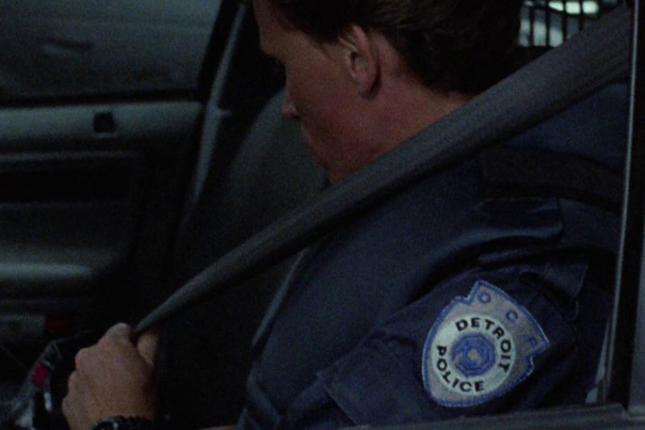
Figure 5.1 The OCP Detroit Police uniform patch as worn by Officer Murphy.
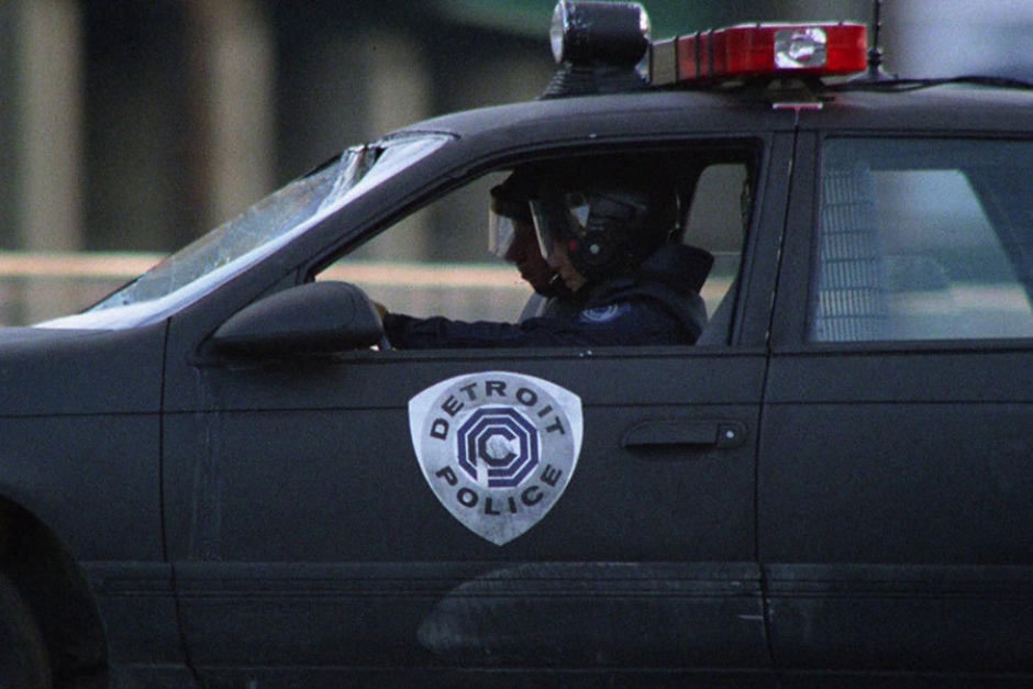
Figure 5.2 A nearly straight on view of the OCP Detroit Police shield, as it appeared on the side of a police car.
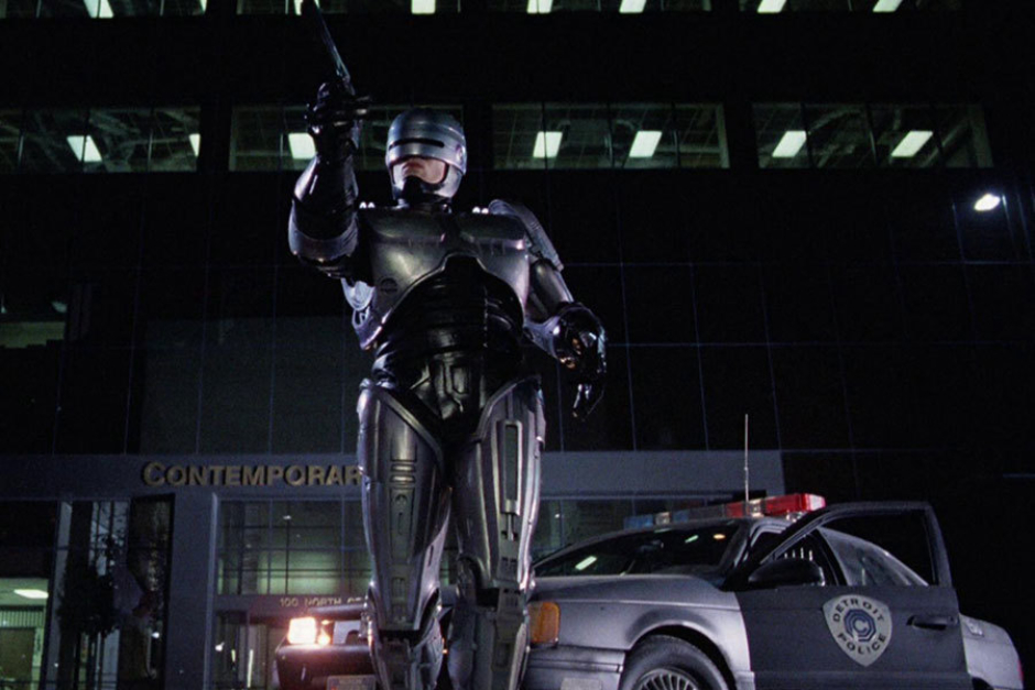
Figure 5.3 RoboCop making an arrest, with the OCP Detroit Police shield in the background.
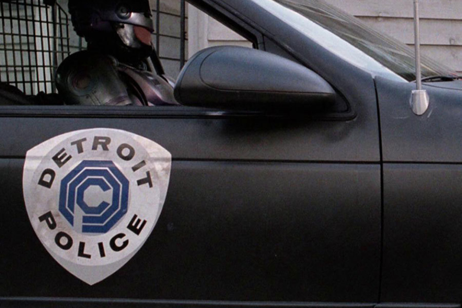
Figure 5.4 A closer view of the Police shield as it appeared on police cars.