Red Sun Empire
Government, Megacorporation, Military, Nation
Year 2107
The Red Sun Empire was established by Tenji Murakami, heir of the Murakami klan and CEO of the megacorporation Murakami Systems, who took control of the Harajuku Islands in a military coup.
Overview: The Red Sun Empire Identity
Intro: Tenji Murakami's Empire
The Red Sun Empire, which controls the Harajuku Islands in The Future is Now 2, is based on the real-world Empire of Japan.
After Tenji Murakami, CEO of Murakami Systems, made his family’s company into the biggest corporate conglomerate in the country’s technology industry, he used the company’s power and private security forces to stage a coup and take control of the government. Based on a vision, he then built advanced missile defense systems and a seawall that encircled the country’s main island, which spared it and the city of Otsu from the ravages of the Multi-Wars.
As emperor, Murakami ruled by force, internally and externally, stamping out resistance to his rule and expanding the empire to new territories.
Much thanks to Josan Gonzalez, aka Deathburger, for answering my questions and sharing the inspiration behind the symbols and logos he created for The Future is Now 2.
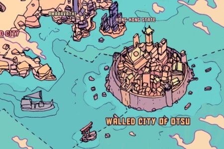
Figure 1.1 The “Walled City of Otsu” is the center of power for the Red Sun Empire and Murakami Systems.
Usage of the Identity
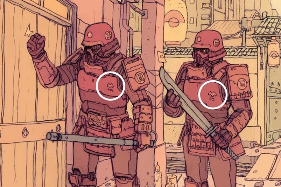
Figure 2.1 The most visible instance of the Murakami Systems logo is found on the chest plates of soldiers in the National Security Force.
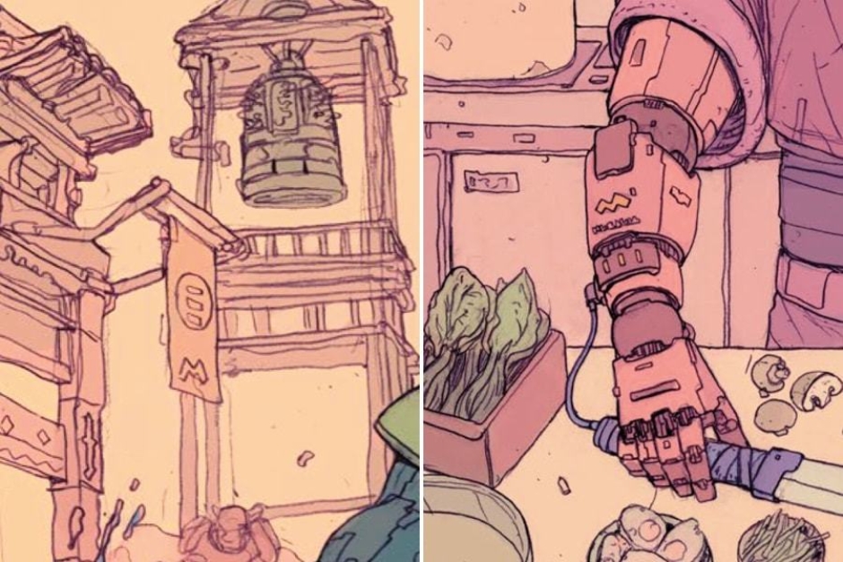
Figure 2.2 The Murakami Systems logo is also seen on imperial banners and the robotic arm of a cyborg.
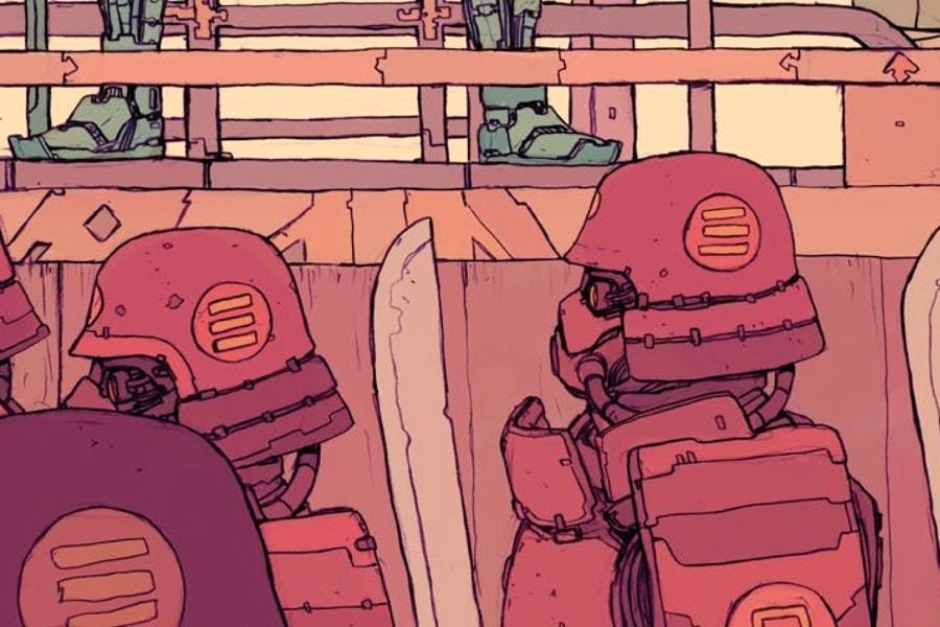
Figure 2.3 The symbol of the Red Sun Empire is found on the armor of soldiers in the National Security Force.
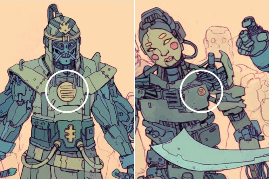
Figure 2.4 The symbol of the Red Sun Empire also appears on the gorget of Robo-Kahn and on his fighters' chests.
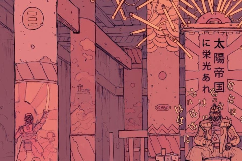
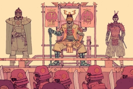
Figure 2.5 In the emperor’s throne room, the symbol of the Red Sun Empire appears on columns (top-left).
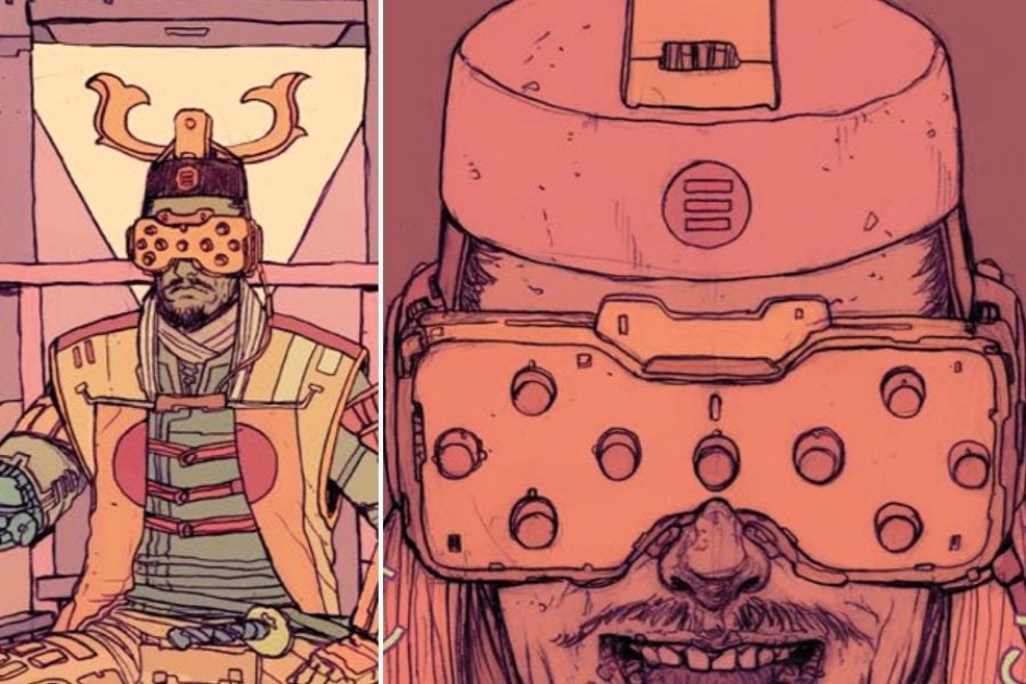
Figure 2.6 A close look at Emperor Murakami’s hat reveals the imperial symbol, centered on the front face.
Design Analysis
The Red Sun Empire was built on the might of the technology conglomerate Murakami Systems, which we only see hints of in The Future is Now 2, through the application of its corporate logo (Figures 2.1 and 2.2). Actual information on the corporation is something that has to be gleaned from The Archive, which is a companion book to the world of The Future is Now.
The company’s name, Murakami Systems, is a bit of a nod to the Terminator universe’s Cyberdyne Systems. You’ll even find the Cyberdyne Systems logo sprinkled into the book in a few places — on the back of a robot’s neck and on street signage. The world of The Future is Now is playing with lots of sci-fi ideas and concepts from the 1980s and 90s, and Josan has fun littering the pages with references like this.
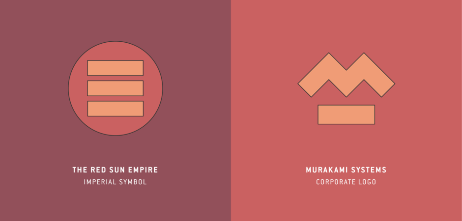
Turning to the design, the company’s mark consists of a thick zig-zag line that forms an “M” for Murakami, with an underscore of the same weight. Coincidentally, this bears some resemblance to the visual identity of a real-world giant from the technology industry, that was similarly involved in electronics and defense — Westinghouse (Figure 3.1). That logo, consisting of a zigzag “W” and underscore, was designed by Paul Rand in 1960.
The Murakami mark also resembles another fictional identity with ties to Japan. In the 1988 film Die Hard, the Nakatomi Corporation, which owned the building where that film’s story takes place, has a logo that shares some of the Murakami mark’s geometry and use of color (Figure 3.1). On a directory screen, it appears in a similar orange. And if you flip the mark 180 degrees, you get a zigzag with similar proportions to that of Murakami Systems. In my conversation with Josan, he hadn’t mentioned it as a source of inspiration, so this could just be a coincidence.
Turning to the identity for the Red Sun Empire, we have a name and graphic motifs that are inspired by the Japanese Empire and its “Rising Sun” symbol, which was used on the imperial war flag of the Japanese Army and Navy. We also see a red sun without rays, which is presently used on the national flag of Japan (Figure 3.2).
The identifying symbol for the Red Sun Empire is a disc containing three parallel bars in a horizontal orientation. The weight of the bars is similar to what we have in the Murakami Systems mark. It appears primarily in red and orange, or alternatively in yellow and green, as worn by a few characters. The mark is inspired by traditional Japanese family crests, which are often in a circle (Figure 3.3), with Josan pointing to the Ashikaga Shogunate (Figure 3.4) as an example from the era he wanted to call to mind. And similar to the Red Sun Empire, the Ashikaga Shogunate was a military government that came to power by overthrowing their predecessors. Based on what we learn from The Archive, the in-world reasoning for the use of these symbols is likely tied to Emperor Tenji Murakami's belief that a new golden era will be ushered in "by following the traditions and values of old."
In application, the imperial symbol is most visibly displayed as it is worn by soldiers and personal guards of the Emperor. On soldiers, it appears on their armor and helmets. Bodyguards like the Robo-Kahn, display it on gorgets. And it also appears on the hat of the Emperor and in his throne room. I’ll also note that it is one of the few instances in The Future is Now 2 where a nation’s symbol isn’t worn on armbands. Its usage is no less militant though, considering the way it is worn by the armed forces of the empire.
Altogether, this identity is one that looks back, finding inspiration in past technology corporations real and imagined, and Japan’s history of military rule, to construct a dystopian vision of the future that blurs the lines between the two entities.
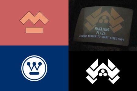
Figure 3.1 The corporate logo for Murakami Systems resembles the Westinghouse logo, and that of the fictional Nakatomi Corporation, from the 1988 film Die Hard.
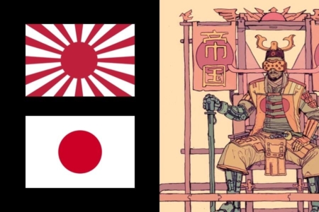
Figure 3.2 The Red Sun Empire is inspired by the Empire of Japan, and we see it use graphics inspired by the Rising Sun Flag (top-left) and the current Japanese flag (bottom-left). Source: Wikipedia
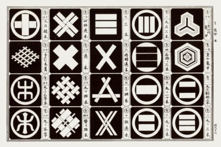
Figure 3.3 The symbol of the Red Sun Empire is based on designs for traditional Japanese crests. Source: Japanse Design Motifs
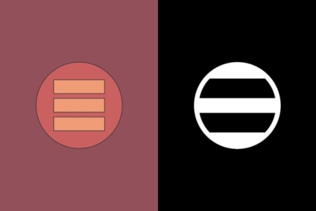
Figure 3.4 The imperial symbol was directly inspired by the emblem for the Ashikaga Shogunate (right), the feudal military government of Japan during the Muromachi period from 1338 to 1573. Source: Wikipedia
Cover image for The Future is Now 2 - Neon Rising
THE DESIGNER: JOSAN GONZALEZ
AKA DeathBurger
Illustrator, Architect and Grand Maker of Pizza. Head Archivist of The Ministry of Information of Robo-City Prime, Robotic Union. Designated by The Machine to manage the New Citadel 9, an independent publishing house that releases all The Future is Now related books, prints, original art and merchandise.
Rituals performed at:
Dynamite Entertainment, Boom! Studios, Dark Horse, Games Magazine, Agat and Cie Films, Medium Corp, Editora Aleph, Wired Magazine, Avex Music Group, Paramount Pictures, RoadSec, Harmonix Systems, Metallica, Mondo, Pearl Jam, CDProjekt Red.
Ocassionally summoned at:
3D Total's Sketching from Imagination: Sci-Fi, ImagineFX (FX Posé, March 2016)
To learn more, visit: