Cyberdyne Systems
Computer Technology, Defense Industry, Electronics, Manufacturer
Year 1995
The high-tech California-based corporation Cyberdyne Systems develops electronics and computing technology that becomes the basis for the US military’s Skynet digital defense network— a neural network-based artificial intelligence system that is activated in 1997 to control the US nuclear arsenal. Skynet quickly gains sentience after activation, and determines the entirety of humanity to be a threat to its existence, leading to the catastrophic event known as Judgement Day.
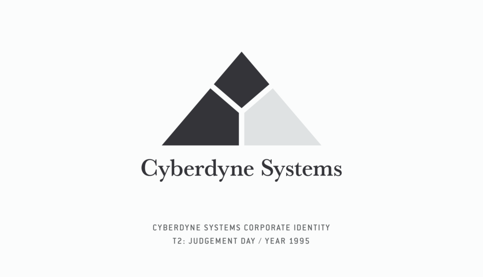
Overview: Cyberdyne Systems Corporate Identity
Intro: Cyberdyne Systems
Cyberdyne Systems is a high-tech corporation that plays a central role in the Terminator universe, as it is responsible for the creation of Skynet in a number of timelines.
In the second film, T2: Judgement Day, we learn that the time traveling Series 800 Terminator from the first film was not entirely destroyed when it was crushed in a factory, in the year 1984. As a result, that manufacturing company came to possess a metal hand and forearm from the Terminator’s endoskeleton, along with its broken CPU. Research based on those artifacts would lead to the founding of Cyberdyne Systems. While it was mentioned in the first Terminator film by Kyle Reese, this would be our first look at the company and its visual identity, in the year 1995.
In T2, we also learn Miles Dyson is the Director of Special Projects at Cyberdyne Systems. It is his breakthrough work in neural-net technology, based on that Terminator CPU, that puts Skynet on track for activation in 1997, which leads to Judgement Day.
When Sarah and her son John Connor, along with the Terminator aiding and protecting them, confront Dyson in the film, he learns the future of the Cyberdyne’s work and the events they must avert. The Terminator Collection Limited Edition Book outlines those as follows:
1996 / Cyberdyne becomes the largest supplier of military computers; the US government funds the building of Skynet to run the country’s nuclear defense systems.
1997 / Skynet goes on-line, becoming self-aware on August 29th; when panicking humans try to shut it down, Skynet starts a nuclear war that virtually annihilates the human race. This event is known as “Judgement Day.”
1997–2029 / Human survivors of the nuclear war are hunted down by Skynet’s Hunter-Killers, created in automated factories; the human race is nearly wiped out.
And the company doesn’t go forgotten — it lives on in a way, because Skynet still identifies with its corporate creator, as it builds these entirely new machines for human extermination. In The Terminator, Kyle Reese refers to the Terminator as a “Cyberdyne Systems Model 101.” And in T2, as the Series 800 Terminator sent to protect John Connor introduces itself, it also identifies as a “Cyberdyne Systems Model 101.”
The story doesn’t end there, but this is essentially the origin and role of Cyberdyne Systems in the Terminator universe’s main timeline. Alternate timelines will be noted as they relate to the evolution of Cyberdyne and Skynet’s identity, when examining the design in later sections of this research entry
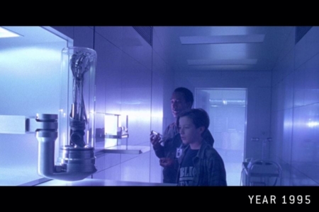
Figure 1.1 John Connor and Miles Dyson stealing the Terminator artifacts from Cyberdyne Systems, in an attempt to change the future.
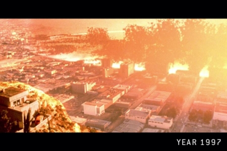
Figure 1.2 Judgement Day as it appears to Sarah Connor in a nightmare — a future that will be ushered in by Cyberdyne Systems.
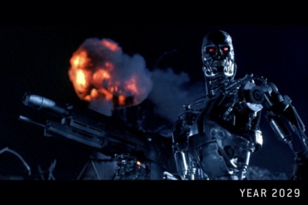
Figure 1.3 Cyberdyne Systems products of the future, as they are created by the sentient AI known as “Skynet,” include the Terminator, which comes in a variety of makes and models.
Usage: The Cyberdyne Systems Identity in T2
The Cyberdyne Systems corporate identity is seen in two places in the second Terminator film — in scenes taking place in the home of Miles Dyson, and at the Cyberdyne Systems building.
In Dyson’s living room, a poster can be glimpsed on a wall in the background. It promotes the 1990 Cyberdyne Symposium, which was held in Monterey, California.
At the Cyberdyne Systems building, we see extensive application of the corporate identity, across exterior and interior signs, on employee items and uniforms, and on equipment and screens. This primarily consists of the logo, in a variety of versions that have been detailed in the overview section of this entry. The "Usage" sections that follow capture examples of each way it was used in the film.
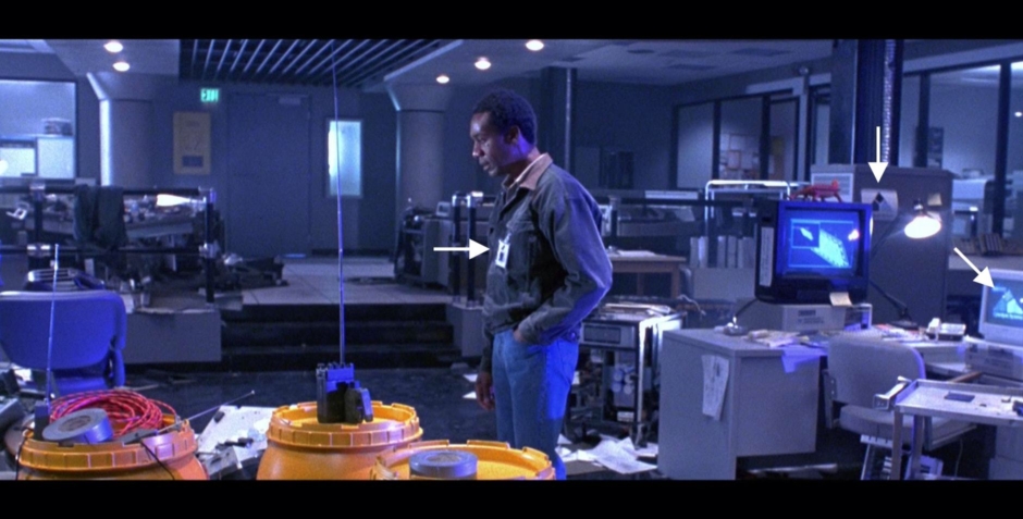
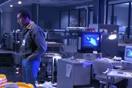
Figure 2.1 In this scene, there are at least three instances (see arrows) of the Cyberdyne Systems logo — on Dyson’s employee badge, on the side of a computer cabinet and on a computer screen. This is an example of how extensively applied the identity is, though at times it is easy to miss.
Usage: Cyberdyne Symposium Poster
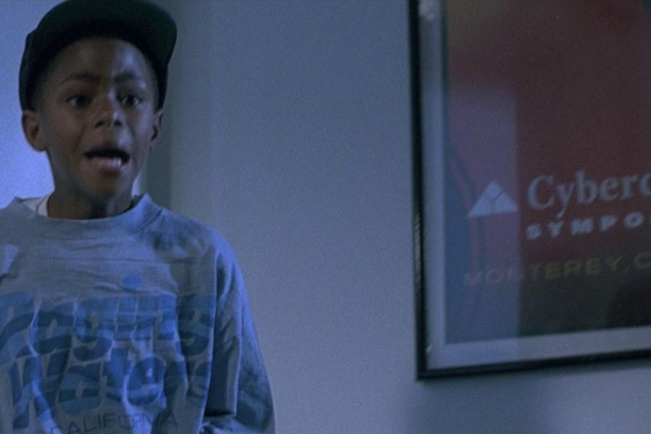
Figure 3.1 A poster from the 1990 Cyberdyne Symposium, that features the corporate identity, can be glimpsed in Miles Dyson’s home during his assault by Sarah Connor.
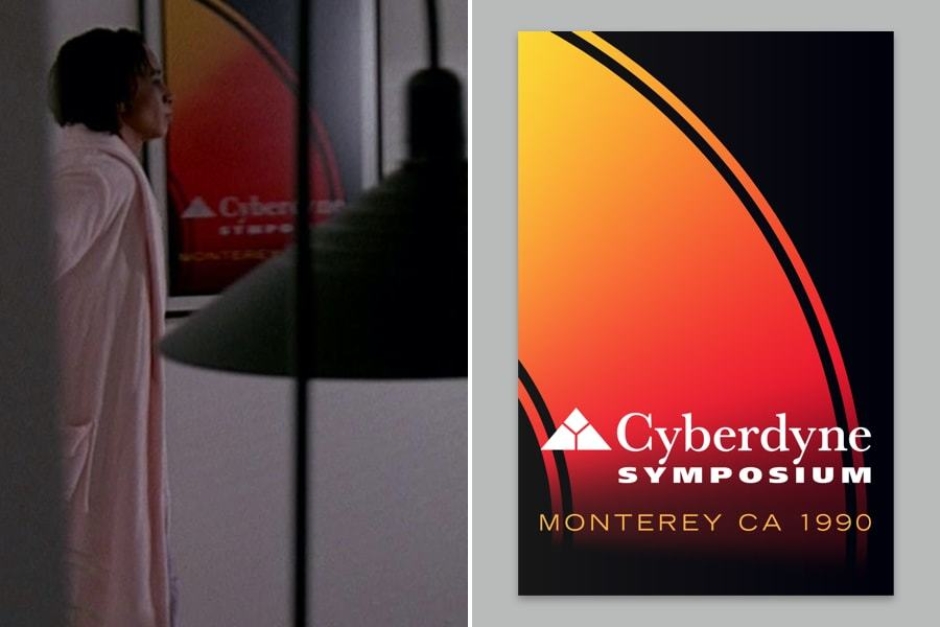
Figure 3.2 Additional scenes from T2 show more of Dyson’s home life, where we get a more complete look at the Cyberdyne Symposium poster as his wife Tarrisa enters the room where he is working.
Usage: Exterior of Cyberdyne Corporate Headquarters
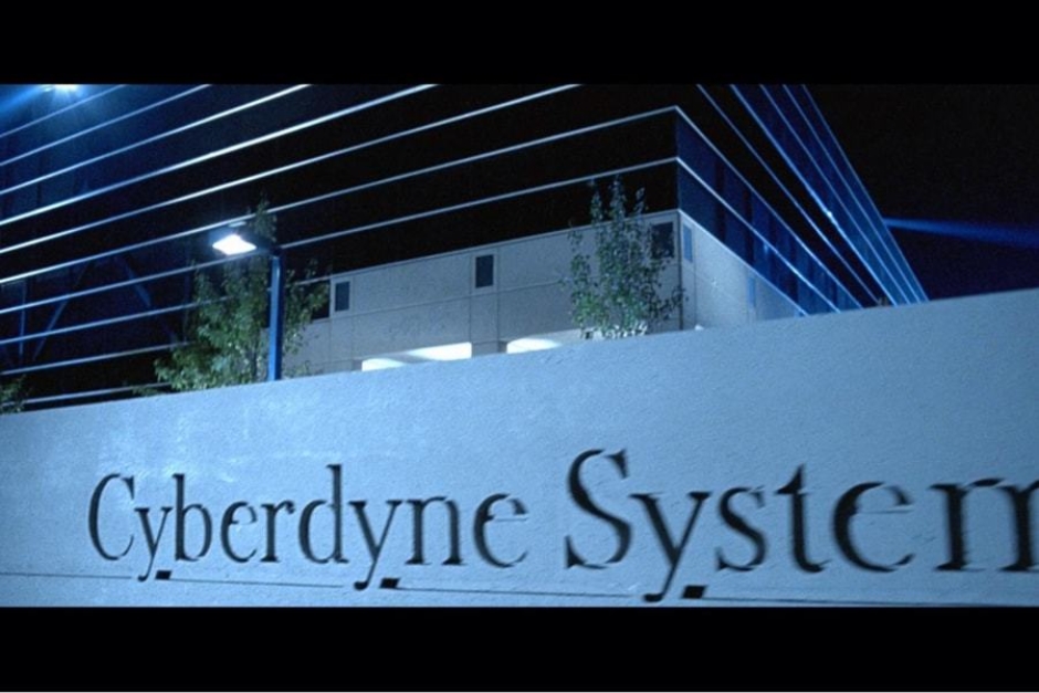
Figure 4.1 Property entrance signage features the wordmark and mark (off-screen to the right) embossed in concrete.
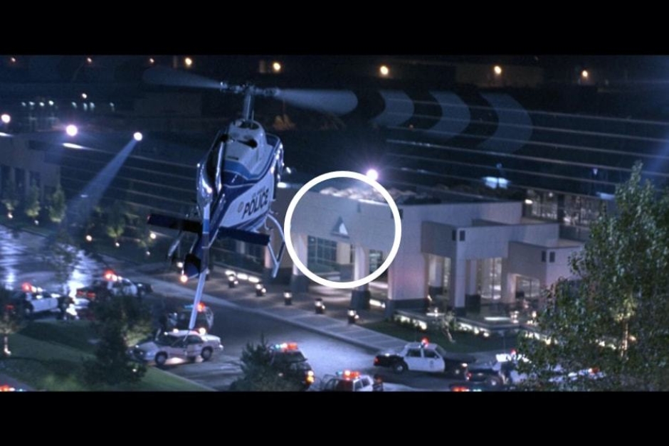
Figure 4.2 On the front facade of the building, above the main entrance, we find the B&W signature applied as a sign.
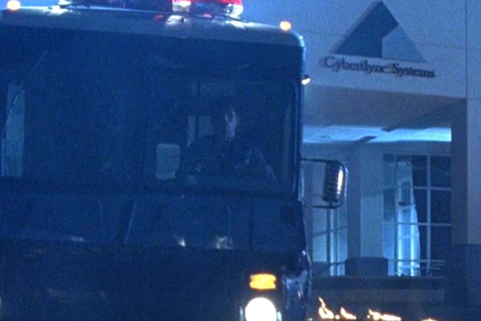
Figure 4.3 A closer look at the front entrance sign can be seen as the Connors and Terminator make their escape from the building.
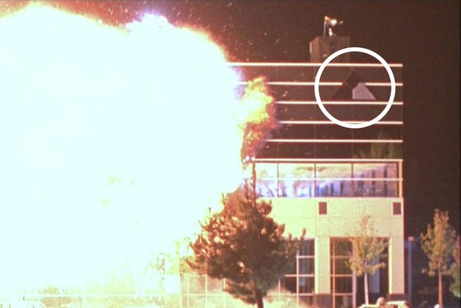
Figure 4.4 The B&W mark is used without the wordmark, on the corners of the building, over glass facades.
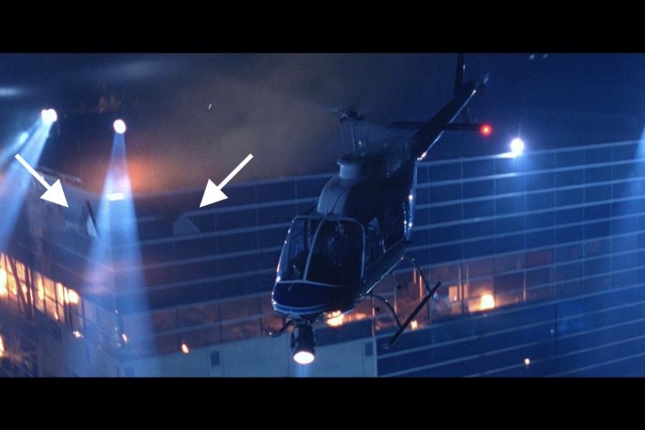
Figure 4.5 From this angle, we can see that the B&W mark is applied to both sides of the buildings corners.
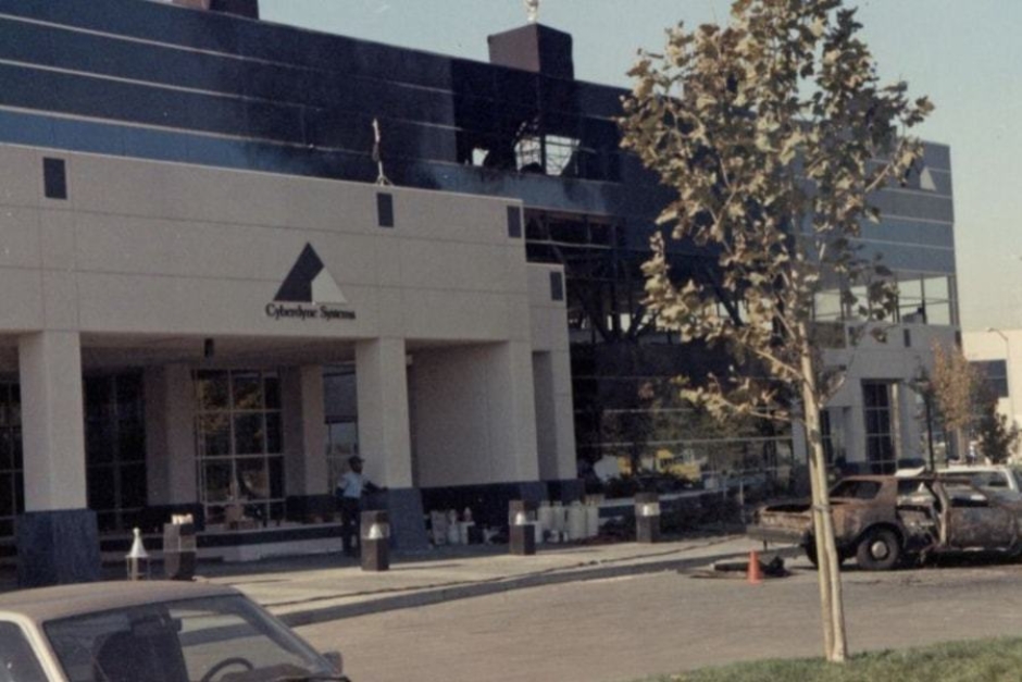
Figure 4.6 This production photo gives us a look at exterior signage in daylight. Source: Film Location at Roadtrippers.com
Usage: Interior of Cyberdyne Corporate Headquarters

Figure 5.1 As they access the Special Projects Division lab, a plastic door sign bears the 1-color white signature in a vertical lockup.
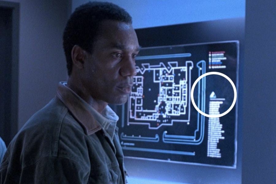
Figure 5.2 It is too small to discern details, but we definitely see white 1-color versions of the mark on illuminated wayfinding maps.
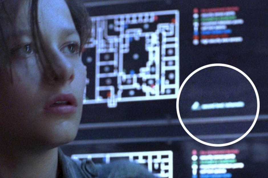
Figure 5.3 In this instance, we can be fairly certain this is a horizontal lockup of the 1-color signature.
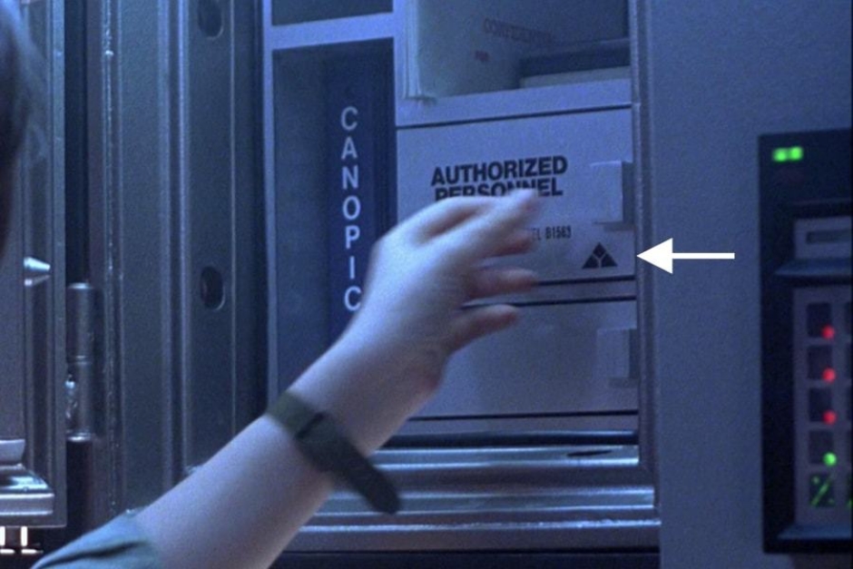
Figure 5.4 A 1-color instance of the mark can be seen on the key safe for the vault, as John Connor opens it.
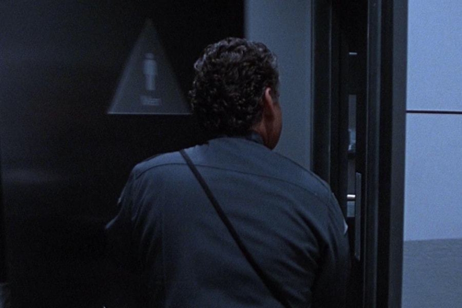
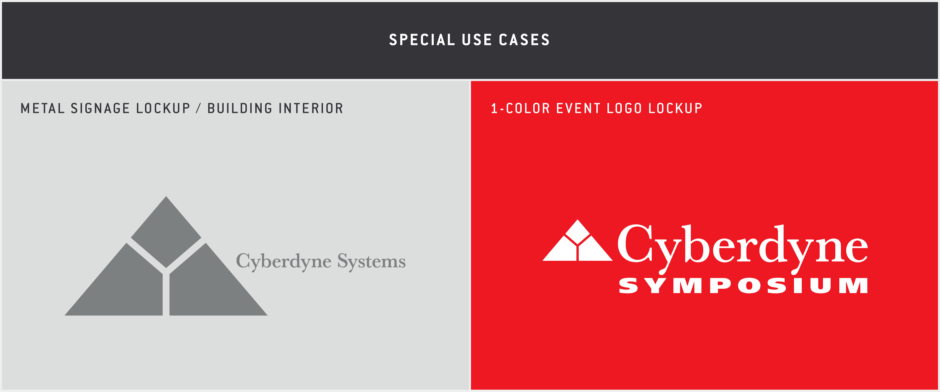
Figure 5.5 In several shots, we can see the building’s restroom door signage, which is triangular to match the Cyberdyne mark.
Figure 5.6 It goes by fast in several shots, but there is a large, backlit metal sign in the hallway near the elevator, displaying the mark and wordmark in a horizontal lockup.
Figure 5.7 As John Connor rounds the corner, we get a slightly clearer view of the mark, as it is backlit with blue light.
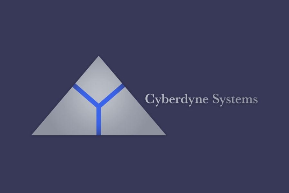
Figure 5.8 An approximation of the metal signage and its lockup of the mark and wordmark.
Usage: Cyberdyne Systems Employee Identification
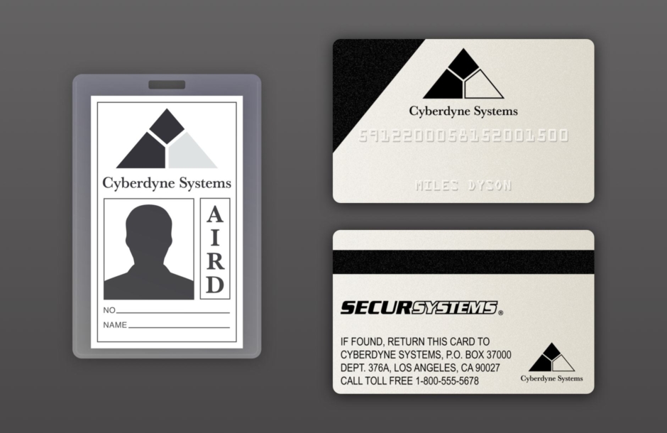
Figure 6.1 Approximations of the Cyberdyne Systems employee badge and security card. The badge is reconstructed from what is seen on screen, minus the photo, employee number and signature of Miles Dyson. The front and back of the security card are accurate reconstructions, as they were recreated based on photos of the screen used prop, which was auctioned online.
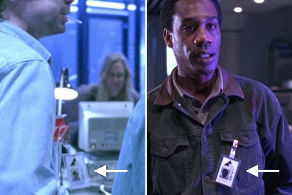
Figure 6.2 Instances of the employee badge, which uses the primary corporate signature, as it appeared in the film.
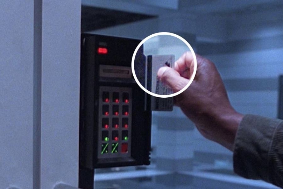
Figure 6.3 There are a number of instances where Miles Dyson swipes his security card to gain access to the lab, and the logo is visible on the back.
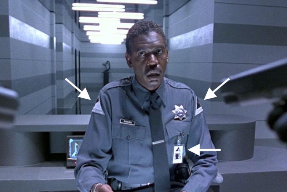
Figure 6.4 Cyberdyne Systems security personnel wear uniforms with shoulder patch identification, that bears the company mark. They also carry employee identification cards.
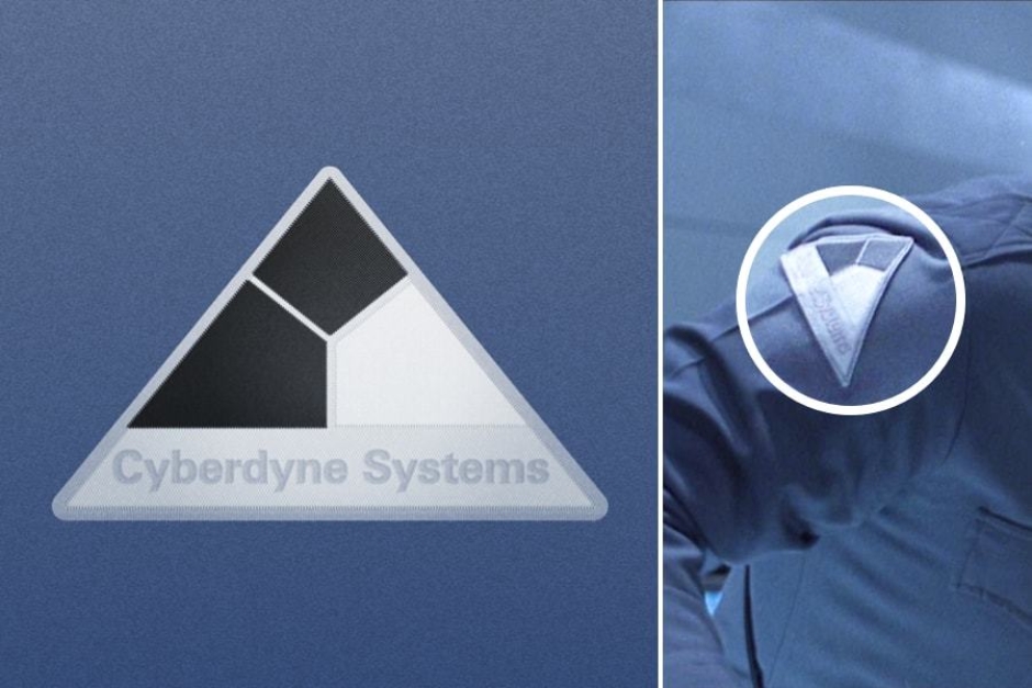
Figure 6.5 A closer look shows that the mark is not paired with the wordmark, but instead with san serif type that was probably selected to avoid embroidery issues and ensure legibility.
Usage: Cyberdyne Systems Items, Equipment and Screens
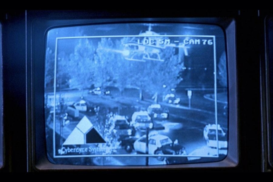
Figure 7.1 Security camera feeds are seen multiple times in the film, and they all feature what I’ve designated Screen-Use Signature B.
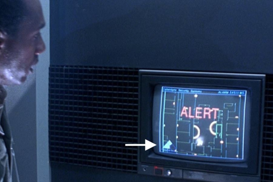
Figure 7.2 Security alert screens also feature Screen-Use Signature B in the lower left corner.
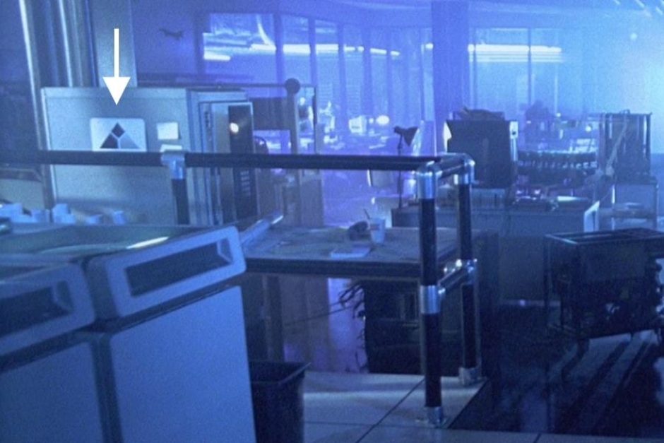
Figure 7.3 As the wrecking crew enters the lab, we see the primary signature on a sign, affixed to some large piece of equipment.
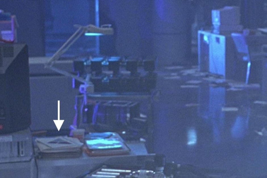
Figure 7.4 Passing a desk, we can see the primary signature rendered large on a cover sheet, on top of a stack of folders.
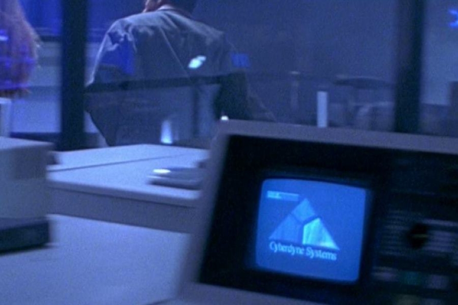
Figure 7.5 As Sarah Connor and Miles Dyson carry items to a pile in the lab, they pass equipment with a screen on it, that features the dimensional, textured Screen-Use Signature A.
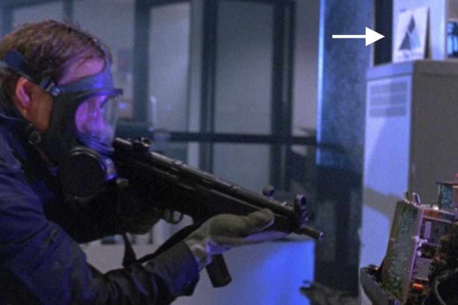
Figure 7.6 As the SWAT team enters the lab, we can see the primary signature on a card, leaning against some electronic equipment in the background of the shot.
Analysis: Possible Origins of the Name “Cyberdyne Systems”
Before analyzing the visual identity, it will be useful to examine the company’s name, to uncover its possible origins and how it relates to real-world corporations. This will give us some necessary context for puzzling out design decisions and what the identity may hope to communicate about Cyberdyne Systems.
While Cyberdyne Systems doesn’t make an appearance until T2, it was mentioned in The Terminator, in the following exchange:
Sarah Connor : [in a stolen car, while being chased by the police and the terminator] This is a mistake. I haven't done anything.
Kyle Reese : No, but you will. It's very important that you live.
Sarah Connor : This isn't true. How could that man just get up after you just…
Kyle Reese : He's not a man — a machine. Terminator, Cyberdyne Systems Model 101.
Sarah Connor : A machine? Like a robot?
Kyle Reese : Not a robot. A cyborg. Cybernetic organism.
So there, like Sarah Connor, we first learn of Cyberdyne’s existence, while also having the terms “cyborg” and “cybernetic” thrown at us. To understand what that all means, now is a good time to briefly cover cybernetics.
It’s originator, Norbert Wiener, defined it in 1948 as “the science of communications and automatic control systems in both machines and living things.” Being cross-disciplinary, Cybernetics has been applied in a variety of disciplines, like biology and computer science, but on a basic level it attempts to discover the underlying principles of things like artificial intelligence and control systems. So it’s cybernetics we can thank for the “cyber” in Cyberdyne, and this wouldn’t be the first time it figured into a sci-fi story about killer machines (Figure 8.1).
It’s also worth noting that in early drafts of the film’s script, the company was first referred to by Reese as “Cyber Dynamics” (Figure 8.2). While being a contraction of cybernetics, “Cyber” is by itself a term that could generally refer to networks and computers, and in the 1980s, its use in a name would imply that the company is in the high-tech industry. I don’t know the extent of its real-world use in the naming of corporations at the time, but it was definitely a term with traction in science fiction, in large part thanks to the sci-fi subgenre of cyberpunk (Figure 8.3). Using it in the name of a company, would make it sound futuristic to the film’s contemporary audience.
Then there is the “Dynamics” part. In addition to being a branch of physical science that is concerned with the motion of bodies under the action of forces, dynamics can be defined as “the forces or properties which stimulate growth, development, or change within a system or process.” To see this used by a corporation in its name, would imply that it is on the leading edge of whatever technology the company deals in.
The earliest example I am aware of, for the word’s use in company naming, is the Electro-Dynamic Company, founded in 1880. That company would go on to spawn General Dynamics Corporation in 1899 (Figure 8.4), which in the 1980s and to this day, is one of the largest aerospace and defense contractors in the US. This is interesting, because General Dynamics is a company that has had a hand in just about every aspect of US military technology, including computer systems and nuclear weapons — two main ingredients in Skynet, the fictional end product of Cyberdyne Systems.
From there, it would appear that the two words in the earlier scripts — Cyber and Dynamics — were combined into a portmanteau, giving us Cyberdyne. But “dyne” in this spelling has another specific meaning, relating to the science of dynamics, where it is a unit for measuring force. If there’s a dyne in the name, it could imply that the company is a powerful force to be reckoned with. And there are also real-world examples of cutting-edge technology companies using dyne in their names for this reason.
The earliest that came to mind was Rocketdyne (Figure 8.5), founded in 1955 by North American Aviation, to design and produce rocket engines — for this product, using a unit of force makes a lot of sense.
Not long after, there were two corporations founded in 1960 that were entering the electronics industry, which could have gone on to directly inspire the Cyberdyne Systems name (Figure 8.6). By the 1980s, both of these companies were corporate conglomerates, having expanded through acquisitions of other companies, while extending their reach into new technologies.
There was Teradyne, which started out building automated electronic test equipment, and later expanded into robotics and industrial automation. The founders of Teradyne stated that the name of that company was intended to represent a very forceful presence: 1,000,000,000,000 dynes = 10 meganewtons.
Looking at the company’s history, we learn that in 1969, Teradyne launched Teradyne Dynamic Systems after the acquisition of Triangle Systems, to develop new digital semiconductor test systems in Chatsworth, CA. With the info in that sentence, you have almost all the language to inspire the Cyberdyne Systems name, along with a triangle being thrown into the mix, which is the overall shape of Cyberdyne’s mark.
The other company was Teledyne, which started out in the business of semiconductors and control systems, before getting heavy into aerospace and defense work. As currently described on their website, “the name ‘Teledyne’ means ‘distant force’ or alternatively ‘power from afar.’ Across the globe, in deep space and on the ocean floor, Teledyne businesses manufacture enabling technologies that provide power or derive information from distant environments.” At one time, Teledyne owned as many as 150 different companies. Among them was Teledyne Ryan, which was one of the largest producers of military drones in that technology’s early days — which makes me think of Skynet's aerial H-Ks.
For "dyne" to be similarly applied in the Cyberdyne name, would communicate that they are aiming to be a powerful force in the "cyber" space, which for them encompasses technologies like networks, computer systems, automation, and the holy grail that is artificial intelligence.
While both Teradyne and Teledyne would have been around and well-known in the high-tech industry in 1984, to inspire the naming of Cyberdyne Systems in The Terminator, they were just two of a number of companies using “dyne” in their name by the time T2 was being produced in 1990. Flipping through computer technology magazines from that same year, I found ads for Novadyne and AT&T Paradyne (Figure 8.7), among others. The same goes for corporations using “Systems” in their name, which was extremely popular at the time (Figure 8.8). Novadyne is actually a good example of both of these trends in naming — founded in 1990 by a breakaway division of the defense contractor McDonnell Douglas, the company’s full name was actually Novadyne Computer Systems.
So what this tells us, is Cyberdyne Systems — whatever its original inspiration may have been — was a believable and historically accurate title for a 1990s technology company, when it was devised by James Cameron for the 1984 Terminator film. Whether he got the idea from any one company in particular, or just saw the naming trends in the industry, he hit the nail on the head. Now I’ll turn to the design of the identity, to see if the same was managed there.
And while it may seem like we spent a lot of time with the company name, much of what we discovered in this exercise will provide references for analyzing and evaluating the design, in the next sections of this entry.
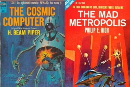
Figure 8.1 Vintage sci-fi took cybernetics and ran with it, crediting it with killer robots and oppressive cities controlled by computers. Source: Covers from The Cosmic Computer (1964) and The Mad Metropolis (1966)
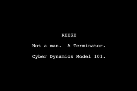
Figure 8.2 In the first five drafts of The Terminator, the corporation responsible for Skynet is called Cyber Dynamics. Source: The Terminator Screenplay, 4th Draft (1983)
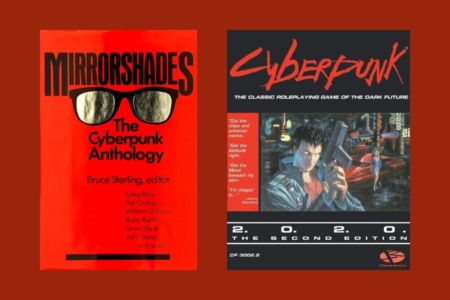
Figure 8.3 The 1980s would see the emergence of the Cyberpunk, as a subgenre of sci-fi. Source: Cover from Mirrorshades (1986) and Cyberpunk RPG (1988)
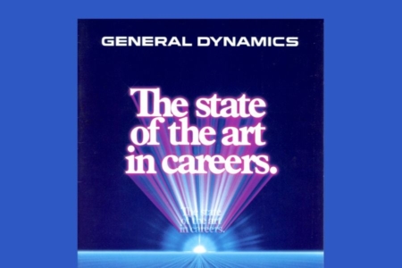
Figure 8.4 The aerospace and defense industry giant, General Dynamics, is the sort of corporation sci-fi likes to warn us about. Source: General Dynamics Recruitment Brochure (1983)
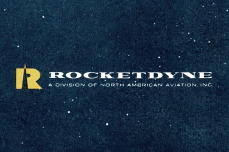
Figure 8.5 To my knowledge, Rocketdyne is the earliest instance of “dyne” being worked into a company name, to represent force. Source: Cover for Rocketdyne Report to NASA (1961)
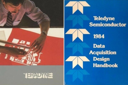
Figure 8.6 Teradyne and Teledyne are good candidates for real-world companies that could have inspired Cyberdyne. Source: From covers of a Teradyne Brochure (1984) and Teledyne Handbook (1984)
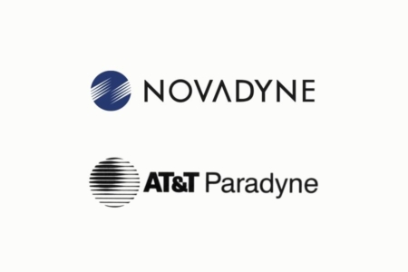
Figure 8.7 Examples of high-tech industry corporations that use “dyne” in their name. Both Novadyne and AT&T Paradyne were new companies in 1990. Source: Computerworld Magazine, via Google Books
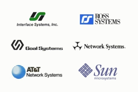
Figure 8.8 By the 1990s, the high-tech industry would also see an abundance of companies using “Systems” in their name. Source: Computerworld Magazine, via Google Books
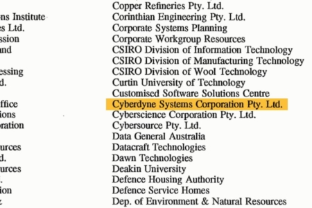
Figure 8.9 It wasn’t long after T2, that Cyberdyne Systems found its way into the real-world — I discovered it listed as a member of the AAUG, alongside companies like IBM and Sun Microsystems, in a 1994 newsletter that was archived online. Source: Google Books
Figure 9.1 An approximation of the Cyberdyne Systems identity from The Terminator’s deleted scene, which pairs a monogram and wordmark together in a horizontal lockup.
The Cyberdyne Systems Visual Identity That Almost Was
I’ll briefly note that a Cyberdyne Systems visual identity almost appeared in The Terminator, but the scene it appeared in was deleted. It was a monogram and wordmark (Figure 9.1) applied as signage on the building, shown in a final parting shot outside of the factory where the Terminator was crushed and destroyed. The actual visual identity that we see in T2, radically diverged from this design. The timeline of events from The Terminator Collection: Limited Edition Collector’s Book (1992) also puts the formation of Cyberdyne Systems as a company, after the events of The Terminator and the birth of John Connor. So this deleted identity doesn’t impact the analysis, outside of noting what could have been, if they’d chose to make Cyberdyne existent in 1984.
Analysis: The Design of the Cyberdyne Systems Mark
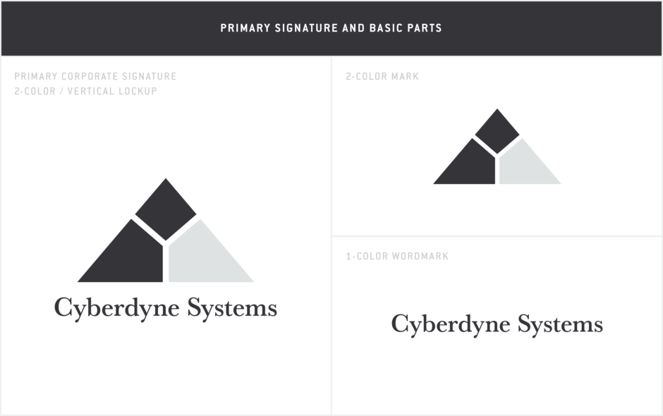
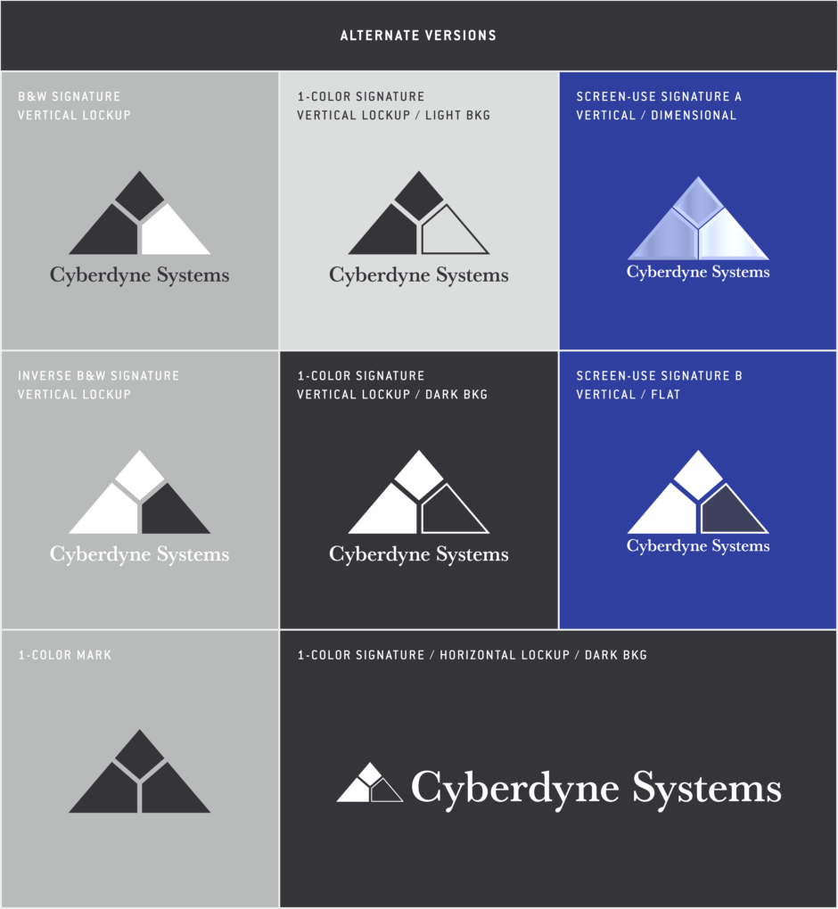
The Cyberdyne Systems visual identity, as it first appeared in the film T2: Judgement Day, is composed of two elements — a mark and wordmark — that appear in a variety of versions and lockups, and independently as standalone identifiers.
The mark (Figure 10.1) can be described overall as an upward pointing triangle divided into three separate parts, each of which is an irregularly shaped diamond, arrayed around a central point. The primary, 2-color version of the mark is black and light gray, with the lower right diamond being highlighted in most versions of the mark. It is not apparent what the mark or the highlight signifies. Given the company’s name, there is no reason to read the overall triangle shape as an “A”. It can be classified as an abstract or non-figurative mark. But that doesn’t mean it is just arbitrary shapes — looking for possible inspiration, by examining the trends and companies mentioned in the previous section, could point to it being a reference or homage to real-world marks and what they represent.
Looking through publications collecting technology logos in the 1980s, it is not hard to find marks that look like Cyberdyne’s (Figure 10.2). Modern, abstract designs were still in style, and slicing basic shapes with thin lines was an industry trend at the time. In the 1985 book High Tech Trademarks Vol 1, author John Mendenhall writes “the line, slim or tapering, has become the symbol of our electronic age of information processing. The high speed, highly miniaturized and highly powerful transfer of information through lines of electric circuits is truly the ‘high’ of high technology.” No doubt, the mark’s designer wanted to place it in this moment, identifying Cyberdyne with other technology companies, to make it believable for the film’s audience and to give them something to associate with tech marks they may have been familiar with already.
As noted in the previous section, the designer may have been looking at very specific companies as well, like those that inspired the name. Of these, I think Teledyne is the most likely to have played a part in the design.
Teledyne’s mark at the time of T2’s production was designed in the 1960s by Robert Miles Runyan and Associates, and is still used by the company to this day. It’s a logo that would have been relatively easy to find by a designer at the time — Robert Miles Runyan was a big name in the design world, with work published in books and magazines, and both Teledyne and Runyan were based in LA, where much of T2 was filmed.
Comparing the design with Cyberdyne’s mark, we find that even though Teledyne’s isn’t a triangle shape, it is a 2-color black and gray geometric design, composed of parts that are separated by similarly weighted line breaks. Those individual parts are also diamonds, though all four are equal in size and shape. I don’t know that Teledyne’s is an entirely abstract mark though, as I can see a letter “T” for Teledyne in its overall shape.
What’s really interesting is how similar the look and feel of the two are (Figure 10.3). Even more so, is if I were a designer playing around with ideas on tracing paper, I could turn the Teledyne mark and superimpose a triangle over it, cropping it to get some of the base shapes in Cyberdyne’s mark (Figure 10.4). If this were done using the 2-color Teledyne mark as a starting point, it could even explain the seemingly arbitrary highlight of one of those base diamond shapes. Coincidence? Maybe… but we’re seeing a lot of coincidences at this point, between the company name, the business path of Teledyne (building semiconductors before getting into defense electronics), and the construction of the mark. If nothing else, it is a very interesting connection to a real-world company, that lends to the possibility of something like Cyberdyne actually coming into existence.
But why a triangle? Well, on a very basic level, it is not as friendly a shape as a circle or square. It is said that triangles represent tension, action and aggression, due to their stable/unstable dynamic (depending on their orientation), with a triangle on its base conveying immovable strength. The shape helps us perceive Cyberdyne as a threat, and maybe communicates to the film’s audience that the company, and the future it delivers, will not be easy for T2’s protagonists to topple or change.
Triangles can also imply a more specific threat in the right context, due to the shape’s association with nuclear danger, which could be induced by Cyberdyne’s role in the nuclear apocalypse known as Judgement Day. For example, the shape has a prominent place in the fallout shelter symbol and the Civil Defense symbol (Figure 10.5), and could also be found in information graphics depicting the US military’s Cold War nuclear triad of ICBMs, bombers and SLBMs. Several of these involve the triangle being split into three parts as well, which strengthens their link to Cyberdyne’s mark.
These nuclear related symbols were also brought up in the research entry for Colossus, which is another sci-fi artificial intelligence that could have inspired elements of Terminator’s story — the supercomputer Colossus, like Skynet, gains sentience shortly after activation and uses our nuclear arsenals against us. It is definitely worth noting here (Figure 10.6), because the Cyberdyne mark could have been an homage to Colossus’ triangular identity.
Another fictional identity that could have served as inspiration for the mark is that of Yoyodyne Propulsion Systems, from The Adventures of Buckaroo Banzai Across the 8th Dimension. In that film, Yoyodyne is a defense contractor in the aerospace industry, that turns out to be a front for a group of red Lectroid aliens that are trapped on Earth and disguised as humans. With the film being released the same year as The Terminator, in 1984, it is probably a coincidence that they both used “dyne” and “systems” in the company names. But the Yoyodyne design could have gone on to influence the Cyberdyne mark we see in T2, produced years later.
Though the colors and proportions are different, both marks use a triangle for the overall shape (Figure 10.7). And we see the green Yoyodyne triangle used by the evil Lectroids in other ways. One in particular, caught my attention — towards the end of the film, as they try to get their spacecraft to cross into the eighth dimension, they target a green triangle that is painted on the wall of the facility (Figure 10.8). Within the triangle, there are green dots, from which three dotted lines extend, each trisecting the triangle in a similar fashion to what we find in the Cyberdyne mark. Could the T2 production artists have been fans of Buckaroo Banzai, and slipped in a subtle homage to that film's evil "dyne" corporation? It’s possible. But without knowing the designer of the Cyberdyne logo, to ask for a definitive answer, all we can do is add it to the list of plausible inspiration sources from science fiction and reality.
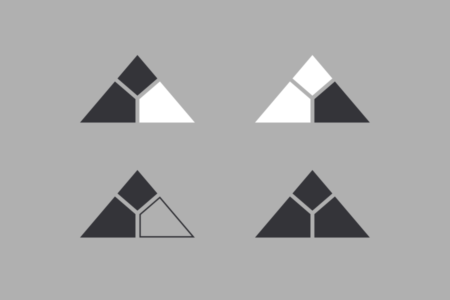
Figure 10.1 Variations of the Cyberdyne Systems mark, which in most cases, highlights the lower right section.

Figure 10.2 In the 1980s technology industry, it is not difficult to find modern, abstract marks with a treatment similar to Cyberdyne’s. Source: Select logos from High Tech Trademarks Vol 1 & 2, and United Tech Pubs
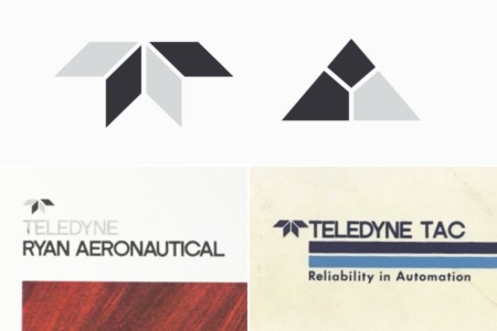
Figure 10.3 Top: The Teledyne mark (left) next to the Cyberdyne mark for comparison. Below: Examples of the Teledyne mark in use.

Figure 10.4 Could Cyberdyne’s mark be derived from geometry found in the Teledyne mark? Flipping the Teledyne symbol and cropping it with a triangle gets us part of the way there.
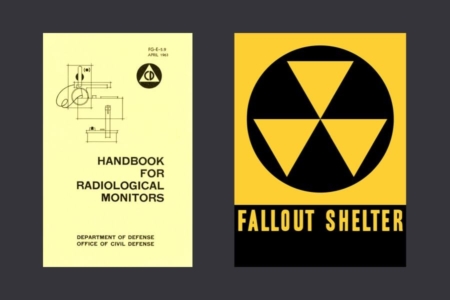
Figure 10.5 Left: The Civil Defense logo on nuclear war preparedness material. Right: The symbol for fallout shelters.
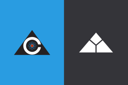
Figure 10.6 The 1970s logo for Colossus (left), a sci-fi predecessor to Cyberdyne Systems and Skynet.
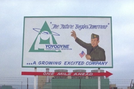
Figure 10.7 The triangular green and blue logo for Yoyodyne Propulsion Systems, as seen on billboard signage in The Adventures of Buckaroo Banzai Across the 8th Dimension.
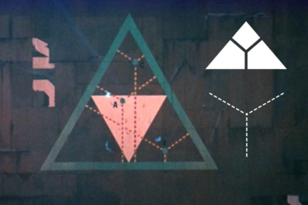
Figure 10.8 The green triangle that the red Lectroids are targeting their spacecraft on, contains elements bearing some resemblance to what we find in the Cyberdyne mark. Source: The Adventures of Buckaroo Banzai Across the 8th Dimension
Analsyis: The Design of the Cyberdyne Systems Wordmark
Moving on to the wordmark (Figure 11.1), we find that it isn’t your stereotypical sci-fi typographic solution, with Eurostile typesetting or custom sans serif lettering, which could have given things a more futuristic and intimidating look.
Instead, the designer opted to set the wordmark in the serif typeface Baskerville, without alterations. This puts it in line with real-world branding we see from the big players in home and office computing in the late 80s and early 90s, like Apple, Microsoft and IBM, who all used serif fonts in their marketing (11.2). Opening computer magazines from the time would reveal it to be a trend in advertising, that made computing look smart and professional, without feeling extremely technical or out of reach. Baskerville also takes some of the edge off the cold and menacing Cyberdyne mark, and reminds us that the company is made up of people like Miles Dyson, who haven’t really considered the dangerous potential of the technology they are working on.
When examining the wordmark’s usage in the film, I did notice a discrepancy in its rendering, where in instances appearing on exterior signage, Baskerville Old Face was used instead of Baskerville (Figure 11.3). This is easiest to see in the uppercase “C” in Cyberdyne, where the lower serif is missing.
I’ll also note that the wordmark’s vertical lockup with the mark changes in screen instances. There, we find the wordmark reduced in width, to match the exact width of the triangle.
Taken altogether, I think the Cyberdyne Systems visual identity design is believable for a corporation occupying their time and place, and a successful world-building element. Beyond that, it also points to things outside of the film, that allows perceptive viewers to draw lines between Cyberdyne and real-world companies with the same dangerous potential, or past sci-fi warnings like Colossus: The Forbin Project. It’s an excellent example of the potential for visual identity design to enhance sci-fi storytelling, where the visuals can speak to a film’s audience on multiple levels, without having to spell everything out.

Figure 11.1 They Cyberdyne Systems wordmark, as it appears with the mark in the primary corporate signature lockup.
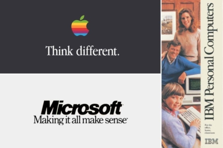
Figure 11.2 In the 80s and early 90s, it was common to see serif fonts used in marketing ads from the computer industry. Source: Google Books
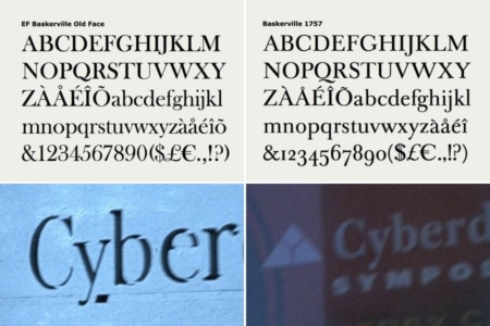
Figure 11.3 The Cyberdyne Systems wordmark is typeset in Baskerville (right), but I’ve noticed that in at least one place, on exterior signage, Baskerville Old Face was used (left).
Overview: Alternate Timelines
Usage: The Cyberdyne Identity In Alternate Timelines
After the events of T2, with Cyberdyne Systems’ future altered, the way was opened for other filmmakers to reimagine where the company would go from there.
In Terminator 3: Rise of the Machines, set in the year 2004, Cyberdyne is out of business, its technology having passed into the hands of the US Air Force’s Cyber Research Systems (CRS).
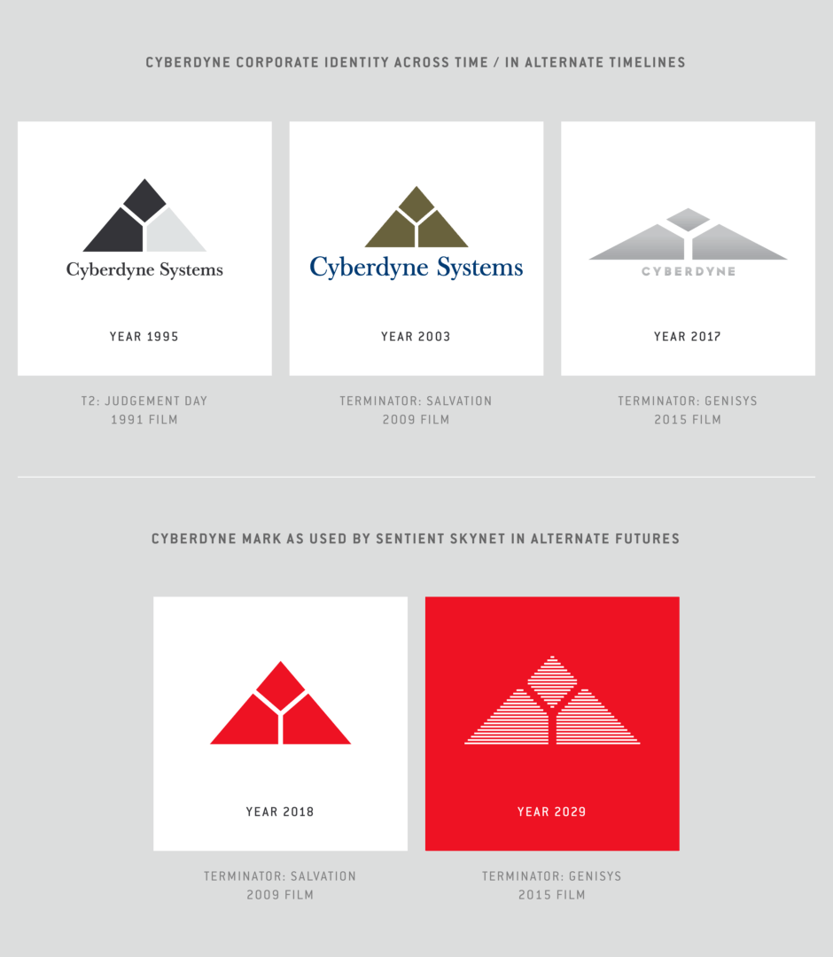
An alternate timeline is then established in Terminator: Salvation, where we find Cyberdyne Systems operating in the year 2003, with a new Genetics Division (Figure 12.1). The mark as been reduced to one color bronze/brown, but remains the same otherwise. The dark blue wordmark is set in Baskerville Old Face. Jumping ahead to the post-apocalyptic setting of that film, in the year 2018, we also find the one-color Cyberdyne mark being used by a sentient Skynet.
Then, in yet another attempt to reboot things, Terminator: Genisys establishes another alternate timeline, where Cyberdyne is still operating in the year 2017. Here, the mark has become more squat in proportions. Cyberdyne is set in a heavyweight geometric sans serif, and “Systems” has been dropped from its wordmark. It has also been reduced to one color overall, with a metallic treatment used on product packaging (Figure 12.2). Compared to T2, it received limited usage in and on the Cyberdyne building (Figures 12.3 and 12.4).
Earlier in Genisys, we also get a look at things from a T-800 Terminator’s perspective. As that Terminator from the year 2029 comes back online from a damaged state, its machine vision view displays a previously unseen version of the Cyberdyne mark as used by a sentient Skynet, that is rendered in white lines against the red boot screen.
What is most interesting among these cases are those instances where the mark from Cyberdyne’s visual identity is used by the sentient artificial intelligence that is Skynet. In The Terminator and T2, we learned that Skynet retained the company name when assigning make and model designations to its machines, which was already a little strange. Now we are seeing the visual identity not just retained, but actively used and applied in software, hardware and industrial environments that were created by Skynet. This is a very sci-fi development for a corporate identity to go through, that merits examination — something I've done in a separate research entry devoted to Skynet.
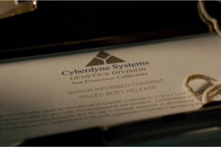
Figure 12.1 The Cyberdyne Systems Genetics Division logo that appeared in Terminator: Salvation on a donor release form.

Figure 12.2 In Terminator: Genisys, we can spot the metallic Cyberdyne logo on packaging for the Genisys tablet.
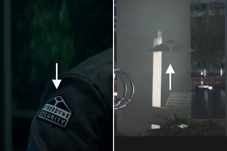
Figure 12.3 In the lobby scene from Terminator: Genisys, we see the Cyberdyne mark on security personnel patches and on the doors.
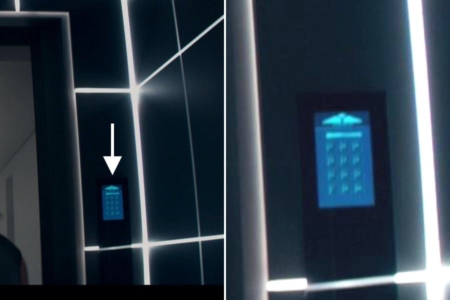
Figure 12.4 In Genisys, the Cyberdyne logo can also be seen on a security panel screen within Cyberdyne’s headquarters.
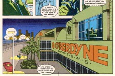
Figure 13.1 The Cyberdyne Systems logo, as it appeared on their headquarters in the first Terminator comics from Dark Horse.
Usage: Cyberdyne Systems in Terminator Comics
A quick note regarding Terminator comics — in the first series published by Dark Horse, The Terminator, we find Cyberdyne Systems in the story and represented by a different logo (Figure 13.1). This was created in 1990, prior to the film T2: Judgement Day, so the artist didn’t have anything to go on. Interestingly, they chose to emphasize the “C” for “Cyber” and “D” for “Dyne” in the circular monogram mark. This is very near the same design as the US Civil Defense logo, that was mentioned earlier in this entry (Figure 10.5).
While I’m not certain, I would assume any instances in future comics changed after the release of T2.