USCSS NOSTROMO
Crew, Freight Transport, Mining Industry, Spacecraft, Vehicle
Year 2122
The USCSS Nostromo is a commercial towing vehicle — a Lockheed CM 88B Bison M-Class Starship — owned by the Weylan-Yutani Corporation and operated by a crew of seven. It tows a massive automated refinery between Thedus and Earth, processing the cargo of mineral ore on its long journey through deep space.
Nostromo Identity Overview
Authorized Nostromo Crew Insignia and Their Official Usage
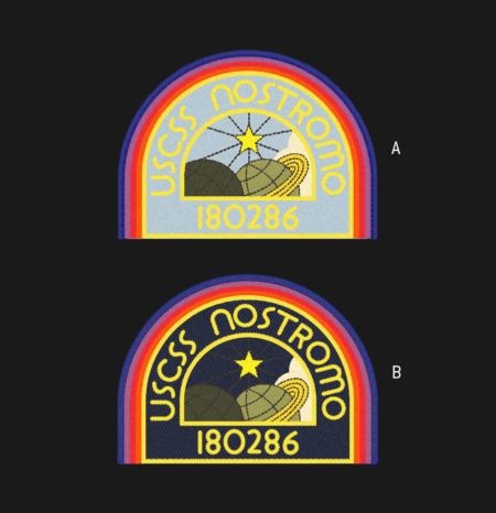
A. NOSTROMO patch with grey background: All crew members must display on both shoulders of outerwear and functional uniforms i.e. flight jackets, jumpsuits, and on at least one shoulder (right side required) of inner-wear and casual dress i.e. over-shirts, t-shirts. Also displayed on Company cap. Designed by John Mollo
B. NOSTROMO patch with dark blue background: May be used in place of (A) optionally. Designed by John Mollo
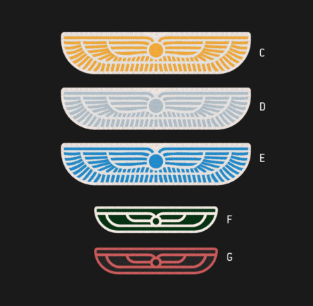
C. WEYLAN-YUTANI WINGS large format patch. Gold version of Company logo to be worn by Captain, displayed on left breast over heart on all uniforms. Note: This patch replaces older braided version formerly issued. Designed by John Mollo
D. WEYLAN-YUTANI WINGS large format patch. Silver version of Company logo to be worn by Executive Officer, displayed on left breast over heart on all uniforms. Note: This patch replaces older braided version formerly issued. Designed by John Mollo
E. WEYLAN-YUTANI WINGS large format patch. Light blue version of Company logo to be worn by Officers, displayed on left breast over heart on all uniforms. Designed by John Mollo
F. WEYLAN-YUTANI WINGS small format patch: Dark green and white Company logo to be worn by all crew members, displayed on the left breast above heart on all inner-wear and casual dress. May be used in place of (C,D,E) above when necessary. Designed by John Mollo
G. WEYLAN-YUTANI WINGS small format patch: Black and red version to be worn by all crew performing medical functions, displayed on left breast above heart on surgical gowns and scrubs. Designed by John Mollo
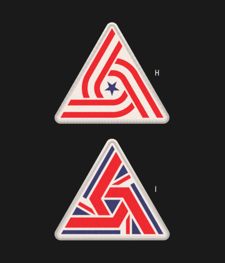
H. AMERICAN TRICENTENNIAL patch: Issued to all active members of the U.S. Space Fleet, Military and Commercial, to commemorate the 300th anniversary of United States Independence. Display over heart, under Weylan-Yutani wings. Triangle should point up. Note: Issuance discontinued, but remains acceptable to Company. Designed by Ron Cobb
I. UK-7 patch: Issued to all active members of the Third World Empire Space Fleet, Military and Commercial, to commemorate the establishment of U.K. settlements on Mars and Titan. Wear restricted to personnel transferred from U.K. Fleet. Display on left breast. Triangle should point up. Note: Issuance discontinued, but remains acceptable to Company. Designed by Ron Cobb
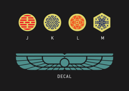
BADGES: Worn by all crew members. Insignias indicate technical functions. Display one on each collar, or alternatively, one on left breast above Weylan-Yutani wings. Also displayed on Company issue belt buckles (optional). Designed by John Mollo
J. EXECUTIVE OFFICERS: Horizontal bars; red on brass.
K. SCIENCE OFFICER: Molecular cluster; blue on brass.
L NAVIGATION OFFICER: Star-chart cluster; orange on brass.
M. ENGINEERING CREW: Electrode cluster; blue on brass.
DECAL: Company logo should be applied to all portable equipment and uniform accessories i.e. belts, boots, gloves, helmets, radios, weapons, tools, etc. Note: A red stamp is also available for use, where decals are not suitable.
Source: This information is partially based on the contents of a typed company memo, original drawings, and reproduction insignia that were included in the The Authorized Portfolio of Crew Insignias from The UNITED STATES COMMERCIAL SPACESHIP NOSTROMO, published in 1980 by The Thinking Cap Company. My goal was to reflect as closely as possible what what was seen in the film, so this required some modification and additions to what was outlined in that somewhat inaccurate source document.
The original portfolio is available in PDF format in the Downloads section of this entry.
Intro: The Nostromo
For the purposes of this analysis, the USCSS Nostromo (Figure 1.1), as it appeared in the 1979 film Alien, is best understood in two parts: the overall ship itself and its crew. Examined from these angles, it’s interesting to see where the Nostromo identity manifests itself visually, and where it doesn’t — and how all of that works from a world-building perspective. But before we dig into that, I’ll provide a basic introduction to the Nostromo for context.
The Nostromo was named after the ship from Joseph Conrad’s 1904 novel Nostromo: A Tale of the Seaboard — a fan of Conrad’s writings, this was chosen by the film’s director Ridley Scott. Similarly, the Nostromo’s lifeboat shuttle is named the Narcissus, a title taken from another of Conrad’s books. This is a theme that has been carried through the Alien franchise for the naming of other spacecraft as well.
The USCSS abbreviation that precedes the ship’s name stands for United States Commerical Star Ship (alternatively: Spaceship). The craft is also assigned a registration number of 180924609 (Figure 1.2). As the commercial designation suggests, The Nostromo is a working-class spacecraft, and it is owned and operated by the megacorporation Weylan-Yutani. Presumably it was also manufactured by Weylan-Yutani, and specs for the retrofitted vehicle can be seen in original drawings by Ron Cobb (Figure 1.6) Without saying what it started life out as, it is a space tug in the film, used for towing between planets (Figure 1.5).
The USCSS Nostromo is flown by a 7-member crew (Figure 1.3) of operators working under individual profit-share contracts for its long-haul journeys through deep space. Notably, at no time in the film is Weylan-Yutani mentioned by name. It is simply referred to as “The Company” by the Nostromo crew.
The ship’s crew consists of the following:
- Arthur Dallas, Captain (Commanding Officer)
- Gilbert Kane, Executive Officer (2nd in Command)
- Ellen Ripley, Warrant Officer (3rd in Command)
- Joan Lambert, Navigation Officer
- Ash, Science Officer
- Dennis Parker, Chief Engineer
- Samuel Brett, Engineering Technician
And there is a ship cat, named Jones.
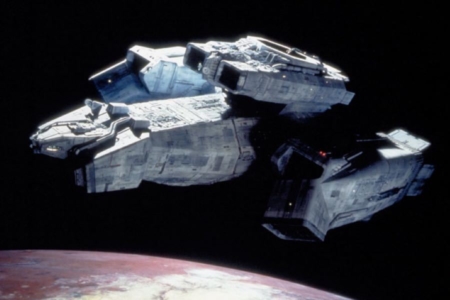
Figure 1.1 The USCSS Nostromo vehicle exterior. Source: Alien: The Archive
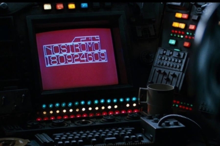
Figure 1.2 A scene from early in the film, where we are being introduced to the ship and start to get acquainted with its interior.
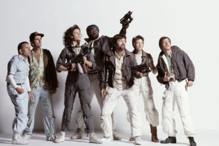
Figure 1.3 A promotional photo for the film, featuring the 7-member crew of the USCSS Nostromo.
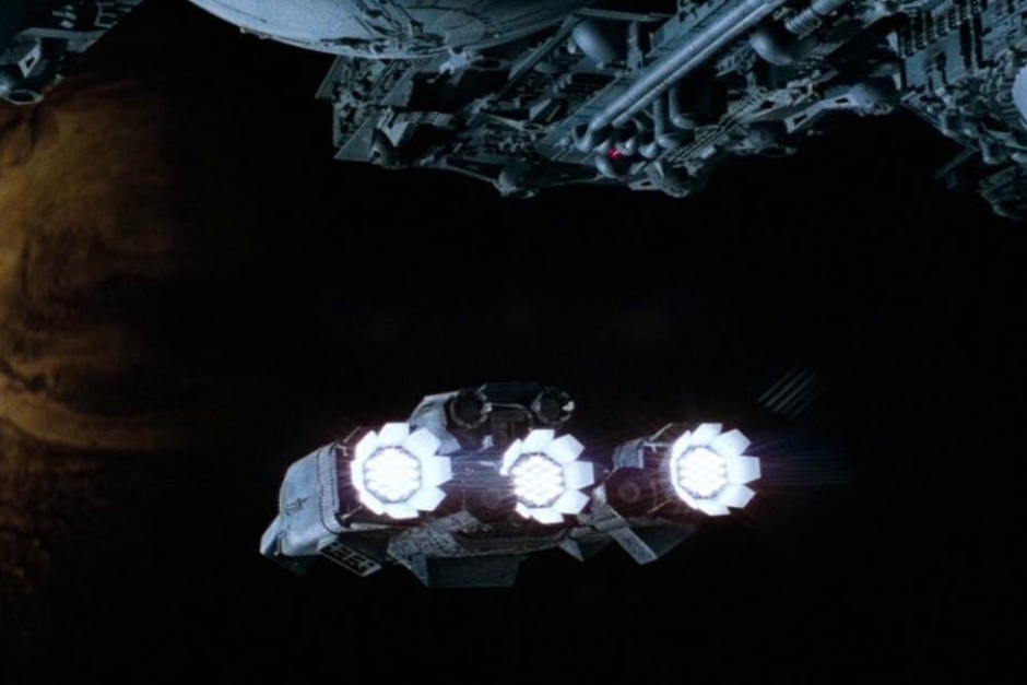
Figure 1.4 Rear view of the USCSS Nostromo in flight, departing from the refinery it tows.
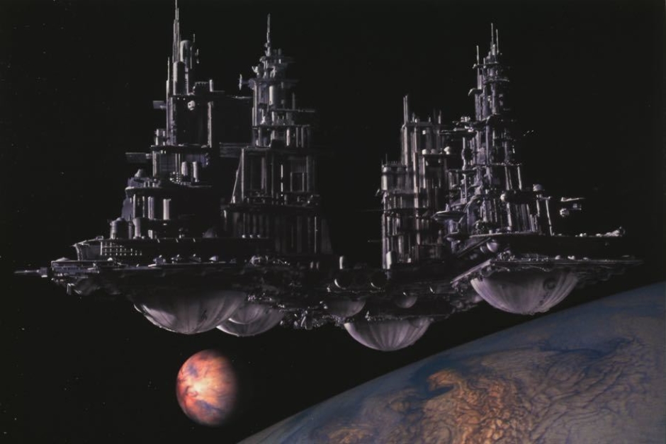
Figure 1.5 The refinery, not to be mistaken as the Nostromo, was to be towed by the ship from Thedus to Earth. Source: Alien: The Archive
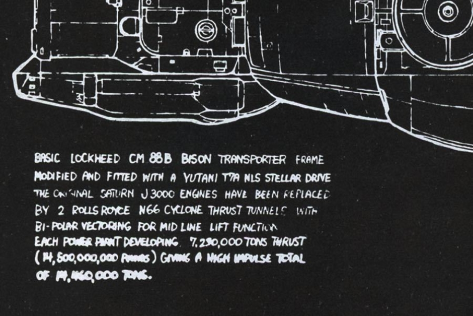
Figure 1.6 Ron Cobb’s original technical specs for the USCSS Nostromo. Source: The Book of Alien
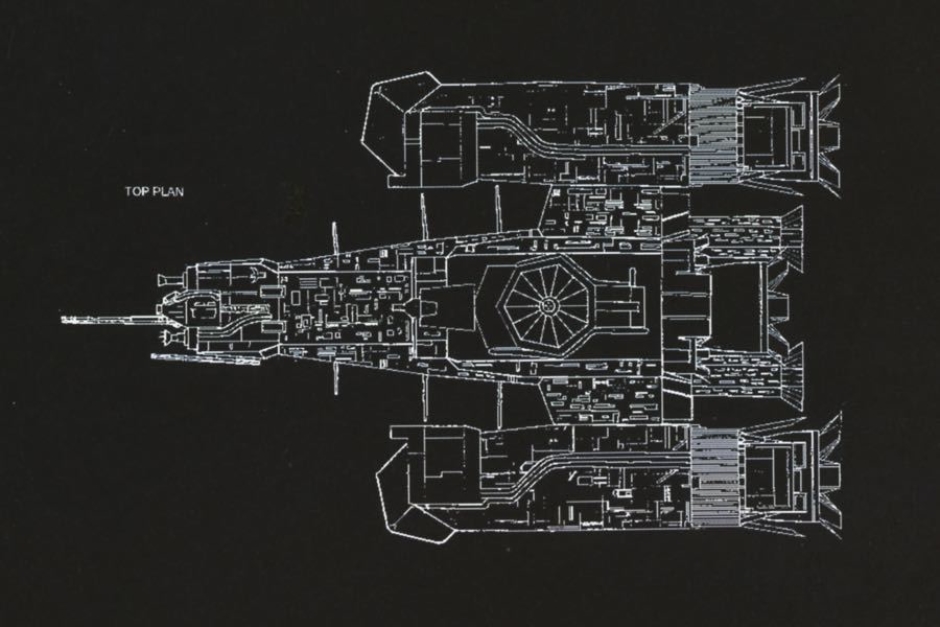
Figure 1.7 An accurate drawing of the USCSS Nostromo as it appeared in the film, from an overhead view. Source: Alien: The Archive
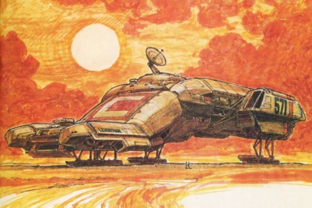
Figure 2.1 Concept art by Ron Cobb, when the ship’s early working name was Leviathan. Here we see more exterior graphics, and what might be a logotype, applied to the exterior. Source: The Book of Alien
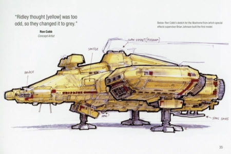
Figure 2.2 Ron Cobb’s “Nostromo A” sketch — one of many concepts handed off to the FX team for actual construction of the models and sets — was selected to inspire the final build. Director Ridley Scott made the decision to lose the yellow paint job. Source: Alien: The Archive
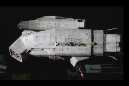
Figure 2.3 In this production photo, we can see the Nostromo’s name and registration number on the port side engine. Source: Alien Makers
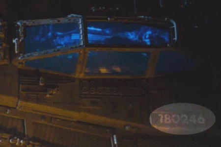
Figure 2.4 In the film, a string of numbers is visible below the bridge viewport (highlighted). They read 780246, which does not match the registration number 180286-09 used to identify the Nostromo.
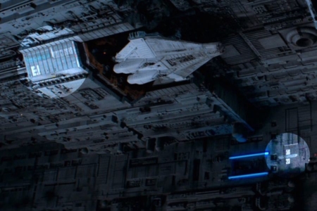
Figure 2.5 In this shot, the blue Weylan-Yutani logo is visible in two places on the Nostromo, as well as the logotypes for the name and model of the lifeboat shuttle Narcissus (areas highlighted).
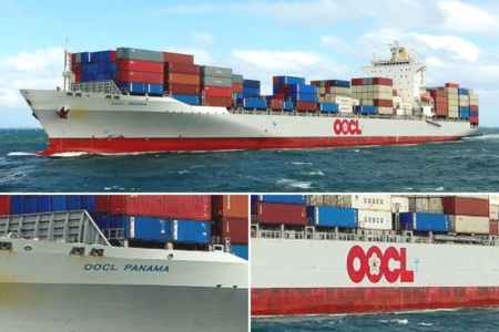
Figure 2.6 Example of a container ship bearing its name on the bow, and the corporate logo on the side. Source: Wikipedia
Analysis: The Nostromo Exterior
The starship Nostromo is not a thing of beauty, in the sense that it isn’t portrayed as some sleek product of a bright and shiny future. It is a workhorse vehicle with a dirty job to do, where function dictates form, and there definitely wasn’t any Company money wasted on making it pretty from the outside. The majority of its work is done floating solitarily through deep space after all, or in orbit for drops and pickups, so there really isn’t anyone around to impress with good looks until it dry docks for repairs or lands on an inhabited surface for some reason.
But given the early concepts executed by the film’s artists, this wasn’t always guaranteed to be the case. Chris Foss and Ron Cobb covered a lot of ground before Ridley Scott took over as Alien’s director, and their ideas for ship designs varied wildly in shape and color, with many of them featuring some kind of exterior graphics. Even on those produced by Cobb, that would end up being the closest approximations of the final constructed design, we still see color graphics (Figure 2.1) and a yellow painted exterior (Figure 2.2). I assume the yellow was considered for its real-world application on present-day terrestrial vehicles of industrial nature, and it definitely would have given the ship a more branded appearance.
After a pile of sketches was hastily shuffled off to the FX crew and work began, the yellow paint job at least, had initially found its way onto the Nostromo models they built. But seeing that, director Ridley Scott ultimately made the call to strip the exterior down to the gray metal finish that made it into the film (Figure 1.1). Despite the FX crew’s affection for it, the yellow was too garish for Ridley and ran counter to the dark look he was after for Alien.
Through all of this, inspiration from military references were central to the filmmakers’ vision for the Nostromo. As recalled by art director Roger Christianson, Ridley Scott had shown them the film Dr. Strangelove and said, “That’s what I want. Do you see? Not that it’s a B-52 in space, but it’s the military look.” This would come across not just in the Nostromo’s ship design, but in its stencil/stamp branding of company objects and military-styled crew insignia as well.
But I still couldn’t help but wonder, despite the spartan approach to the ship’s exterior, if it was in fact totally devoid of company graphics or ship identifiers of some kind. Even the military tends to slap a number and insignia on vehicles. But it’s tough to tell in the film, since everything is so dark and we don’t get to see all angles of the craft.
In some of the production photos I came across in my research, I found the Nostromo’s name and registration number painted in dark gray, on the side of the engine (Figure 2.3). I believe this was painted over though, as it does not appear to have made it into the actual film.
Carefully examining the ship as it appeared on screen, I did find numbers under the bridge viewport, but they don’t match the registration number (Figure 2.4). So they aren’t related to the craft’s identity — not sure what they would represent.
But in the scene where we see Ripley making her escape in the Narcissus, we definitely see the blue Weylan-Yutani wings logo in two places (Figure 2.5). Just behind the docked shuttle, we see the wings next to the the shuttle’s name “NARCISSUS”. Below those marks, we see the “EI” logo, which represents the shuttle’s model. And in the same shot, to the right of the blue lights marking an airlock, we see the Weylan-Yutani wings stacked vertically between the numbers 56 and 23 (Figure 2.7). As far as I can tell, this is the only branding on the exterior of the ship. Which basically marks it as owned and operated by Weylan-Yutani, and identifies and ties the lifeboat shuttle with the Nostromo.
Given the massive scale of the craft, and the fact that it spends most of its existence in space where very little of its exterior would even be seen, this makes a lot of sense. Probably the only spots that would involve someone out in space getting close enough for seeing a mark that wasn’t ridiculously large scale, with direct visuals of it through a viewport or maybe a camera view, would be docking areas and airlock entries — which justifies the Company logo placements where we see them. Anything beyond that, plastering some giant logo, or multiple logos and graphics all over the craft, would just be a large waste of time and effort.
As big as the craft is, with all of the surface mechanicals, it’s funny to even think how a giant logo or graphics of some kind would realistically be applied. Rather than thinking of a vehicle featuring visual branding, it’s more useful to think of it as a giant building being branded… just put the logo by the entrances and call it good! Actually, supertankers or container ships would be a good reference — being used for commercial purposes and similarly scaled — and these usually have the corporate logo/name on the side, and the craft’s name and/or hull number on the bow (Figure 2.6). But those surfaces are smooth and relatively flat, compared to the craggy surface topography of the Nostromo.
But it does seem a bit odd that the ship’s name and serial number doesn’t appear somewhere, for identification of the craft in the event that it has lost communications or is floating derelict for some reason. That said, I think the filmmakers were smart with their overall design restraint.
Analysis: The Nostromo Interior
Viewed from the inside, the Nostromo is again, a product of function and necessity. There are graphics, but very little in the way of a visual identity system. We don’t see NOSTROMO painted on the interior hull or walls, no branded wayfinding graphics, no color schemes branding the occupied spaces; there’s just the Company logo, adhered to terminals, bins, etc. Like the exterior of the ship, early concepts explored interiors and crew uniforms that shared common graphic treatments, but this was ultimately abandoned for the unadorned, military/industrial look.
An abundance of icons can be seen though — part of a “semiotic standard” designed by Ron Cobb for the future that Alien takes place in (Figure 3.2) — but for the non-designer audience reading this, these should not be considered as part of a visual identity system. They’d be the sort of thing one would expect to see on any spacecraft. They are the equivalent of standardized symbol signs like the men/women figures on restroom signs, warnings on machinery, that sort of thing. They don’t serve as the mark of identity for something, and they aren’t part of a system specific to an identity. So I won’t be analyzing them here. That said, symbol signs are closely related to logos and trademarks, so they are definitely worth a closer look if you’re unfamiliar with them — larger images can be seen on Ron Cobb’s website, in the section devoted to his Alien concept work.
On the Nostromo’s display screens, there are no beaming logos or fancy corporate graphics as we’ve come to expect with science fiction films today; instead we see only mundane readouts of ship functions, and only one instance where “WEYLAN-YUTANI” appears in a run-of-the-mill screen font. The ship’s name appears a few times, but those instances are similarly treated with random, system fonts specific to their terminal readouts.
All in all, I think this is a good thing. It seems realistic enough for a retrofitted blue-collar, working-class ship. And it attained Ridley’s desired “military look”. Inadvertently, they may have also dodged the risk of dating the film with bygone design trends.
A closer look does reveal one thing though, where we see a systematic use of type that is tied to the ship’s identity. I address this in the section that follows.
Figure 3.1 In some of Ron Cobb’s concept sketches, we see the color red applied across interiors, uniforms, space suits, and the shuttle, in such a way that it could be said it was an element in the Nostromo’s overall visual identity. Source: The Book of Alien
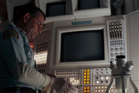
Figure 3.2 The Company logo, as seen here on Ash’s lab terminal, is the only branding we see applied to the ship’s interior.
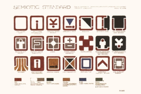
Figure 3.3 Ron Cobb's designs for “The Semiotic Standard For All Commercial Trans-Stellar Utility Lifter And Heavy Element Transport Spacecraft. April 26, 2078.” Source: The Book of Alien
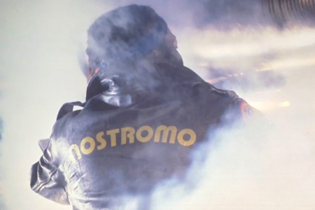
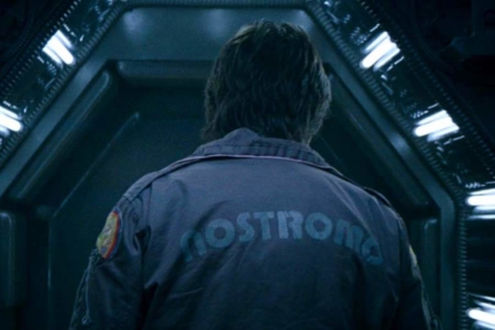
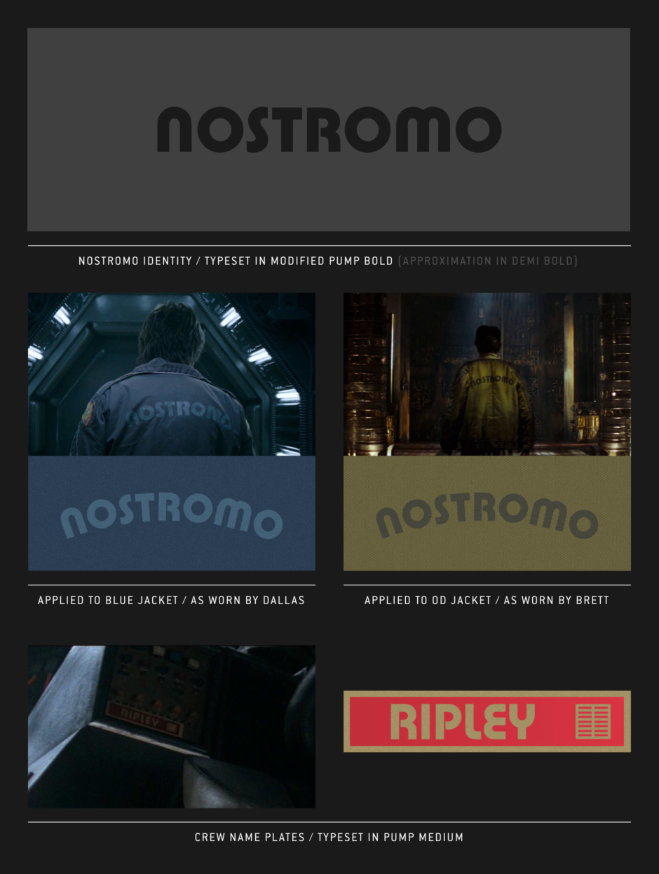
Figure 4.1 On the back of Parker’s jacket, “NOSTROMO” is typeset in Pump. Source: Production Image Gallery, The Alien Anthology

Figure 4.2 Behind Ripley’s seat on the bridge, we see the name plate for her station is set in Pump Medium (highlighted).
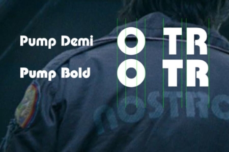
Figure 4.3 Pump Demi Bold or Pump Bold? Only one was available in 1979, so it should be Pump Bold. But Demi looks closer to the proper weight.
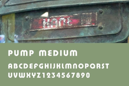
Figure 4.4 A look at the rest of Pump’s characters, set in Medium weight, which was used on Nostromo crew name plates.
Analysis: The Nostromo Typography
Transitioning from a discussion of the ship’s interior, to the crew and how the identity applies to official garb and insignia, I’d like to focus on a typographic design element that spans the two — that being the use of Pump for typesetting names. Where we see “NOSTROMO” on jackets, worn by Dallas, Brett and Parker (Figure 4.1), the type is set on a curve using Pump. And it is also used on name plates for the crew. These are seen on the ship’s bridge at each crewmember's station (Figure 4.2), on locker shelves in the shuttle, and on the breastplate of their armored pressure suits (Figure 4.4).
Designed in the 1970s by Philip Kelley at Letraset, Pump was based on geometry found in Universal — a typeface designed in 1925 by Herbert Bayer for use in Bauhaus communications. So Pump’s style is rooted in a very forward-thinking time in design history, and possesses some qualities of what we tend to see as timeless design. Pump’s geometric construction, and stencil-like character, was probably one reason it was drawn into science fiction use. For instance, I've also found geometric sans faces like Pump, Burko, Blippo, etc., used on other scifi themed art from the seventies, and the same year as Alien, Pump was used in the opening titles for Andrej Tarkovsky’s 1979 science fiction movie Stalker.
But like many geometric typefaces contemporary to Pump, it was also embraced by the pop and disco culture of the seventies, and I think that is what really dates it for audiences at present. People don’t notice the modular, mechanical nature of its component parts, all perfect circles and straight lines, and think of something technical or produced by a machine. They likely see it as a product of another time — a past time when things were funkier. So, like other designs I’ve examined in my research, we see again the difficult job a designer has with creating something that actually stays ahead of the times over the long haul.
With that little history lesson behind us, we can now get back to how Pump was applied in Alien. But don’t forget that Pump was designed for Letraset, because an issue related to spec’ing the type arose in the course of my investigation.
The exact weight we see used for the jackets is somewhat questionable. I know everyone on the fan forums and even Typeset in the Future nailed it as Pump Demi Bold for the NOSTROMO lettering, but I started questioning this when I looked it up in the Letraset catalogs I have in my office. Pump Demi Bold was listed as “NEW!" in a late 1980 catalog, and it was absent in an early 1980 catalog, which only listed Light, Medium, Bold and Triline — Pump Demi shouldn’t have been available in 1979. Every instance of Pump Demi Bold I could find on actual letter sheets, had it copyrighted in 1980 as well.
So I decided to do a little test, comparing weights to footage from the film (Figure 4.2). The Demi R seems a little narrow overall. And the counter space in the Demi O seems a little big. But Pump Bold doesn’t appear exactly right either. When I drop a T in there, the Demi Bold looks like the closer match by far. Due to camera perspective and the material the type appears on, it’s difficult to determine exactly what we’re seeing. My best guess is this was set in Pump Bold that was trimmed or redrawn by hand, and subsequently made lighter in weight. Or they time travelled to 1980 to bring back Demi. Believe what you want here.
But for the sake of reproducing the mark for this analysis I’m going with everyone else, for what appears to best approximate it visually without a bunch of work — Pump Demi Bold (Figure 4.3).
For the name plates, I found a larger image online (Figure 4.4) and can say with certainty it is Pump Medium used in those instances. It’s also possible the NOSTROMO type started as Pump Medium, and was redrawn to bulk it up a bit.
Analysis: The Crew Insignia
A very interesting element of the Nostromo visual identity is the crew’s official insignia — the patches, badges and marks that appear on crew clothing and space suits, denoting rank, role, and the fact that they are under the employ of Weylan-Yutani.
Technically, not all of what we see sewn onto the crew’s clothing and space suits falls under the Nostromo or Weylan-Yutani identity, but since Company policy dictated how those extraneous but acceptable symbols could be worn, I featured them in the Official Usage overview as they appeared in the collectible portfolio. The two I’m referring to are the American Tricentennial and UK-7 logos, both of which get their own separate research entries.
All of the crew insignia can be seen in Figure 5.1, in close to a final state, as they were designed by John Mollo. If you’re unfamiliar with Mollo, he was an award-winning costume designer for film, best known for his work on Star Wars. He was also an expert on the history of military wear, a subject he published a number of books on, and something that would inform his work on Alien and other science fiction films.
For instance, the Nostromo patches were inspired by military uniform buttons of the French Restoration Period (Figure 5.2). As Mollo said, “I was looking intently through various historical references and came across these buttons which seemed so spacy and appropriate for the Nostromo. After consultation with Ridley I experimented with some variations; some without the rainbow and finally, one with the rainbow that was eventually used.” (Figure 5.3)
Around that central graphic, we can see Mollo hand-lettered NOSTROMO, simplifying the Pump letterforms for reproduction and legibility on the embroidered patch. For the 180286 registration number (variantly 18028609 on screens and in dialogue), it looks like he avoided any Pump reference there, and went with something less stylized.
I’m curious how the rainbow came into the picture, and what it symbolizes, if anything in particular. Mollo doesn’t elaborate on it, and I saw no likely reference in the pages of Mollo’s 1972 book, Military Fashion. But it’s possible it could have been inspired by something dating after the uniforms covered in that book. Contenders include colorful military service ribbons, or something like the WWII-era US Army insignia patches I came across in my online research (Figure 5.4).
Outside of military references, I also wondered if it could have been inspired by insignia used in space exploration. There is one, that features a rainbow, that being the 1973 patch for NASA’s Skylab 4. The rainbow’s meaning in that mission patch is described as follows:
“The rainbow, adopted from the Biblical story of the Flood, symbolizes the promise that is offered to man. It embraces man and extends to the tree and hydrogen atom, emphasizing man's pivotal role in the conciliation of technology with nature by a humanistic application of our scientific knowledge.”
Beyond the biblical story of the flood, the rainbow appears as a symbol in other cultures, which could offer a clue to other possible meanings. In Greco-Roman mythology, the rainbow was considered to be a path made by a messenger, between Earth and Heaven — and the Nostromo moves resources between Earth and Space, right? Similarly, in Norse mythology, the rainbow is a bridge between Earth and the celestial realm of the Gods. Interesting to think about, but all speculation on how it could relate.
Personally, what I like the most about the rainbow is something pretty straightforward and simple — I like the color it adds to the otherwise bleak and gloomy world they’ve built for Alien (same reason I dig Brett’s Hawaiian shirt).
There were also two different background colors used for the Nostromo patch — grey and dark blue. The Authorized Portfolio of Crew Insignias (Figure 5.5) states that the grey is to be worn on the shoulders of inner-wear and over-shirts, and the dark blue on the shoulders of outerwear and jumpsuits, and on the front of the official cap.
That sounds nice.
But it doesn’t actually hold up for the film, where the grey dominates on most of what the crew wears, and is used on Brett’s cap — the only cap worn in the film. The dark blue version was available on a collectible cap though (Figure 5.6), sold by The Thinking Cap Co., which also created the authorized Portfolio (Figure 5.7). So it seems possible they were more concerned with justifying the design decisions they made for their Alien merch, than squaring things with the film.
To be precise, Parker’s jacket and Ash’s jumpsuit were the only pieces of clothing using the dark blue patch. And Brett may have accidentally had a dark blue patch for a fraction of a second — in his death scene, apparently the FX team used a prepared hat with a paper patch over a hole that could be easily punched through, and people have pointed out that it looks like they used the wrong version in that instance. It’s easiest to see in the Alien Movie Novel, which breaks the film into stills, and it sure looks like it.
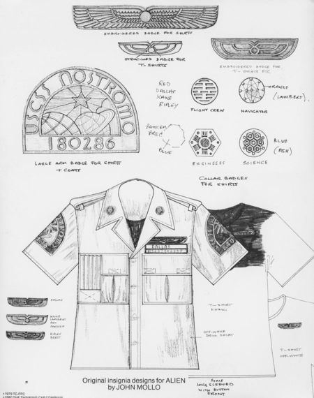
Figure 5.1 Original insignia designs for Alien, by John Mollo. Source: The Authorized Portfolio of Crew Insignias from The UNITED STATES COMMERCIAL SPACESHIP NOSTROMO Designs and Realizations
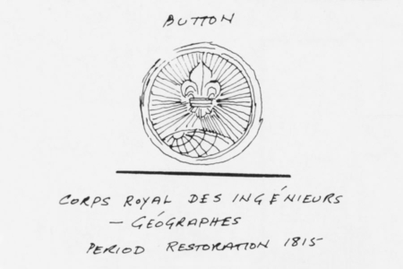
Figure 5.2 John Mollo’s sketch of the French military uniform button that inspired the Nostromo patch design. Source: The Authorized Portfolio of Crew Insignias from The UNITED STATES COMMERCIAL SPACESHIP NOSTROMO Concepts and Derivations
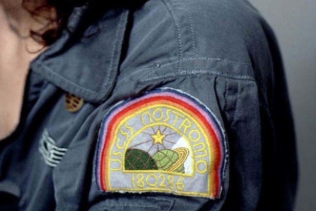
Figure 5.3 The USCSS NOSTROMO patch design as it appeared in the film. Source: IMDb Photo Gallery for Alien (1979)
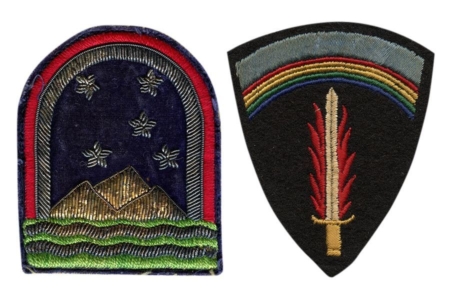
Figure 5.4 Examples of military insignia featuring rainbows. Left: WWII US Army South Atlantic Forces shoulder patch. Right: WWII US Army SHAEF (Supreme Headquarters Allied Expeditionary Force) shoulder patch that was made in the UK. Source: Flying Tiger Antiques Online Store
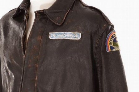
Figure 5.5 Parker’s jacket from the film, with the dark blue Nostromo patch. Source: invaluable.com
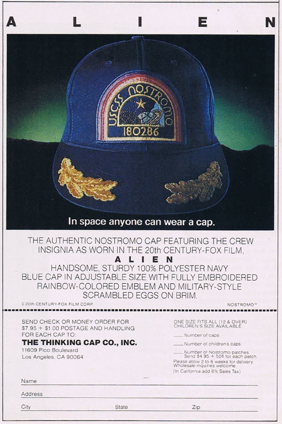
Figure 5.6 The dark blue version of the USCSS NOSTROMO patch appeared on a cap sold by The Thinking Cap Co. Source: Starlog Magazine, Nov 1979.
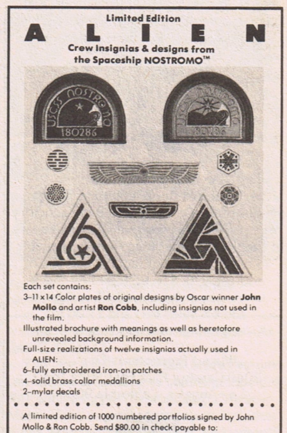
Figure 5.7 An Authorized Portfolio of Crew Insignias was also available from The Thinking Cap Co. Source: Starlog Magazine, June 1980.
Analysis: The Weylan-Yutani Wings As Worn By Nostromo Crew
In addition to the decal’s uncompromising rendition of the Company logo, there are a number of variant wings worn by the crew — altering the logo’s form and color for application as patches.
First, a larger set of the wings (Figure 6.1). These imply rank, and are worn by the ships’ officers. Brett, being just a technician, is the only crewmember that doesn’t wear them. The light blue on white embroidered patch is the most common, worn by most of the officers. Exclusive to the ship’s Captain, Dallas wears a gold version of this embroidered style. We also see older braided versions of these wings — a gold braid version worn by Captain Dallas, and a silver braid version worn by Executive Officer Kane.
The form of these braided versions is more organic or natural in its outline, as opposed to the newer versions, which stay truer to the more geometric Weylan-Yutani logo with its overall rectangular shape. The Authorized Portfolio of Crew Insignias explains the braided versions as older and having been replaced with the newer embroidered style, so this implies senior officers Dallas and Kane have been with the Company for a good amount of time. Reinforcing this in the film, these braided wings also look more tattered and worn around the edges, than the embroidered patches.
There are also smaller wings (Figure 6.2), that serve more as a company logo, that appear in two versions. Dark green on white is used on the crew’s everyday wear. And what appears to be a black on red version, is worn on medical garments like the green surgical gowns we see Dallas and Ash in as they tend to Kane’s facehugger situation.
See the Research entry for Weylan-Yutani to view screen images covering all variations of the wings insignia.
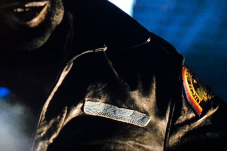
Figure 6.1 The large Weylan-Yutani wings embroidered patch worn by ship’s officers, seen here on Parker’s jacket.

Figure 6.2 The small Weylan-Yutani wings patch in green appears on work uniforms and casual wear, like this t-shirt worn by Kane.
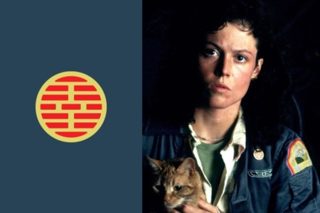
Figure 7.1 The Executive Officer badge as worn by Ripley, just above the small green Weylan-Yutani wings patch. It features red bars.
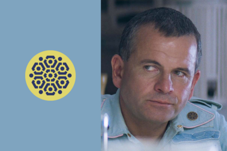
Figure 7.2 The Science Officer badge worn by Ash, seen here on his shirt collar, features a “molecular cluster” in blue.
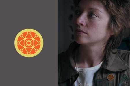
Figure 7.3 The Navigation Officer badge worn by Lambert features a “star-chart cluster” in orange.
Figure 7.4 Brett wears the hexagonal Engineer’s badge over wings on his jacket, below the American Tricentennial patch. It features an “electrode cluster” in blue.
Analysis: Nostromo Crew Badges
The crew also display small brass badges, denoting their role and technical function aboard the Nostromo. There are four types.
A circular badge, featuring horizontal bars in red, is used for Executive Officers. Dallas, Kane, and Ripley can all be seen wearing one, usually on the left breast of their shirt or jacket (Figure 7.1), above the Weylan-Yutani wings. At times, Dallas can be seen wearing his on the left shirt pocket flap (Figure 7.5), below his gold wings — so the usage rules defined in the Company Memo aren’t strictly adhered to.
In Kane’s death scene when he falls back onto the table, we see he also wears a Company issue belt. The badge insignia is displayed on the buckle, with the Weylan-Yutani logo below it — I’ve enhanced a promo photo to provide a clearer view (Figure 7.6).
One other place where the Executive Officer badge makes an unexpected appearance, is on the space suit. In the documentary film, The Alien Legacy, John Mollo points out that the badge design was added to the shoulder armor of the space suit, where it can be seen in the circular outcropping at the top of the piece (Figure 7.7).
Regarding the design, bars are a fairly common element used by military forces around the world to display rank (7.8). They are also worn in a similar fashion to the Nostromo crew’s badges. I feel it’s safe to assume this is the sort of thing Mollo was referencing.
For Science Officers, the circular badge features a “molecular cluster” in blue . This is worn by Ash — very much the Company man, he displays one on each collar of his shirt, and on his belt buckle. (Figures 7.2 and 7.9)
Navigation Officers wear a circular badge featuring a “star-chart cluster” in orange. This is worn by Lambert, one on the left breast of her vest. As the badge title suggests, this was inspired by star charts. (Figures 7.3 and 7.10)
Breaking from the circular shape, Engineering Crew get a hexagon badge, featuring an “electrode cluster” in blue (Figure 7.4). And I’m going off of what I see in the film and in Mollo’s drawings, as opposed to the color green that is assigned to this badge in the authorized portfolio. The electrode cluster illustration is interesting… I’m not sure what they are referencing when calling it that in the portfolio, but it looks an awful lot like an aircraft’s rotary combustion engine (Figure 7.11).
Both Parker and Brett should wear these badges, but as demonstrated with their attire, they take a pretty relaxed approach to Company dress code. I mean, they are only getting half shares anyways, so who can blame them?
Anyways, Parker isn’t really seen wearing the badge in the film as far as I can tell, and Bett’s is only seen on his jacket, where it is pinned over a pair of wings. But the wings we see aren’t like those used in the Weylan-Yutani logo. This is never mentioned anywhere, but I think Mollo had taken his inspiration for this insignia’s presentation from old flight engineer badges, like the one used by the US Army Air Force during WWII and the Korean War. Other air forces from that era can be seen using something similar as well, sometimes sewn to a black patch like we see with Brett’s Engineer badge and wings. (Figure 7.12)
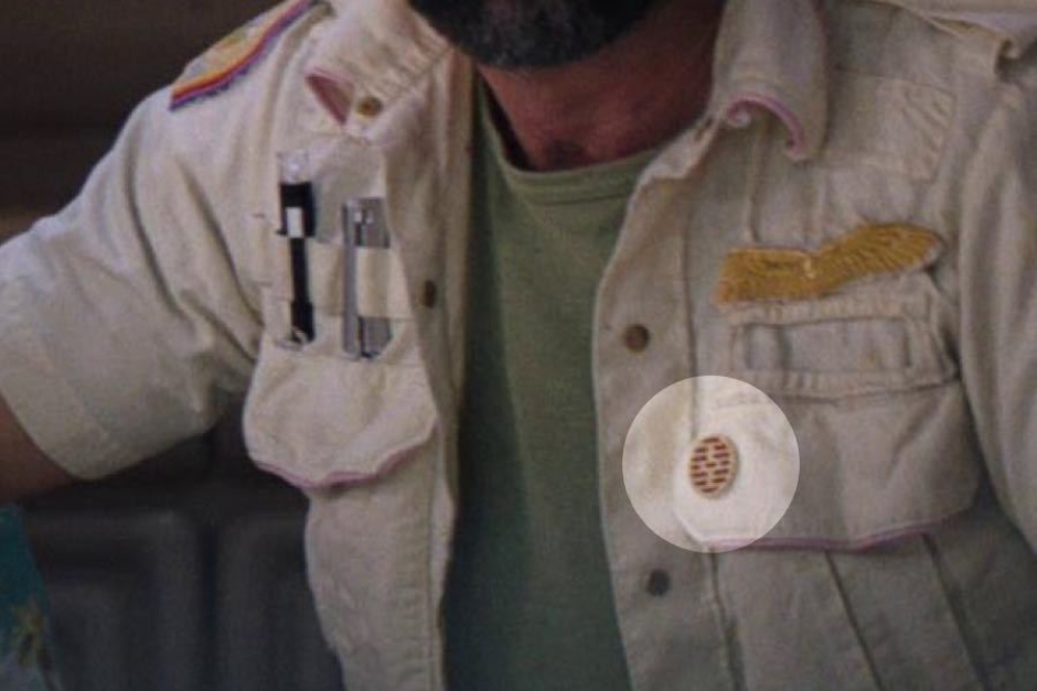
Figure 7.5 Dallas wears his Executive Officer badge casually pinned to a front pocket flap, below the wings (highlighted).
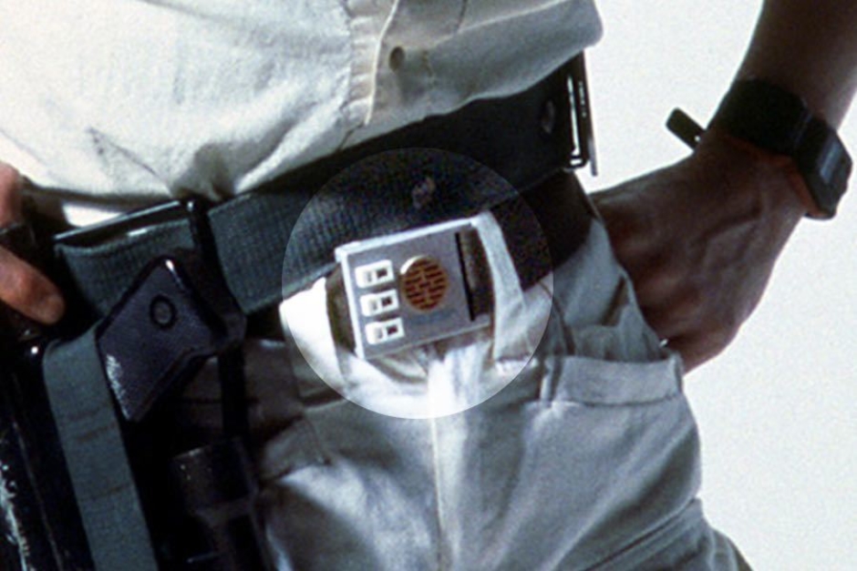
Figure 7.6 Kane wears a Company issued belt, with buckle featuring the Executive Officer badge (highlighted).
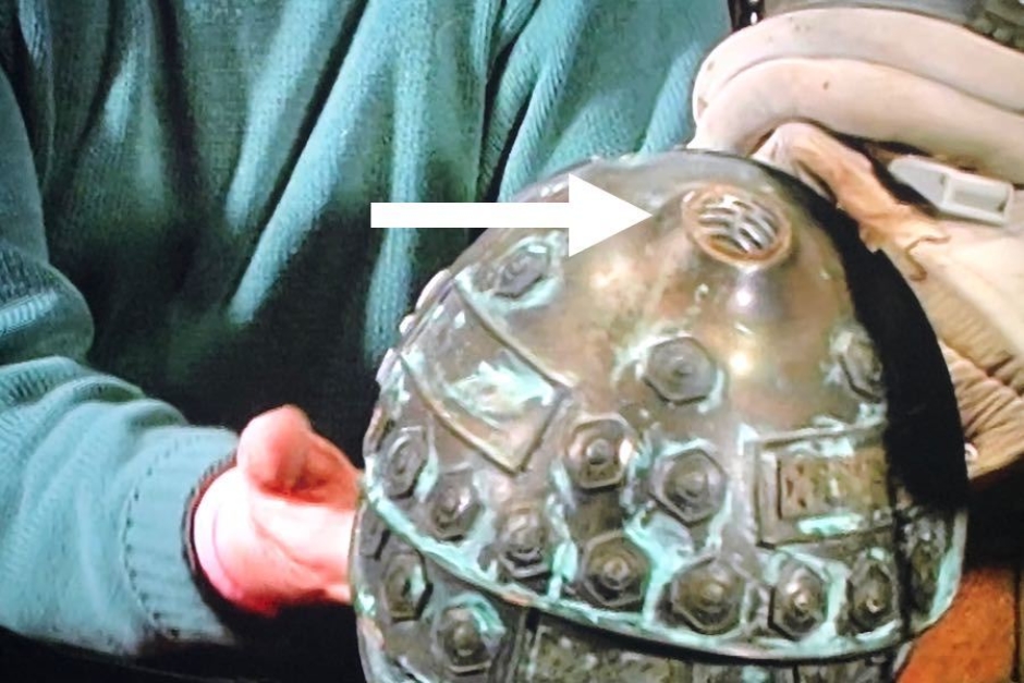
Figure 7.7 In The Alien Legacy documentary, designer John Mollo points out the badge design as it appears on the shoulders of Company-issued pressure suits worn by the crew.
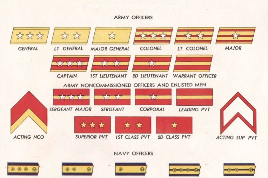
Figure 7.8 The red bars on the Executive Officer badge were likely military inspired. For example, the Imperial Japanese military wore bar insignia on their coat or shirt collars to indicate rank. Source: Excerpted from Handbook of Japanese Military Forces, via Hyperwar
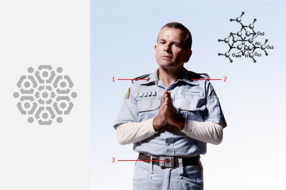
Figure 7.9 Ash is wearing the max number of badges — 3 of them, each in its proper place. The Science Officer insignia is a “molecular cluster,” in reference to molecular graphics/models used in chemistry (top right).
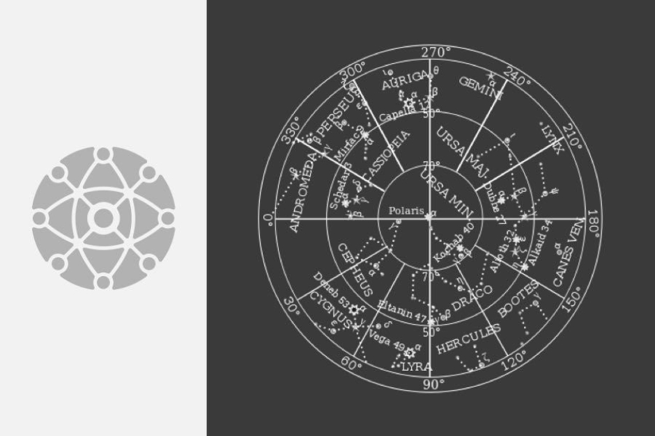
Figure 7.10 Here we have a star chart depicting navigable northern stars used in celestial navigation on Earth. The Navigation Officer’s badge may be inspired by this, resulting in the “star-chart cluster.” Source: Wikipedia
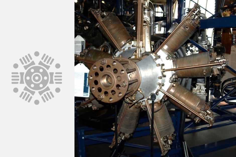
Figure 7.11 Referred to as an “electrode cluster” in the Authorized Portfolio of Crew Insignia, the Engineer badge bears a strong resemblance to rotary combustion engines used in aircraft. Source: Wikipedia
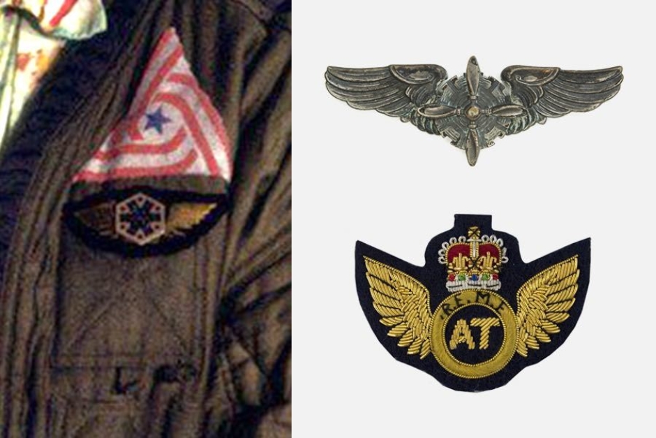
Figure 7.12 Brett’s badge was likely inspired by vintage military insignia, for example: US Army Flight Engineer (top right) and British Air Technician (bottom right). Sources: Air Mobility Command Museum; Wydean
Noted: The Role of Tradition
After everything we’ve looked at here, I’d like to note the role tradition can play in visual identities found in science fiction. As we’ve seen, Mollo and Cobb both designed not just for some far off future, but for a future that had emerged from the past we know.
For instance, Mollo’s Nostromo crew uniforms and insignia are rooted in references from military history. Cobb’s American Tricentennial patch is derived from the American Bicentennial logo of 1976. And there’s no reason to think that tradition would be discarded in these instances. From here in the present day, we can see that modern military forces still uphold and exhibit visual traditions from the distant past. And a designer working on an identity that celebrates and marks a moment in American history, isn’t going to ignore where the event came from. Humans like to remember, and pay homage to their heritage. And unless the past has been completely erased in the future, there’s no reason to expect certain things to not turn up.
Take the badges Mollo designed for the Nostromo crew, to denote their technical functions. The Engineering badge appears to feature a combustion engine from an airplane. You may ask, why should that be the case? They’re flying through space in a starship, and it seems unlikely that even airplanes on Earth would still rely on a fossil fuel source. Or take the Navigation badge, that bears a resemblance to hemispherical star charts used in celestial navigation of the skies and seas on Earth. These things would be so outdated; what place do they have in the future, in the far reaches of space? I would argue that tradition, and paying homage to the origins of those technical roles, is a very real thing we could expect to see in the future. Maybe even as far out as the year 2122.
If humans are still human, we’ll still have that tendency to look back and carry certain things forward. And I think Cobb grasped that, and Mollo especially did, with his scholarly knowledge of the history and evolution of military dress.