Weylan-Yutani
Manufacturer, Megacorporation, Space Settlement
YEAR 2122
Weylan-Yutani is a large British/Japanese multinational conglomerate that is heavily involved in space colonization and the myriad technologies that both support and result from human expansion to the stars.
Keeping it at the forefront of space exploration, Weylan-Yutani is a leading manufacturer and operator of spacecraft. Other industry involvement includes computer technology, robotics and weapons.
Overview: The Weylan-Yutani Visual Identity
Analysis: The Weylan-Yutani Wings
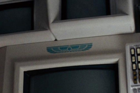
As the camera pans through the starship Nostromo’s darkened interior in the opening of the 1979 film Alien, when passing through the ship’s galley you may have first noticed these little blue marks that go on to be liberally applied throughout later scenes.
Pausing, we can see them on kitchen cabinets, food dispensers, a bowl and the face of a coffee maker (Figure 1.1). A closer look at the largest of these decals on the cabinet door shows it to be a set of blue wings, outspread from a central circle — the Weylan-Yutani logo, also referred to as the Weylan-Yutani wings (Figure 1.2).
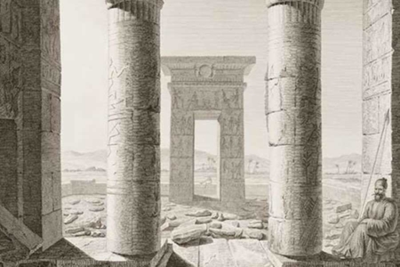
The wings are not really aviation inspired as one might expect, but were designed by John Mollo after Ridley Scott suggested using an ancient Egyptian motif for the company logo. More specifically, Mollo and Ridley seem to have referenced a winged sun disk (Figure 1.3), an icon that was used in the Egyptian Old Kingdom and other ancient Near East societies as a symbol of royalty, divinity and power. The logo’s blue color was also likely inspired by Egyptian art (Figure 1.4), which frequently featured turquoise gems and blue paints, as well as blue faience ceramics.
Weylan-Yutani itself, as a company name, was devised by Ron Cobb. As Mollo noted, both the wings and the name “were hotly pursued at the beginning,” but eventually they dropped the words and just used the wings as the logo. In the Authorized Portfolio of Crew Insignias, Cobb describes the company name Weylan-Yutani as almost a joke, or a kind of satirical play on world events:
“I wanted to imply that poor old England was back on its feet and united with the Japanese, who had taken over the building of spaceships the same way they have now with cars and super-tankers. In coming up with a strange company name I thought of British Leyland and Toyota, but we obviously couldn’t use Leyland-Toyota in the film. Changing one letter gave me Weylan, and Yutani was a Japanese neighbor of mine.”
He goes on to describe the design process for the logo:
“I also thought it would be fun to develop a logo using a W and Y interlocking. We tried a lot of variations and came up with some very industrial looking symbols, which were to be stenciled all over the ship. By that time though, Ridley was already set on using the Egyptian wing motif. We tried some combinations, but they didn’t work. So Weylan-Yutani now only appears on the beer can, underwear and some stationary, so the joke got kind of lost.”
In fact, the name Weylan-Yutani did appear in one other place, besides those he mentioned — it is visible on a screen display, during the Nostromo’s landing sequence. But it didn’t really exist anywhere as a logotype, in any meaningful way. As for the standalone wings, they were stenciled, stamped and adhered to all manner of things throughout the film. They didn’t make it onto any screen displays, but it was policy of the Company to label almost all goods and property on the Nostromo with their mark.
So when the crew awakens from hypersleep, and joins for a communal meal in the ship’s galley, we see the wings decal on just about every container on the table (Figure 1.5). Even Jones the cat has to know he’s eating out of a Company bowl. Beyond the ship’s galley, we see the wings on walls, lab terminals, undergarments, gloves, boots, belts, pressure suits, helmets, and no doubt a lot of things we couldn’t even see in the film.
I’ve provided some examples in Figures 2.1–2.11, but to show every instance would be too exhaustive for this entry.
Seeing how the ubiquitous visual identity represents Weylan-Yutani with a simple mark, and no lockup with typography to carry the company name, there is an interesting parallel to be noted with how those under its employ relate to Weylan-Yutani’s identity. Just like the logo doesn’t state the name, at no time does the crew of the Nostromo ever refer to Weylan-Yutani by name. It’s always “the Company”. As if megacorporations aren’t bad enough, the absence of the company’s true name makes it seem even more impersonal as an entity, and as something they have zero power over.
Between this choice of language and the heavy-handed reminder that Weylan-Yutani owns everything around them, what comes to mind for me is the “company town” that was seen in the late 1800s, in industries like mining, lumber, and the railroad. Often times in remote locations (e.g., Outer Rim Systems), far from existing cities (e.g., Earth), a company would build a town for its workers (e.g., starship, space colony), at the same time serving as their sole source of goods and services (e.g., Weylan-Yutani beer and cigarettes, Company gear, counseling from a Company computer, medical care from a goddamn robot sent by the Company). In such a situation, the company would pretty much own you.
I’ve also seen online comments and discussions pointing to the colonial era British East India Company, often considered to be the first significant global corporation, as likely inspiration for Weylan-Yutani. It’s not something I’ve seen voiced by any of the film’s creators, but I could see how a comparison can be drawn. For one, that exploitative corporate entity was informally referred to as “John Company” in its day. And the East India Company did blur the lines between corporate and military, which Ridley was after in some ways for the Weylan-Yutani look. And they felt the need to slap their "logo" on everything too (Figure 1.6). So perhaps there’s something to it. All things considered, whatever the references are that come to mind, they don’t paint a very pretty picture of the Company.
So rather than just serving as mere decoration for a future world the filmmakers have created in Alien, Weylan-Yutani’s visual identity helps communicate things about that fictional world, drawing on real-world contexts like those I’ve described to reinforce the story that unfolds for the audience. Maybe you don’t notice it all the first go around, and it just works on you from the background, but multiple viewings of the film can offer up these details to really put things in place and give the story more depth.
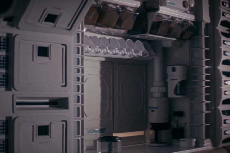
Figure 1.1 We first see the Weylan-Yutani logo in the ship’s galley, applied to cabinets, food containers, a bowl, and the coffee maker.
Figure 1.2 A detailed look at an authorized replica of the blue Weylan-Yutani wings decal, which was liberally applied to company property and goods throughout the Nostromo. Source: The Authorized Portfolio of Crew Insignias from The UNITED STATES COMMERCIAL SPACESHIP NOSTROMO
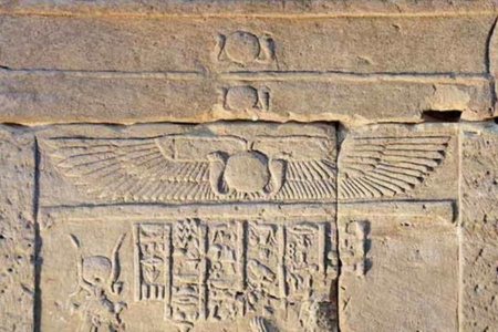
Figure 1.3 Detail of an ancient Egyptian sun disk flanked by the outspread wings of Horus, the sky god, as seen on the the Temple of Dendur. Source: www.metmuseum.org
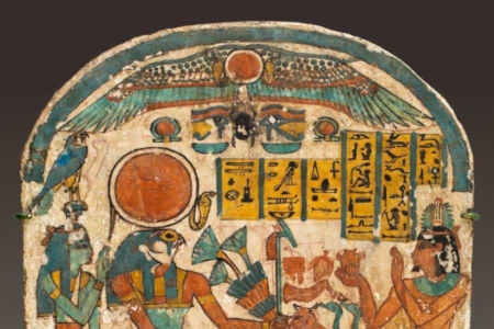
Figure 1.4 In the Stela of Saiah, we see a winged sun disk and other elements painted in turquoise blue colors, similar to those that Weylan-Yutani’s logo appears in. Source: www.metmuseum.org
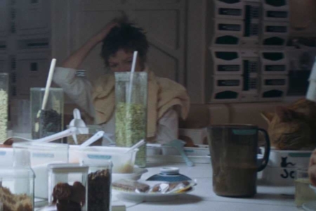
Figure 1.5 In the scenes where the crew first gathers for a meal, we see the Weylan-Yutani wings applied to just about every container on the table.
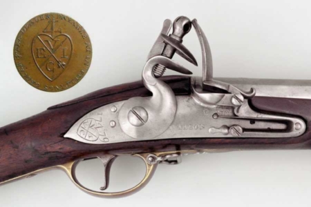
Figure 1.6 Some have made comparisons to the East India Company. There are similarities to be sure. For instance, their bale mark was applied to Company goods, tokens, weapons and other property. Weylan-Yutani shows equal enthusiasm for marking all the things. Sources: Musket from National Army Museum Online Collection; Token from www.columbia.edu
Application: The Logo on Company Goods and Property
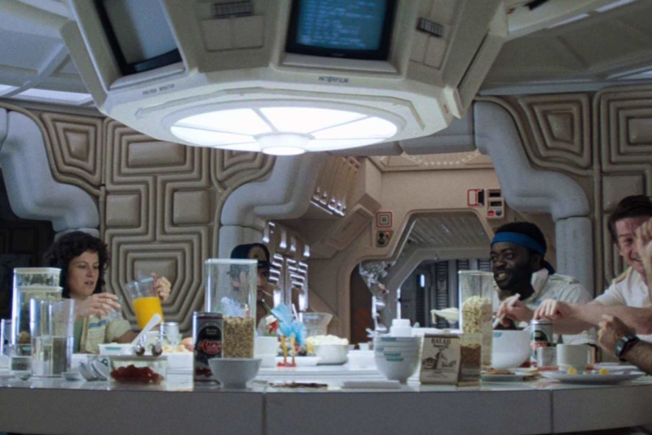
Figure 2.1 In addition to the logo-bearing dishes and containers we see at the table setting, there are two brand name products — Aspen Beer and Balaji Imperial cigarettes. These products are both Company made, and bear the Weylan-Yutani logo as well.
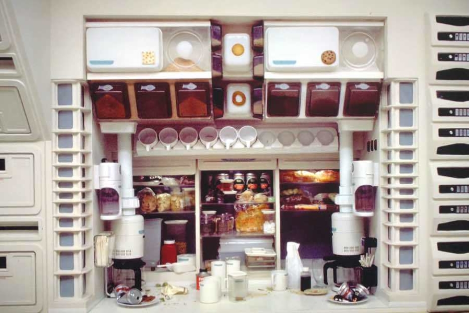
Figure 2.2 Production photos offer a closer look at the galley. The Company is well represented. Source: Production Image Gallery, The Alien Anthology
Figure 2.3 The logo as seen on the white plastic coffee mugs that appear throughout the film. Source: Production Image Gallery, The Alien Anthology
Figure 2.4 At Ash’s lab terminal in the ship’s infirmary, we see the logo above screen displays (top center and center right).
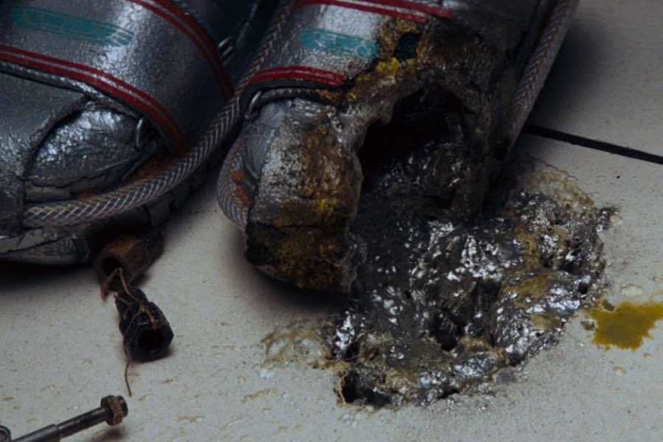
Figure 2.5 As the acid blood of the alien lifeform burns through multiple decks of the ship, at one point we see the logo on a pair of boots.
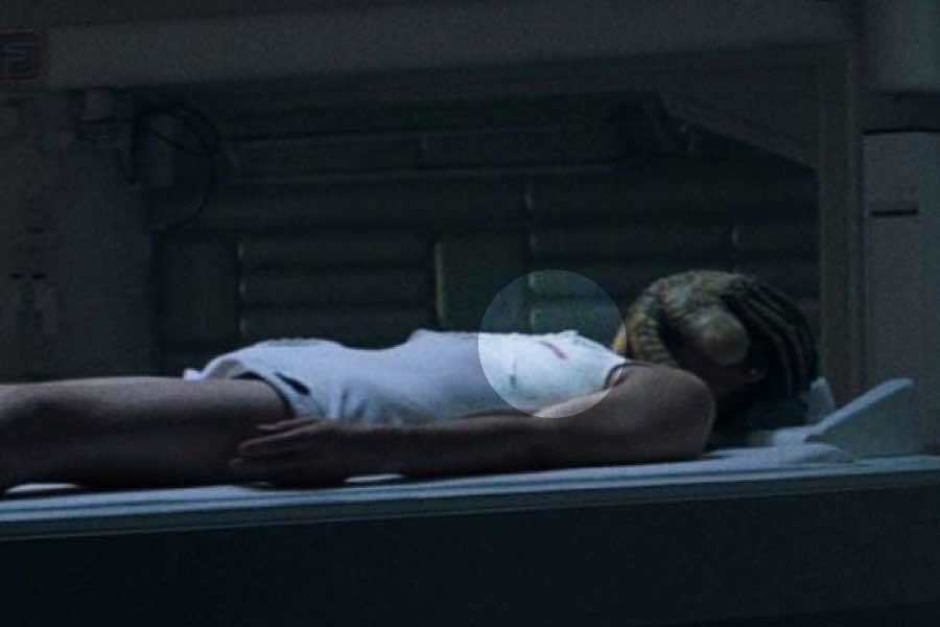
Figure 2.6 Where we see Kane in the infirmary, a red stamp of the logo (highlighted) is visible on the white undergarment he is wearing.
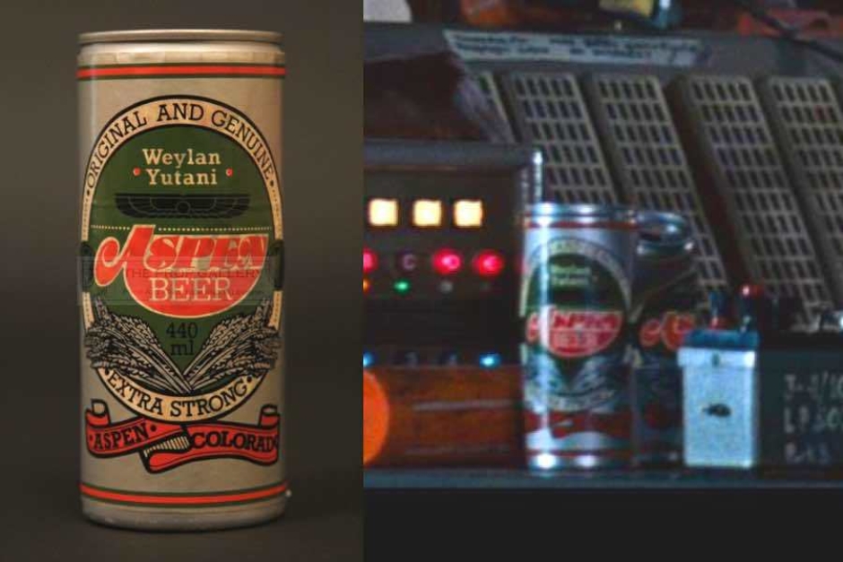
Figure 2.7 A closer look at the beer cans reveal Weylan-Yutani’s name (set in Rockwell Bold) and logo, over the Aspen Beer logotype. Image Source for Can: Prop Store of London, propstore.com
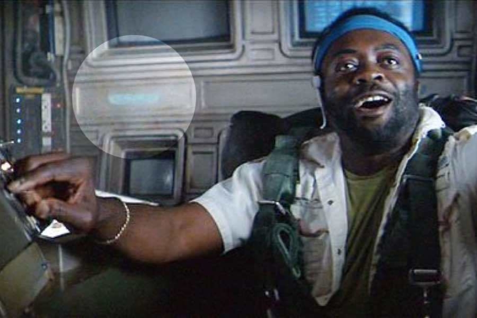
Figure 2.8 Behind Parker, as the Nostromo departs from LV-426, we can see the logo (highlighted) on the ship’s interior wall.
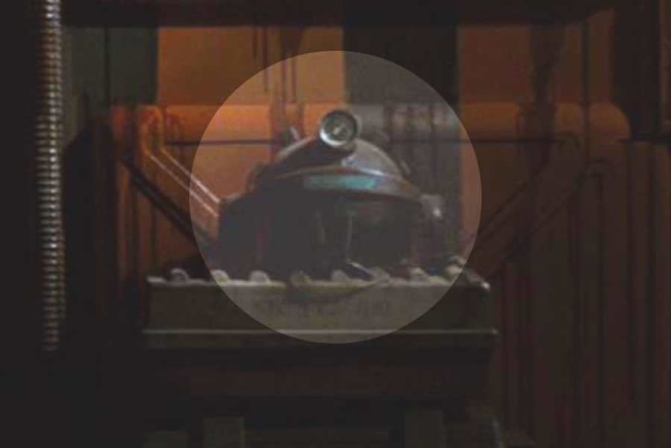
Figure 2.9 Just before Brett, Parker and Ripley search lockers for the alien, we see a helmet bearing the logo (highlighted).
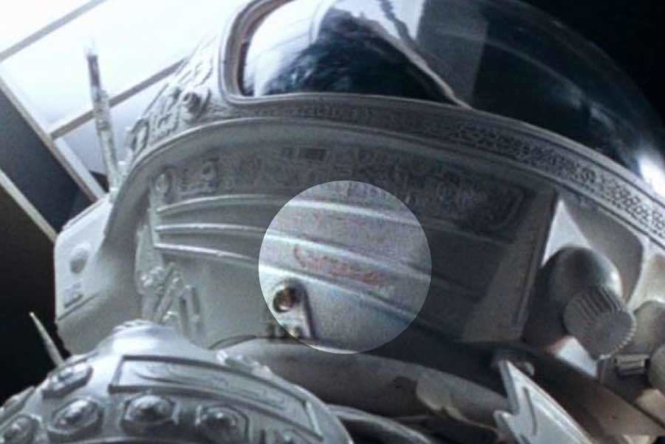
Figure 2.10 As Ripley readies herself for a confrontation with the alien aboard the lifeboat shuttle, we see the logo stamped in red (highlighted) on the helmet of her space suit.
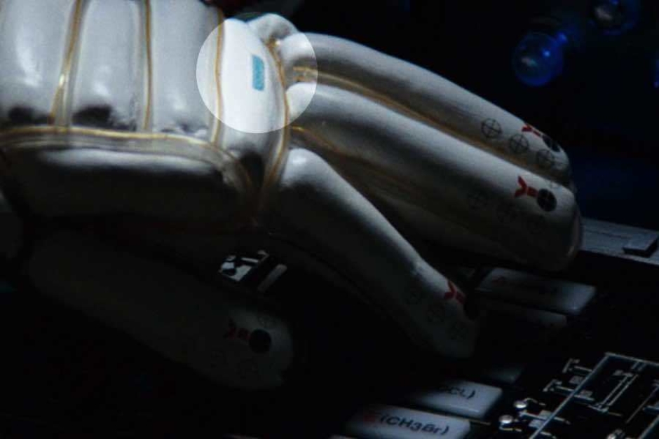
Figure 2.11 As Ripley operates shuttle controls to drive the alien into her trap, we see the logo (highlighted) on her space suit gloves.
Application: The Nostromo Exterior
The Weylan-Yutani logo also appears in a few spots that we can see on the exterior of the Nostromo starship. In the scene where we see Ripley making her escape from the doomed craft, it is visible in two places (Figure 2.1). Just behind the docked lifeboat shuttle, we see the wings next to the the shuttle’s name “NARCISSUS” (Figure 2.2).
And in the same shot, to the right of the blue lights, we see the wings stacked vertically between the numbers 56 and 23 (Figure 2.3). As far as I can tell, these are the only instances of the logo on the ship’s outer hull, presumably placed where someone approaching the shuttle dock or the airlock entry would see them.
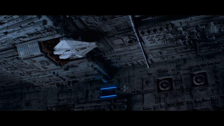
Figure 3.1 In this shot, where we see Ripley making her escape in the Narcissus, the blue Weylan-Yutani logo is visible in two places on the Nostromo.
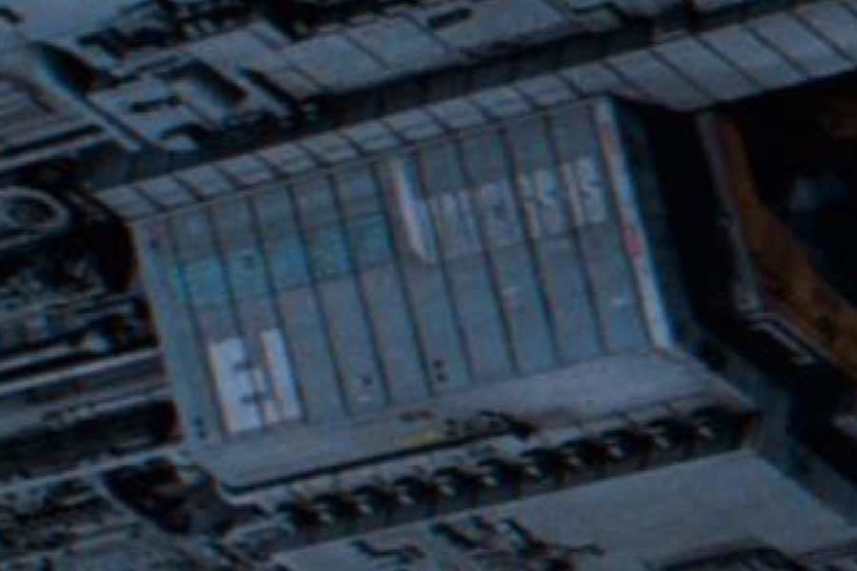
Figure 3.2 The Weylan-Yutani logo can be seen on the underside of the Nostromo, where the shuttle is docked.
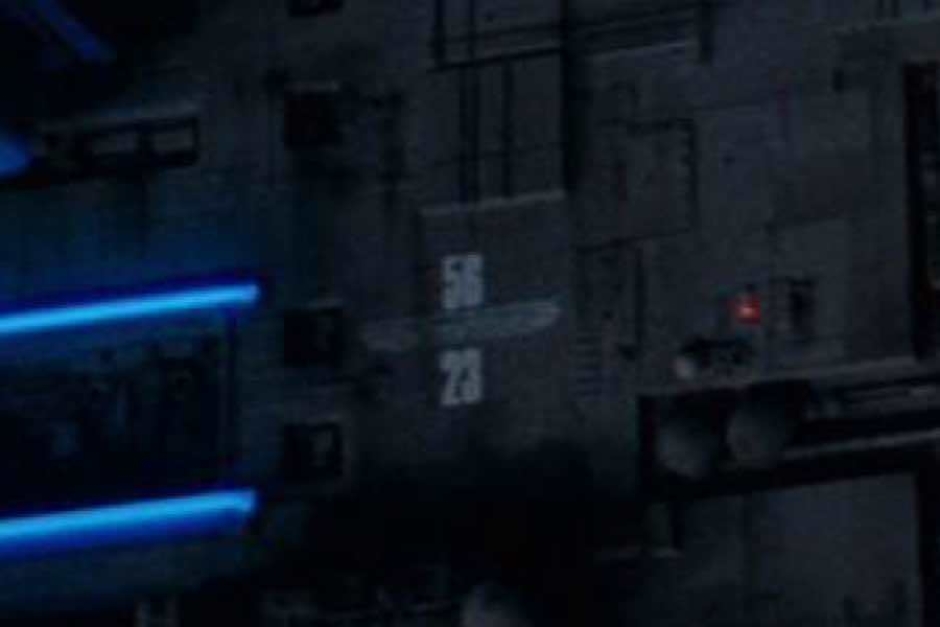
Figure 3.3 The Weylan-Yutani logo is also visible beside these blue lights, sandwiched between numbers.
Analysis: Company Crew
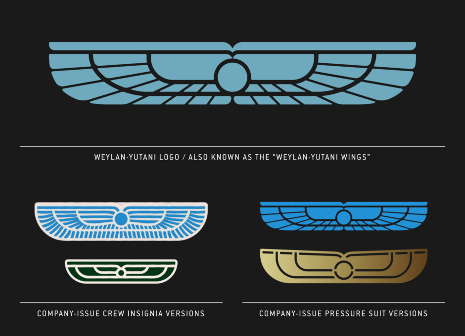
In addition to the uncompromising rendering of the logo in decals and labels on Company items, and on the exterior of the ship, there are a number of variant wings worn by the crew — altering the logo’s form and color for these different applications.
First, it appears on uniforms and clothing as insignia patches in two sizes. The larger wings patch implies rank, and is worn by the Nostromo’s officers. Brett, being just a technician working under Parker, is the only crewmember that doesn’t wear one. The light blue on white embroidered patch is the most common, worn by most of the officers at one point or another. Exclusive to the ship’s Captain, Dallas wears a gold version of this embroidered style. We also see older braided versions of these wings — a gold braid version worn by Captain Dallas, and a silver braid version worn by Executive Officer Kane.
The form of these braided versions is more organic or natural in its outline, as opposed to the newer versions, which stay truer to the more geometric Weylan-Yutani logo with its overall rectangular shape. The Authorized Portfolio of Crew Insignias explains the braided versions as older and having been replaced with the newer embroidered style, so this implies senior officers Dallas and Kane have been with the Company for a good amount of time. Reinforcing this in the film, these braided wings also look more tattered and worn around the edges, than the embroidered patches.
There is also a smaller wings patch, that serves more as a company logo, which appears in two different colors. Dark green on white is used on the crew’s everyday work and casual wear. And what appears to be a black on red version, is worn on medical garments like the green surgical gowns we see Dallas and Ash in as they tend to Kane’s facehugger situation.
On Company space suits worn by the crew (Figure 4.7), we see the logo in five places. On the breastplate of the armor-like suit, we see a more detailed rendering, truer to the logo if not the actual logo (Figure 4.8). And on each shoulder, there is a simplified version that uses similar geometry to the small Weylan-Yutani wings crew insignia. Depending upon the space suit design, these appear in etched brass attached to the armor plates (Figure 4.10) or seamlessly cast into the suit’s armor (Figure 4.11). There is also a small wings insignia on each glove.
Taken altogether in its various forms and applications, it’s notable how the logo is used as a kind of storytelling device, communicating to the film’s audience that while it goes unnamed by the crew (who only refer to it as “the Company”), Weylan-Yutani is omnipresent and god-like. And that’s not just because it uses an ancient symbol of divinity and power as a logo. By seeing that logo everywhere, you are made very aware of the fact that literally everything in the crew’s closed and inescapable world out in space is property of the Company, down to the food and beer they consume, not to mention the larger world itself, which is the ship.
And wearing logos themselves, it’s not a big jump to conclude how the crew are regarded by Weylan-Yutani as well — while under contract they are property, that can be used as it pleases, or even deemed expendable if it serves the Company’s interests. Everything on the Nostromo happens, as Dallas says, “because that’s what the Company wants to happen.”
Application: The Logo as Worn by Company Employees
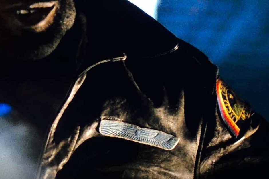
Figure 4.1 The light blue Weylan-Yutani wings embroidered patch worn by ship’s officers, seen here on Parker’s jacket.
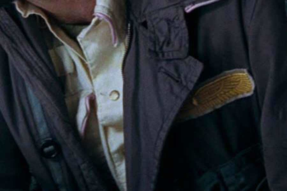
Figure 4.2 The gold version of the Weylan-Yutani wings embroidered patch worn by ship’s Captain, seen here on Dallas’ jacket.
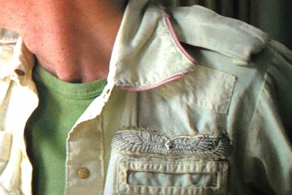
Figure 4.3 The silver braided Weylan-Yutani wings worn by the ship’s second in command, Executive Officer Kane.
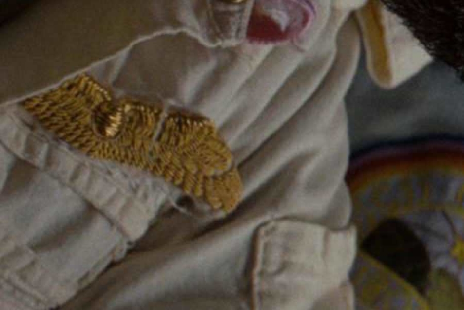
Figure 4.4 The gold braided version of the Weylan-Yutani wings worn by ship’s Captain, seen here on Dallas’ over-shirt.
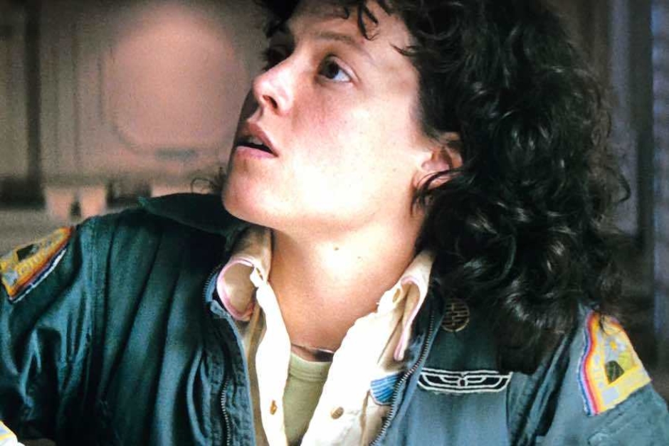
Figure 4.5 The small Weylan-Yutani wings patch that appears in dark green on white, worn by all crew, is seen here on Ripley’s jumpsuit.
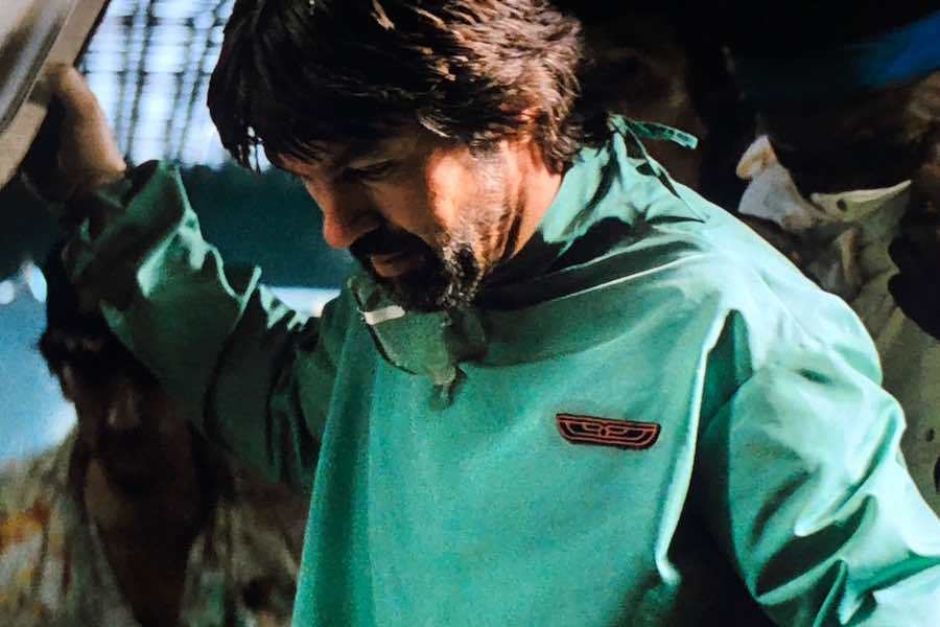
Figure 4.6 The small Weylan-Yutani wings patch that appears in black on red, worn on medical garments, as seen here on Dallas’ surgical gown.
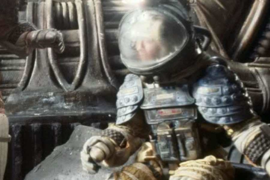
Figure 4.7 Wings appear on the pressure suits. Note in this image of Kane, their placement on each of the armored shoulders and on the breastplate above his red nameplate.
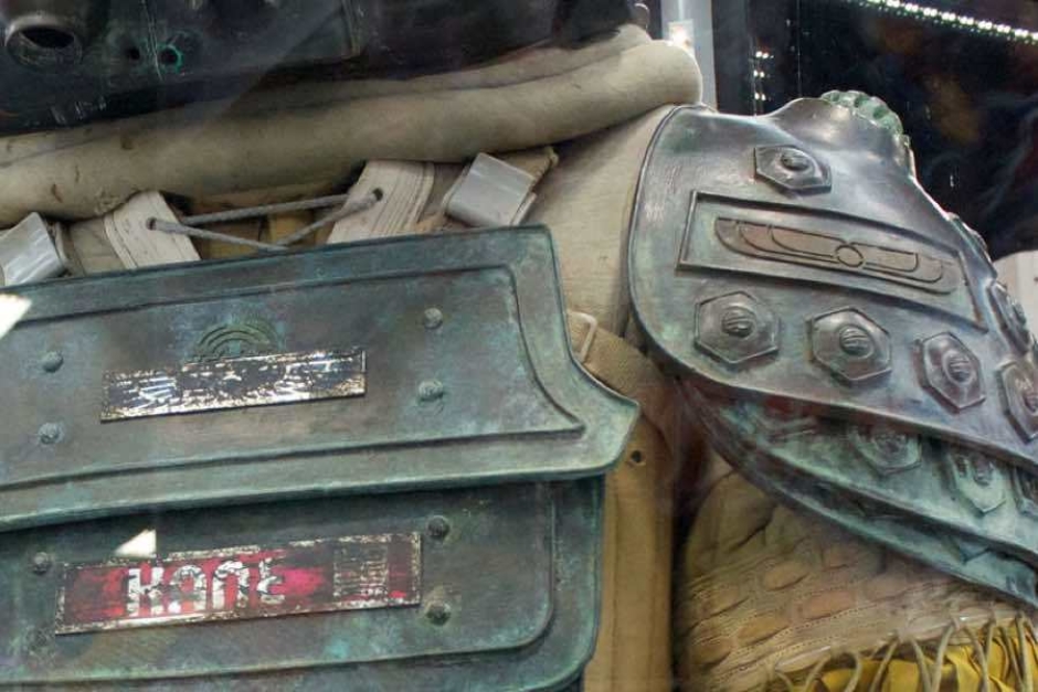
Figure 4.8 A closer look at the wings on Kane’s suit, in this exhibit photo, shows variations of the logo applied as brass plates. Source: Detail of photo by Ewen Roberts, Comic-Con 2012
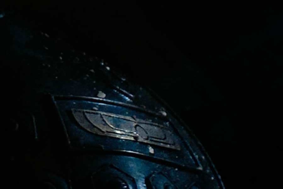
Figure 4.10 A close-up view from the film, showing the brass wings on the shoulder of a pressure suit.
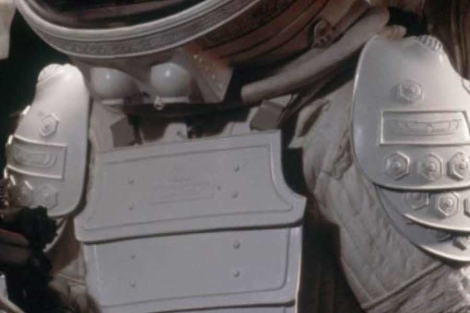
Figure 4.11 Ripley’s pressure suit from the shuttle shows the wings seamlessly cast in the white armor. Source: AVP-WIKIA
Looking Back
In closing, I’d like to consider an aspect of the Weylan-Yutani visual identity that puts it in contrast to some of the marks I’ve covered thus far with my Speculative Identities Research. So far, what I’ve found is that designers working on this sort of thing have a tendency to pull inspiration from logo designs in areas of cutting-edge technology, or use emergent stylistic trends that will look futuristic to their contemporary audience. But with Alien, the filmmakers took what may be a counterintuitive approach in sourcing their inspiration for a logo that would need to live in the distant future of 2122.
Instead of searching the horizon for what is to come, they went back, and dug up an idea from ancient history. And in doing so, they accomplished something a lot of science fiction designs fail at over time, and something you really wouldn’t expect from a symbol that is thousands of years old — it doesn’t look or feel dated in the future of Alien. At least not in a way that would nail it to a specific era. For instance, it doesn’t look or feel to me like a design that is stereotypically 1970s.
So what is going on here? Why does it still work? For one, they chose a long established symbol with some obvious staying power, rather than building something that leans heavily on a style or trend. But it doesn’t look ancient either, and that was accomplished by the designer’s rendering of the winged sun disk in a simple and direct Modern style. And finally, no typography. That’s an anchor that usually drops in a place and time, dragging an identity back from the future. Type choices are very often prey to trends, and certain styles of type can become loaded down with associations over time, depending on where and how they get used by the design world. That really could have been an easy place to foul up, but they dodged it despite trying to combine the logo with a wordmark while the identity was still in development.
So overall, maybe the Weylan-Yutani identity doesn’t look overtly futuristic, but it also doesn’t feel like some out of place throwback, and that’s its own kind of success depending on how you look at it. So for those taking notes, these could be a few things to keep in mind when designing for a science fiction future.
Source: Franz Christian Gau, Dendur, interior view of the porch, Antiquités de la Nubie (Stuttgart, 1822), plate 24.