Cryoco
Chemical Industry, Cryogenics, Freight Transport
Year 1995
Cryoco is a Los Angeles-based trucking company specializing in the transport of cryogenic chemicals like liquid nitrogen.
In 1995, one of its trucks is hijacked by a liquid metal shapeshifting T-1000 Terminator from the year 2029. The resulting wreck and chemical spill proved capable of freezing the seemingly unstoppable T-1000 and temporarily disabling it.
Overview: Cryoco Visual Identity
Intro: Cryoco
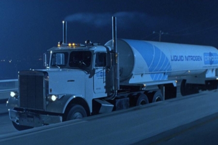
Cryoco plays a brief, but important role in T2: Judgement Day, where one of its cryogenic tanker trucks (Figure 1.1) is hijacked and used by the shapeshifting T-1000 Terminator to pursue John Connor towards the end of the film.
Unable to escape the truck in the chase that ensues, the T-800 Terminator protecting John decides to leap from their vehicle onto the Cryoco truck, causing it to crash into a steel mill, where the truck’s tanker of liquid nitrogen bursts and spills. It’s here that we begin to learn the T-1000’s weakness — its mimetic polyalloy composition is still vulnerable to extreme temperatures. The T-1000 freezes in the spill (Figure 1.2), and is then shot, shattering it into tiny pieces. It is only able to reconstitute itself when heat from a nearby crucible thaws those pieces to the point that they can regain their liquid form. It would take a fall into molten steel to totally do the machine assassin in, but Cryoco slowed it down.
With all that said, while a trucking company may seem like a rather ordinary and mundane thing to look at here in the research, it did find itself involved in a very sci-fi chain of events. It’s not every day that your chemical cargo can play a role in slowing down a time traveling killer robot, while possibly helping to save the future of humanity.
Beyond its use for freezing robots, Cryoco’s cryogenic cargo also possesses a real-world connection to the future that likely registered with the film’s audience — liquid nitrogen is an ingredient in cryonics, the speculative life extension practice that freezes and stores human corpses or severed heads with the hope that advances in technology will make resurrection possible at some point in the future (Figure 1.3). Though cryonics is largely regarded as pseudoscience, it hasn’t stopped people with the money to pay for it from trying to escape death and wake up in the future. And it’s something that has found its way into popular culture via science fiction. For that reason, I’ll take cryonics into consideration when I examine the Cryoco visual identity in my analysis.
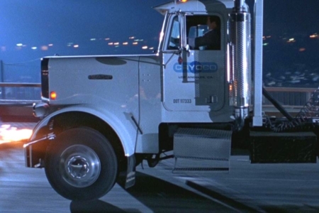
Figure 1.1 The Cryoco truck slams on its brakes to avoid crashing into the burning helicopter wreckage, from which the T-1000 emerges.
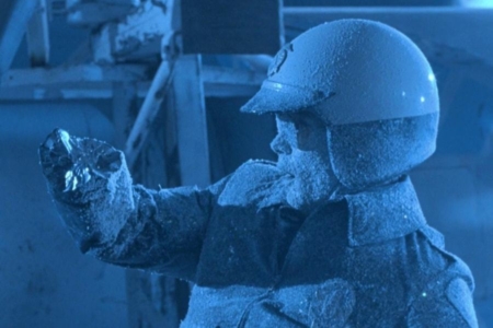
Figure 1.2 The T-1000 realizes it made a big mistake stealing the Cryoco truck with its tanker of liquid nitrogen.
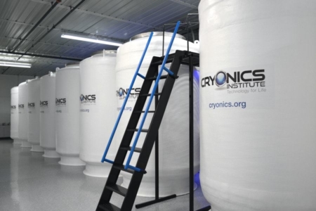
Figure 1.3 A look inside the Cryonics Institute — one of a number of companies in the business of preserving dead humans in liquid nitrogen, for a possible restoration of life in the future. Source: Cryonics Institute
Usage: The Cryoco Truck and Trailer
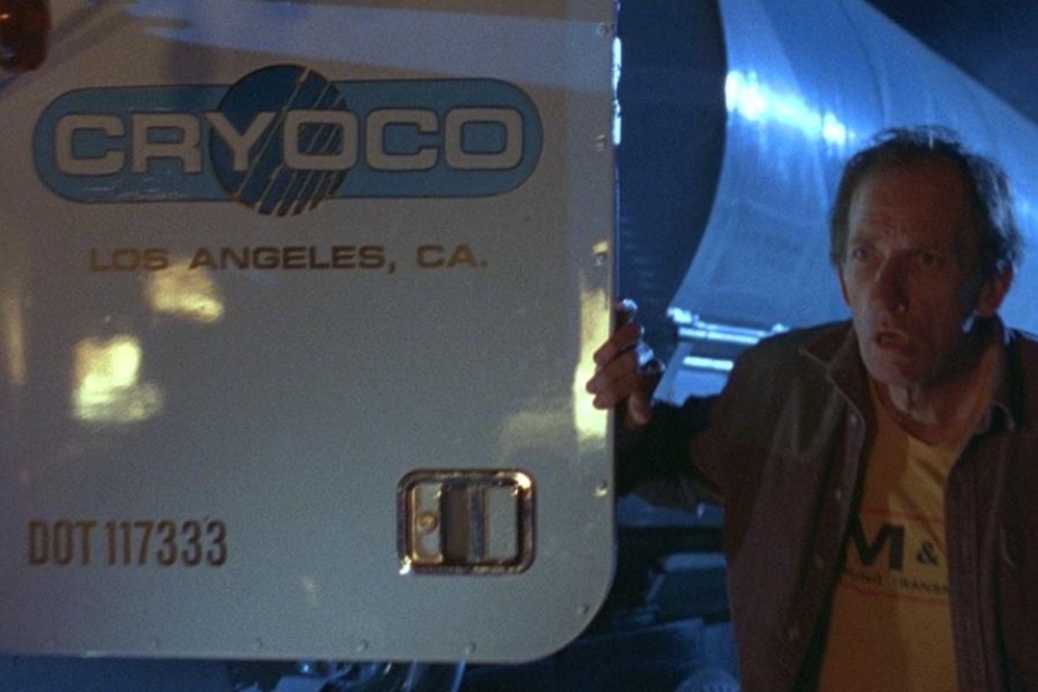
Figure 2.1 When the Cryoco truck driver exits the vehicle to view the helicopter wreck, we see the company logo and location on the door.
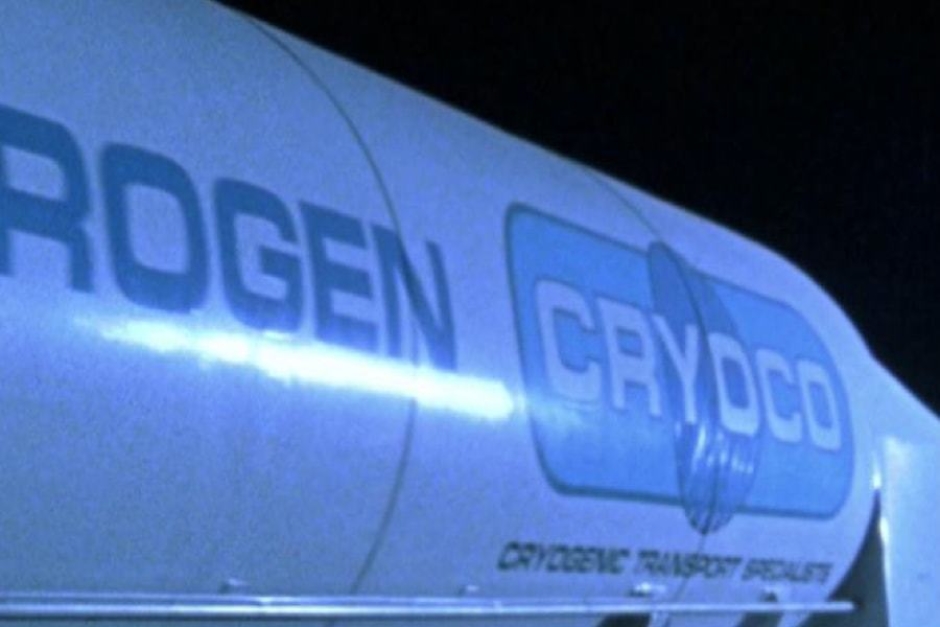
Figure 2.2 The tagline, “Cryogenic Transport Specialists” is legible on the tanker trailer as the T-1000 drives off in the Cryoco truck.
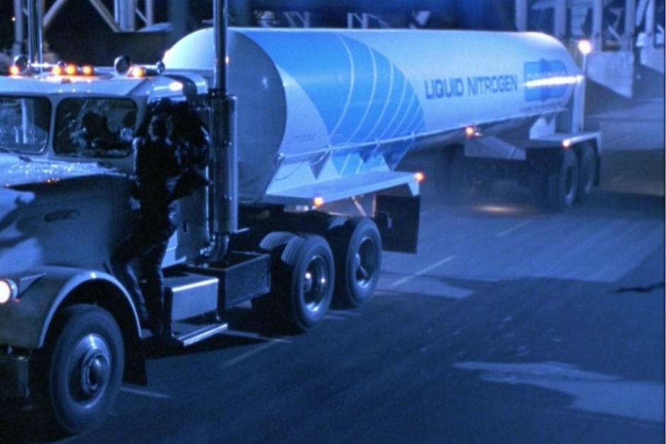
Figure 2.3 The forward end of the tanker trailer is wrapped by a large blue stripe, that is broken into gradated lines.
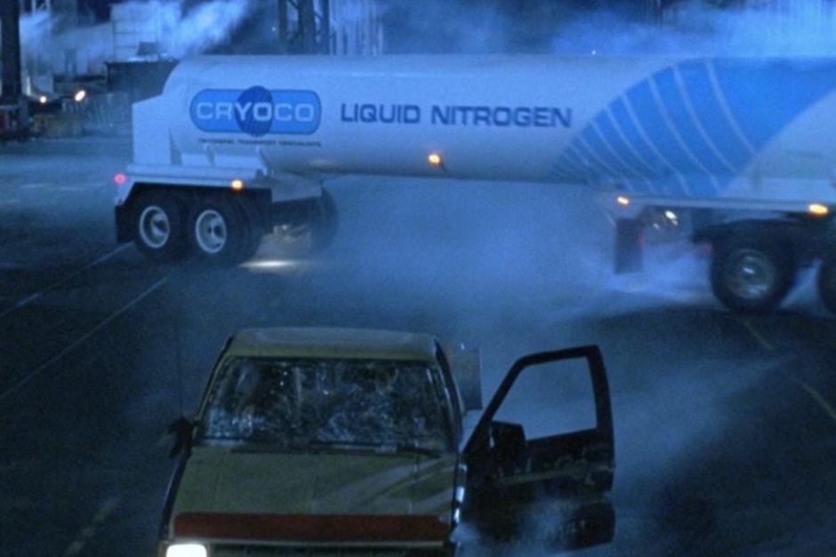
Figure 2.4 When the Cryoco truck slides sideways, just before it rolls onto its side, we are offered our best look at the trailer graphics.
Analysis: The Cryoco Visual Identity
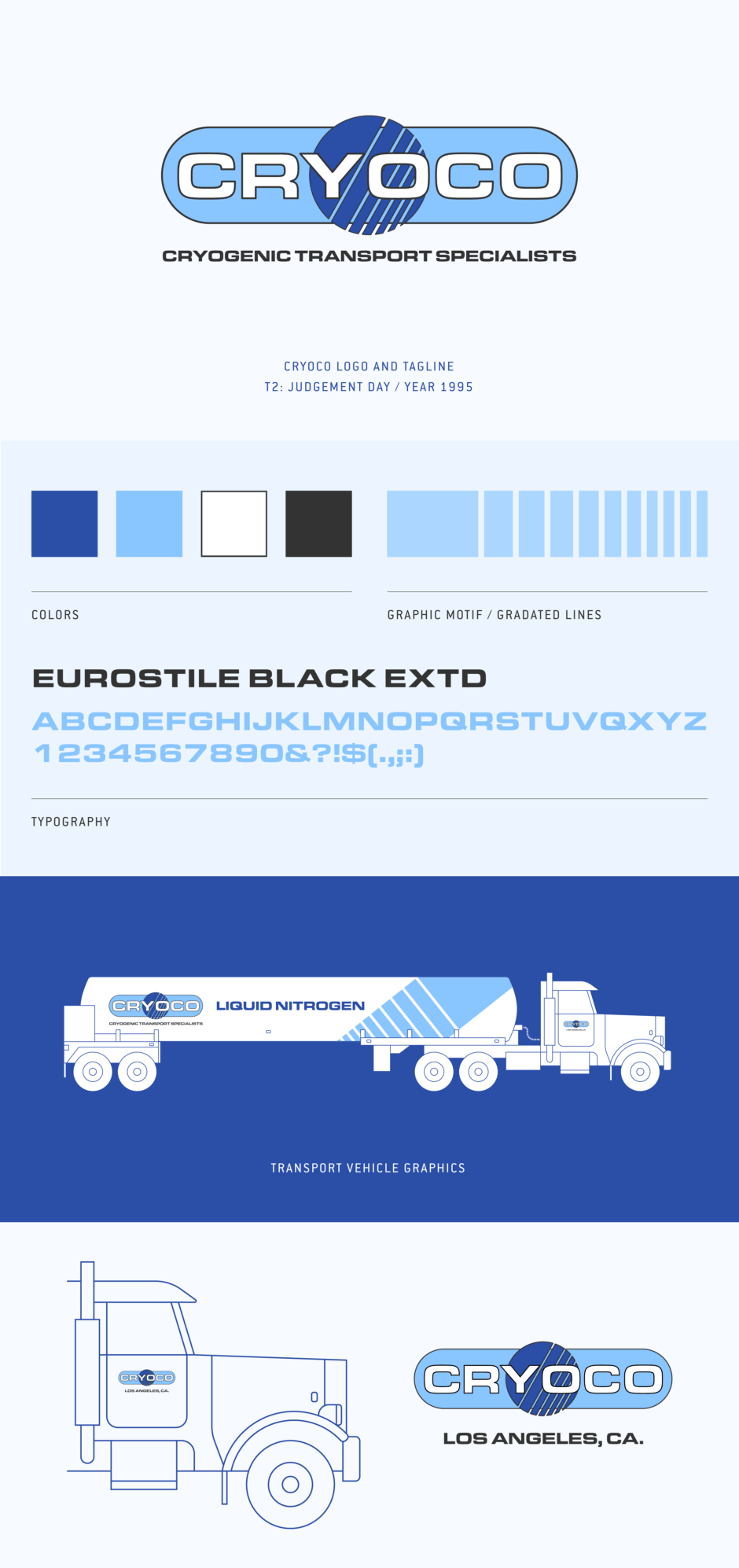
Cryoco’s visual identity as we see it in T2, consists of a logo and vehicle graphics. The logo is comprised of three basic elements that are stacked on top of each other — a white wordmark, over a blue circle symbol, over a light blue capsule shape. While the symbol breaks the edges of the capsule shape a bit, the all caps wordmark is contained within it. That treatment minus the symbol, along with the name Cryoco, strongly suggests a play on the identity for the real-world oil company Conoco (Figure 3.1).
The wordmark, like the tagline and other text that appears on the vehicle, is typeset using Eurostile Black Extended, which is probably the most popular typeface in sci-fi.
The symbol is a blue circle, broken into gradated lines, which was a popular treatment in 1980s logo design. In the context of this mark and its representation of a cryogenic chemical transporter, it is likely meant to imply a change in temperature or physical state. Gradients of all kinds are easy to find in the chemical industry (Figure 3.2) Regarding the circle, it could represent a basic element, like a liquid or gas molecule.
The capsule shape behind the wordmark and symbol is without a doubt, based on the shape of a tank that hauls liquids or gases, as it was in the Conoco logo.
All of the elements receive a black outline, probably for increased legibility. The use of cold blue and white colors makes sense for a company that hauls cryogenics, and is also common in the chemical industry. Along similar lines, cryonics companies tend to use the color blue in their visual identities, with some even employing blue circles in their marks. I would like to think these real-world businesses that are peddling what amounts to science fiction, were inspired by T2’s fictional Cryoco mark.
The Cryoco logo is applied to the doors of the truck, and on the sides of the tanker trailer. On the truck doors, we see it paired with all caps type calling out Los Angeles as Cryoco’s base of operations. On the trailer, it is paired with a tagline, that reads “Cryogenic Transport Specialists” in all caps. The liquid nitrogen contents of the tanker trailer are clearly labeled in large type as well.
The forward end of the tanker trailer features large, light blue stripe graphics made up of gradated lines — a graphic motif established in the logo’s circular symbol — that angle up each of the tank’s sides. As noted previously when covering the symbol, this sort of graphic treatment was popular in the 1980s, especially in the tech industry (Figure 3.4).
Altogether, the visual identity is believable and realistic, and the company name and vehicle graphics are clear about what is in the tanker, which is necessary for the film’s audience to understand what is happening when it spills and freezes the T-1000. And in some part thanks to cryonics, a lot of people would associate “liquid nitrogen” and “cryogenic” with freezing bodies and other things… so not a big jump to believe it would work on a liquid metal Terminator that happens to find itself covered in the stuff.
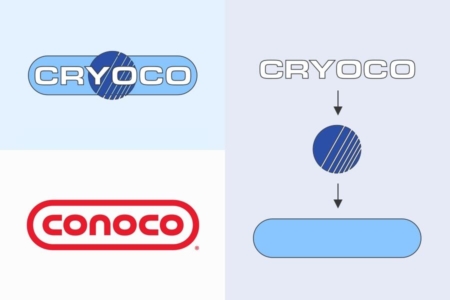
Figure 3.1 The Cryoco logo is comprised of three basic elements that are stacked. The name and logo take inspiration from the real-world Conoco.
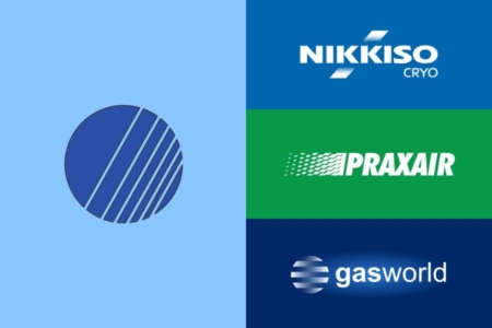
Figure 3.2 The circle symbol in Cryoco’s logo is broken into gradated lines. Gradient treatments are easy to find in real-world logos from the cryogenic chemical industry.
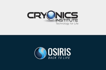
Figure 3.3 Like the fictional Cryoco, cryonics companies bordering on science fiction have decided a blue circle is the way to go in their logos.
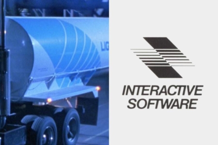
Figure 3.4 Lines dicing up shapes were popular in 1980s graphic design, especially in technology industries.