Tech Noir
Entertainment, Nightclub
Year 1984
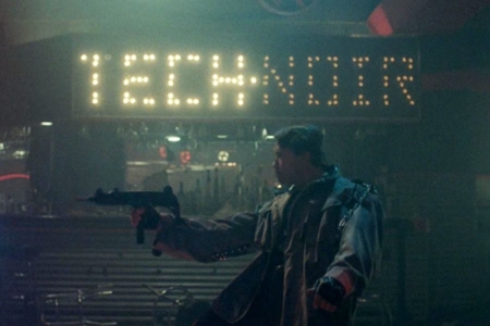
Tech Noir is a nightclub located on Pico Boulevard in the city of Los Angeles. On the night of May 12, 1984, it became the site of a shooting, as a Terminator sent from the future attempted to kill Sarah Connor, killing and injuring a number of other patrons in the process. This cyborg assassin almost succeeded in its mission, but was thwarted when fellow time traveller Kyle Reese intervened to save Sarah Connor’s life.
Overview: Tech Noir Identity
Usage: Wordmarks as Signage
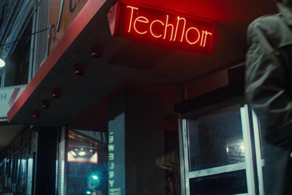
Figure 1.1 As Kyle Reese walks by the club Sarah Connor ducked into to call the police, we see its name — Tech Noir — in red neon above the door.
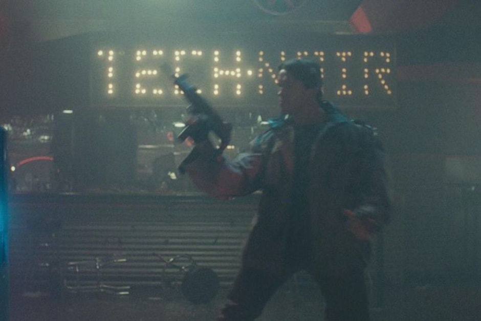
Figure 1.2 A good view of the Tech Noir light bulb signage can be seen above the bar, as the Terminator shoots at a fleeing Sarah Connor.
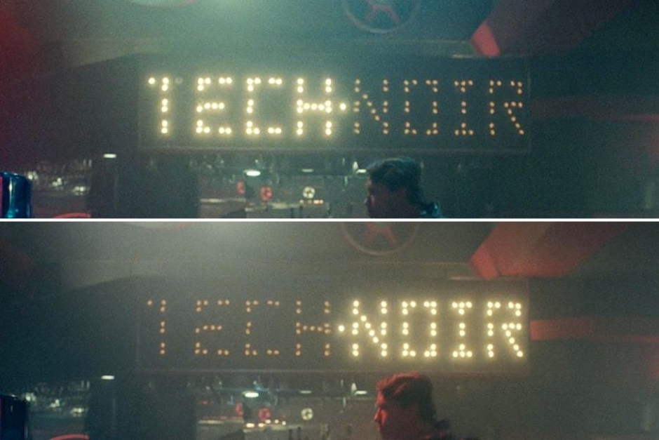
Figure 1.3 The interior signage flashes, alternating between the words TECH and NOIR, with a constantly lit bulb acting as a middle dot.
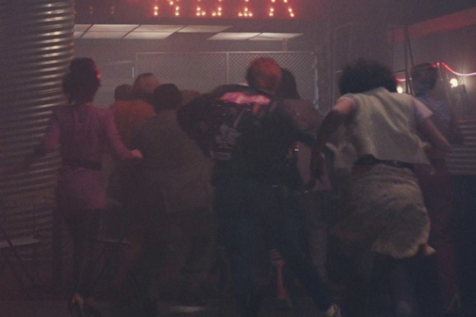
Figure 1.3 The Version B interior light bulb signage also appears near the exit, and is partially visible above as patrons flee the carnage.
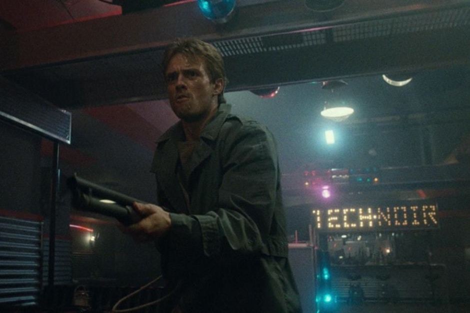
Figure 1.4 Another clear view of the Version B signage is seen when Kyle Reese blasts the Terminator out the front window in a hail of gunfire.
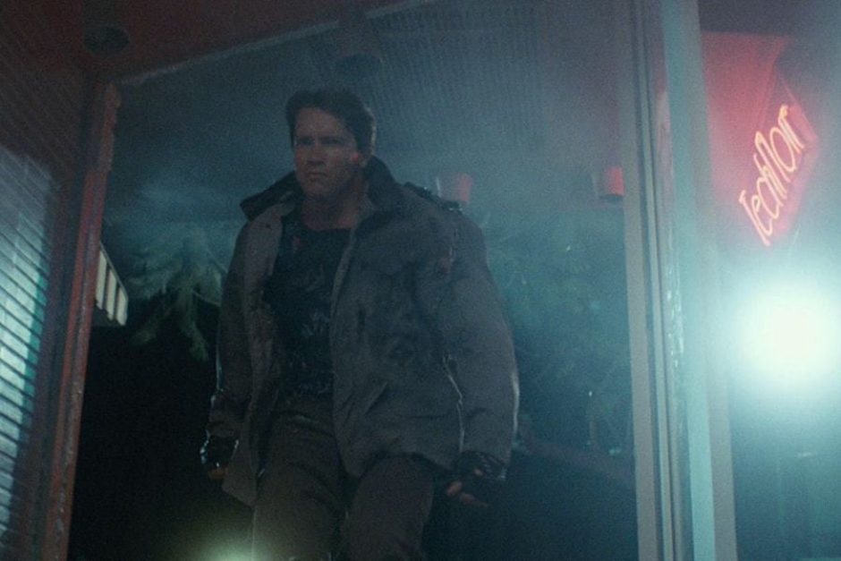
Figure 1.5 After the Terminator recovers from falling through the club’s plate glass window, we see the Tech Noir neon again on the upper right.
Analysis: The Tech Noir Name and Wordmark Design
The dimly lit and neon adorned nightclub where Sarah Connor comes face-to-face with the future, was originally named Stoker’s in the script, but was later changed by director James Cameron to Tech Noir — a term he coined for films like The Terminator, that blend the genres of science fiction and noir. Perhaps the best known example is Blade Runner, which is an explicit homage to classic film noir, and the atmosphere and neon decor of the Tech Noir club echoes the world we see in that 1982 film. This look is also tied up with what is considered cyberpunk, which was a sci-fi genre taking hold at the time, helped along significantly by William Gibson’s 1984 debut novel Neuromancer — released the same year as The Terminator.
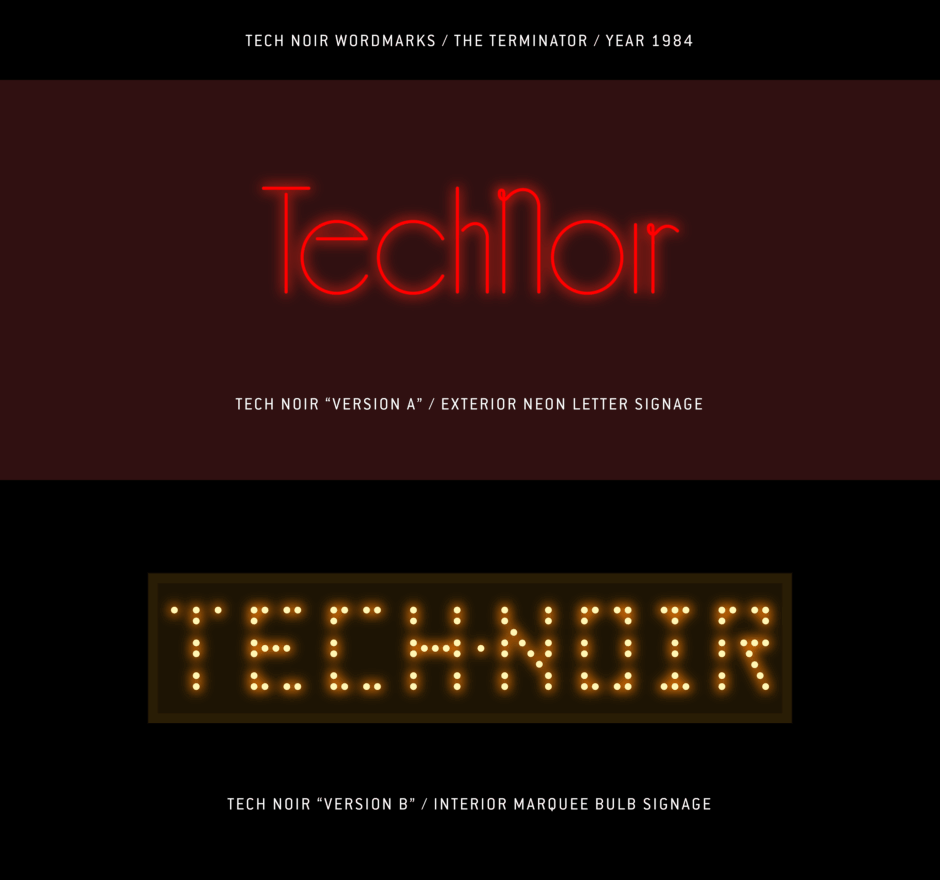
The name of the Tech Noir nightclub appears in several instances as illuminated signage, using two different typographic solutions that are heavily influenced by their production methods.
The first, what I’m referring to as Version A, is what we see in red neon above the entrance to the club, hanging under the awning on the exterior of the building. Here, Tech Noir is set in title case, using what is likely custom type, that looks to be influenced by 1940s typography (Figure 2.2) — when many of the classic noir films were made. Examples are plentiful from that era, of hairline or thin type with Art Deco styling, that places the contrasting geometry of condensed letterforms alongside the wide, near perfect circles of round letterforms, like we see in the Tech Noir wordmark. The style lends itself well to construction with neon tubes, with a few flourishes on the “N” and “r” resulting from tighter bends. In addition to its typographic styling, neon was also popular in the 40s and 50s, and can be found lighting up the night in black and white noir films from the time (Figure 2.3).
The second instance of the Tech Noir name, what I call Version B, is seen in the interior of the club in at least two places — above the bar and near the front exit, above the dance floor. Here, the name is rendered as a marquee bulb sign (Figure 2.4), with the uppercase TECH and NOIR alternating as each side flashes on and off. The style has diverged radically from what we saw in the exterior neon. Where the exterior type was more noir, this is more tech, with the angular geometry and pixel-like bulbs of the letterforms calling to mind what you’d see used on an electronic readout (Figures 2.5 and 2.6).
But the fact that it is built like a vintage exterior marquee sign, still ties it to a noir film look and feel — for example, you can find marquee bulb-styled type used in film titles, like that of Night and the City (Figure 2.6). Like the neon, it has its feet in both worlds, both sci-fi and noir, where the past meets the future.
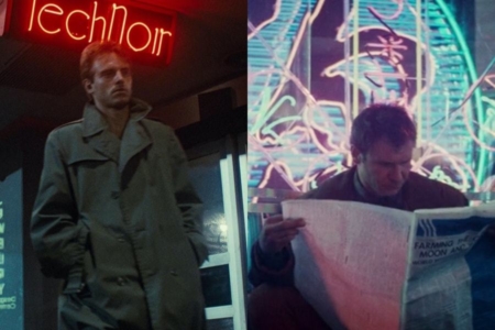
Figure 2.1 Director James Cameron named the nightclub Tech Noir (left), as an homage to films like Blade Runner (right), that blend sci-fi and noir in a number of ways.
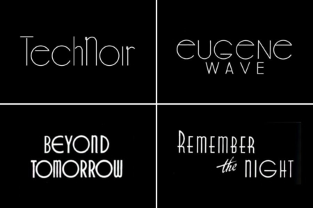
Figure 2.2 Version A of the Tech Noir wordmark, alongside similarly styled lettering from the 1940s. Source: Custom Lettering of the 40s & 50s
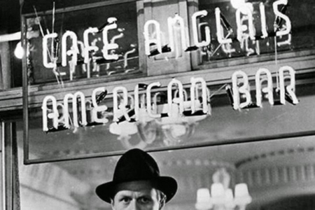
Figure 2.3 Neon letter bar signage as seen in a still from the 1950 classic noir film, Night and the City. Source: Toronto Film Noir Syndicate
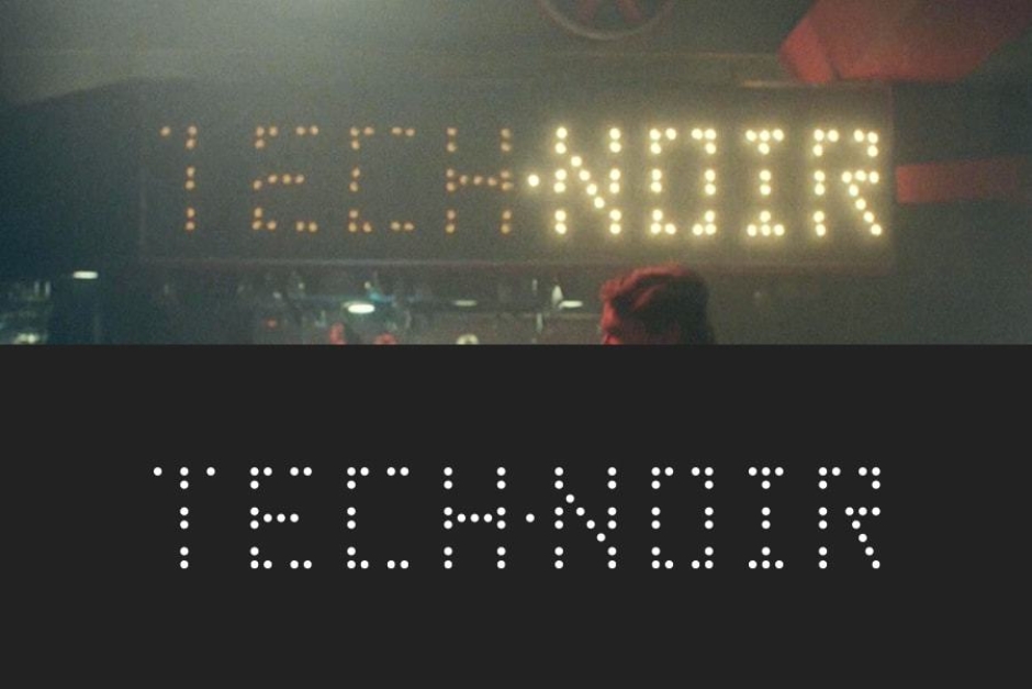
Figure 2.4 The interior Tech Noir signage is built from flashing bulbs roughly placed on a grid, with a few burned out.
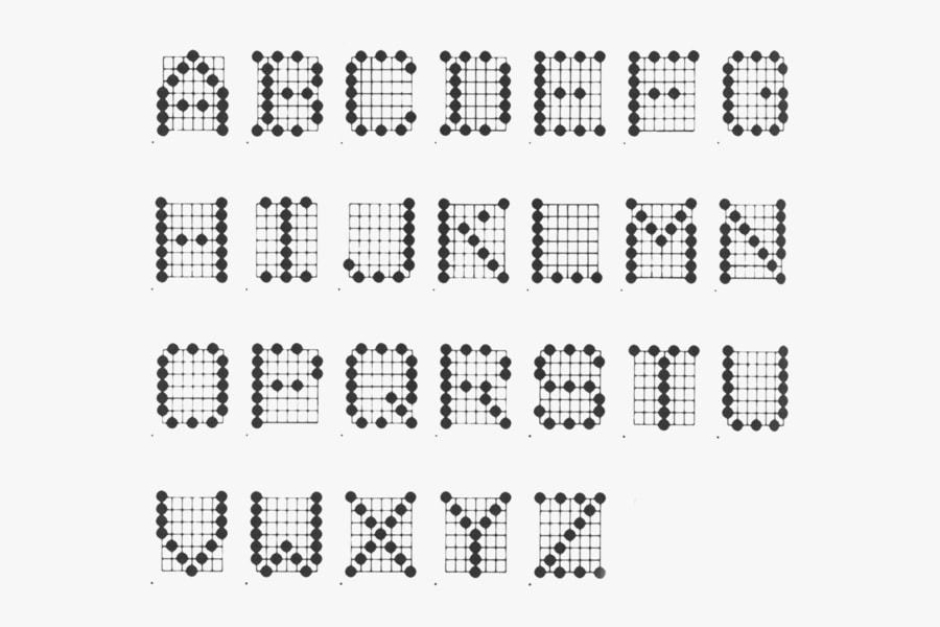
Figure 2.5 A set of 7x7 dot matrix characters from the 1980s, created by Centronics Data Computer. Source: High Tech Trademarks Vol 1.
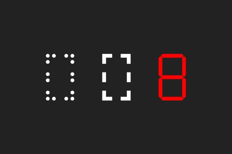
Figure 2.6 The characters feature horizontal and vertical breaks, that give the lettering a segmented appearance — like a dot matrix display imitating something like a 7-segment electronic display.
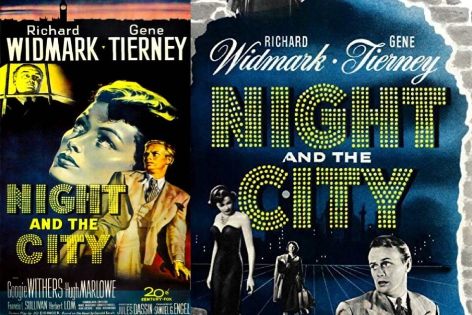
Figure 2.7 A good example of type styled in the fashion of a marquee bulb sign, can be found on these posters for the 1950 noir film Night and the City. The Tech Noir signage is definitely a nod to the genre. Source: IMDb
Analysis: Interior Design
While a wordmark (in this case two of them), sits front and center as the visual identity for Tech Noir, it is worth noting elements and motifs from the club’s interior design, as these play a supporting role and establish a kind of informal identity system. The design choices are not without thought and purpose, and they communicate some interesting things to the film’s audience.
A closer look at the scenes reveal industrial metal furniture made of steel grates, diamond plate and corrugated metal wainscoting, and walls adorned with red accents and metal pulleys (Figure 3.1). What really catches the eye though, as it relates to the exterior signage, is the red neon adorning the walls and the light it casts (Figure 3.1 and 3.2). It’s definitely a strong part of the identity.
Take a closer look at that neon (Figure 3.3), and we can see that they are simulating arcs of electricity passing between transformers that are mounted to the wall.
Going back to neon’s popularity in the 40s and 50s, noted in the previous section, it’s interesting to consider how and why it got used beyond signage, which we already covered. In architectural applications, it owed a good part of its popularity to the Streamline Moderne style of the 30s (Figures 3.4 and 3.5), where it was used as an accent on buildings. That design movement ”stripped Art Deco design of its ornament in favor of the aerodynamic pure-line concept of motion and speed developed from scientific thinking .” Interesting to consider in the context of The Terminator, and what all the fancy science and machines got us in the future.
Beyond looking at home in a 1980s club and triggering nostalgia for even earlier eras, the interior neon and lighting of the club also echoes the film’s future. There’s a connection to be drawn between the neon arcs of electricity in the club and the neon beams of lasers we see fired by Hunter-Killer machines in the year 2029 (Figures 3.6 and 3.7). Also note the abundance of red and blue emergency strobes in the club. And then take a look at the aerial and ground Hunter-Killers, and you’ll find that they feature red and blue lights as well (Figures 3.8 and 3.9). All of this creates an atmosphere on that future battlefield that is similar to what we find in Tech Noir. So in a way, this is a visual identity that foreshadows the arrival of killer machines and a dark future for humanity, which makes it very sci-fi and all the more worthy of its place here in the Speculative Identities Research.
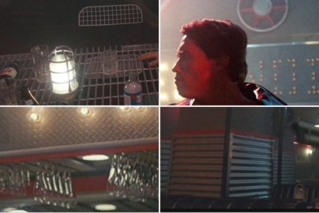
Figure 3.1 The club’s interior is decked out in industrial fixtures and materials like corrugated metal and diamond plate steel.
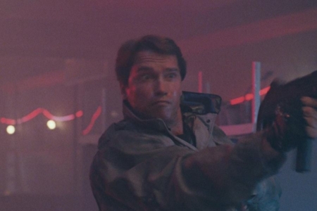
Figure 3.2 Ringing the perimeter of the club, are arcs of red neon lighting mounted on the walls.
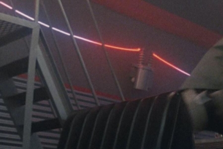
Figure 3.3 A closer look reveals that the neon arcs bridge between power transformers, like you’d find on a utility pole.
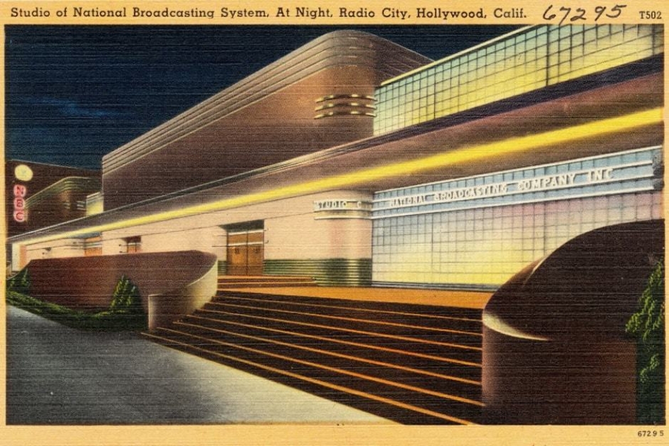
Figure 3.4 An example of Streamline Moderne architecture from the 1930s, which often featured neon lighting. Source: Wikipedia
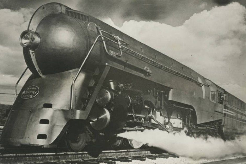
Figure 3.5 Streamline Moderne took its inspiration from advances in science and aerodynamics, which in turn influenced industrial design. Source: Wikipedia
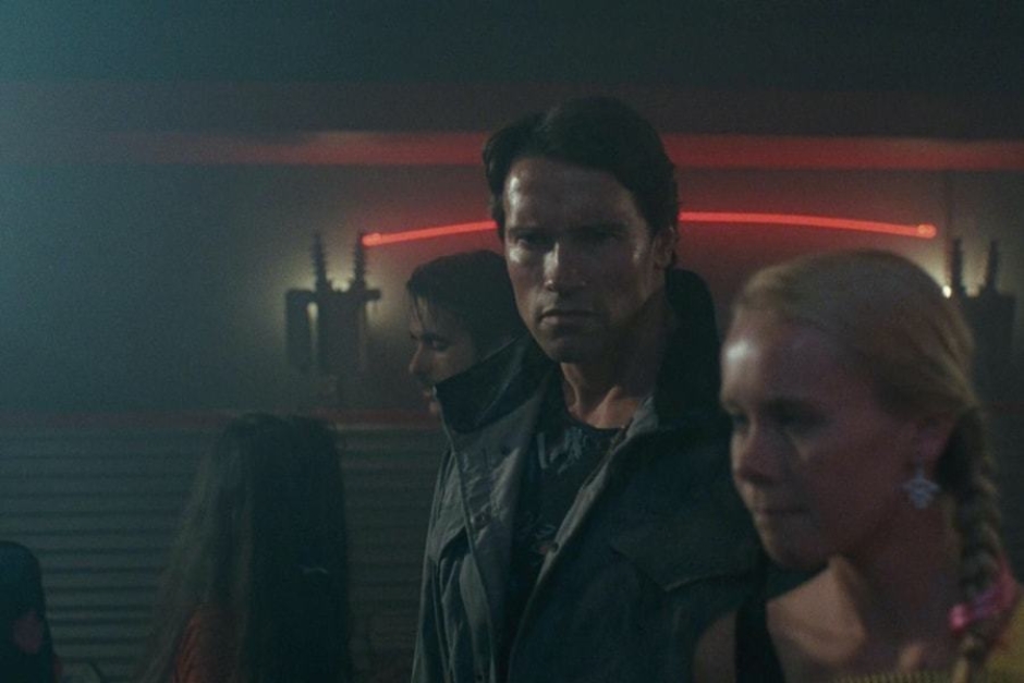
Figure 3.6 An arc of red neon light can be seen behind the Terminator, like a bolt of electricity coursing through the head of Frankenstein’s monster.
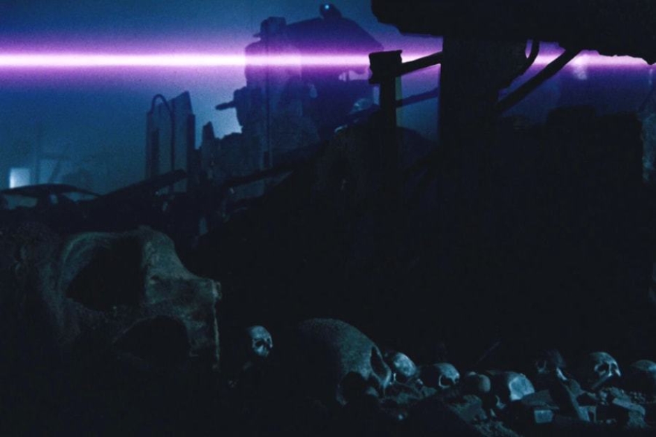
Figure 3.7 In the year 2029, we see H-Ks firing lasers at humans — a visual that ties the future war to Sarah Connor’s predicament in Tech Noir.
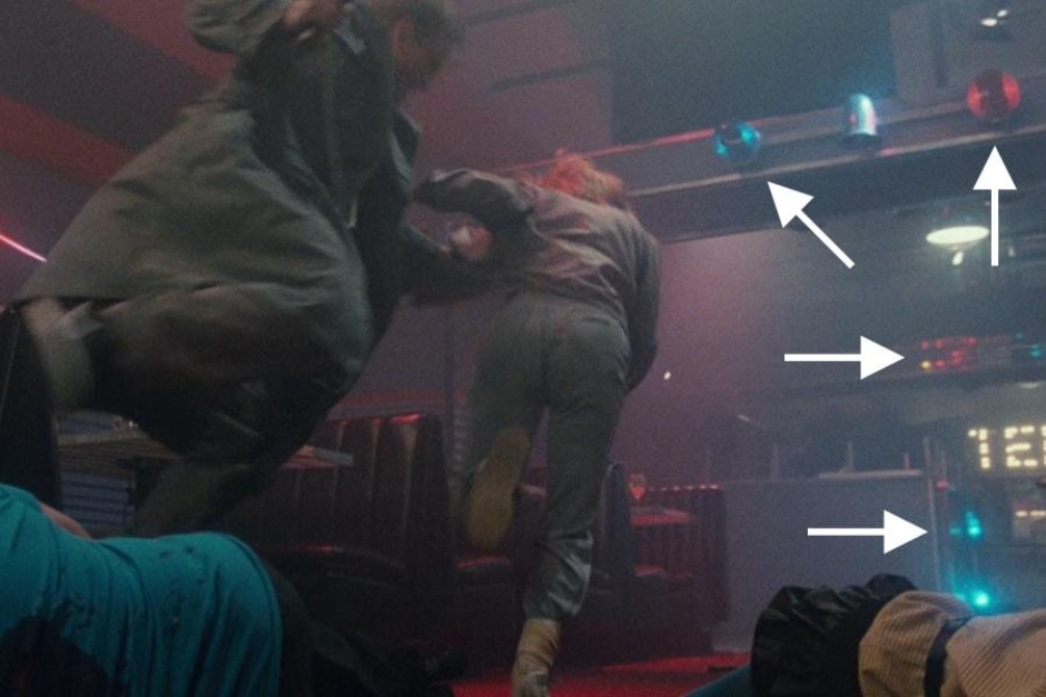
Figure 3.8 In many of the shots within Tech Noir, we see red and blue emergency strobes mounted to the walls.
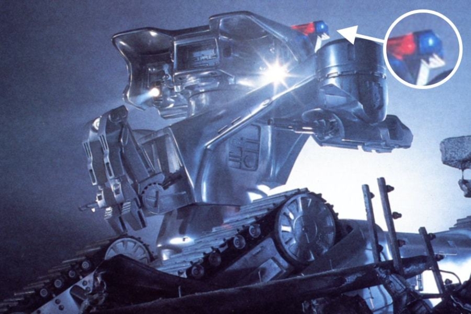
Figure 3.9 The H-Ks in the future all feature red and blue strobes, creating a battlefield atmosphere similar to what is experienced in Tech Noir.