Esper
Computer Technology, Law Enforcement
Year 2019
The Esper is a high-density computer with a very powerful three-dimensional resolution capacity and a cryogenic cooling system. The police cars and Deckard's apartment contain small models which can be channeled into the mainframe at police headquarters. Among many functions, the Esper can analyze and enhance photos, enabling investigators to search a room without being there.
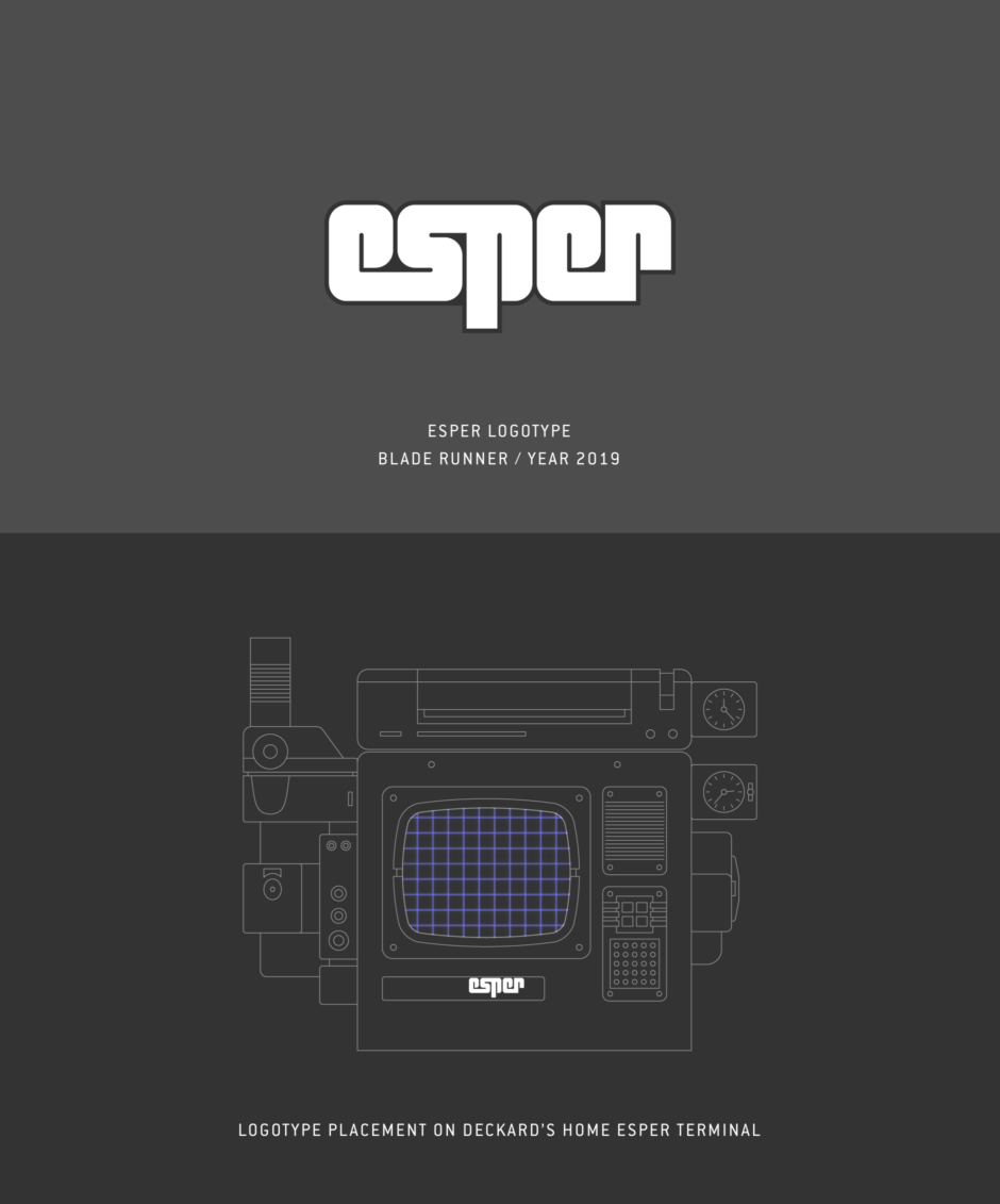
Overview: Esper Logotype
Intro and Usage
The Esper is a super computer used by the police in Blade Runner. It is briefly described in the official Blade Runner Souvenir Magazine, but a 1982 presskit for the film provides the most detail:
“A high-density computer with a very powerful three-dimensional resolution capacity and a cryogenic cooling system. The police cars and Deckard's apartment contain small models which can be channeled into the large one at police headquarters. This big apparatus is a well-worn, retro-fitted part of the furniture. Among many functions, the Esper can analyze and enlarge photos, enabling investigators to search a room without being there. Bryant briefs Deckard with the help of an Esper and Deckard examines Leon's photos with one as well.”
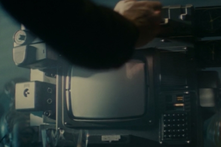
So we actually see an Esper in multiple scenes (Figures 1.1 and 1.2) before we see one with a logo on it, in Deckard’s apartment when he analyzes Leon’s photos (Figure 1.3). There, the Esper logotype can be seen as an emblem attached to the machine, just below its main monitor screen.
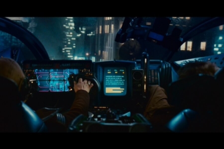
Figure 1.1 Police Spinners have small Esper computer terminals in them.
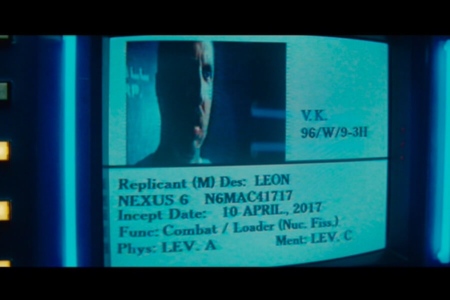
Figure 1.2 At the police headquarters, when Captain Bryant briefs Deckard on the Replicants, they are looking at the Esper computer.
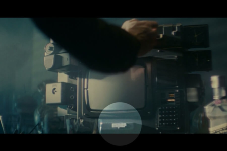
Figure 1.3 As Deckard inserts the photo into his home Esper terminal, the Esper logotype is seen below the monitor (highlighted).
Original Artwork
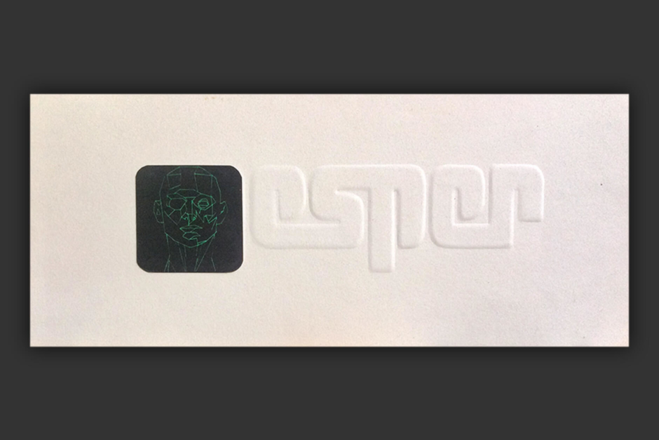
Figure 2.1 The original presentation of the Esper logo by Tom Southwell, as it was shown to Blade Runner’s director, Sir Ridley Scott, and Lawrence G Paull, the production designer. Ridley Scott told Southwell, “Lose the head and that’s fine.” Photo courtesy of Tom Southwell.
Analysis: The Esper Logotype Design
The Esper logotype was designed by Blade Runner production illustrator, Tom Southwell, who has shared insights and process images for inclusion in this analysis.
As we could see in the original artwork (Figures 2.1 and 3.2), the logo was initially designed and presented by Southwell as a paired symbol and wordmark. In Figure 3.1, an original pencil sketch roughs out the elements and their lockup, along with a few notes. One note calls for a black rectangle with thin, green-line face — the thinking was, there would be a “green neon line head that talks to Deck from within his ESPER machine.” The other calls for the logotype to be blind embossed, with a side profile sketched below to illustrate the arched surface of the lettering. Regarding the blind embossment, Southwell said he liked the clean look it presented, and that he was also designing for the logo to appear as a raised metal plate on the prop, which would be made by an engraver.
Ultimately, the presented mark did not make it into the film intact. The Esper lost the talking head function due to a lack of special effects funds, and Director Ridley Scott said “lose the head” in the logo. The logotype though, made it through unscathed (Figure 3.3).
The logotype was hand lettered in all lowercase, which allowed its letterforms to continuously flow from one to the next and curl in on themselves. Southwell points to the Graphis Poster Annual logotype that was used by the publication in the 1970s (Figure 3.4), as his inspiration for the futuristic typographic solution. The result, with its snaking turns and maze-like appearance, may remind you of the way Deckard moves through the Replicant’s room after he plugs Leon’s photo into the Esper computer — tracking to the side, moving around corners, centering and zooming forward (Figure 3.5).
For me, the curling and connecting type, and how tightly all the letters are bound together, calls to mind wrinkles in the human brain. This is an interesting conceptual connection, with the Esper being a super computer. I am reminded of a late 1970s pharmaceutical ad by Argentinian graphic designer Eduardo A. Cánovas, for Tonibral, which was used to treat neuropsychological conditions (Figure 3.6). In that ad, Cánovas created type that was similarly styled, that was mirroring what he had done in the ad's stylized brain illustration.
I also found similar treatments in logos featuring the human brain. For example, we can look at how the Esper logotype compares to a 1980s logo for the Fidea Research Foundation (Figure 3.7), which did medical research in neuroscience fields. The Esper logotype would fit right in, within that head full of noodles.
After running this by Tom Southwell, he pointed to the fact that with his blind embossment, the surface of the curling letters were arched, adding texture to the brain-like effect. He agreed it was an interesting interpretation, and drew an additional line between the brain and the name Esper, highlighting its connection to extrasensory perception — also known as ESP. As described on Wikipedia, ESP involves the “reception of information not gained through the recognized physical senses, but sensed with the mind.” That certainly sounds a lot like the powers the Esper computer seems to exhibit, as it enables Deckard to navigate a room from information in a mere photo, as he sits in his apartment.
Southwell also clued me in to a fun fact I was unaware of — the “esp” from his Blade Runner logo has found use in another place, with ties to Philip K Dick. A slightly modified derivative is used to represent Electric Shepherd Productions (Figure 3.8), which is a production company that belongs to PKD’s daughter, Isa Dick Hackett. It appears after the credits, at the end of TV shows she has produced, like Amazon’s The Man in the High Castle and Philip K. Dick's Electric Dreams.
In addition to the brain and mind, my research also found that the Esper logotype has ties to real-world computer technology marks, contemporary to the film's production. Starting in the early 1980s, there looks to have been a trend in this direction, using similar type treatments (Figure 3.9). Of course, the Esper design predated it a bit. In a way, it was predicting these kinds of tech industry marks in the near future.
Taken together, the maze, brain and computer connections are a perfect combo for representing the Esper. Hats off to Southwell for a design that may seem like a simple and futuristic logotype at first, that offers so much conceptual substance once a person really starts thinking about it.
Much thanks to Tom Southwell for answering my questions, and sharing photos and first-hand info regarding his visual identity design for the Esper. You can learn more about him and his work, in the bio section near the bottom of this research entry.
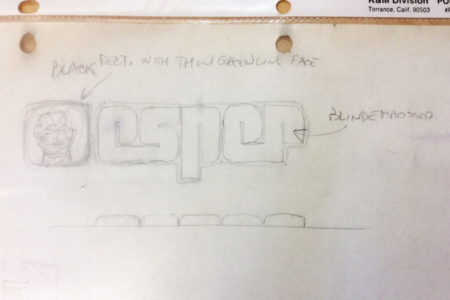
Figure 3.1 Tom Southwell’s original pencil sketch for the Esper logo. It includes notes for the “greenline face” and blind embossed logotype, with the arched embossment also drawn below in side profile. Photo by Tom Southwell
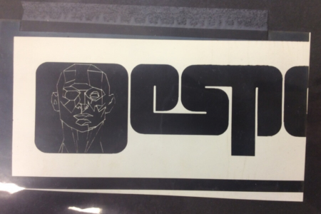
Figure 3.2 A clipping of the Esper logo as it was presented, in black and white. Photo by Tom Southwell

Figure 3.3 A vector approximation of the final Esper logotype, that was used in the Blade Runner on Deckard's computer.
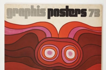
Figure 3.4 A look at the 1970s Graphis Poster Annual logotype. Southwell got the inspiration for his typographic solution from the 1978 issue. Source: Photo by Julian Montague via Instagram
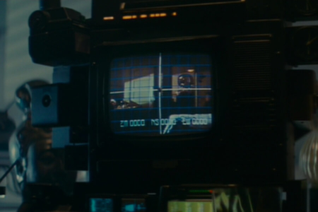
Figure 3.5 The Esper allows Deckard to move around the room in Leon’s photo, using voice commands to navigate.
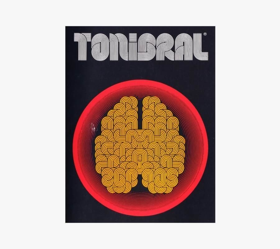
Figure 3.6 A late 1970s pharmaceutical ad for Tonibral, which features a stylized brain and typographic treatment to match. Source: i09 / Gizmodo
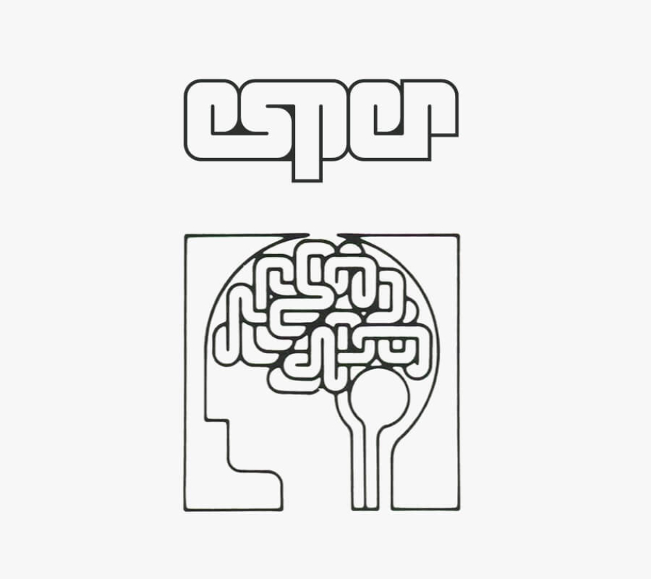
Figure 3.7 The Esper logotype compared to a logo from the 1980s that depicts the human brain in a similar fashion, for the Fidia Research Foundation. Source: High Tech Trademarks Vol. 2

Figure 3.8 A derivative of Southwell’s Esper logo — the ESP logo used for television productions by Isa Dick Hackett, who is PKD’s daughter. Source: The Man in the High Castle, Amazon Prime TV Series

Figure 3.9 The Esper logotype stacked up with real-world computer technology logotypes from the early- to mid-1980s. Source: High Tech Trademarks Vol. 1 and 2
The Esper Head Repurposed
There’s an interesting side note, regarding the fate of the green-line head that was removed from the original Esper logo design (Figure 4.1). After it was discarded, Southwell repurposed it on a magazine cover that was to appear on a prop in a street vendor’s stall. One of several they created for the film, the fictional magazine was called MONI — a play on OMNI magazine — and featured futuristic articles penned by L G Paull (BR production designer), M Deeley (BR producer), and R Scott (BR Director).
The head was redrawn with thicker lines and recolored white and yellow, appearing large over a background grid (Figure 4.2).
That said, the magazines were not something that made it into the film after the scene with the street vendor was discarded in editing. After two good attempts, the head would not find a home in the world of Blade Runner.
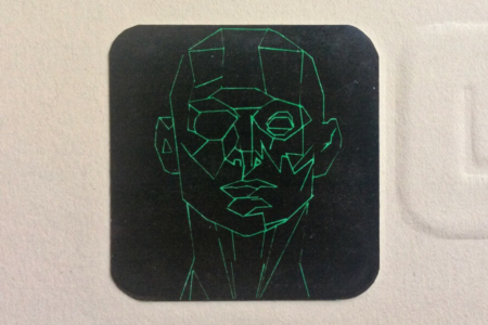
Figure 4.1 A detail shot of the green-line head, from the presented version of the Esper logo. Photo by Tom Southwell
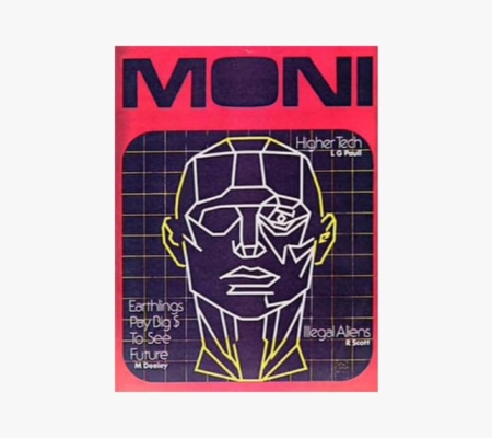
Figure 4.2 The line art head repurposed on a prop magazine cover, after it was dropped from the Esper logo. Source: Signs of the Time

Source: The Craft of Production Design
The Designer: Tom Southwell
Tom Southwell has worked in virtually every position in the cinema art department, where over the course of 46 years he has had a hand in major feature productions such as Blade Runner, The Goonies, City Slickers, I Am Number Four, Arachnophobia, X-Men, Mission Impossible, and The Godfather Part II — just to name a few of the over 150 film projects on his resume.
Of his time as a production illustrator on Blade Runner, he is quoted in Paul M Sammon’s book Future Noir, as follows:
“Many people lost their significant other during this film. Long hours away from home can do that. Many people left the project in a storm of loud shouting. But for me it was the assignment to die for (not over). I was given a huge task and I jumped right in and attacked it with joy and vengeance. This was a juicy project. I could use so much of what I learned at art school. Here I am showing my work to Ridley Scott! Wow! I feel that when you come face to face with real genius, you walk away with your pockets full. We had lots of geniuses on BR, so I took trunks of ideas home every night. So many that not all of them made it into the film. I dip into that trunk still.”
Knowing how lucky he has been to have worked on films like Blade Runner, Southwell is now focusing on teaching, to pass on what he has learned to a new generation of artists and designers. You can learn more about his career and where he is taking things, in the 2018 film The Craft of Production Design, which is a great five minute short documentary created by former students of Southwell.
To learn more, visit:
The Craft of Production Design (2018 film) on Vimeo
Tom Southwell’s Filmography on IMDb
View more identities designed by Tom Southwell