
Metrokab
Passenger Transport, Taxi Service, Vehicle
Year 2019
Metrokab is a taxi service found on the future streets of Los Angeles. When you need to escape the rain and the crowds to reach a destination, you don't have to go far to find one of their ubiquitous yellow passenger vans.
Overview: Metrokab Identity
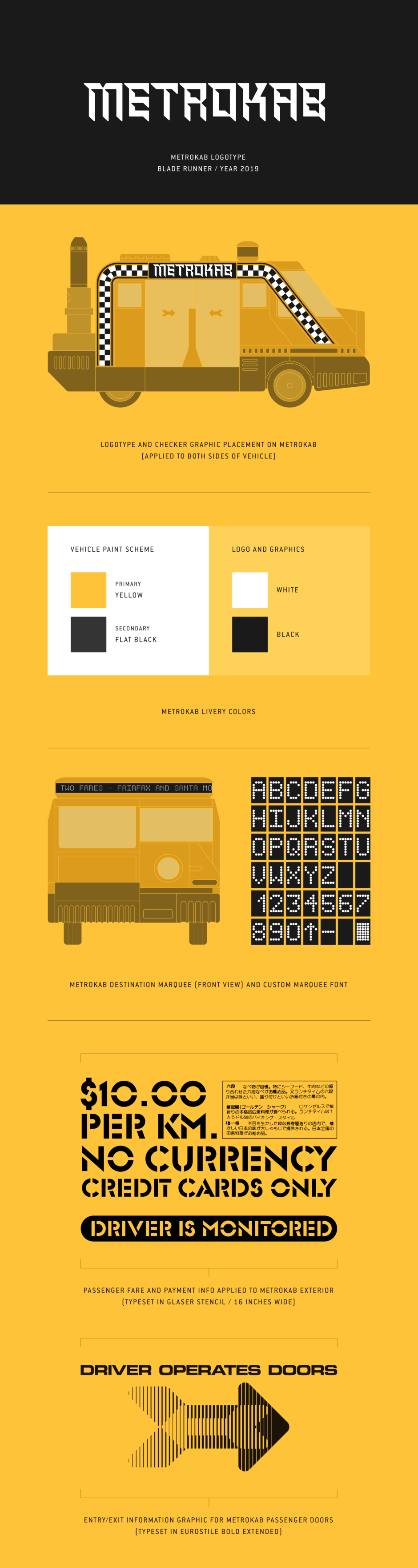
Note: The logotype and other elements of the Metrokab visual identity recreated here, are based on original renderings provided by Tom Southwell.
Intro: Metrokab
In the year 2019, on the crowded and debris-strewn streets of future downtown Los Angeles, we find the Metrokab taxi service conveying passengers from one destination to the next. In contrast to the sloping, low profile form of newer vehicles, and even the older retrofitted sedans, the Metrokab stands out as a box on wheels. The passengers ride in a cab, behind a narrow driver’s compartment, entering and exiting via sliding doors — a solution that makes a lot of sense in the context of Blade Runner’s cram packed streets.
It is a vehicle built for this city of the future, but not disconnected from the past, as the Metrokab still sports a yellow paint job, with black and white graphics, similar to what you’d expect to find on the old Checker Taxi cabs.
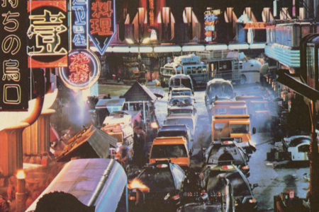
Figure 1.1 The crowded streets of Los Angeles, where the earthbound Metrokab is a common sight. Source: The Blade Runner Souvenir Magazine
Usage: The Metrokab Identity
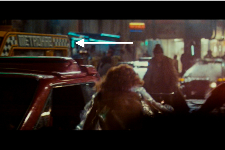
Figure 2.1 In the film, the Metrokabs are most visible in the scene where Deckard is pursuing Zhora through the city streets.
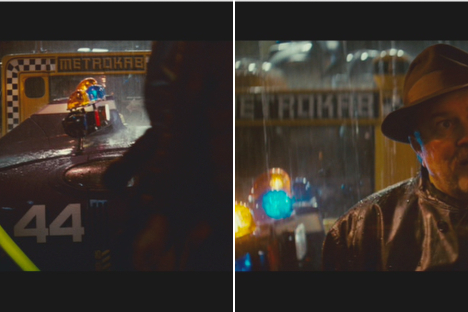
Figure 2.2 Clear views of the Metrokab’s side with logo can be found in the traffic passing behind Bryant, when he meets Deckard on the scene.
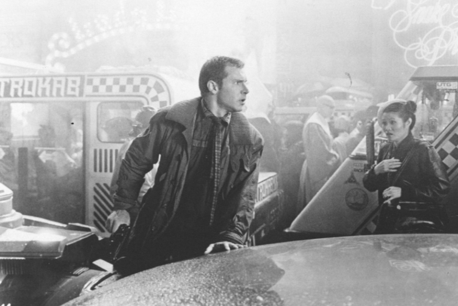
Figure 2.3 Black and white production photo of Deckard in the street with Metrokabs in the background. Source: Future Noir Tumblr
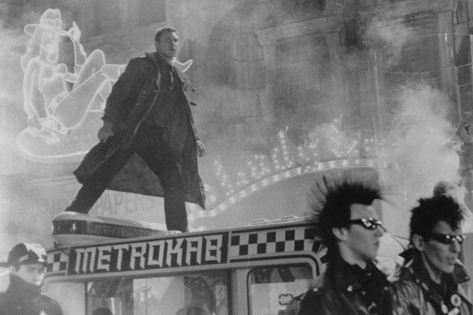
Figure 2.4 Black and white press kit photo of Deckard standing on a Metrokab, with the logo clearly visible. Photo courtesy of Tom Southwell.
Analysis: The Design of the Metrokab Identity
As was the case with all of Blade Runner’s futuristic vehicles, Syd Mead was responsible for the design and illustration of the film’s ubiquitous taxi cab — which aside from checker graphics, had no logo or name when it was handed off (Figures 5.1 and 5.2). That job would end up with Tom Southwell, the film’s production illustrator.
As he describes it, at the outset of Blade Runner’s production, Director Ridley Scott showed the art department just one film he wanted them to be inspired by: METROPOLIS. It was this that lead Southwell to name the taxi service METROKAB, to honor that decision by Scott (Figure 3.1). This also informed his type choice when designing the logo, which is set in something resembling a dimensional chiseled font, with facets obscured by darkness, that really calls to mind the architecture of the Metropolis and its Art Deco influence. (Note: We’ve been unable to identify the font used, so I encourage any reader that recognizes it to reach out with info.)
After refining the cab’s checkers with a stripe (Figure 3.2), Southwell then enlarged the logo for the side of the vehicle, from the small sample he pasted up. The enlargement produced a rough edge on all the letters (Figure 3.3) — something he and Director Ridley Scott liked, that was unfortunately lost in production when the sign shop cut the logo’s lettering by hand for application on the vehicle.
Southwell wasn’t done there though, as the cab’s exterior required a number of additional graphics. Based on what he saw in Syd Mead’s drawings (Figure 5.1), he created a custom font built on a matrix of dots, for the Metrokab’s destination marquee. They’d hoped this would be animated, hence the use of dots, though I don't think the effect made it into the film.
Marking the passenger doors of the vehicle were striped arrow decals, with a written notice that they were operated by the driver. The thick to thin stripe treatment of the arrows call to mind high tech logos from the 1980s, like those for AT&T and Electronic Arts (Figure 3.4), while the written notice was set in a sci-fi staple — Eurostile Bold Extended. Fare and payment info was also noted on the side of the cab, and that was set in Glaser Stencil — a typeface designed by Milton Glaser, that was initially known as Neo-Futura, before it became commercially available through Photo-Lettering in 1969.
It’s interesting to see all of these different design styles come together under the Metrokab identity, and still feel cohesive in the context of their use. I think it echoes what we see in the Metrokab vehicle itself, where some of them appear to have different parts and components. And even more so, in the broader context of the film, it fits in with the retrofitting and cobbling together of different things, old and new, that we see so much of.
As Syd Mead described the aesthetic, “Things are ‘retro fitted’ after the fact of the original manufacture because the old, consumer-based technology wasn’t keeping up with demand. Things have to work on a day-to-day basis and you do whatever is necessary to make it work. So you let go of style and it becomes pure function. The whole visual philosophy of the film is based on this social idea.”
With that in mind, it doesn’t seem so odd to see an Art Deco logo paired with checker graphics, with stenciled lettering and technical looking decals also thrown in the mix.
Along similar lines, when they started filming the street and needed more clutter, Southwell was tasked with quickly designing a few posters. One of these advertised the Metrokab (Figure 3.5) using Syd Mead’s concept art, and as Southwell recalls it, even that was the result of retrofitting: “Don’t tell Syd but… I took stats of the type and with fine red tape attached them directly to Syd’s originals to be photographed. That’s how fast we were going at that point.” I have a feeling Syd would understand. As he said of the film’s visual approach, “you do whatever is necessary to make it work.”
Much thanks to Tom Southwell for answering my questions, and sharing photos and first-hand info regarding his visual identity design for the Metrokab. You can learn more about him and his work, in the bio section near the bottom of this research entry.
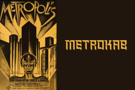
Figure 3.1 Tom Southwell was responsible for the naming and logo design of Blade Runner’s Metrokab, which was inspired by the film Metropolis.
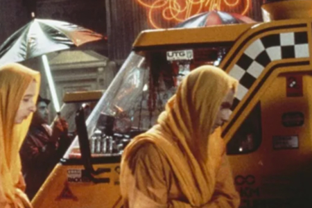
Figure 3.2 A closer look at the checker and stripe graphics that appear on the side of the Metrokab. Source: Blade Runner: A Story of the Future
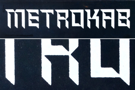
Figure 3.3 Tom Southwell’s original paste up of the Metrokab logo, and a close up of the rough edges that resulted from the photo enlargement. Photo courtesy of Tom Southwell.
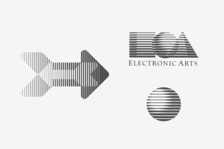
Figure 3.4 The arrows marking the Metrokab’s passenger doors are rendered in a style that became trendy in 1980s tech industry logos.
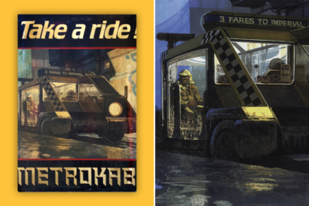
Figure 3.5 One of several prop posters Tom Southwell created to add clutter to street scenes. Poster Image: Courtesy of Tom Southwell. Right Image Source: The Movie Art of Syd Mead: Visual Futurist
Analysis: The Type Treatment

Figure 4.1 Chiseled type like what is pictured here, from the 1938 book New Letters and Lettering, is built on the same dimensional form that Metrokab’s logo is — all we need to do is subtract the shaded facets.
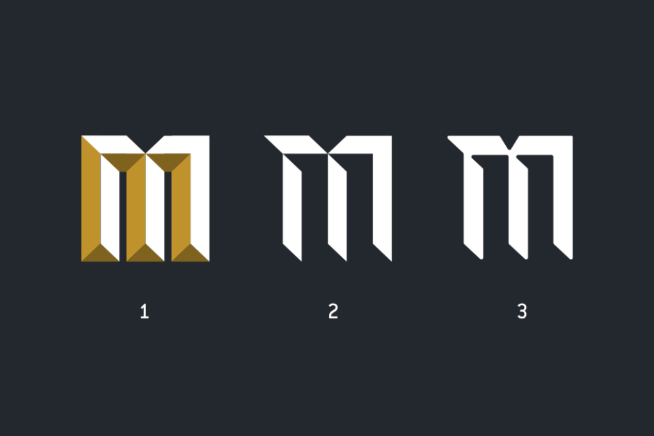
Figure 4.2 Using the letter M, here is an example of how you can achieve the Metrokab logo lettering (3), through modification of chiseled type.
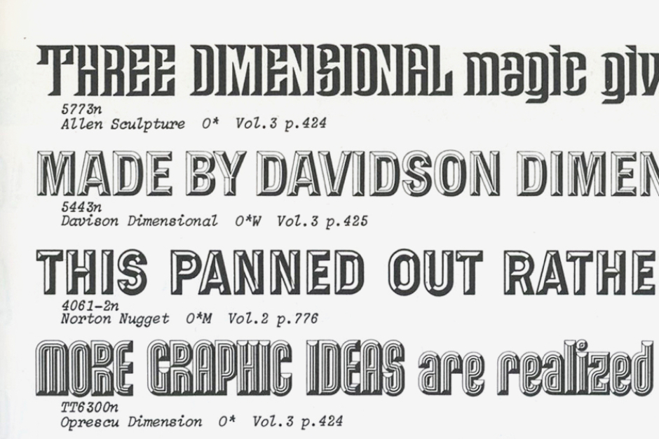
Figure 4.3 Looking at vintage phototype from the 60s, the chiseled Allen Sculpture (top) uses a subtractive treatment similar to what we see in the Metrokab logo. Source: Photo-Lettering’s One Line Manual of Styles
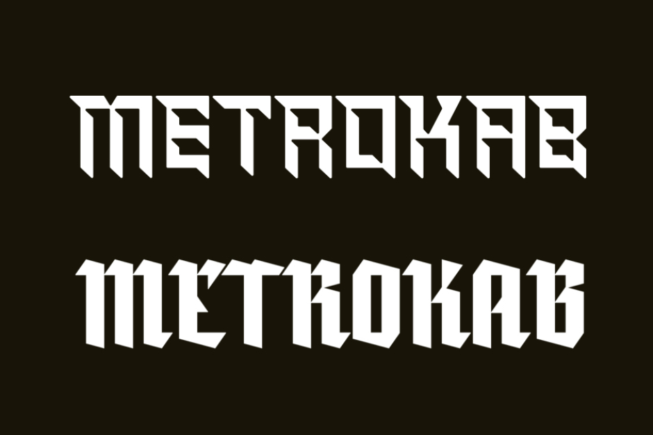
Figure 4.4 The type treatment shares some of the qualities of modern blackletter typefaces, with their sharp, blade-like terminals and serifs. Source: Golovolomka by Alexandr Galuzin, via MyFonts
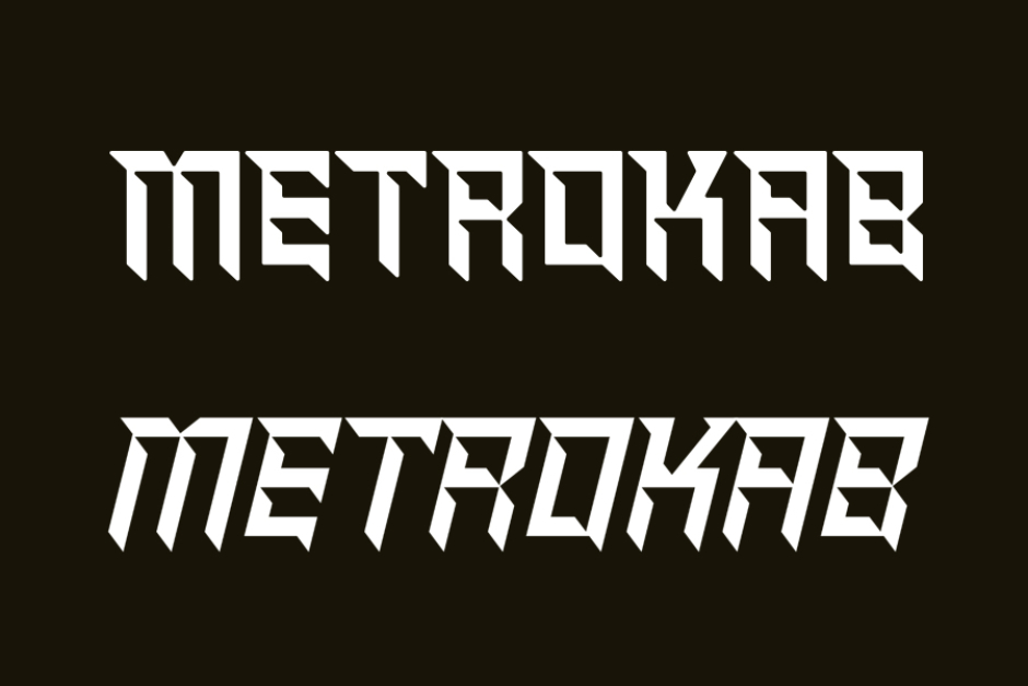
Figure 4.5 The closest match I was able to find for the Metrokab logo (top) is the Shred font from Canada Type (bottom), which looks like an oblique or italicized version of what Southwell used. Source: MyFonts
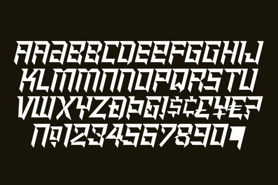
Figure 4.4 A look at the entire character set for Canada Type’s Shred font, which became available in 2010, and can still be purchased from Canada Type and other sources. Source: Canada Type
The Destination Marquee and Metrokab Livery Design

Figure 5.1 Front view of the cab as drawn by artist Syd Mead, which shows the destination on a roof-mounted marquee and checkers on the sides. Image courtesy of Tom Southwell.
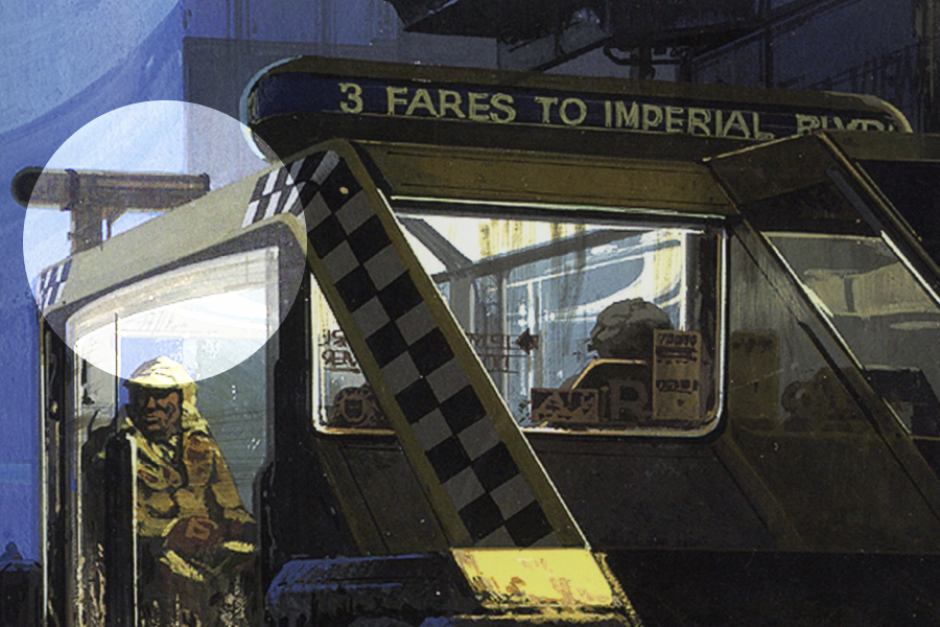
Figure 5.2 Syd Mead’s designs for the cab had checkers, but no name/logo. Tom Southwell added stripe borders and used the blank space for a logotype. Source: The Movie Art of Syd Mead: Visual Futurist
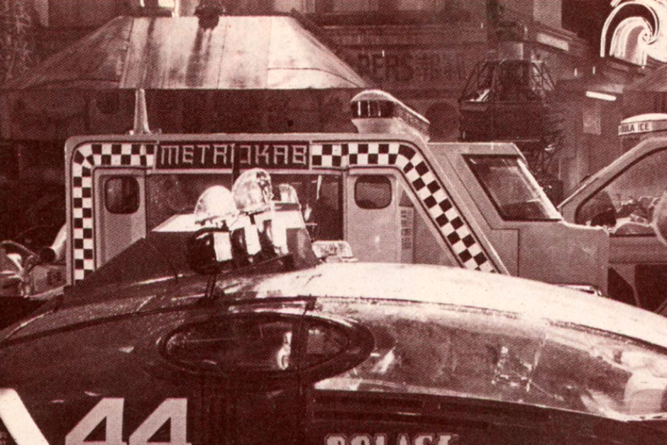
Figure 5.3 A more complete look at the logotype, checkers and striping graphics that appeared on the sides of the Metrokab. Source: The Blade Runner Souvenir Magazine
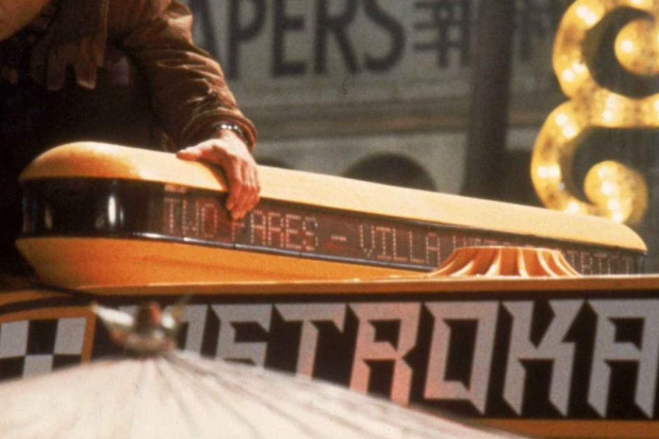
Figure 5.4 A close look at the destination marquee as it appeared in the film on the Metrokabs. Source: Blade Runner: A Story of the Future

Figure 5.5 Photo of a restored 1980s model A-11 Checker Cab, for comparison, to see how the Metrokab’s livery design evolved from taxi cabs of the past. Source: Jim Henderson, Wikipedia
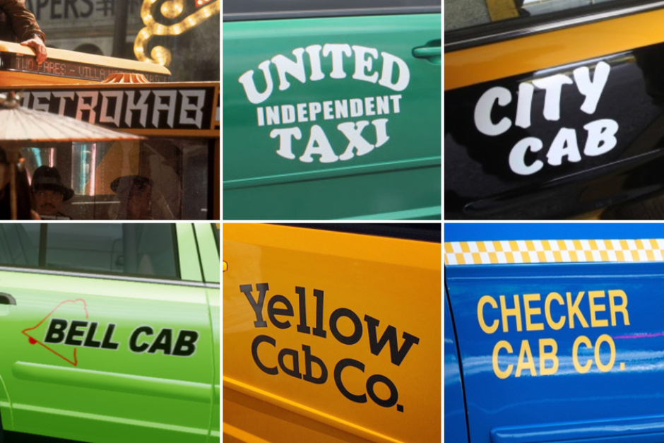
Figure 5.6 When comparing Blade Runner’s Metrokab logo to those of realworld taxi cabs we find on the streets of LA in 2019, you may be disappointed in the future we actually got.
Source: The Craft of Production Design
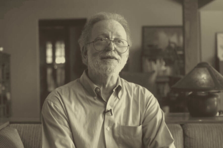
The Designer: Tom Southwell
Tom Southwell has worked in virtually every position in the cinema art department, where over the course of 46 years he has had a hand in major feature productions such as Blade Runner, The Goonies, City Slickers, I Am Number Four, Arachnophobia, X-Men, Mission Impossible, and The Godfather Part II — just to name a few of the over 150 film projects on his resume.
Of his time as a production illustrator on Blade Runner, he is quoted in Paul M Sammon’s book Future Noir, as follows:
“Many people lost their significant other during this film. Long hours away from home can do that. Many people left the project in a storm of loud shouting. But for me it was the assignment to die for (not over). I was given a huge task and I jumped right in and attacked it with joy and vengeance. This was a juicy project. I could use so much of what I learned at art school. Here I am showing my work to Ridley Scott! Wow! I feel that when you come face to face with real genius, you walk away with your pockets full. We had lots of geniuses on BR, so I took trunks of ideas home every night. So many that not all of them made it into the film. I dip into that trunk still.”
Knowing how lucky he has been to have worked on films like Blade Runner, Southwell is now focusing on teaching, to pass on what he has learned to a new generation of artists and designers. You can learn more about his career and where he is taking things, in the 2018 film The Craft of Production Design, which is a great five minute short documentary created by former students of Southwell.
To learn more, visit:
The Craft of Production Design (2018 film) on Vimeo
Tom Southwell’s Filmography on IMDb
View more identities designed by Tom Southwell