Spinner
Law Enforcement, Vehicle
Year 2019
The Spinner is a two-seat wheeled vehicle that is not only capable of driving on streets, but also flying and hovering via vertical take-off and landing. Spinners are used extensively by the LAPD, taking over the separate present-day roles of police cars and helicopters.
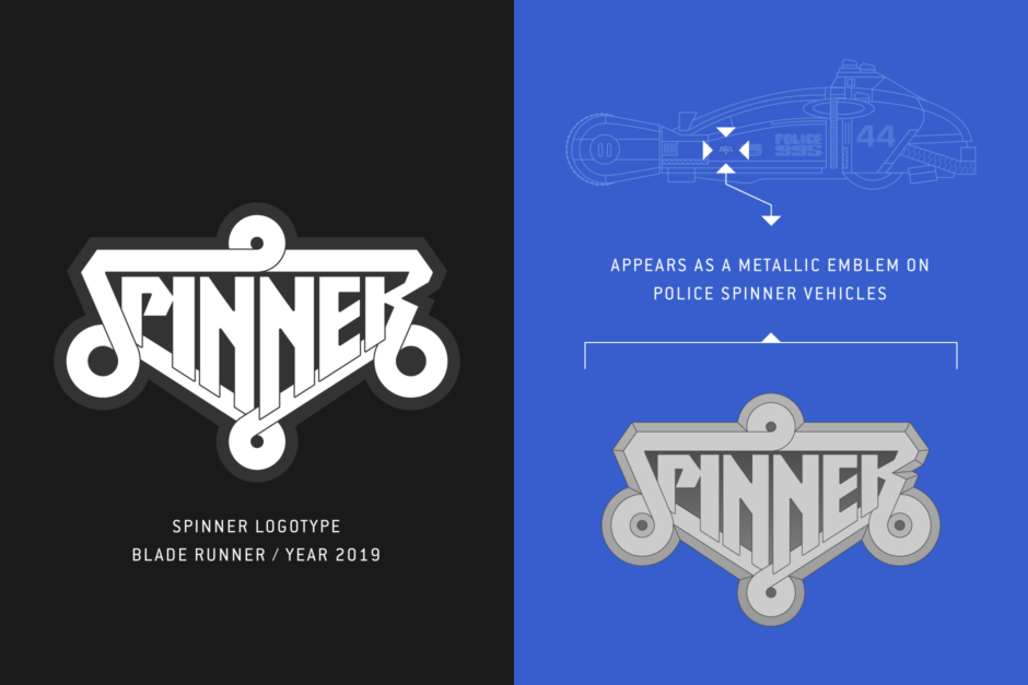
Overview: Spinner Logotype
Intro: The Spinner
Of all the vehicles that appear in the future depicted by the 1982 film Blade Runner, the Spinner is the most iconic. Being a flying car, it is very much the stuff of science fiction, and for the time being, something we’ve yet to see fully realized in our lived in present.
The car’s unique design was a product of renowned artist and visual futurist Syd Mead (Figure 1.1), who rendered over a half-dozen vehicles for the film, along with his involvement in the design of exterior and interior sets, and a number of the future’s artifacts.
In Blade Runner, Spinners are used extensively by the Los Angeles Police Department. Coupled with its street capability as a wheeled vehicle, it also had the ability to hover and fly, with flying being the LAPD’s primary mode of traversing the towering and sprawling Los Angeles of the future (Figure 1.2). Most large buildings have landing pads on the roof to accommodate flying vehicles, and it makes it easier for the police to patrol the overcrowded streets.
At several points in the film, we see the Spinner in the act of vertical take-off or landing, spiraling as it ascends or descends (Figure 1.3). This is mentioned in the official Blade Runner Souvenir Magazine, as being the reason behind the vehicle's name.
In the Philip K Dick novel the film was based upon, Do Androids Dream of Electric Sheep?, the vehicles are only referred to as “hovercars,” but there is a single instance that describes the Spinner’s movement, which was carried forward into the film. Where Deckard is waiting on the Soviet WPO officer, the story describes the scene and a hovercar’s arrival: “As he resumed reading the poop sheet on Luba Luft a hovercar taxi spun down to land on the roof a few yards off.”
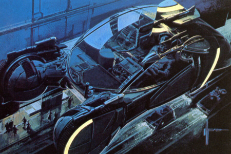
Figure 1.1 Original concept art for the Spinner by Syd Mead. Source: Blade Runner: The Inside Story
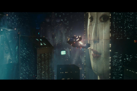
Figure 1.2 Our first good look at a Spinner as it flies by one of the city’s massive video screens, after seeing them buzz by in the opening scene.
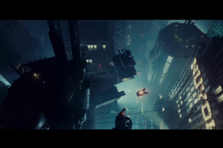
Figure 1.3 As we see Gaff’s Spinner make its spiraling ascent from the city floor after picking up Deckard, the vehicle’s name starts to make sense.
Original Artwork
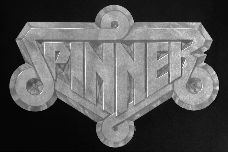
Figure 2.1 The original pencil drawing of the Spinner emblem, created by Tom Southwell for Blade Runner. Photo courtesy of Tom Southwell.
Analysis: The Spinner Emblem Design
The Spinner logotype, was designed to serve as a car emblem, by Blade Runner Production Illustrator Tom Southwell.
In my conversations with Southwell, he noted that the design was never on a “work to do list” and that he acted on his own initiative: “As I saw Syd Mead’s impressive paintings, and Bill Skinner’s equally impressive scale drawings and working blueprints, well I felt it deserved a good mark. So I jumped in.”
A rough sketch can be seen in the Dangerous Days documentary (Figure 3.1), and Southwell was kind enough to share the final approved drawing here, pictured in Figures 2.1 and 3.2.
From there, Southwell explained how the Spinner design made its way onto the vehicle:
“Once my drawing was approved by Mr Scott (director) and LG Paull (production designer), the art director (David L Snyder) asked me to draw it in actual size and section, and indicate exactly where to put it on the car, which I did, and happily (for me) that’s where they put it.” This applied the emblem (Figure 3.3 and 3.4) in three places — one on each side of the vehicle, forward of the doors, and one on the rear. The Spinner’s unconventional design and construction didn’t really afford a place to put one on the hood or grill.
In the documentary Dangerous Days, we get a close look at the resulting production emblem that was used on the cars (Figure 3.3). Like many of the artifacts that were produced for the film, the quality is rough with a well-worn, aged appearance.
Looking at the emblem design, it is a logotype consisting of a heavy line or band, that forms a continuous perimeter as it spirals around four points, creating both the S and R letterforms in the process. The circuitous path pulls the eye around the mark, calling to mind tight turns and air maneuvers, and the spinning take-offs and landings that the vehicle is named for. The overall shape is like that of a badge or shield, with the custom lettering conforming to its interior. This particular treatment isn’t something we seem much of at present in the real-world, but it was not uncommon among vintage vehicle emblems (Figure 3.5).
Regarding the stylistic approach, it has been mentioned by many sources and confirmed by Tom Southwell, that Director Ridley Scott referenced sci-fi stories that appeared in Heavy Metal magazine as inspiration for some of Blade Runner’s look — particularly “The Long Tomorrow” by Dan O'Bannon and Moebius. But seeing the letterforms in the Spinner logotype, my mind initially went to another heavy metal source — the logotype for Iron Maiden, that featured prominently on their 1980 self-titled album. There looked to be some similarity in the R and N characters (Figure 3.6). But as it turns out, I’d missed the mark there.
Southwell’s actual inspiration came from several places that he was happy to identify. In part, it was influenced by previous work that he had done — evident in the logo he created for Designer and Illustrator Tom Nikosey (Figure 3.7). The way Southwell described it to me, “Tom Nikosey is one of my best friends. We graduated art school together, and now we both live in California. He did a ‘Southwell’ sign for my studio, and I did that logo for him.” Comparing the logo with what he did for the Spinner (Figure 3.8), you can definitely see the influence, noting the way the N and Y flow into lines that trace the outer perimeter of the mark, and the similarity between the E letterforms. An interesting side note: Southwell claims you may even spot this Nikosey mark in Blu-ray versions of the film, in Deckard’s bathroom. He used it in three or four places, on sets and props (Figure 3.9).
The other source of inspiration Southwell points to, is the film title design for ZARDOZ — a 1974 sci-fi fantasy film, written and directed by John Boorman. The ZARDOZ logotype (Figures 3.10 and 3.11) was created by Graphic Designer and Lettering Artist Michael Doret, and you can see how the sharp angles of the letterforms and the overall shape and dimensional treatment would have inspired Southwell’s work on the Spinner emblem. Doret writes about the ZARDOZ design on his blog, where interestingly, he also considers the likely scenario that it inspired the logos of heavy metal bands like Asia and Anthrax. Funny, how heavy metal kept finding its way into this entry, down different roads.
All said and done, the logo would end up being one of Southwell’s favorites that he created for Blade Runner, and like the vehicle it appeared on, an original and memorable design from an imagined future that still captures the imagination of science fiction fans.
Much thanks to Tom Southwell for answering my questions, and sharing photos and first-hand info regarding his visual identity design for the Spinner. You can learn more about him and his work, in the bio section near the bottom of this research entry.
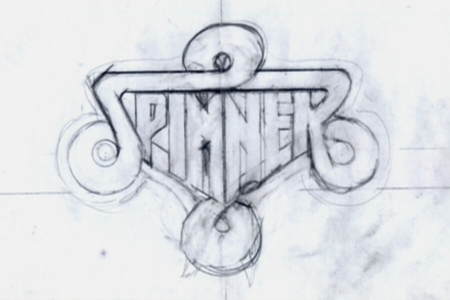
Figure 3.1 An early rough sketch of the Spinner logotype, by Tom Southwell. Source: Dangerous Days: The Making of Blade Runner
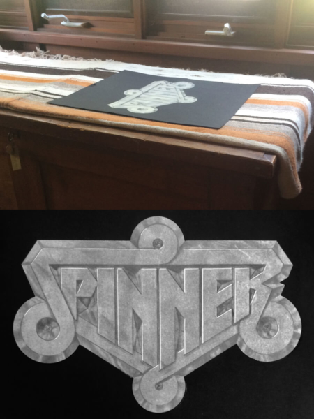
Figure 3.2 Tom Southwell’s original pencil drawing of the Spinner emblem, that was presented and approved for use on the vehicles. Photos by Tom Southwell.
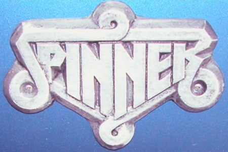
Figure 3.3 The production emblem that appeared on the vehicles. Source: Dangerous Days: The Making of Blade Runner
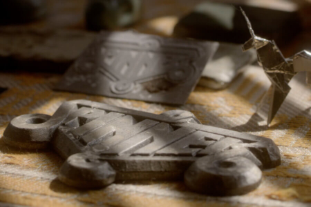
Figure 3.4 Spinner emblems in Tom Southwell’s personal collection. Source: The Craft of Production Design
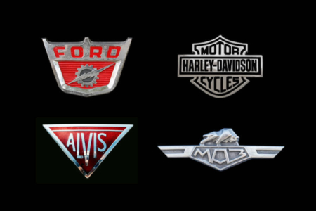
Figure 3.5 The shield or badge shape we see in the Spinner emblem, with lettering conforming to its interior, is a treatment we can find in vintage vehicle emblem designs in the US and abroad.
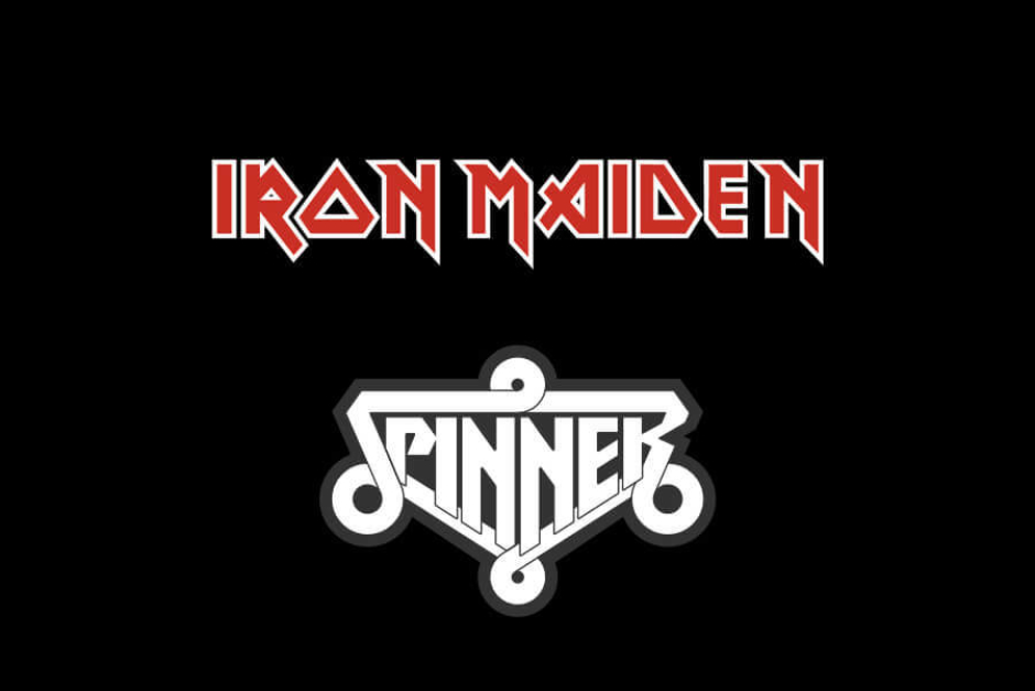
Figure 3.6 The Spinner lettering bears some resemblance to what one might expect to find in the logo for a 1980s heavy metal band — my mind went to that of Iron Maiden, whose self-titled album came out in 1980.
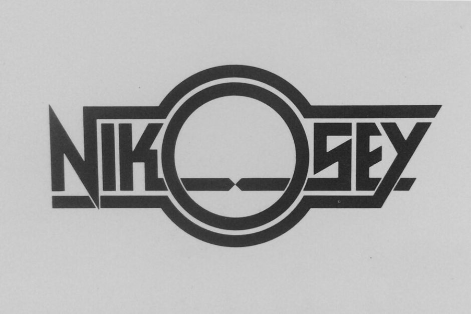
Figure 3.7 Tom Nikosey is a designer and illustrator, and one of Tom Southwell’s close friends. Southwell designed this logo for him in 1977. Photo by Tom Southwell.
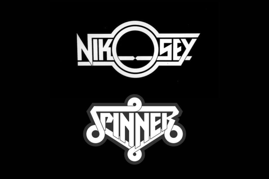
Figure 3.8 Southwell’s identity designs for Nikosey and Spinner, stacked up for easier comparison. Note the similarly styled letterforms, and their use of extending lines to encapsulate the names.
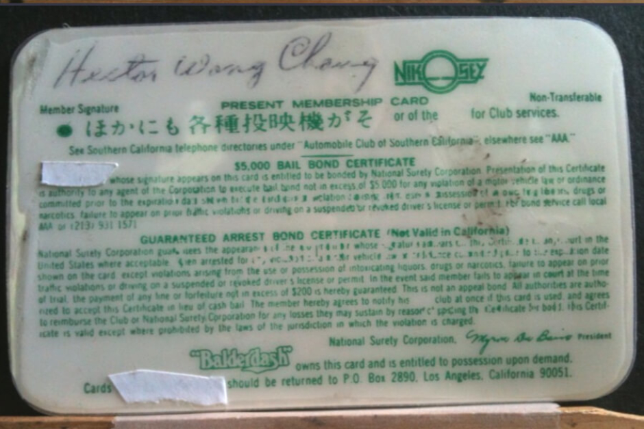
Figure 3.9 The Nikosey logo, as it appeared on the back of a Blade Runner prop “$ Card” that didn’t quite make it into the film. Source: Propsummit, Photo by Tom Southwell
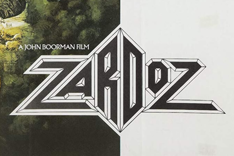
Figure 3.10 A source of inspiration for Southwell — Michael Doret’s faceted ZARDOZ title design, shown here as it appeared in promos. Source: IMDb
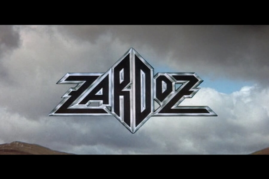
Figure 3.11 The ZARDOZ title as it appeared in the film’s opening, with a metallic edge treatment. Source: ZARDOZ (1974 film)
The Spinner Emblem’s Appearances in the Film
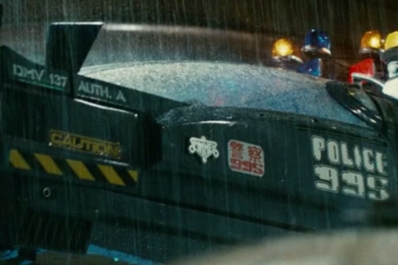
Surveying the film, we find the emblem in three places on the Spinner vehicles. The scenes where Gaff first takes Deckard in to meet Captain Bryant gives us our best glimpses of it. As they approach the vehicle, it appears as a metallic emblem on the side of the car, on the forward area of its scissor door, right next to a decal featuring the number 995 (Figure 4.1).
In addition to appearing on both sides of the Spinner, the emblem is also found in a third location, on the back of the vehicle. If you look carefully, it can be seen as Gaff and Bryant drive off in the Spinner (Figure 4.2), leaving Deckard with the news that Rachel is now among those remaining replicants he is assigned with retiring. To be certain of what we are seeing, we can refer to the documentary Dangerous Days, where a photo of the Spinner’s rear is shared, in the chapter devoted to the design process (Figure 4.3).
I asked Tom Southwell about the interior of the vehicle, and while he confirmed that he provided a smaller emblem to use in the only Spinner with a finished interior, we never see it in the film and can't be sure it was ever installed as he advised (Figure 4.4).
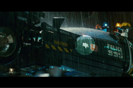
Figure 4.1 As Deckard and Gaff depart to meet Captain Bryant, we can see the metallic Spinner decal on the side of the vehicle.
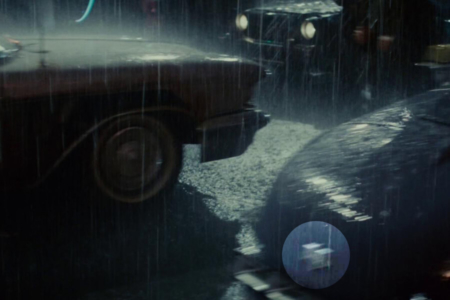
Figure 4.2 It goes by fast, but we can just make out the Spinner emblem on the back of Gaff’s vehicle here, as he and Bryant leave Deckard at the scene of Zhora’s killing.
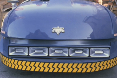
Figure 4.3 In the documentary Dangerous Days: Making Blade Runner, we can more clearly see the emblem affixed to the back of the Spinner.
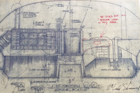
Figure 4.4 Tom Southwell’s original note on the interior placement of a Spinner emblem, on the dashboard. Photo by Tom Southwell.
The Spinner Logotype on Blade Runner Merchandise
In addition to its film appearances, the Spinner logotype was also applied to official Blade Runner merchandise, in a few instances.
As seen in this 1982 advertisement from the back of the official Blade Runner Souvenir Magazine (Figure 5.1), police Spinners were among the four die-cast replica toys produced by Ertl. The Spinner logotype is applied as a black and white decal, on the sides of the toy car.
Opposite that advertisement in the souvenir magazine, was another full-page ad, offering enrollment in the Blade Runner Fan Club. Membership got you an exclusive club kit mailing, and included in this was a Spinner Operator’s Permit. One side of the card is partially visible behind the photo of Deckard. From what I can see in the ad, and in low-res images of the card that are floating around the internet, there is a light blue watermark of the Spinner logotype behind the permit’s form fields.
Note: If anyone reading this possesses the Spinner Operator’s Permit from the fan club kit, it would be amazing to receive a high quality photo or scan of both sides, that could be shared here in this research entry.
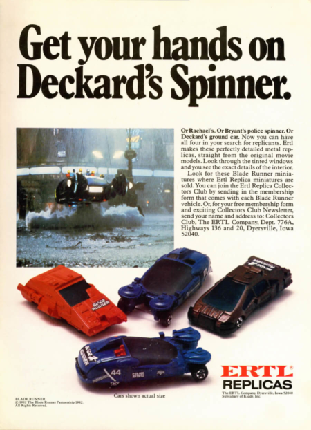
Figure 5.1 A full-page 1982 advertisement for Ertl Replica miniatures of vehicles that appeared in Blade Runner. Source: Blade Runner Souvenir Magazine
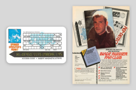
Figure 5.2 The Spinner logotype also appeared on the Spinner Operator’s Permit, that was available through the Blade Runner Fan Club. Source: Blade Runner Souvenir Magazine

Source: The Craft of Production Design
The Designer: Tom Southwell
Tom Southwell has worked in virtually every position in the cinema art department, where over the course of 46 years he has had a hand in major feature productions such as Blade Runner, The Goonies, City Slickers, I Am Number Four, Arachnophobia, X-Men, Mission Impossible, and The Godfather Part II — just to name a few of the over 150 film projects on his resume.
Of his time as a production illustrator on Blade Runner, he is quoted in Paul M Sammon’s book Future Noir, as follows:
“Many people lost their significant other during this film. Long hours away from home can do that. Many people left the project in a storm of loud shouting. But for me it was the assignment to die for (not over). I was given a huge task and I jumped right in and attacked it with joy and vengeance. This was a juicy project. I could use so much of what I learned at art school. Here I am showing my work to Ridley Scott! Wow! I feel that when you come face to face with real genius, you walk away with your pockets full. We had lots of geniuses on BR, so I took trunks of ideas home every night. So many that not all of them made it into the film. I dip into that trunk still.”
Knowing how lucky he has been to have worked on films like Blade Runner, Southwell is now focusing on teaching, to pass on what he has learned to a new generation of artists and designers. You can learn more about his career and where he is taking things, in the 2018 film The Craft of Production Design, which is a great five minute short documentary created by former students of Southwell.
To learn more, visit:
The Craft of Production Design (2018 film) on Vimeo
Tom Southwell’s Filmography on IMDb
View more identities designed by Tom Southwell