Federal Colonies
Government, Military, Space Settlement
Year 2084
Federal Colonies operates and governs mining facilities and their supporting domed habitats on the planet Mars—a sprawling colony constructed by Earth’s Northern Bloc for the purpose of extracting Mars’ turbinium ore.
Turbinium is a high value export that returns immense profits, with the ore being essential to war efforts back on Earth, where it has military applications in the Northern Bloc’s space-based weaponry targeting enemies in the Southern Bloc.
Federal Colonies also collects revenues from Mars tourism, and the controlled production, distribution and sale of breathable air supply required by the colony’s inhabitants. For security and defense, the militarized colony employs its own armed forces.
Overview: The Federal Colonies Visual Identity
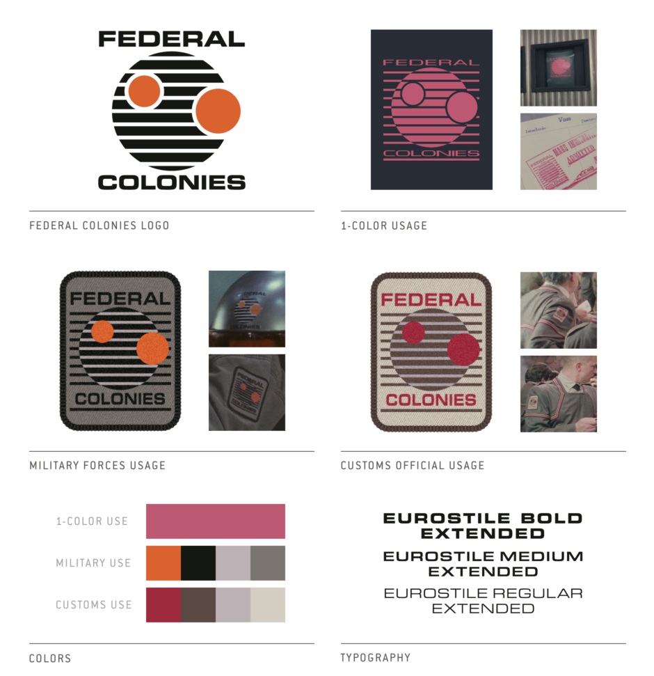
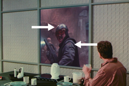
Figure 1.1 Our first look at the Federal Colonies logo.
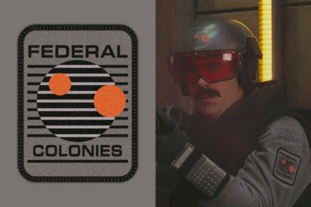
Figure 1.2 Detail views of Federal Colonies logo. Left: Vector approximation of the design. Right: Logo as worn by soldier with mustache.
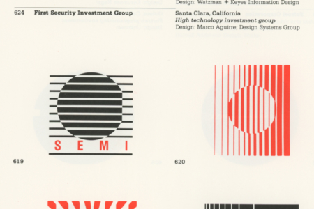
Figure 1.3 1980s logos for SEMI and Primages Incorporated. Source: High Tech Trademarks Vol 2
Analysis: The Federal Colonies Logo
Our first look at the Federal Colonies logo comes from news footage of military authorities on Mars, brutally putting down an episode of resistance by Kuato’s Freedom Brigade (Figure 1.1). Better views are to come, but careful observation reveals logos on the shoulder patches and helmets of these military forces that are “restoring order with minimal use of force” as the camera shows them straight up executing captured and disarmed combatants with their automatic assault weapons.
This version of the Federal Colonies logo, seen in the detail provided by Figure 1.2, depicts the planet Mars in black with its two rust red moons, Phobos and Deimos, in transit. A note about the moons: they are named after the characters Phobos (panic/fear) and Deimos (terror/dread), from Greek mythology. Seeing how Federal Colonies operates, it seems fitting that these moons would be featured so prominently in their logo.
While the moons appear as solid shapes, the planet is crossed with horizontal counterchanged lines, which feature a positive to negative reversal where they pass over its surface. Without knowing the designer’s intent, it is tough to say at this point why it was actually drawn this way. It’s likely it was simply a graphic treatment which was in vogue at the time, used for “futuristic” effect, as this line treatment is something that was common with “high tech" industry logos created in the 1980s.
Some examples include the logos for the Semiconductor Equipment & Materials Institute (SEMI) and Primages Incorporated (Figure 1.3) as they appear in Mendenhall’s 1988 book High Tech Trademarks Volume 2. These are just two examples, from page after page of this sort of thing.
I have to say though… we could probably just remove the type from the SEMI logo, which has the same number of horizontal lines, drop our two moons on there, with the larger Phobos covering that flat spot on the semidconductor wafer. Then add our type, with “FEDERAL” set above and “COLONIES” set below, in modified Eurostile Medium Extended. And there you have it! If you’re still skeptical as to whether this is actually what inspired the design, wait until you see what I find later in my survey.
And a note regarding the type: It seems to vary across applications, but is always some form of modified Eurostile Extended. An unsurprising choice, given the status of Eurostile as the go-to typeface for a lot of design in Science Fiction films and television, as Dave Addy at Typeset in the Future has pointed out. Can’t argue with what works!
Now, with the basics covered, lets move on to the various versions of this logo and how they were applied.
Analysis: The Federal Colonies Logo in Military Applications
Upon arrival on Mars, we’re quickly introduced to how the Federal Colonies visual identity plays out with two different types of military dress, and how its colors coordinate with standard issue gear and accessories.
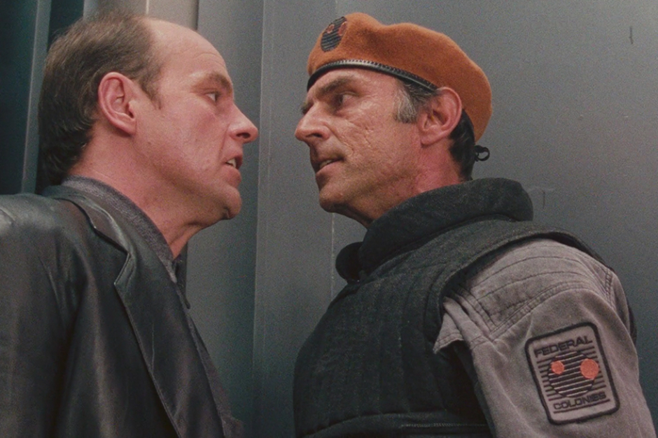
We’ve already seen the military patch, with its black and rust red logo against a gray background. In Figure 2.1, we have Captain Everett in the center, with a subordinate standing beside him on the right side of the image. This is a good place to start, where we can see the military costumes the logo coordinates with and the differences in how the identity is applied. You can’t see it from this angle, but they are both sporting the same military-issue patch previously referenced—on both the left and right shoulders. But note the gray fatigues of each, the logo was designed to live on. And matching the black elements of the logo, we have black gear, military vest, and weapons as well.
As far as the differences go, we have Captain Everett wearing a beret to denote his higher rank (Figure 2.2, left side), colored rust red to match the colors used for Mars’ two moons in the logo. We can see that the logo is stripped of its typographic elements, with the graphic used alone as a form of military insignia.
The lower ranking soldiers wear a silvery gray helmet, the color closer to matching those silver negative lines crossing the face of Mars in the logo as you see it on the military patch. In an image from a scene later in the film (Figure 2.2, right side), you can see a bit better how the logo is applied to that helmet. With no background, the black horizontal lines that continued past the face of Mars have been removed. The “FEDERAL COLONIES" type remains in the lockup we’re used to seeing. This soldier sports a dark red visor, but there are others in the film that appear lighter, closer to the rust red we see used in the logo.
Taken altogether, we see a thoughtful use of color to tie everything together and sensible variation of the mark to suit a range of applications. And when you see a bunch of these thugs together, you know who you’re dealing with. Federal Colonies is plastered all over them (Figure 2.3).
Next up, we take a look at the logo as it is used for customs personnel and paperwork seen at the Mars entry checkpoint.
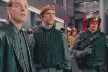
Figure 2.1 Scene featuring Captain Everett and subordinate soldier.
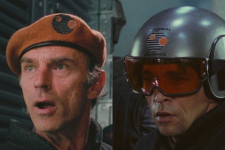
Figure 2.2 Left: Logo as insignia on Captain Everett’s beret. Right: Logo on helmet worn by soldier.
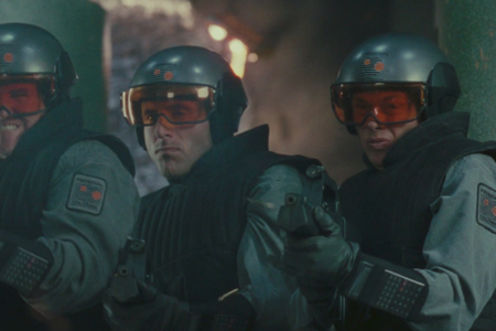
Figure 2.3 A bunch of thugs with logos plastered all over them.
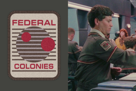
Figure 3.1 Left: Approximation of the customs patch, featuring red, brown and beige logo variant. Right: Customs personnel wearing the logo patch.
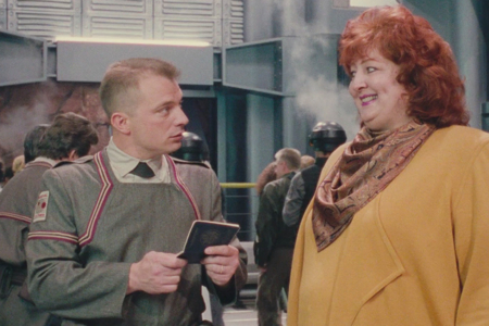
Figure 3.2 Striped uniform that compliments the customs logo variant.
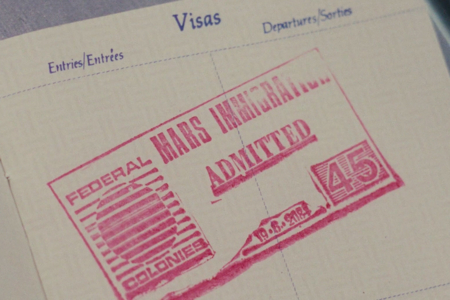
Figure 3.3 Visa stamp, with what appears to be a mistakenly used version of the Federal Colonies logo without its two moons.
Analysis: The Federal Colonies Logo at the Mars Entry Checkpoint
Even before we really get a good look at the military on Mars, we see the Federal Colonies identity as it is worn by customs personnel (Figure 3.1) and stamped on passport visas. Here we find that the element of color is customized in both cases.
In the logo’s use by customs officials, we see brown and dark red substituted for the military’s use of black and rust red. The logo’s background is now beige, very much the same color as all of the paperwork you see them shuffling. The three colors also see use in two types of striped accents on uniforms (Figure 3.1 and 3.2), possibly denoting rank. It’s a color palette that creates an official “Red Planet” look, that still bears authority while being less aggressive than the military’s gray, black and rust red combo.
You may also note that the use of stripes on the uniforms calls to mind those lines we see used in the logo. This also reminds me of Saul Bass’ 1969 Bell System logo pitch, in which striped uniforms are fit into Bell’s updated corporate identity. Not to say it is the same look, but it’s apparent that the same sort of thinking went into how a uniform could tie into a logo’s overall visual identity system.
With the visa stamp of admittance we see used by customs officials we are provided our first look at the logo in its one-color magenta application (Figure 3.3). But here we find something strange… what I think has to be a mistake. The logo is missing its two moons, Phobos and Deimos! And what’s even more interesting, we see that the flat spot observed in the SEMI logo referenced earlier (Figure 1.3) is now visible on the right side of Mars in this stamped logo. Which seems to confirm my earlier suspicions about the 1980s tech industry origins of the mark. I can only assume that this is a result of production methods used at the time, where the actual SEMI logo from the book was copied, cut up and used by the designer to create the Federal Colonies identity.
That one mistake aside, these versions of the mark exhibit the flexibility of the visual identity system, repurposing the logo for different applications without anything feeling alien to the overall Federal Colonies identity.
In the next section, we take a look at the Federal Colonies logo in the context of monitor screens seen in Cohaagen’s administrative offices, its most technological application in the film.
Analysis: The Federal Colonies Logo on Digital Displays
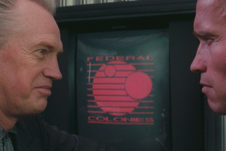
In the scene where colony administrator Vilos Cohaagen meets with Richter after his arrival on Mars, we start to see the logo used on display monitors for the first time.
As the two take their conversation to the conference table, we notice on the right a bank of three CRT monitors embedded in the corrugated steel wall (Figure 4.1). While the screens on left and right display bluish white bitmapped type, the center monitor displays a one-color version of the Federal Colonies logo in magenta. Later in the film, where Cohaagen confronts Melina and Quaid with his carefully laid plans for infiltrating the mutant resistance and killing their leader Kuato, we get a closer look at how the logo renders.
Cropping in on a monitor from that later scene reveals more detail (Figure 4.2). Kind of blurry, but I can start to note a few diversions from what we’ve seen up to this point.
At first glance the logotype appears to be set in a different typeface from what we’ve seen used before. The proportions and weight are off. The lower arm of the F appears to be slightly shorter than the top, where in Eurostile they would be the same length. And the C is different as well. But a closer look at the R and S still reveals features of Eurostile. To see what’s going on here, I decided to try a quick experiment where I take a swing at modifications, starting from the regular weight of Eurostile Extended (Figure 4.3).
Step 1: FEDERAL COLONIES in Eurostile Extended, unmodified.
Step 2: The type is smashed, and FEDERAL is tracked out to achieve the same line length as COLONIES. Getting closer.
Step 3: Modify the individual characters. Bring in the lower arm of the F, and the top half of the S. Widen the stems a bit everywhere. Increase the curve on the sides of the O characters, then chop up those modified O characters to build a new D and C. Accounting for the curve in the screen and the blurry image, what we end up with is something roughly along the same lines as what we see in Figure 4.2, and a pretty good bet as to where this variant type started from.
The real question though, is why is it different from what we’ve already seen on uniforms and paperwork? I can’t see a good reason for having changed it for screen display. If anything, they made it harder to read with the smashed type and high contrast thick and thin strokes, which renders poorly when viewed from a distance.
At any rate, that’s the final variation of the Federal Colonies logo in my survey of this visual identity. From here we’ll look at some more images from the film to see an overarching view of what we’ve already analyzed—providing a bit more context, which is always useful for appreciating the design choices made.
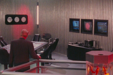
Figure 4.1 The Federal Colonies logo can be seen on a wall monitor to the right, as Richter and Cohaagen enter the conference area.
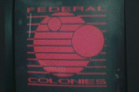
Figure 4.2 Detailed look at the Federal Colonies logo as it appears on wall display monitors.
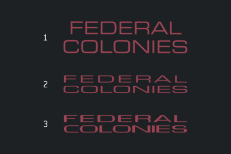
Figure 4.3 An experiment modifying Eurostile Extended to achieve the an approximation of the variant type seen in digital versions of the logo.
The Federal Colonies Visual Identity in Context
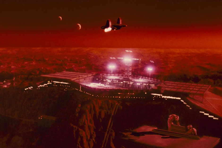
A shuttle approaches the Mars colony, with its two moons in the sky overhead. The moons are featured prominently in the Federal Colonies logo. And with the Red Planet living up to its name, it’s also easy to see why red hues were used in all variations of this identity.
Here we see the visual identity applied to the striped uniforms of customs officials. It’s also worth noting how the logo with its repeating horizontal lines complements all of the lines seen in the colony’s architectural features, be it on walls or structural bars running across the face of its glass domes.
The closest look at the Federal Colonies patch worn by customs officials.
The Federal Colonies military identity as worn by Captain Everett (right).
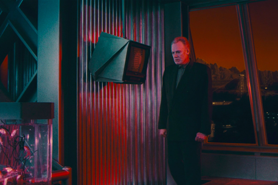
Administrator Vilos Cohaagen brooding in front of a wall-mounted monitor displaying a one-color version of the Federal Colonies logo, with Mars’ red exterior glow cast over the scene.
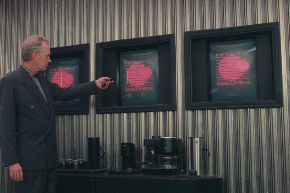
Vilos Cohaagen thumbing the control of a monitor, one of three displaying the Federal Colonies logo. Again, the lines on the corrugated steel walls complement the repeating lines seen in the logo design.
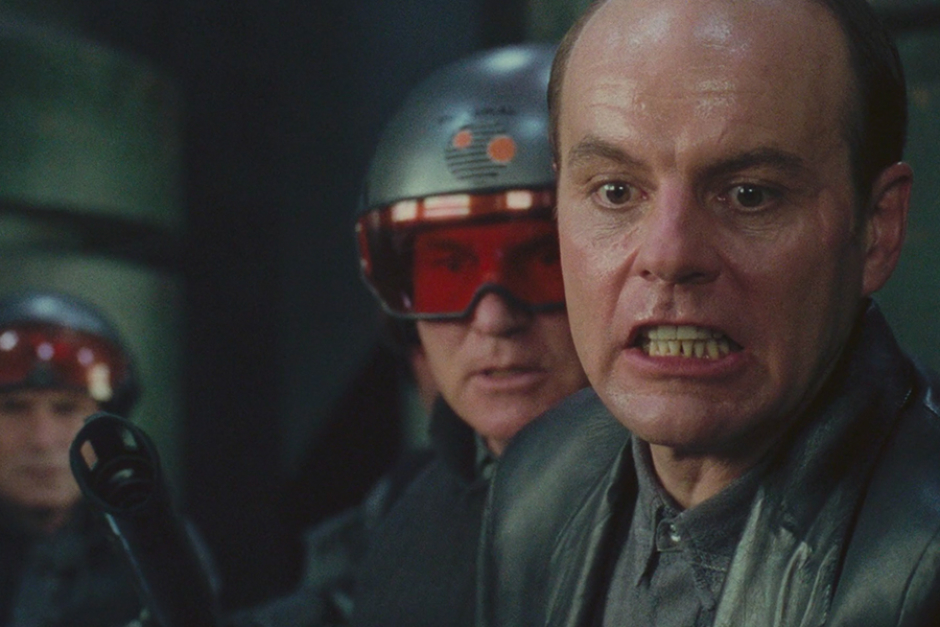
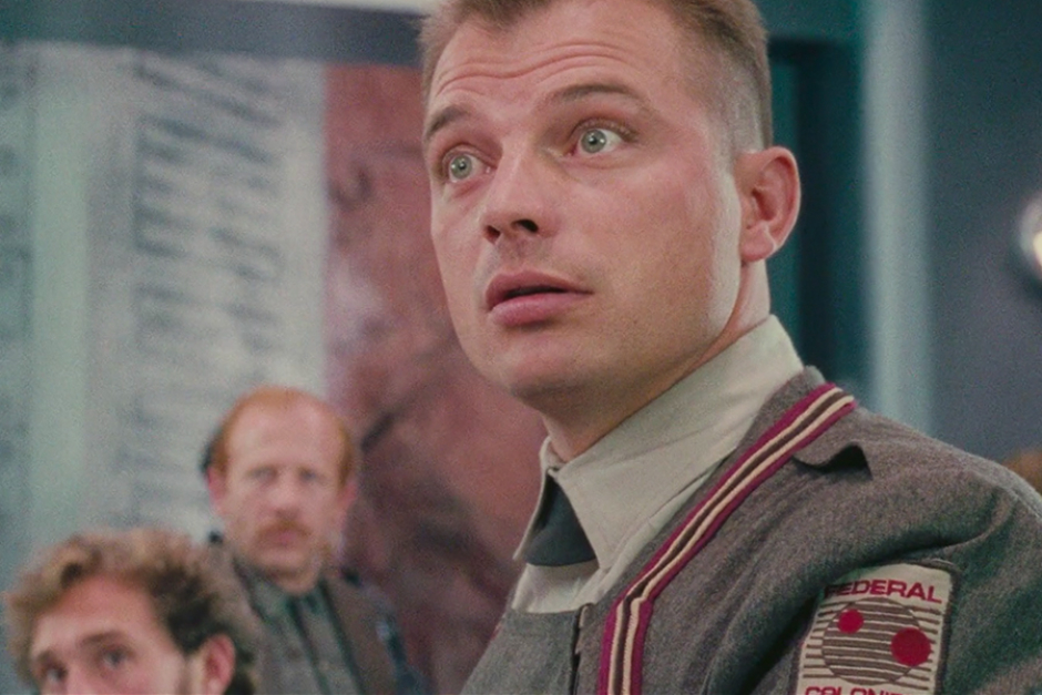
The Federal Colonies logo as seen on a military helmet worn by a soldier standing behind Richter, who is in his regular cheerful mood.
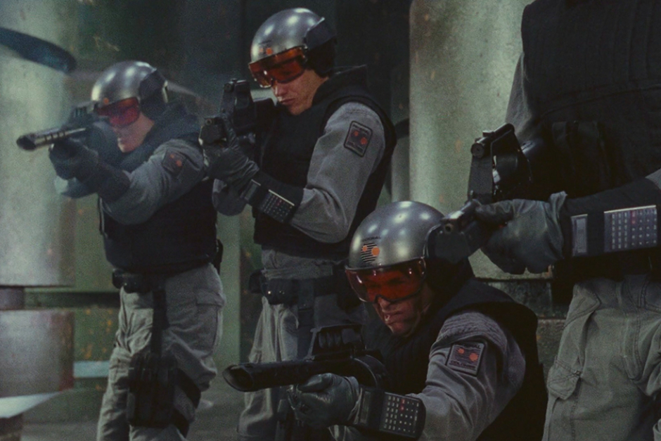
The colony’s military personnel with the Federal Colonies logo well-represented on patches and helmets.