Mars Burger
Restaurant
Year 2084
A fast food burger chain that operates on Mars, across the street from The Last Resort, in the colony’s red light district.
Overview: The Mars Burger Logotype
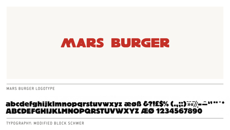
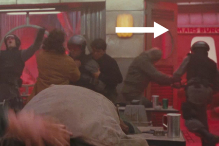
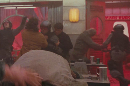
Figure 1.1 The Mars Burger is across the street from The Last Resort, seen through the front door during a fight scene there.
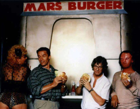
Figure 1.2 The Mars Burger was used in behind the scenes photography, featuring actor Arnold Schwarzenegger (center-left) and director Paul Verhoeven (center-right). Source: ScreenCrush News
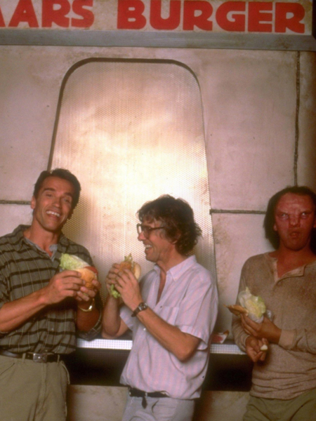
Figure 1.3 Another behind the scenes shot, that affords us a better look at some of the characters in the Mars Burger logotype. The R and G especially, give good indication that this is Block Schwer. Source: Unknown
Analysis
With very limited screen time, the Mars Burger shows up in the few scenes where we can see across the street from The Last Resort (Figure 1.1). From that vantage, it is tough to say much of anything about the design, and I almost omitted the identity from my Research entries for that reason. But thanks to behind the scenes photography I stumbled across while searching the internet (Figures 1.2 and 1.3), we have something to look at after all.
For starters, I sourced the type from old specimens I have on hand, with all characters pointing to Block Schwer by Berthold—a face that was released in 1981, according to the Letraset catalog from that year. In the case of the M, they appear to have used a W flipped 180 degrees. This specific version of the typeface doesn’t appear to be available digitally, so I had to do my best with free-handing an approximation of the logotype for my overview.
The logotype is set in red, because hey, it’s Mars. But it's also a color associated with the big fast food burger chains, McDonalds using red as a background element and Burger King having a red logotype, so it makes sense on more than one level.
Overall, the design decisions we find in this identity are pretty straightforward, and it's still something we can relate to from a present tense standpoint. At least the audience can take comfort that fast food still has a place in humankind's far off future, clogging our arteries out there amongst the stars.