Johnnycab
Passenger Transport, Taxi Service, Vehicle
Year 2084
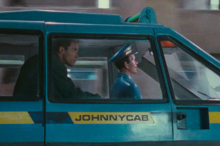
Johnnycab is an automated taxi service, consisting of small self-driving vehicles piloted by an integrated conversational android that acts on passenger voice commands. Much like a human taxi driver, “Johnny” will whistle tunes and engage in small talk during the ride, and is even capable of expressing emotional states.
Note: Always pay your fare, as Johnnycabs have been known to exhibit homicidal tendencies.
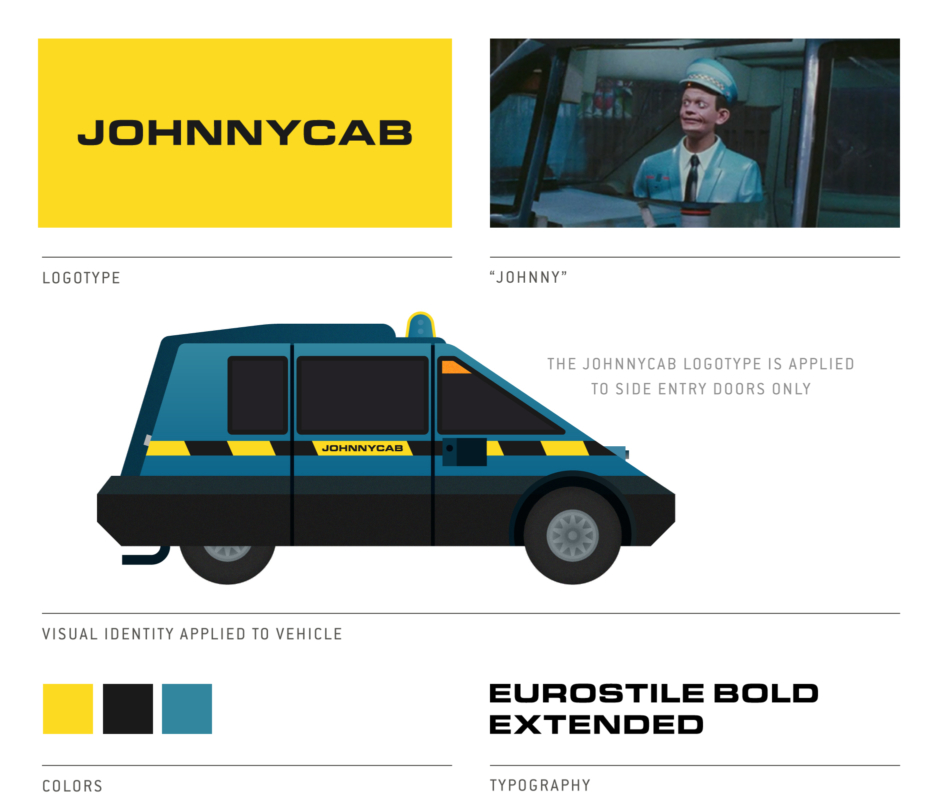
Overview: The Johhnycab Visual Identity
Analysis: The Johhnycab Identity
We first meet Johhnycab as Douglas Quaid regains consciousness after his incident at Rekall, when he finds himself riding in one of the film’s ubiquitous self-driving taxis (Figure 1.1).
Right away we start to get a sense of the personality and character the Johnnycab brand possesses, and why I think it’s so easy for them to get away with using a simple logotype (Figure 1.2). With Johnny’s weird looks and the vehicle’s clown car appearance (Figure 1.3), I mean really, who needs an eye-catching, memorable logo when your car and driver look like these things? As strange as they are, you couldn’t possibly miss them on the streets or mistake them for anything else.
As for the logotype, it isn’t custom in any way—just Eurostile Bold Extended set in all caps. It’s simple but it works, and the placement on the vehicles is smart, putting it where passengers (and the movie’s audience) will always see it, as they approach and enter the side doors of the cab.
Beyond the logotype and the unforgettable character of the vehicle and driver, Johnnycab successfully owns their visual identity’s blue, yellow and black colors. Consistently applied inside and out, Johnny is decked out in all blue, with yellow and black checkers on his cap, while the car is also predominantly blue, with yellow and black stripes. And it’s nice that they went for something a little different than the strictly yellow and black combo we are used to seeing with present day taxi services.
I also find the additional choice of blue interesting given their service’s twist on the taxi—blue being a color that communicates security and trust, which is something you’d want to feel when climbing into a vehicle you have no control over, that is being driven by an animatronic machine intelligence that isn’t understanding half of what you say to it.
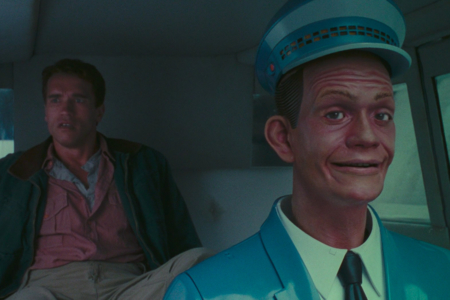
Figure 1.1 “How did I get in this taxi?” “The door opened; you got in… hell of a day, isn’t it?”
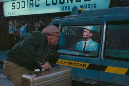
Figure 1.2 The Johnnycab logotype, seen on the door of the taxi as Quaid makes the terrible choice of using it as a getaway vehicle.
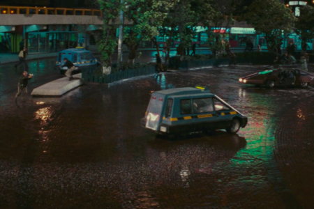
Figure 1.3 In this view, we get a better look at this weird little vehicle.