Rekall
Entertainment, Memory Implants, Travel
Year 2084
Rekall is a virtual travel service offering vacation experiences via implanted memories—a process they claim is “cheaper, safer, and better than the real thing.”
Typical trips include memories for two full weeks of vacation, visiting your choice of exotic locales—such as Earth’s undersea cities or Mars’ mining colonies. For an additional fee, a vacationer can also assume a fictional persona for the duration of their trip, customizing that experience “for the memory of a lifetime.”
Overview: The Rekall Visual Identity
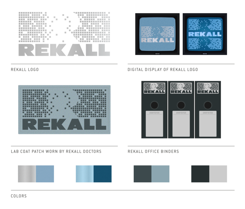
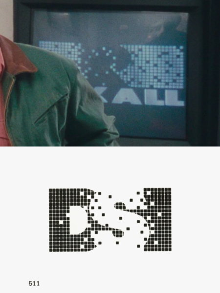
Figure 1.1 Rekall’s logo was likely inspired by the Data Systems for Industry identity, designed by Don Whipple. Source: High Tech Trademarks Vol 1
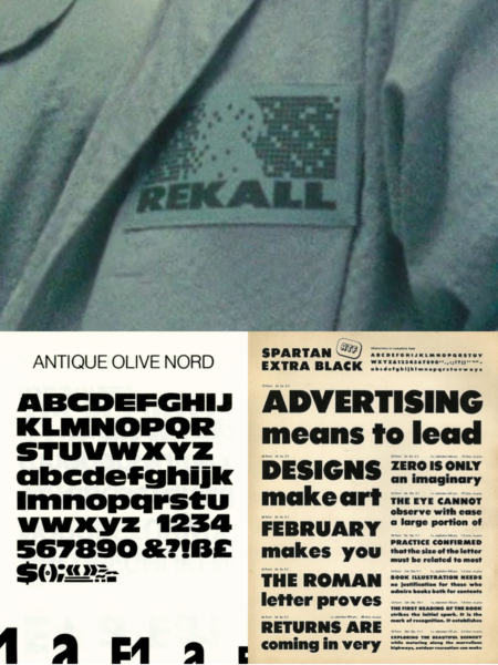
Figure 1.2 While I found no exact match, the Rekall type shares characteristics of sans serif typefaces like Antique Olive Nord and Spartan Extra Black (a knock-off of Futura).
Analysis: The Rekall Identity
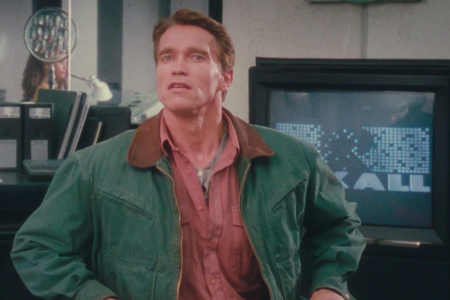
In the film Total Recall, the main character Quaid is chasing the dream of visiting the Red Planet, when a company called Rekall grabs his attention with a video advertisement running on the Metro. Their offer? The implanted memory of a trip to Mars as an alternative to actually traveling there. As Quaid contemplates going this route (Figure 2.1), Rekall’s chromed out logo animates on—the pixels that make up the mark flying into place, as their catchy jingle plays itself out. Unable to shake the idea, it isn't long until Quaid heads for Rekall’s office to learn more, affording us the opportunity to examine their logo in more detail.
It first turns up in the lobby, where Quaid consults a computer console that offers up info to visitors. The Rekall logo briefly appears (Figure 2.2), followed by a list of names and the Rekall Incorporated logo (Figure 2.3). From here, Quaid enters the office and we see the logo of Rekall on more screens (Figures 2.4 and 2.5), on the spines of binders (Figure 2.6), and on lab coats worn by Rekall’s doctors (Figure 2.8).
The Rekall logo that gets used everywhere is the one we are familiar with from their video advertisement. The mark is a rectangular grid of pixels, its center giving way to reveal the shape of an uppercase R. A scattering of stray pixels invades that negative space, while a few strays throughout the grid have yet to materialize. It evokes the sense that it is a work in progress, and is relatable to the memories Rekall creates for you—with all the little pieces that make the trip feel like something you really experienced, falling into place. And as we saw in the video advertisement, the pixels lend themselves to animation reinforcing this.
Like other logos that appear in Total Recall, it seems to have been inspired by high tech industry logos from the 1980s—the sorts of marks that would look cutting edge and futuristic to the film’s contemporary audience. Pixels were starting to find their way into logos, and I’m confident in pointing specifically to the logo for Data Systems for Industry (Figure 1.1) as the direct inspiration for Rekall’s logo design. In the way the S is reversed out of the pixel grid in DSI’s logo, we see the same technique used to achieve the R in Rekall’s. Same goes for the scattered and missing pixels, and they even have the same overall rectangular shape.
Below the grid of pixels, Rekall is set in heavyweight sans serif type. It’s tough to say what the typeface is or was, as I suspect this is something customized, but it bears some similarities to faces like Antique Olive Nord or Spartan Extra Black (Figure 1.2). The R and the K are good characters for comparison.
Regarding the Rekall Incorporated logo: while it uses the Rekall logo’s typographic element, this is a different mark with a different purpose. I’d look at it this way: Rekall is the product or service, which has its own logo, and Rekall Incorporated is the parent company. What really sets it apart, is instead of the pixels, it features a butterfly in flight. This is something we saw referenced in their video advertisement when Dr. Edgemar opened his hand and released a butterfly— presumably a symbol of “the memory of a lifetime“ customers receive from Rekall. But the only place we see this logo used is on the information kiosk Quaid uses in the lobby.
In the section that follows, usage examples from the film show the Rekall logos in action.
Usage: The Rekall Identity
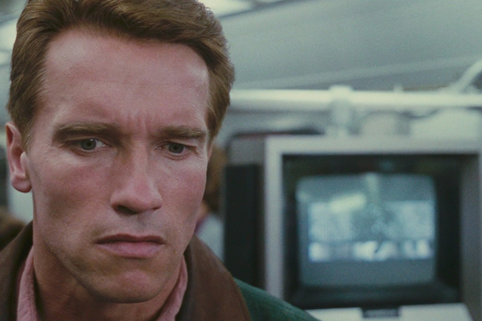
Figure 2.1 Quaid’s first encounter with Rekall, seen in an advertisement while riding the Metro to work.
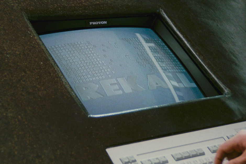
Figure 2.2 The Rekall logo on an info console in the lobby.
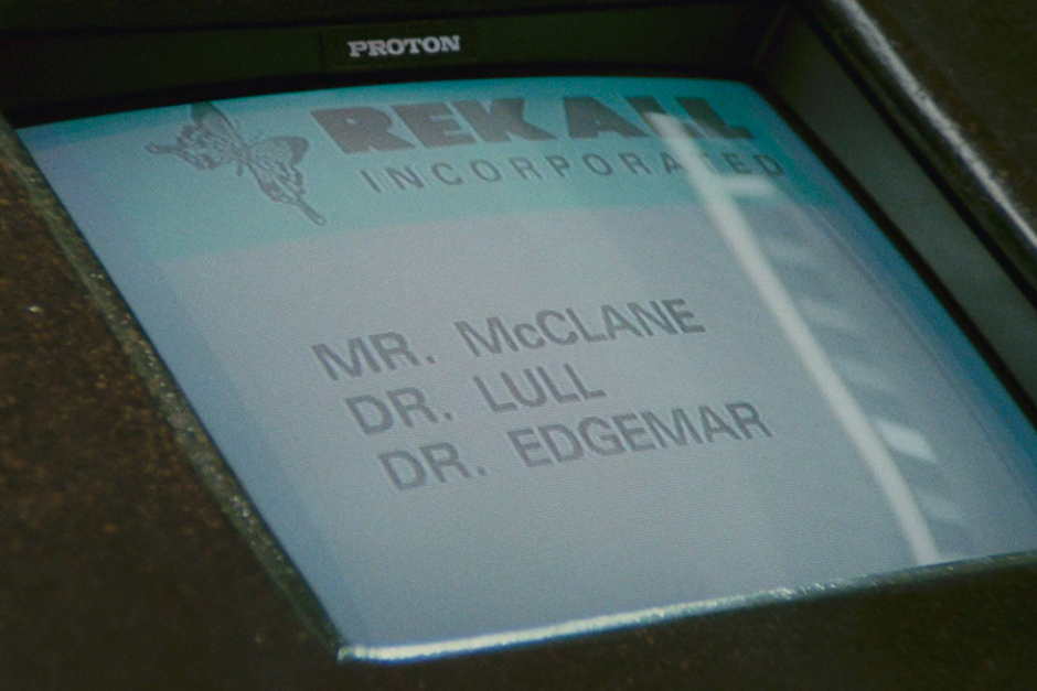
Figure 2.3 The Rekall Incorporated logo on an info console in the lobby, the only time it is seen in the film.
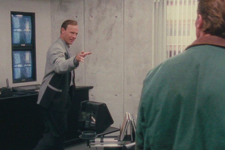
Figure 2.4 In the office of Bob McClure, Rekall’s sales rep, the Rekall logo can be seen behind him on wall inset monitors.
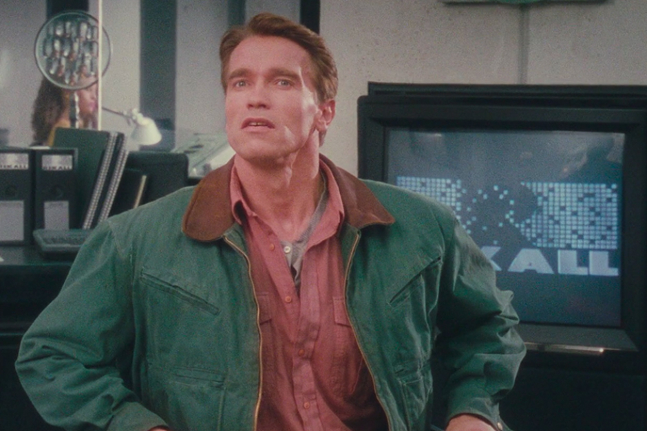
Figure 2.5 As Quaid takes a seat to hear Bob McClure’s pitch, we see the Rekall logo behind him on a television screen.
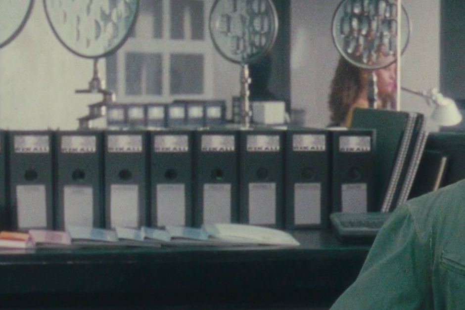
Figure 2.6 Lining the shelving behind Quaid, we see binders with the Rekall logo on their spines. We also see these in the lab, where Quaid is to receive his memory implant.
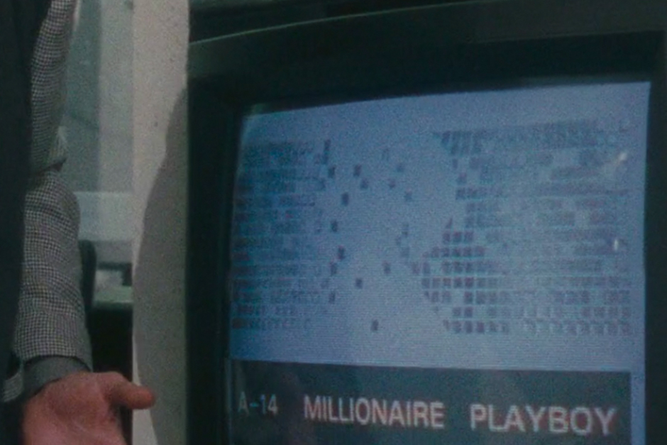
Figure 2.7 The Rekall logo freed from its typographic lockup.
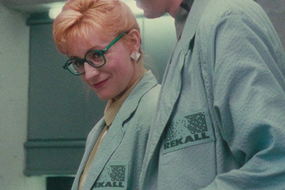
Figure 2.8 The logo as it appeared on the lab coats of Rekall’s doctors.