
Mars Today
Media, News
Year 2084
Known as “The Newspaper of the Universe,” MARS Today is an intergalactically distributed Martian daily newspaper published by the Gannett Company.
Overview: The Mars Today Visual Identity
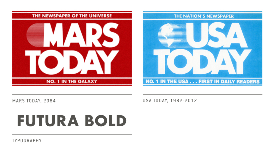
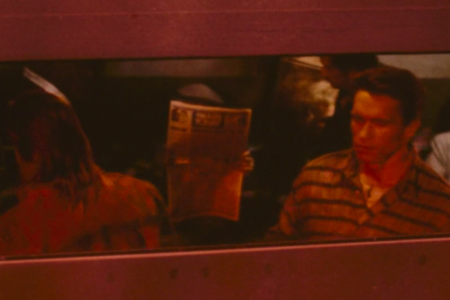
Figure 1.1 A man reads Mars Today in the background, as Quaid rides the train after arriving on Mars.
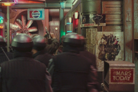
Figure 1.2 The MARS Today logo stands out on the right, where it appears on a newspaper vending machine.
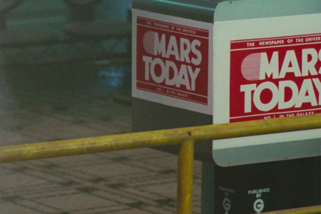
Figure 1.3 Our closest look at the MARS Today logo in the film.
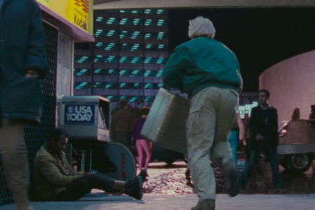
Figure 1.4 On the left, a USA Today newspaper machine is seen as Quaid is on the run from “The Agency” back on Earth.
Analysis: The Mars Today Visual Identity Design
MARS Today is a logo we start seeing when Quaid reaches Mars, first on the train where a man is reading a newspaper (Figure 1.1), and then on newspaper vending machines found in several of Total Recall’s action scenes that take place on the planet. (Figure 1.2).
A close look at a vending machine reveals a logo that borrows heavily from USA Today, which it is spoofing in the film’s future (Figure 1.3). This version of the logo I’m referring to was in use from 1982, when the paper was founded, until its redesign by Wollf Olins in 2012. We actually see this USA Today logo earlier on in the film, back on Total Recall’s Earth (Figure 1.4).
The taglines of USA Today are remixed for Martian consumption—now reading the “Newspaper of the Universe” as opposed to the “Nation’s Newspaper,” and “No. 1 in the Galaxy” rather than “No. 1 in the USA.” On the machine’s stand, we can start to see what reads “Published by Gannett Company,” the publisher for USA Today at the time of the film’s release and at present.
The MARS Today logotype is set in a modified Futura Bold, with TODAY appearing the same as it does in the old USA Today logotype. The M and the R on the other hand, didn’t match any Futura I looked at for this analysis, so those characters appear to be heavily modified or made from scratch. The R is particularly wonky.
The globe is devoid of oceans and continental landmasses, to depict the barren surface of Mars. It does appear as a silhouette composed of lines though, in a similar fashion to the USA Today logo. And behind it all, the background has been changed from blue to red, as one would expect for Mars.
While a number of real-world brands appear in the film, Mars Today offers an opportunity to examine one that has been retooled for the future, rather than finding placement as is. In the section that follows, I offer a little commentary on this.
Finding the Past in Our Futures
The MARS Today identity is an interesting example of a real-world identity redesigned for a science fiction scenario.
In doing this sort of thing, the film’s creators give the audience more to relate to, helping them to better understand the story’s future world as one that has grown from their lived-in present. It can help with successful world-building, holding things together like the mortar that goes between all of the big, important stones making up a story. The future will need news, and if we have USA Today now, why not MARS Today tomorrow?
But as you may have already noticed, the MARS Today logo presents a small problem you can run into in the process. By keeping it easily recognizable for the film’s contemporary audience, the designer fails to change it enough to account for the inevitable redesign and evolution a visual identity goes through over time.
It’s a small thing and maybe it doesn’t hurt the actual story at all, at least not for the intended audience—Total Recall wasn’t made for an audience in 2084 or even today, it was made for people in 1990—but it does date the film after awhile, possibly reducing its mileage for future viewing. If enough small things like this add up, people start noticing. And at some point, these insufficiently advanced identities may become distracting enough to interfere with the audience's ability to buy into your future scenario.
For me, while I still might find utility in the story and what it is trying to communicate, this issue can rob a futuristic scifi work of some of its novelty—as depicting a possible future or even an unlikely future that is nonetheless still ahead of us, even if we’ve already parted ways with that particular path forward. Instead it feels like it is a part of history, a future that is just some relic of the past. And when I see an old logo like I do with MARS Today, that’s what it starts to feel like to me—an old future made up of old things. From here in the year 2017, with the 2012 redesign of USA Today behind us (Figure 2.1), the MARS Today visual identity helps relegate Total Recall to the 1980s-90s. Funny thing… that 2012 redesign even threw in a variation featuring the planet Mars, to really kick dirt over what we see in Total Recall.
I suppose in any case it is only a matter of time before this happens. The mileage just varies. And graphic design alone can’t solve this sort of thing. A logo that still looks fresh in the 2084 isn’t going to do a lot of good if it is still on a coin-operated vending machine dispensing galaxy spanning news on ink-stained paper. Technology is just as prey to this sort of thing as graphics, if not more so, which leaves a lot in Total Recall that dates the piece.
I’m not sure what I’m getting at here. I just find it interesting I guess, the role a visual identity can play in the inevitable entropy that immediately goes to work on a piece of science fiction, from that instant it is kicked into existence. Depending on what a storyteller hopes to accomplish by setting their tale in an imagined future, perhaps it is something to consider though, just how far out an identity should be cast into that future.
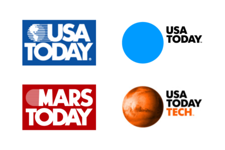
Figure 2.1 Left: The USA Today logo as it appeared in 1990 and the fictional MARS Today logo from the 1990 film Total Recall. Right: The current USA Today logo and a TECH variant featuring the planet Mars, both from the redesign that went into effect in 2012.