AT&T
Communications
YEAR 2015
In 2015, the telecommunications company AT&T is still a large provider of telephone products and services in the United States. Offerings include telephone, fax, wireless, videoconferencing, home automation and security. AT&T pay telephones are also available for use in public spaces.
Overview
Logo Usage
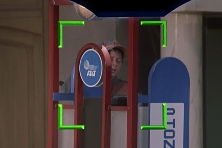
Figure 1.1 As Doc Brown scopes out the situation in the futuristic town square, he spots Marty’s son approaching a pay phone, where we can see the AT&T logo on signage.
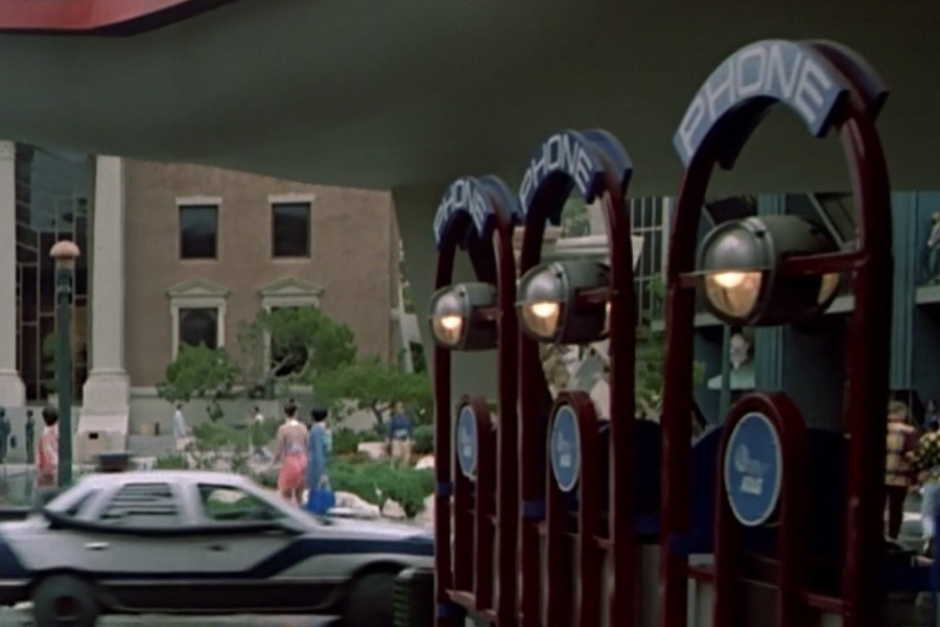
Figure 1.2 Then, as Marty enters the town square on his mission, to his right we see more pay phones bearing the AT&T logo.
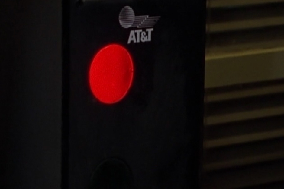
Figure 1.3 When the police drop 1980s Jennifer of at her 2015 residence, we see the AT&T logo next to the front door, on the security interface.
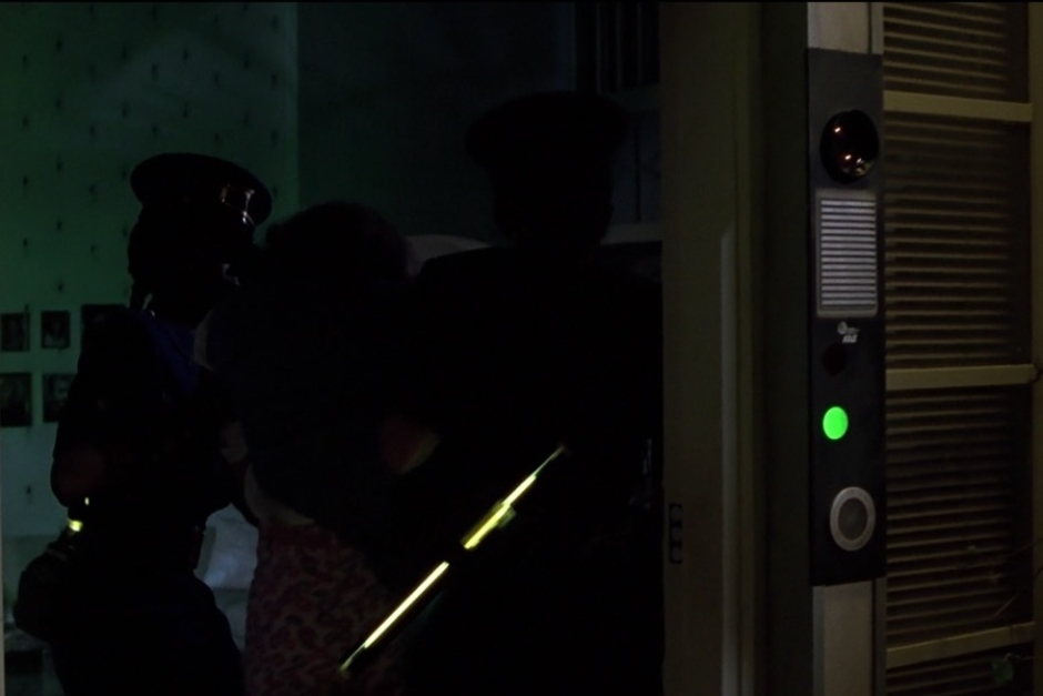
Figure 1.4 To provide more context for how the logo is used, here is a better look at the interface, which includes a voice intercom and camera.
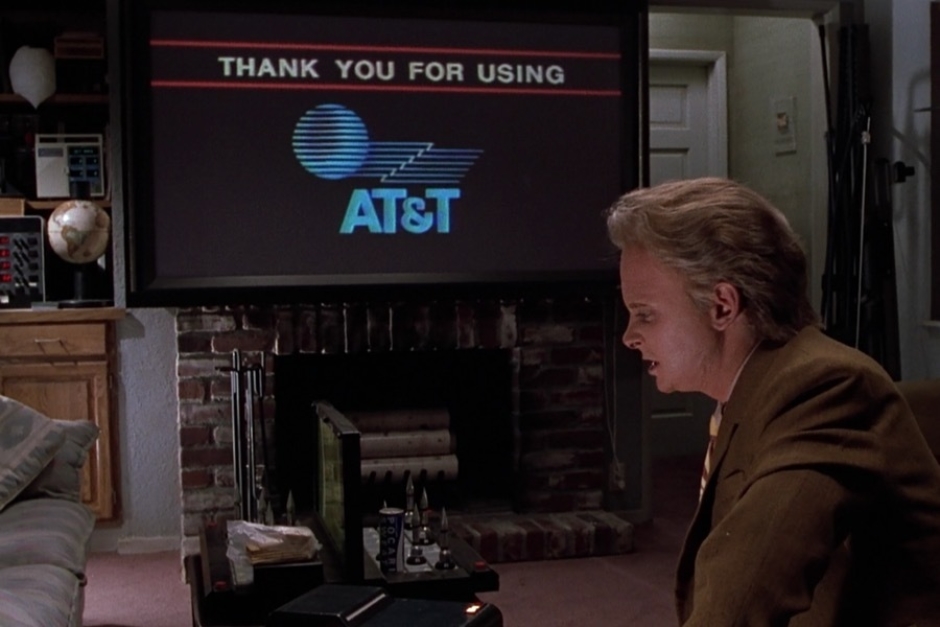
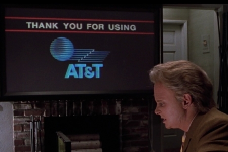
Figure 1.5 As 2015 Marty concludes his video call with Needles, we see the AT&T logo briefly on screen. Note that the ampersand has changed.
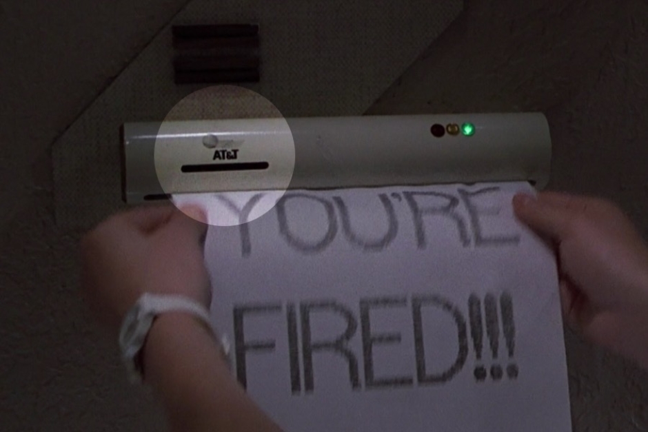
Figure 1.6 When 2015 Marty is fired from his job, the AT&T logo is visible on one of the fax machines delivering the message.
Analysis
In the future as depicted in the 1989 film Back to the Future 2, we see that AT&T still has a strong presence as a telecommunications service provider, in both the household and in public spaces.
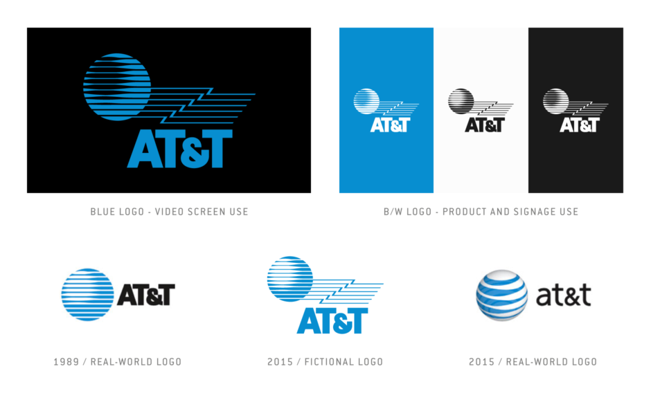
Examining the logo (Figure 2.1), we see that it hasn’t evolved far from the real-world design used at the time the film was made. That version, designed by Saul Bass in 1983, was created upon the breakup of the Bell System. It was one of the first marks of its kind — a striped circle, sometimes referred to as “the death star”, which triggered a trend in similar marks that would go on to be categorized as Bass globes. As described in High Tech Trademarks by John Mendenhall, “The evolution of the AT&T logo illustrates the shift in graphic design towards more abstract (technological) forms and away from object-oriented (industrial) symbolism.” No longer solely a telephone company, and abandoning the old bell symbol for that reason, the AT&T logo was meant to emphasize the company’s involvement in the industries of telecommunications and computers.
In the fictional 2015 logo, we see that the technological globe has itself remained the same, only now there are thin lines extending from its lower hemisphere, trailing behind it in a zig-zag path. Below those lines, we have the AT&T name, which is unmodified, with the exception of the ampersand in one instance. In the video screen usage at least, the leg is missing — an odd place for a mistake to slip by, since it is the largest application of the logo in the film. In all other instances I found, it appears intact, and looks to be the same type used in the real-world logo.
The addition of the lines and how the type relates to the symbol, makes for a dynamic, but unbalanced and awkward overall logo. Looking at design in the 1980s, the trailing lines can be seen as another emergent trend, that was used for identity work in high tech industries. This applied to both symbols (Figure 2.2) and type (Figure 2.3). Given the associations that would have been drawn from their use by these sorts of companies (software, computing, etc), these lines would have looked high tech and futuristic to the 1980s audience, and they were likely added for this reason.
As far as colors go, the AT&T brand of the future still uses the blue we see in the real-world branding, and in instances of signage and product branding, we see 1-color black and white versions, which is to be expected for those sorts of applications.
Given our convenient vantage point, it’s interesting to see how all of this compares to the real-world AT&T logo from 2015. What we had then was a mark from 2005 — a redesign that was undertaken after AT&T’s acquisition by SBC. The globe was made three-dimensional, to represent the “breadth and depth of services” that the new AT&T family of companies would provide consumers. And in between the lines, transparency was added to represent “clarity and vision.” For the type, the “AT&T” characters were set in lowercase to make it more approachable and friendly. So quite a departure from the mark Back to the Future 2 envisioned.
But funny thing, just a year after the film’s imagined future, in 2016, the mark got another redesign, which flattened it back out.
It also saw a move towards using the globe symbol divorced from type, due to its recognition power, and this is something to think about. Not that Back to the Future 2 was really trying to predict where brands would end up (they were just trying to entertain people in 1989), but if they were, its worth considering how recognizable those already mainstream brands would be by symbol alone, after decades of consumer familiarity with them. Now that I think about it, it’s also a way to avoid science fiction typography choices that could potentially date a mark over the long haul.
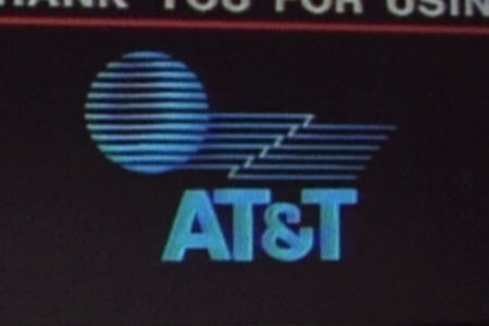
Figure 2.1 The video screen usage gives us the closest look at the film’s futuristic AT&T logo.
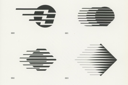
Figure 2.2 The use of trailing lines can be seen as a popular trend in the 1980s, for logos identifying businesses in high tech industries. Source: High Tech Trademarks Vol. 1
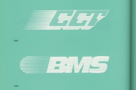
Figure 2.3 Not confined to symbols, trailing lines were also applied to logotypes that appeared in 1980s high tech logos. Source: High Tech Trademarks Vol. 2
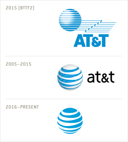
Figure 2.4 A look at the film’s 2015 AT&T logo, compared to the real-world logo from 2015 and the redesign that took place the following year.