Cafe 80s
Restaurant
Year 2015
Similar to retro themed American diners harkening back to the 1950s, Cafe 80s is a nostalgic restaurant in the future that attempts to transport patrons back to an earlier time through its use of music, displayed artifacts and other cultural references from the 1980s.
Overview
Logo Usage
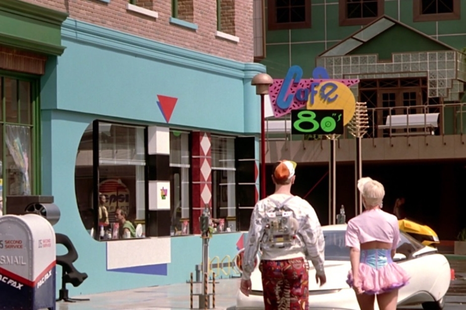
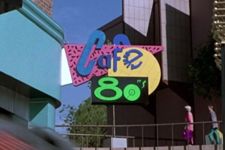
Figure 1.1 After Marty survives the holographic shark attack, he spots the Cafe 80s, where Doc has sent him on a mission. The logo is displayed large on exterior signage, mounted on the front corner of the cafe.
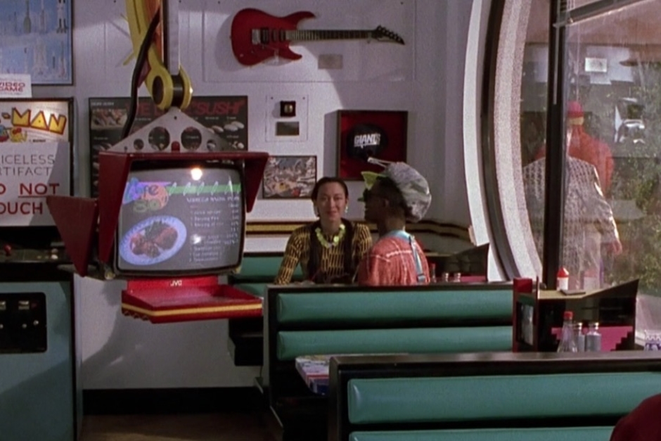
Figure 1.2 Once inside, he is confronted with a strange scene — a mix of 1980s nostalgia and futuristic technology. A prime example is the robotic waitstaff he encounters, which feature the logo on their menu screens.
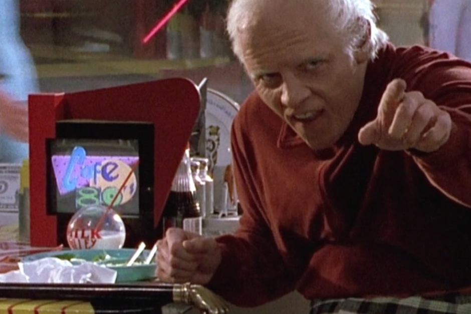
Figure 1.3 When old 2015 Biff calls Marty out, we see the Cafe 80s logo displayed on a small retro-styled tabletop TV. Interesting that a TV replaces what would have been a little jukebox in a 50s diner.
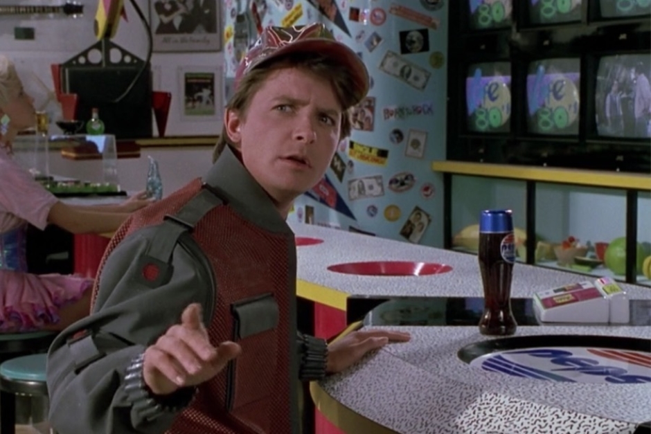
Figure 1.4 As Marty makes the connection between old Biff and Griff, we see the Cafe 80s logo on video screens in the background. The logo pops in like a commercial between 80s TV show segments.
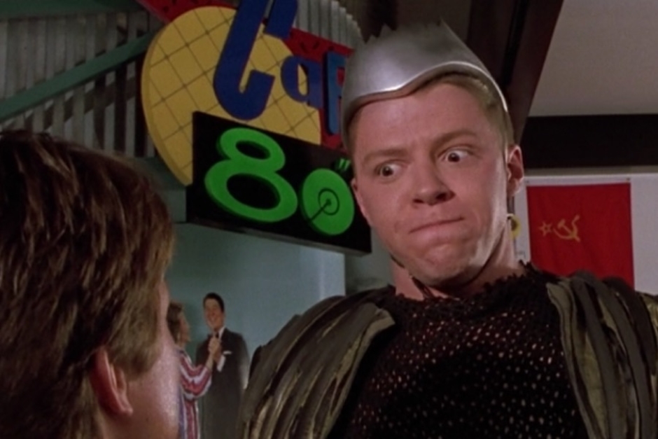
Figure 1.5 When Marty stands up to Griff, we see the logo in the background on cafe signage. Note that it is the reverse of what we see in other places.
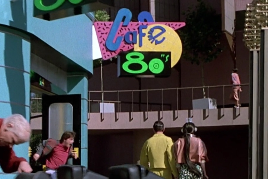
Figure 1.6 As Marty flees from Cafe 80s, we get another look at the logo on exterior signage. I notice the colors used for the characters in “CaFe” change a little from one instance to another.
Analysis
In Back to the Future Part II, the Cafe 80s provides us with an interesting case for analysis. In contrast to other visual identities that appear in the film’s depicted future, it’s not an identity that attempts to portray some existing entity the audience is familiar with, in a futuristic guise. Instead, what we have is an identity that tries to summon the past into the future, a past that is also the lived in present of the story’s audience and main protagonists. So what the designer had to wrestle with is not how a design is imagined to have evolved over the course of decades, but what manner of design survives into the future and defines an era? What kind of cultural artifacts would the future dig up and what would they choose to assemble into an identity?
As the film’s production designer Ron Carter said of Cafe 80s, “It was a way of looking at the future that looked back on us, so that everything didn’t just have to be about the future. So that part of it was making reference to ourselves back in the day, asking what really ends up lasting from what we’re doing right now that people in the future would care about.”
Tasked with the job of creating the identity for the cafe, was artist and designer John Bell (Figure 2.1), who was responsible for a number of the film’s futuristic designs, like the Hoverboard and the USA Today news drone. I know for a fact that he used the Swatch watch brand as inspiration for a number of designs, due to the popularity of their style at the time. We see something similar in the Cafe 80s logo and interior designs. The bright, bold and sometimes clashing colors, the haphazard assemblage of geometric shapes, the patterns and wacky type — a very postmodern look, that has its origins in the boundary-pushing work of the Memphis Group.
The Memphis Group was a global design collective organized in the early 1980s by Italian architect and designer Ettore Sottsass, that initiated what is referred to as the Memphis style (Figure 2.2). Inspired by previous movements like Art Deco and Pop Art, Memphis’ reach had it informing fashion, interior design, furniture, and industrial design for household objects, as well as graphic design of the 1980s. I believe this style, more than anything, informs what we see in the Cafe 80s visual identity.
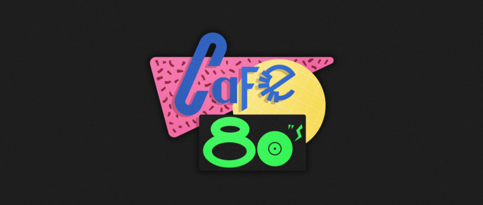
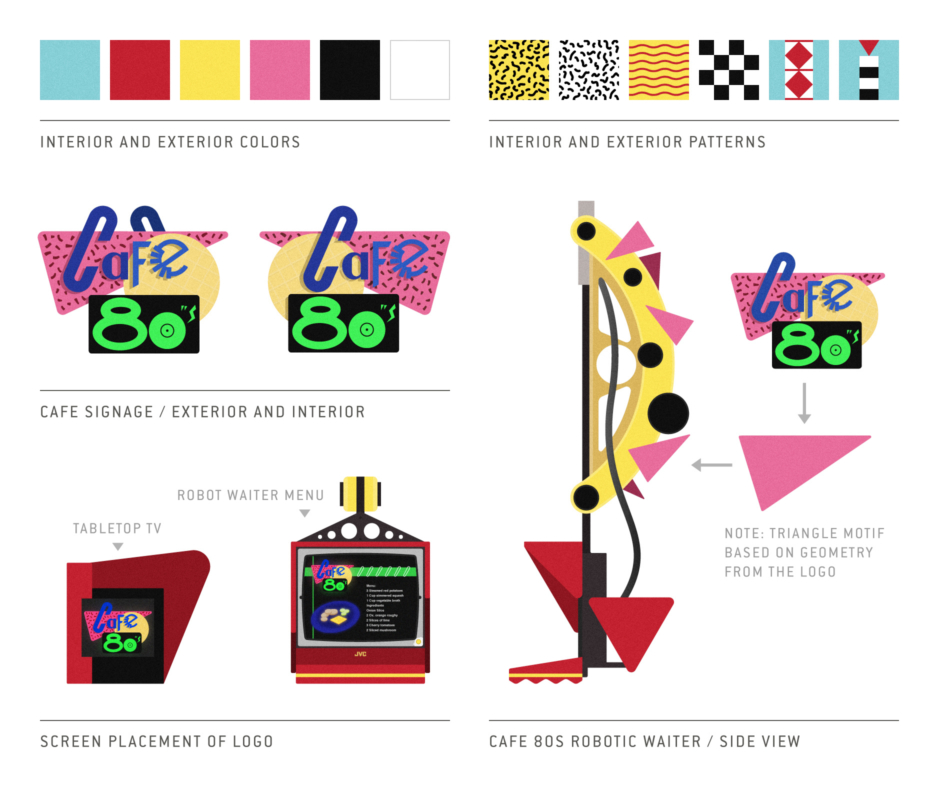
The best look at the Cafe 80s logo comes from the exterior shots, where we see it used as signage (Figure 2.3, left). You’ll notice the C on the opposite side poking up. That gives us a reverse version, which we also see used for interior signage. But the right pointing triangle is what is used primarily, as it appears on monitors and in menus. The custom type uses a mix of upper and lowercase characters of different styles, and the e is particularly weird, as its spine is replaced with small rectangles. The type sits on top of stacked shapes, which adds dimension to the logo even in its 2D usage. Patterns are used in the triangle and circle, though they are not the same patterns we see used in the interior and exterior design of the cafe. Some of the logo’s colors carry through to the interior and exterior though, as part of the larger visual identity.
The triangle shape and color from the logo is repeated as a motif, that we see used in the industrial design that goes into the robotic video screen waitstaff, which are gliding around the cafe taking orders (Figure 2.3, right). Like slices of pizza that were thrown at the thing, just sticking however they landed, the pink triangles are arrayed along the yellow arc that helps connect the machine to the ceiling track. Looking at the signage and robotic waiter, and perusing works by the Memphis Group and those who were inspired by them, you begin to see the similarities. The layering of shapes in a watch, or the yellow arc of a floor lamp topped with shapes (Figure 2.4), are playing by the same wacky rules as the Cafe 80s design.
Beyond those elements of the Memphis style and influence we find in the logo and robotic waiter designs, we also find it in patterns, colors and shapes used for architectural elements and objects throughout the establishment. Notable are the Formica surfaces (Figure 2.5), as well as the little monitors in the dining booths, with their asymmetric styling (Figure 1.3).
As far as logo application goes, its use is what you’d expect, having it appear in signage and on menus. Some aspects of the presentation are more science fiction in nature though, where the menu it appears within is presented on the same screen that has you talking to a computer-generated Ronald Reagan or Michael Jackson, who appear Max Headroom-style as your waiter. It also appears on a wall of televisions, flashing on screen in between segments of 1980s shows the Cafe has playing for patrons.
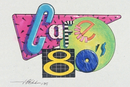
Figure 2.1 The original concept art for the Cafe 80s identity, by artist and designer John Bell. Source: www.JohnBell.Studio
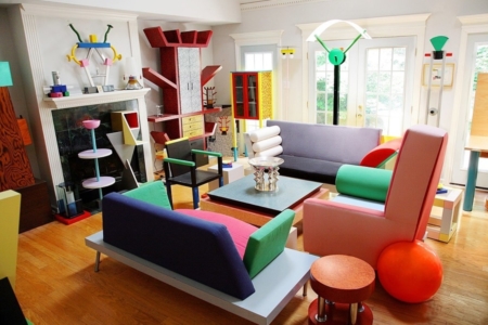
Figure 2.2 A collection of household objects created by the Memphis Group. Source: Wikipedia
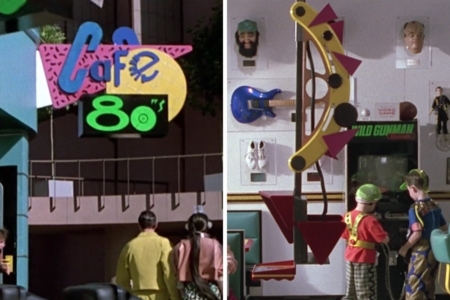
Figure 2.3 The Cafe 80s logo on signage (left) and the robotic waiter (right), which has the pink triangle from the logo repeated in its design
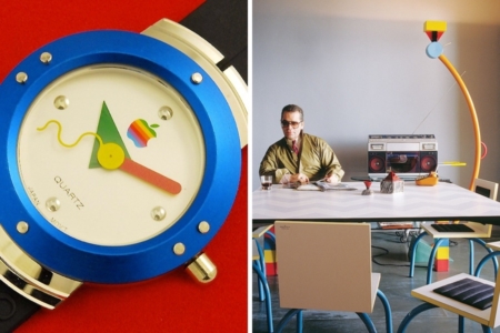
Figure 2.4 Examples of Memphis design — a special edition Apple watch designed in the early 90s (left) and the 1981 Treetops lamp by Sottsass seen in a photo with Karl Lagerfeld, who collected Memphis pieces (right). Sources: Pinterest, Memphis-Milano.org Flickr
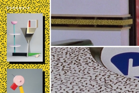
Figure 2.5 The Memphis squiggle pattern (left) makes an appearance in the Formica we see in Cafe 80s, on its wainscoting rail along the walls (top right) and on its countertops (bottom right).
Back to the Real-World Future
As the film’s designers have noted, this is an identity from the future, looking back on the past. And what we see is obviously what the filmmakers thought the future would find important or worth remembering about their era, as Back to the Future Part II was created at the end of the 1980s. From our vantage point in the actual future though, with 2015 behind us, we can pose another question of whether or not this was accurate speculation on their part. Did they get it right? From a design perspective, I think so.
When you see the logo and other aspects of the identity’s design, it immediately communicates what people perceive as “the look of the 80s.” And we can still find retro design homages and references to design culture from the 80s depicting things in this manner (Figure 3.1). Also, Back to the Future Part II itself is a cultural artifact of the era, that reinforces these throwback references for the real-world future we live in.
Coincidentally, we may also be seeing a resurgence of the Memphis style at present, as the creative world churns through the past in search of ideas and direction that can be remixed into something that feels fresh and new. I’m seeing elements of it in graphic design, textiles, ceramics, and more than anything, in illustration work (Figure 3.2). So that says something maybe, about the idea of what might still be important or relevant about 80s design for people in the future. Here in the real-world of 2018, the style no doubt arouses nostalgia for those who experienced the 80s, while still capturing new audiences with its exuberant and outlandish patterns, colors and forms, operating on the same appeal it had for people back in the day.
So we may not have 80s cafes everywhere yet, but the 80s are definitely still with us in the future.
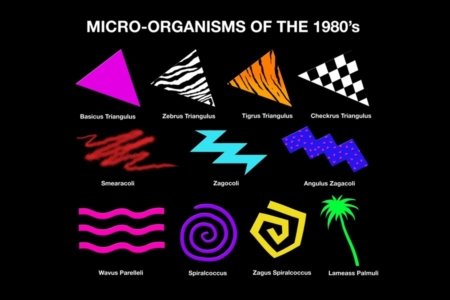
Figure 3.1 A “pop-cultural chart” jokingly referencing 80s design elements, by Dan Meth. Source: danmeth.myportfolio.com
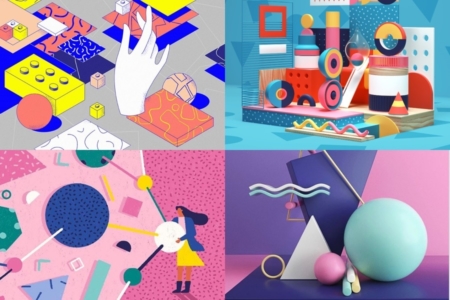
Figure 3.2 Evidence of 80s design appeal can be seen in contemporary illustration work. Examples: Clockwise from top left, Intercom blog art by Mercedes Bazan, 3D art by Peter Tarka for Ueno agency branding, 3D art by Philip Lück for Zehn Socks, and New York Times illustration by Yukai Du.