Pizza Hut
Food, Product, Restaurant
Year 2015
In the year 2015, the chain restaurant Pizza Hut eliminates the need for delivery of hot, ready-made pizzas, by selling its customers packaged dehydrated pizzas that can be prepared at home in a matter of seconds.
Overview
Logo Usage
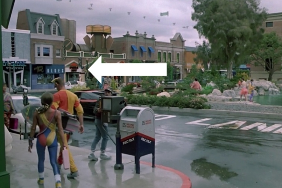
Figure 1.1 As Marty takes in the future Hill Valley town square, the Pizza Hut logo of the future is spotted on a building facade.
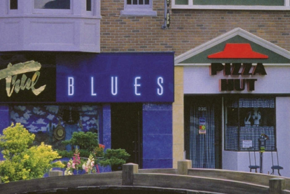
Figure 1.2 Production photos provide a closer look at the Pizza Hut restaurant signage. Source: Back to the Future: The Ultimate Visual History
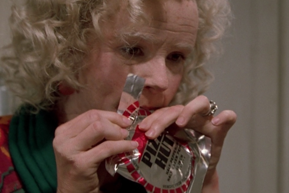
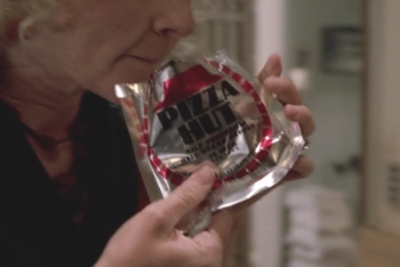
Figure 1.3 As Grandma Lorraine opens the package we catch glimpses of the Pizza Hut logo and packaging design.
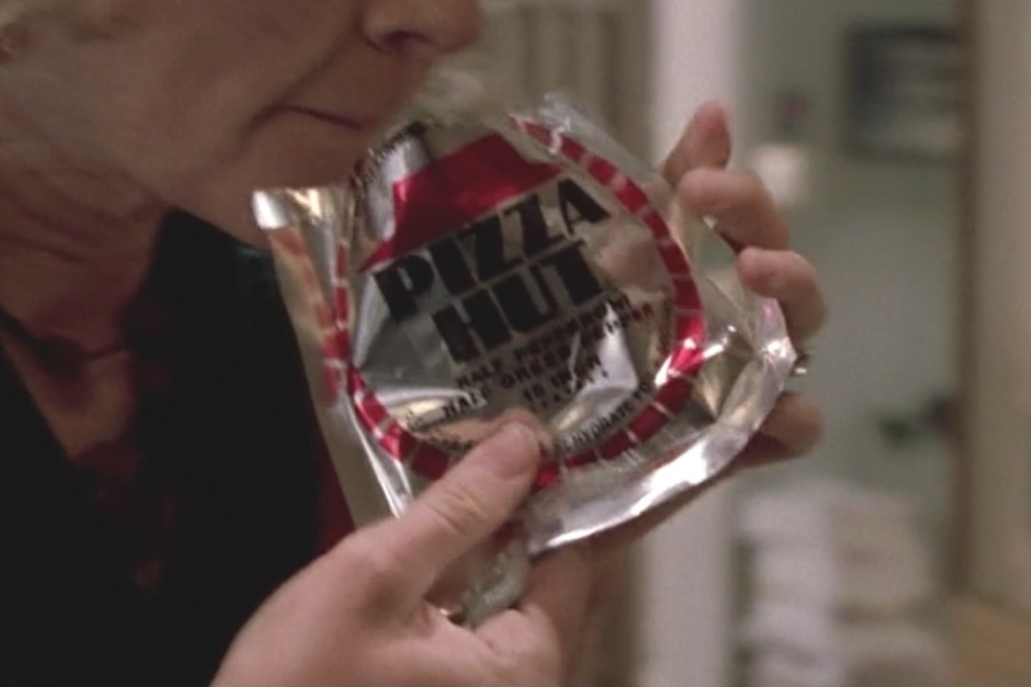
Figure 1.4 Another look at the pizza packaging — a little blurry, but more of a complete view.
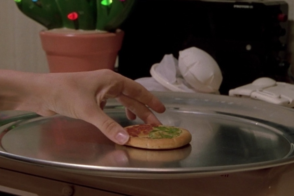
Figure 1.5 For context, the pizza prior to rehydration is the size of a cookie.
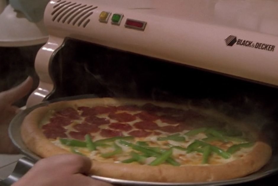
Figure 1.6 The full-sized, cooked pizza, as it emerged from the Black & Decker hydrator appliance.
Analysis
In Back to the Future Part II’s depiction of 2015, the Pizza Hut logo makes two appearances. In the first instance, we see it applied to signage on the front of a Pizza Hut restaurant in Hill Valley’s town square. The second, is at the 2015 McFly household, where Grandma Lorraine prepares dinner. In those scenes, we see the Pizza Hut logo on foil packaging for a dehydrated pizza.
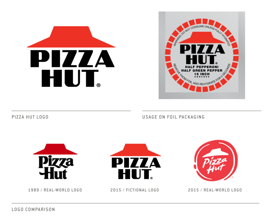
The logo would have been recognizable to the 1980s audience, as it was still composed of the iconic red roof sitting atop the stacked Pizza Hut wordmark (Figure 2.1). In the fictional 2015 version, we see a brighter red used for the roof, and a shift towards harder geometry overall. While the 1980s logo likely used custom lettering for its wordmark, in the future it could be set in an unmodified version of Koloss, a geometric sans typeface originally created by German type designer Jakob Erbar in 1923 (Figure 2.2). Several versions of this typeface are still commercially available today.
Despite the wordmark being all uppercase and more mechanically rendered, the thick and thin letterforms do echo some of what we saw in the older logo’s type. But overall, the logo is saying something very different about the Pizza Hut of the future — this isn’t the source of a home town pizza made by human hands, it's where you get a product of clean and efficient technology. And really, that’s what we see in the future depicted in the film. In its primary application, the audience sees the logo on the foil package for a dehydrated pizza (Figure 2.3), that is simply popped into a machine, producing a meal in a matter of seconds.
But when we compare it to what we actually got in the real-world, the Pizza Hut imagined by the film lands far from the mark in a number of respects. Instead of a geometric and mechanically-rendered visual identity, that gives heavy emphasis to the wordmark, the real 2015 logo went in the opposite direction. Designed by Deutsch LA in 2014, what we have is a very organic logo, that restyles the iconic red roof symbol and wordmark in a painterly manner, also placing them inside a larger holding container depicting a “smear of tomato sauce.” In some instances, the wordmark is even removed from the lockup, as seen in Figure 2.4.
The real-world visual identity was also launched in conjunction with a new menu and branding that touted it as the “Flavor of Now,” which put emphasis on fresh ingredients and new sauces. Again, this was pretty much the opposite of what we saw in the film, where your dehydrated pizza with a shelf life of maybe 8-10 years is the farthest thing from fresh. And rather than fine print preparation instructions and a warning of the danger posed if one fails to follow them, the packaging of the real-world 2015 pizza features a typographic assemblage of words and phrases alluding to all of the perfectly safe and delicious toppings you’ll be enjoying.
It's safe to say Back to the Future Part II didn’t present us with an accurate prediction of Pizza Hut in the year 2015, but I do think the identity they created for it was fitting, especially in contrast to what we saw in the real-world of 1989 and 2015. As with other products and brands that appeared in the film, the goal wasn't prediction, but to exaggerate existing trends and take them to ridiculous conclusions, presenting the audience with something that was both familiar and out-there.
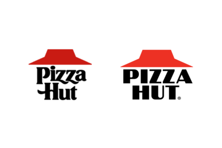
Figure 2.1 The real-world 1989 version of the Pizza Hut logo (left), next to the film’s fictional depiction of the logo from 2015 (right).
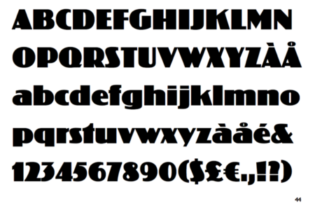
Figure 2.2 The type in the futuristic Pizza Hut logo looks very similar to Koloss, a thick and thin geometric sans typeface designed in 1923.
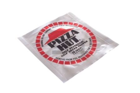
Figure 2.3 The Pizza Hut dehydrated pizza package from Back to the Future Part II — pictured is an actual unused prop for the film, that appeared in an online auction listing. Source: ScreenUsed
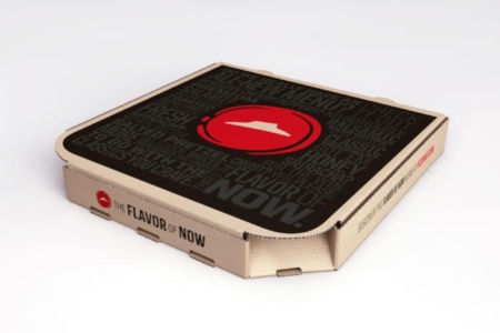
Figure 2.4 The real-world 2015 Pizza Hut logo and pizza box, from a press release for the 2014 rebrand. Source: Brand New