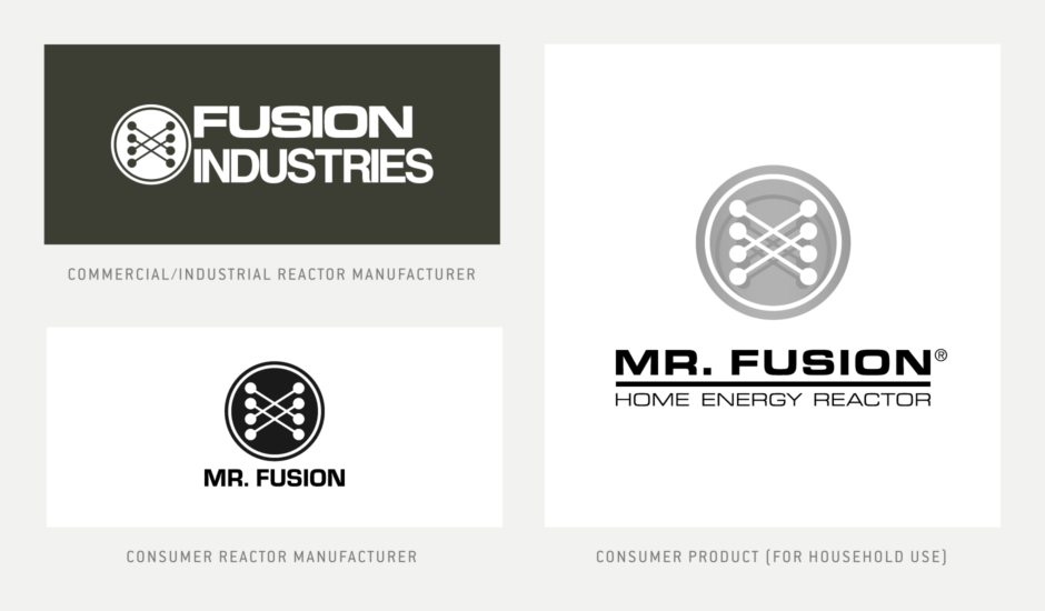
Fusion Industries
Energy, Manufacturer
YEAR 2015
Fusion Industries is a manufacturer of nuclear fusion energy reactors. This includes a Mr. Fusion consumer product line, featuring small-scale reactors capable of powering homes and vehicles.
Overview: The Fusion Industries Family
Intro
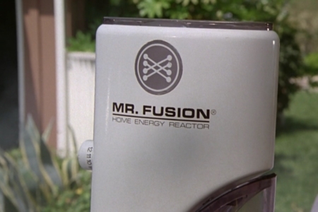
Mr. Fusion first makes its appearance in the end scene of the film Back to the Future (1985) — which is also reenacted in the beginning of Back to the Future 2 (1989) — when a futuristic-looking Doc Brown abruptly arrives in the DeLorean to retrieve Marty, so he can accompany Doc on a mission back to the future in 2015 (Figure 1.1). As the two banter back and forth, Doc hastily digs through the McFly’s garbage, dropping organic waste and a Miller High Life (can included) into the white appliance that is now protruding from the back of the vehicle (Figure 1.2). This apparatus bears a striking resemblance to a Krups coffee grinder, but it is actually a new power plant from the future, which the logo reveals to be a Mr. Fusion Home Energy Reactor.
When they finally reach the year 2015, parking in an alley near Hill Valley’s town square, we see another logo as they get out of the car to prepare for their mission (Figures 2.1–2.3). It reads, “Fusion Industries” and shares the same symbol as the Mr. Fusion logo. What we’re seeing it on appears to be a larger fusion reactor, for commercial/industrial use. Beyond that, we don’t see the Fusion Industries logo again anywhere else.
But we do see the Mr. Fusion logo in one other place — on signage advertising sales, service, and installation available at the futuristic Texaco station (Figure 2.4). In this instance, it appears without the tagline “Home Energy Reactor.” So while what we see on the DeLorean may be Doc’s handy work, installing a reactor meant for household use, it seems there is the option to have a Mr. Fusion professionally installed as a street legal power plant in your vehicle.
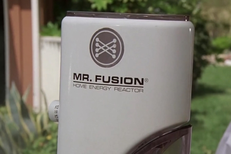
Figure 1.2 The Mr. Fusion logo as it appeared on the Home Energy Reactor that powers the hovering post-2015 version of the DeLorean time machine.
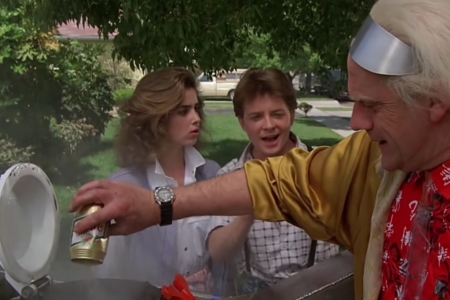
Figure 1.2 Saving Doc the trouble of feeding his previous power plant’s plutonium fuel requirements, Mr. Fusion can run on easy to obtain household waste, like Miller High Life.
Usage
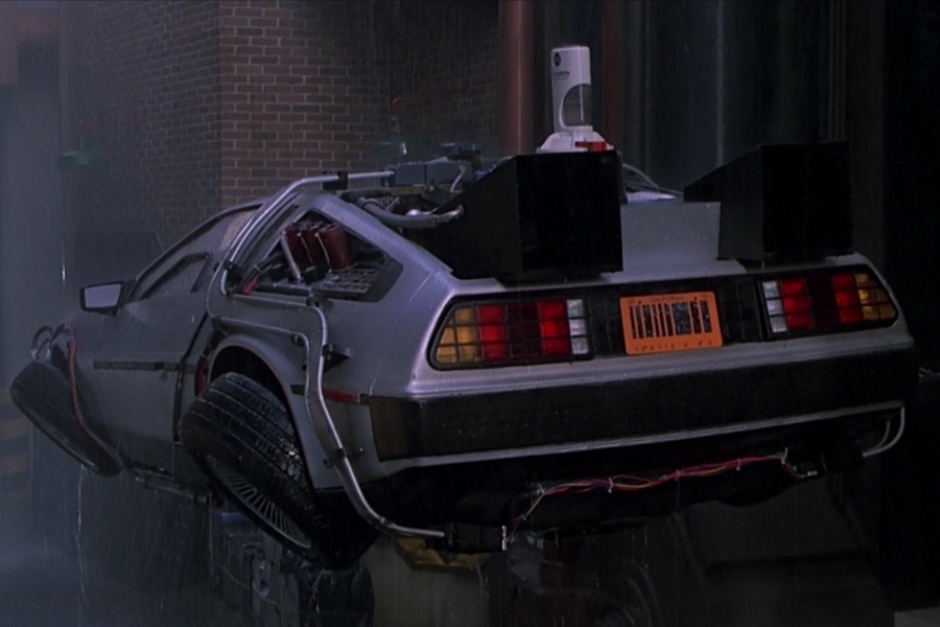
Figure 2.1 In the year 2015, as the hovering time machine comes to a rest in an alley, we see the Mr. Fusion protruding from the car’s engine area.
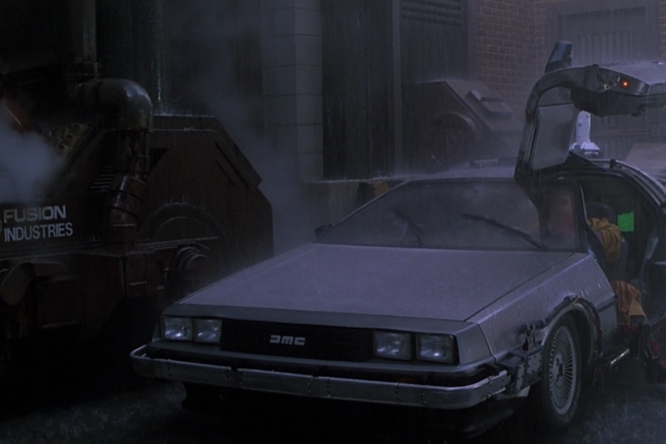
Figure 2.2 As they wait for the rain to stop, to the left of the car we see a large fusion reactor, with a logo reading “Fusion Industries.”
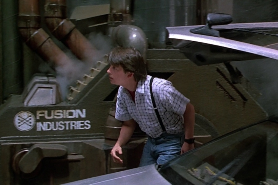
Figure 2.3 As Marty walks past it, we get a closer look at the logo in its entirety. It shares the same symbol as the Mr. Fusion logo.
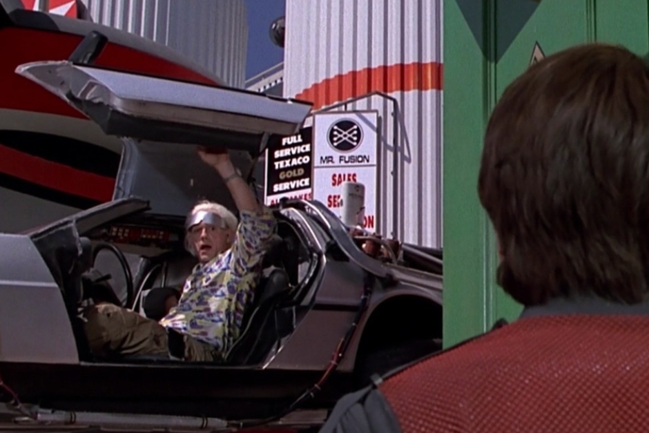
Figure 2.4 When Doc swoops in to pick Marty up from the town square, we see the Mr. Fusion logo in the background, on the service station signage.
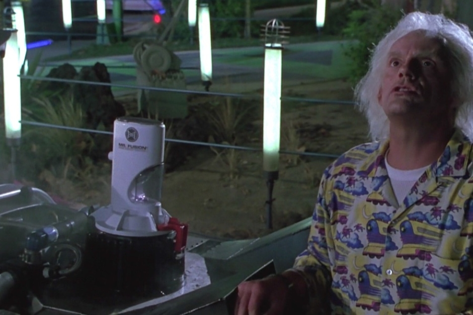
Figure 2.5 As Doc Brown contemplates the dangers of time travel and the mysteries of the universe, we get a better look at the Mr. Fusion.
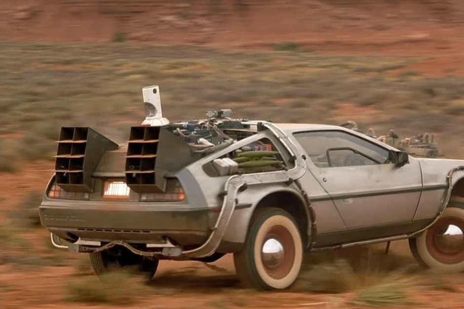
Figure 2.6 In addition to appearing on the time machine in the first and second films, the Mr. Fusion logo makes it into the third film as well. Also, we can note here that the logo only appeared on one side of the reactor unit.
Analysis
Of the three logos pictured in the overview, the first to appear in the Back to the Future films is the Mr. Fusion product logo, so we’ll start there with the design analysis.
The name “Mr. Fusion” is obviously a parody of the real-world kitchen appliance, Mr. Coffee, which is well-known in American popular culture and has been referenced in other films as a joke (Mr. Radar in Spaceballs, for example). Usually it implies that some device or machine involving a complicated hands on process has been made so simple a monkey could use it.
That said, the logo itself isn’t derived from that of Mr. Coffee (Figure 3.1). But there is an odd, maybe coincidental, connection between the name and the logo design — Mr. Coffee was engineered by two former Westinghouse employees. And going back through books on the history and making of the films, I found concept artist Michael Scheffe’s sketches for the Mr. Fusion (Figure 3.1), which shows it was originally conceived as a future product of the Westinghouse Electric Corporation.
In addition to the obscure Mr. Coffee tie-in, Westinghouse is a real-world corporation that would make sense for two reasons — one being that it was a household name in consumer appliances, and the other being its longtime involvement in energy generation technologies, including nuclear power.
Now they did change this, opting to drop the Westinghouse identity for what made it into the film, but that logo’s presence is still felt as an inspiring force behind the final Mr. Fusion identity. So it’s worth looking at the Westinghouse logo design, and how certain elements were retained and modified.
Designed in 1960 by Paul Rand, the symbol for Westinghouse was an adaptation of an earlier mark, that was basically a circle with a W and underscore drawn inside of it. Rand modernized that uninspiring mark while retaining those basic elements, and created something unique at the time — the final design being comprised of a series of dots and lines that connect to form the W, with a fresh take on the underscore to compliment them. The dots and lines are said to suggest electronics and printed circuits, based on info from Rand’s book Paul Rand: A Designer’s Art (but there’s also a video interview where an older Paul Rand said the mark didn’t mean anything and they were just some dots and lines). The symbol proved so successful it is still used to this day, unchanged.
And as I’ve shown in Figure 3.3, all we need to do is remove the Westinghouse symbol’s underscore element and turn the W on its side, to start working things towards the arrangement seen in the Mr. Fusion symbol. Not an exact copy of those elements, but the influence is definitely there.
But is that all there is to it? Just a simple rehashing of an existing brand’s identity? Possibly so, but I think there could be one other source of inspiration informing the design, tying it to the physics involved in fusion energy production. A quick internet search for nuclear fusion returns a lot of diagrams depicting the most common reactions (Figure 3.4). All of these diagrams rely on dots and lines, and while they don’t exactly map to the mark, the most common has a vaguely similar composition of two in and two out, with the reaction/point of contact in the center. So there is a chance this visual came into play as they created the final Mr. Fusion mark. I wonder if it is meant to suggest a chain reaction? The way it seems to stack two reactions, is why I suggest this. None of the “making of” books mention this, so it’s all speculation on my part.
From there, the type is a set in the old scifi staple — uppercase Eurostile. To be specific, “Mr. Fusion” is set in unmodified Eurostile Extended Black, and “Home Energy Reactor” is set in unmodified Eurostile Extended Regular.
As the logo appears on the reactor, the type is in black on the white plastic surface, and the symbol is in white, over a circular clear plastic window where you can look at your coffee beans as they undergo the nuclear fusion process.
Moving on to the 1-color white Fusion Industries logo, we see familiar elements. The symbol from Mr. Fusion is used. “Fusion” remains set in uppercase Eurostile Extended Black, but with tighter letterspacing. This logo introduces another typeface though, using Helvetica Bold for the “Industries” line, where the letterspacing is so tight the characters almost touch. Another departure from what we see in the Mr. Fusion logo, is the lockup isn’t center aligned and vertically stacked, but horizontal with left aligned, stacked type.
And finally, there is a version of the logo that just reads “Mr. Fusion,” which can be read as the manufacturer logo for the consumer product line of reactors (this would include the Home Energy Reactor). That logo appears in 1-color black, on a white sign attached to the Texaco service station. And breaking from the use of Eurostile Extended Black, “Mr. Fusion” is set in uppercase Eurostile Heavy — probably for placement in a smaller space, allowing it to appear larger and more legible to the film’s audience.
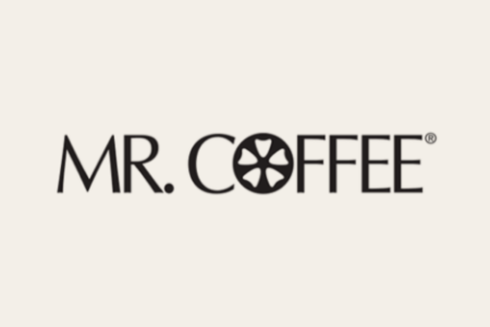
Figure 3.1 The inspiration for Mr. Fusion’s name is Mr. Coffee, but the coffee maker’s logo wasn’t part of the equation. Source: Brand New
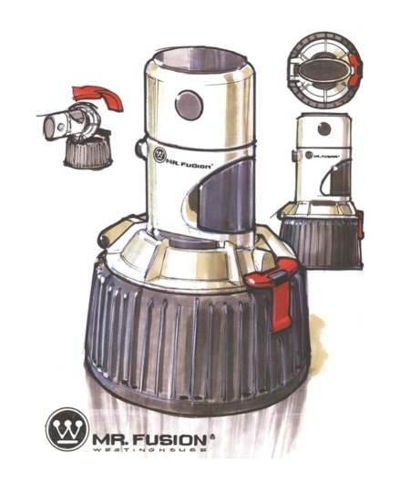
Figure 3.2 Michael Scheffe’s original sketches show the Mr. Fusion as a Westinghouse product, which employs the Westinghouse symbol and name in its logo lockup. Source: Back to the Future: The Ultimate Visual History
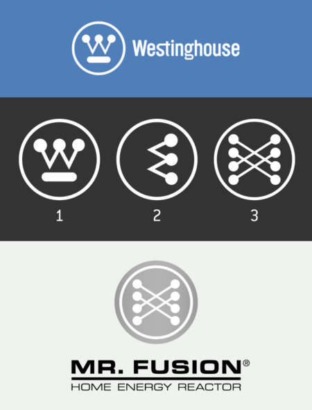
Figure 3.3 Starting from the Westinghouse symbol, all we need to do is remove the underscore element and turn the mark on its side to see how the Fusion symbol can begin to be derived from its basic elements.

Figure 3.4 Diagrams depicting fusion reactions rely on dots and lines, and have a composition similar to that of the elements making up the Mr. Fusion symbol. Source: Google Search