Pepsi Perfect
Beverage, Product
Year 2015
In the year 2015, Pepsi Perfect is the flagship Pepsi beverage, which are sold in plastic bottles featuring a lid with built-in straw.
Overview
Intro
In Back to the Future Part II’s depiction of 2015, in scenes where Marty is taking in the view of Hill Valley’s futuristic town square, if you’re looking carefully you can spot the Pepsi logo, on what appears to be the backlit facade of a vending machine (Figure 1.1). Not a terribly futuristic application, but the logo does look a little off — the first hint of the changes it has undergone since Marty’s present in 1985.
His mission then takes him to Cafe 80s, where in spite of the retro theme, Pepsi products from 2015 are featured prominently (Doc did say they did a bad job with recreating the 80s). It’s here that Marty encounters the brand’s flagship beverage, Pepsi Perfect.
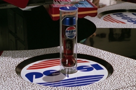
Not only does this scene give us a good, clear view of the Pepsi logo on the countertop (Figures 2.1–2.3), but in one of the more novel ways I’ve seen a logo used, our first look at the Pepsi Perfect logo is when a bottle it is on literally rises out of the Pepsi logo using some of that tube transportation we always hear about in the future.
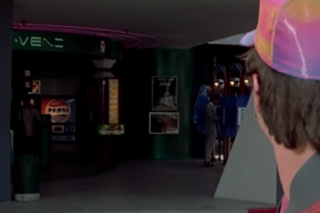
Figure 1.1 As Marty takes in the future Hill Valley town square, the Pepsi logo of the future is first spotted on a vending machine (center-left).
Logo Usage
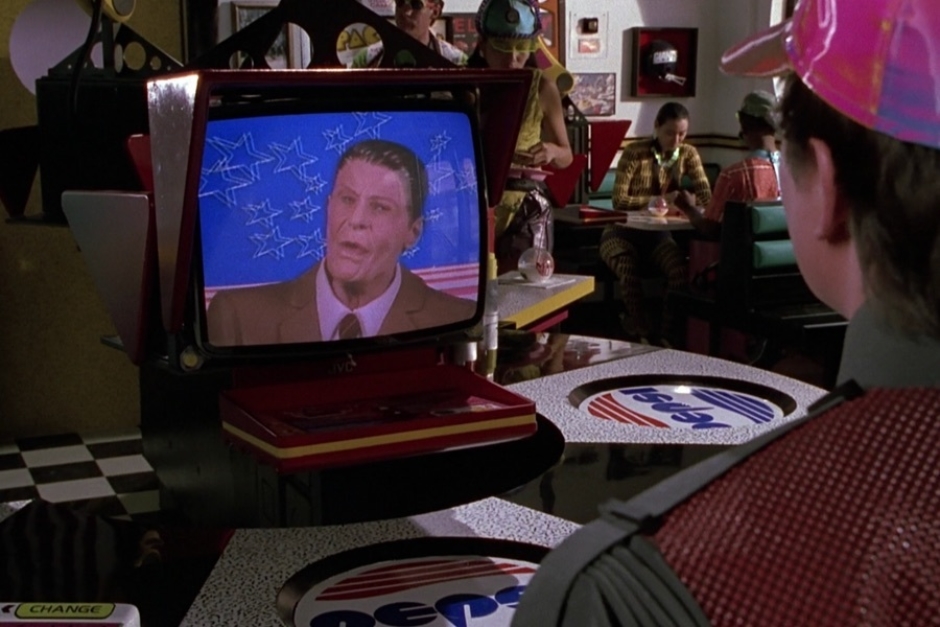
Figure 2.1 In the Cafe 80s, the 2015 Pepsi logo can be see in recessed circles in the surface of the countertops.
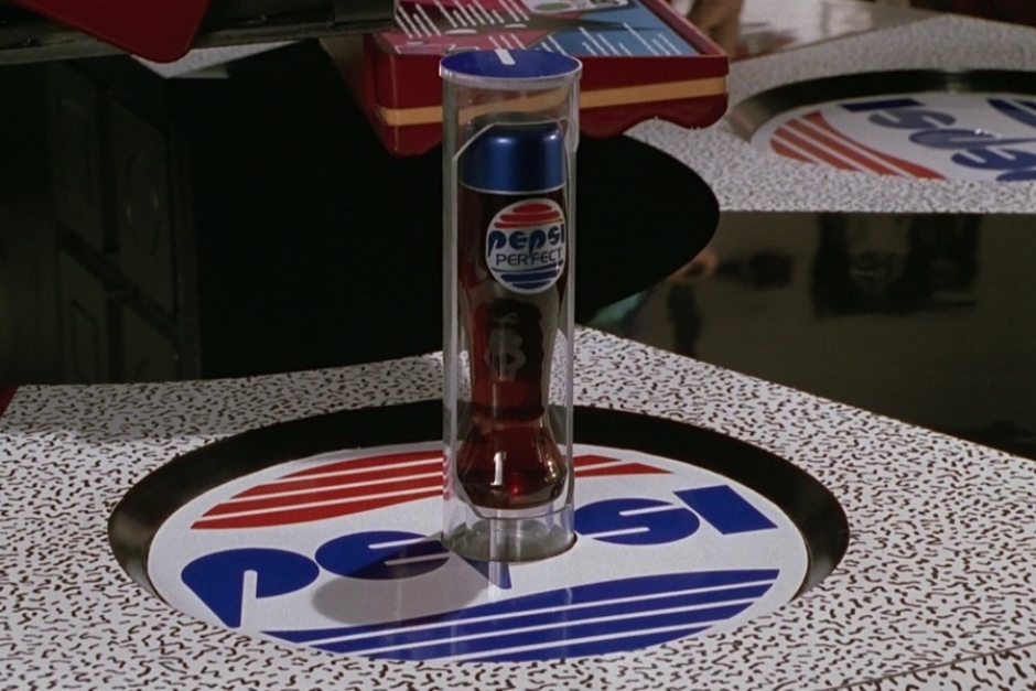
Figure 2.2 When Marty orders a Pepsi, a bottle of Pepsi Perfect is dispensed via a tube that spirals up from below the P in the Pepsi logo.
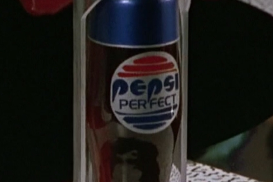
Figure 2.3 A closer look at the Pepsi Perfect logo, on the front of the bottle. Note that the red and blue waves from the Pepsi logo appear differently.
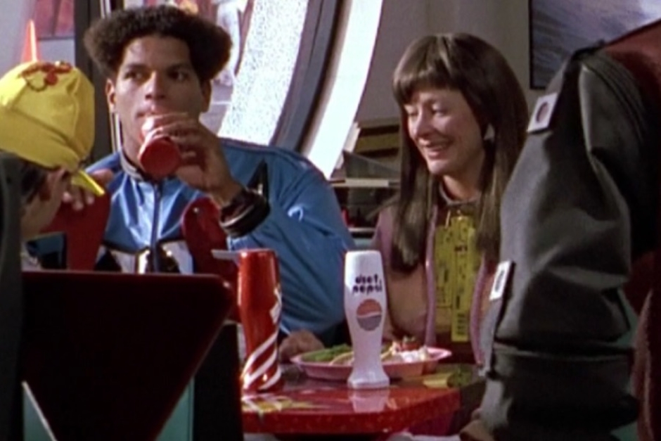
Figure 2.4 If you look in the background of scenes in the Cafe 80s, you can see people drinking other Pepsi products like Slice and Diet Pepsi.
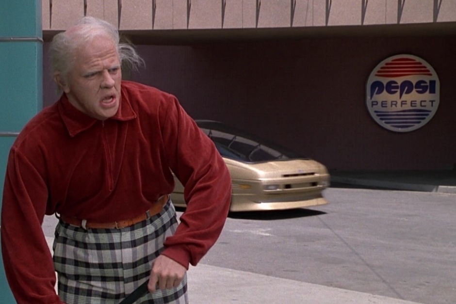
Figure 2.5 As old 2015 Biff observes the hoverboard chase scene, we can see the Pepsi Perfect logo on outdoor signage across the street.
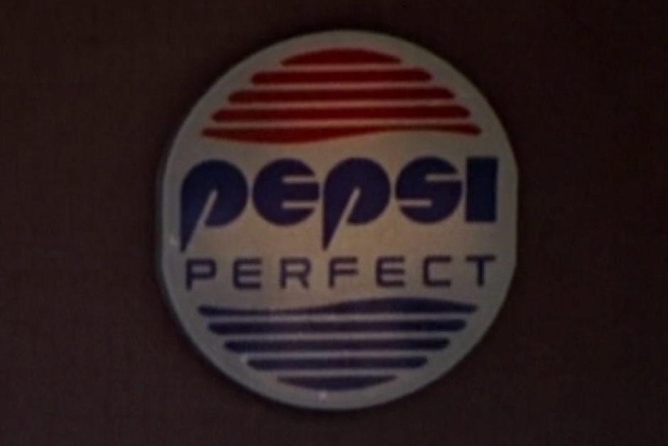
Figure 2.6 Note that the outdoor signage uses a different logo from what we saw on the bottle — more lines and PERFECT is set in a different typeface.
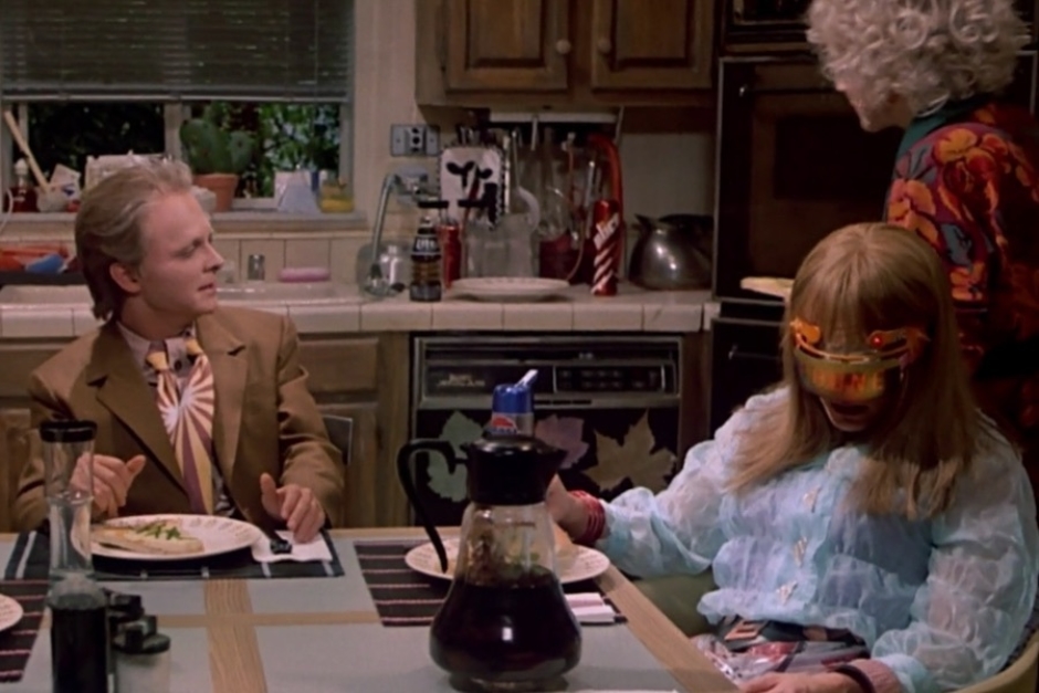
Figure 2.7 At the 2015 McFly household, we see Marty’s daughter Marlene with a Pepsi Perfect. In the background, a Slice bottle is seen on the counter.
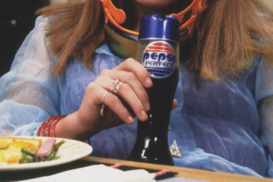
Figure 2.8 Another look at the Pepsi Perfect logo as it appeared on bottles. Image Source: Back to the Future: The Ultimate Visual History
Analysis
Thanks to time travel and the film being a sequel, this one requires a bit of explaining to get started.
In the 1989 film Back to the Future Part II, Marty travels from his own time in 1985 to the year 2015, where he encounters the Pepsi brand of the future. As a result, the story manages to jump the audience over a real-world redesign of the Pepsi logo that took place in 1987 — a development that no doubt influenced designers working on the film. Which means we have two real-world logos to examine first, to give us a better understanding of the visual identity’s evolution once we trek off into its science fiction future.
The Pepsi logo as it concerns this analysis, consists of two main elements. One being the blue Pepsi wordmark at its center, and the other being the circular “Pepsi globe” that encapsulates the wordmark with red and blue halves, which are broken by a wavy white stripe. I’m not sure when they started referring to it as a globe, but that’s what they call it at present. I believe the original reason behind its circular form is owed to it being designed to work well on bottle caps.
As for its evolution over time, it’s surprisingly difficult to find an accurate account of the Pepsi logo’s history, in articles on the subject that can be found on the internet. Dates of redesigns and the actual logos vary from article to article, with many omitting some designs altogether. So what I did was look at actual can collector archives, vintage ads and some old logo books, to find what I was looking for.
In 1985, the year of Marty’s present, he would have been familiar with two logos (Figure 3.1). There was the Pepsi-Cola Company logo, which was a design from 1973, that appeared on ads, signs, bottles, packaging, etc., and was also the logo where the red and blue shapes on the left and right came into the picture, implying an overall rectangular shape. And there was another version of the logo that appeared on Pepsi cans, featuring type in a lighter weight, that had been used as far back as 1970.
In 1989, when Back to the Future Part II was made (Figure 3.2), there was a slight change in the wavy white stripe and the space it allotted for the type, which was reduced. The wordmark was updated with a more modern look. Where the back stem of the E previously made right angle turns to meet the horizontal bars, rounded corners were introduced. The S became more geometric. Overall, the letters became more cohesive, and the E and the S shared elements of the same mechanical construction employed in the P letterforms. Interestingly, this type was actually something I found in use on even earlier cans, in Mexico in the 1970s and then on Diet and Caffeine Free Pepsi cans in the US starting in the early 1980s, even though the logo is listed in most places as being a 1987 redesign. At any rate, by 1989 it had been adopted as the new Pepsi logo, as seen in the 1989 "A Generation of Choice” television commercial.
So, with those steps in mind, now we can take a look at the logos Marty encounters in the year 2015.
The first instance we saw, was on the vending machine (Figure 1.1), and it shows the logo flanked by red and blue shapes that form a rectangle, so that element has been carried forward.
Later, when Marty is in Cafe 80s, we get a good close look at the 2015 Pepsi logo, which appears in circular surfaces recessed into the countertop (Figure 3.3). The Pepsi globe remains a familiar shape, but it now has white lines cutting across it, slicing each half into four horizontal stripes. The wordmark has taken geometric construction to the extreme. Just as we saw the letterforms redesigned in the 1987 version, to bring each letter closer in line with the others, we see the same thing happening in the 2015 logo — this time relying on the same circle shape to build the P, E and S letters. Aside from the triangle descender of the P, what actually defines these simple shapes as letters are lines cut into the circles, where they imply counter spaces. The use of these lines also ties the wordmark to the sliced globe.
Another interesting aspect of the logo’s geometry, is how the circle in the center P serves as a portal, from which a bottle can be dispensed. For me, it calls to mind the way the form and function of the bottle has influenced elements of the logo design in the past, where the old metal bottle caps dictated the use of a circular logo. Now, in a futuristic application, we see the logo being designed with shapes that facilitate tube transportation and delivery of its beverages to consumers.
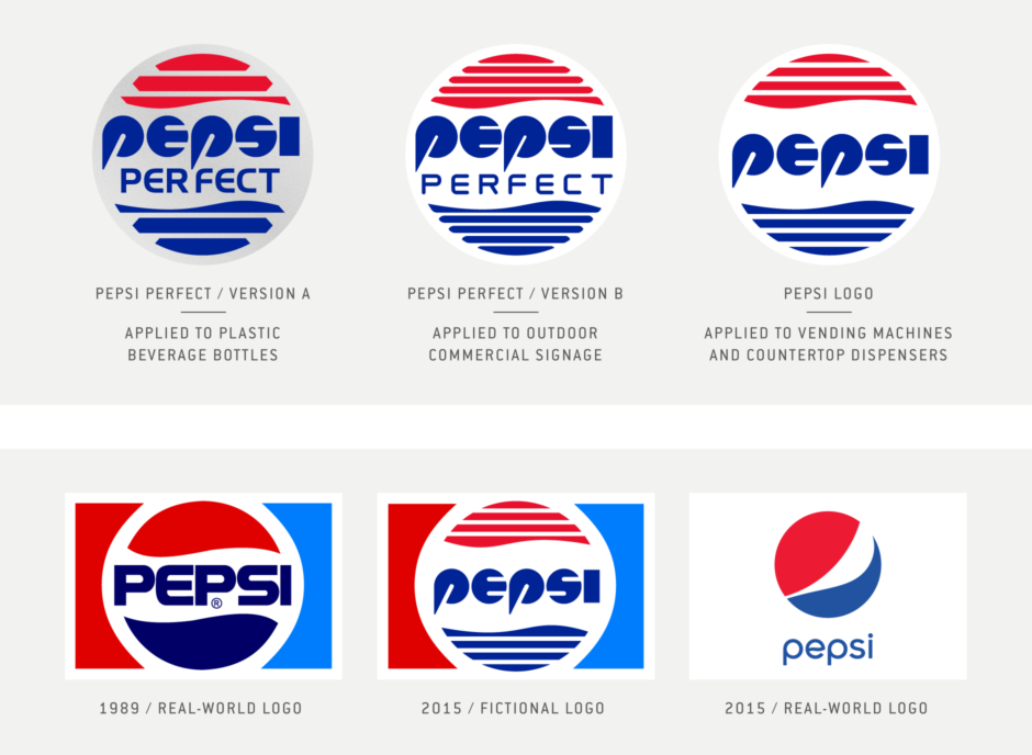
Regarding the striped globe, I have to admit that this treatment threw me for a loop at first. Especially in the Pepsi Perfect versions of the logo (Figures 3.4–3.5), where the ends of the sliced shapes taper to a point. In the version on the bottle they are particularly pronounced, giving its globe a jagged and mechanical appearance.
What immediately came to mind was the 1980s design trend of using similarly styled linework in hi-tech industry logos, so I assumed it was just something done for futuristic effect. But after I started my research, I was reminded that in the 1980s, Diet and Caffeine Free Pepsi used a globe that was implied by the thickening of repeating horizontal lines running around the can. This also explains the weird tapers in the Pepsi Perfect versions of the striped globe — looks like they just chopped off the lines that had extended past the Pepsi globe. In the larger version of the Pepsi Perfect logo we see on outdoor signage, the slices even number the same, with 5 above and below, just as there are in the 1980s Diet Pepsi logo.
Having noted the difference in the way the globe element is rendered in the two versions of the Pepsi Perfect product logo, there is one more difference to point out. While we see the same Pepsi wordmark used in each, the word “PERFECT” is set in different type. Both are stylistically similar to the lettering used in the real-world 1989 Pepsi wordmark. In the case of the bottles, PERFECT is typeset in Handel Gothic, a typeface used in other designs that appear in the film’s 2015 future (see the Pac-Fax entry, for an example). For the larger version of the logo that is used on outdoor signage, I wasn’t able to identify the typeface. It’s possible it is a different version of Handel Gothic that is no longer available, or custom lettering.
Overall, when considering the logos it evolved from, none of what we see from Pepsi in the film’s version of 2015 seems terribly far-fetched. As for how it all measures up to the real-world 2015 Pepsi identity? I think what we really ended up with would have looked pretty odd to the 1980’s audience. Even at the time it was introduced in 2008, it generated a lot of attention and controversy, due to the design’s weird alteration of the longstanding Pepsi globe’s form and the bizarre design rationale documents that were released in conjunction with the design. As the saying goes, sometimes truth is stranger than fiction.
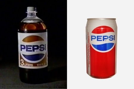
Figure 3.1 Two versions of the Pepsi logo that could be found in 1985. Image Sources: 1985 Pepsi TV Commercial (Left) and CanPedia (Right)
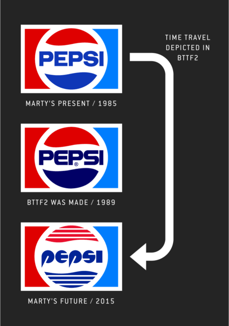
Figure 3.2 When Back to the Future Part II was created in 1989, its designers had by then seen the real-world Pepsi logo evolve beyond what would exist in Marty’s present in 1985. This likely figured into their designs for 2015.
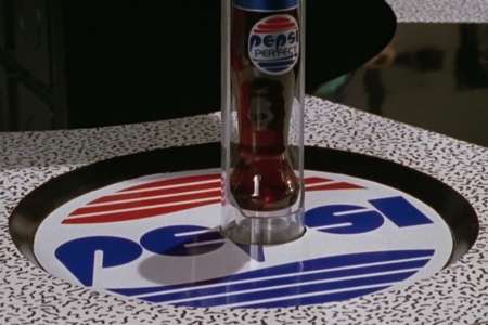
Figure 3.3 The Pepsi logo as it appeared on bottle dispensing countertops in Cafe 80s, from which Marty receives his Pepsi Perfect order.
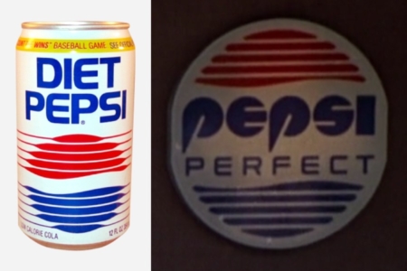
Figure 3.4 Left: A 1987 Diet Pepsi can, featuring a Pepsi globe implied by the thickening of horizontal lines. Right: One version of the 2015 Pepsi Perfect logo, that uses a Pepsi globe consisting of the same number of horizontal lines — 5 above and below. Image Source for Can: CanPedia
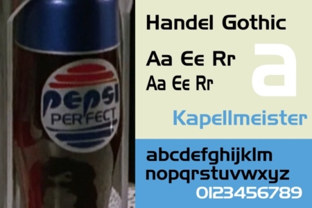
Figure 3.5 Left: The Pepsi Perfect product logo as it appears on bottles. The Pepsi globe has fewer lines slicing through it, and PERFECT is typeset in Handel Gothic, a typeface similar in style to the lettering used in the 1987 Pepsi logo. Specimen Source: Wikipedia
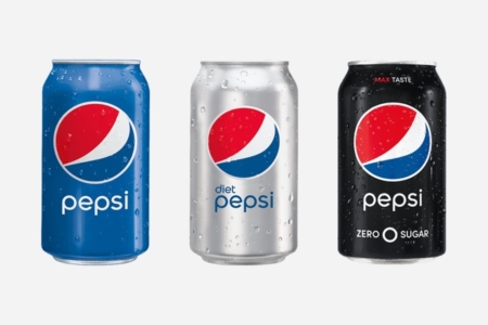
Figure 3.6 Pepsi cans featuring the current logo design, which was introduced in 2008. Source: Pepsi Website
Pepsi Perfect Homage
The Pepsi Perfect story didn’t end with the film’s depiction of 2015. On October 5, 2015, a Pepsi press release announced the following:
“Surprising Back to the Future fans everywhere, Pepsi officially confirms the long-awaited creation of Pepsi Perfect - the famous soda Marty McFly orders in the second installment of one of the most beloved trilogies in motion-picture history. The fantastical cola, made famous by the film, will officially be available on October 21, 2015, paying homage to the date Marty McFly travels to in the future. Since 1989, Back To The Future enthusiasts have waited patiently to see how the future unfolds.”
Limited to a release of 6,500 bottles, available for $20.15 each, they quickly sold out to collectors.
Regarding the design, Pepsi opted to modify the logo (Figure 4.1) from what we saw in the film. The straight horizontal lines were ditched for curvier lines that echo the wave passing through the center of the Pepsi globe. And the the type was scaled down in relation to the overall mark, which also saw PERFECT further reduced in scale and aligned with the right side of PEPSI. As for the PEPSI wordmark, it remains fairly true to what was seen in the film, with some small tweaks to the E and S.
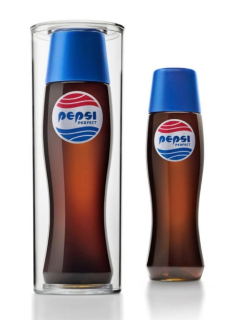
Figure 4.1 The Pepsi Perfect bottle as it appeared in the special collector’s edition released by Pepsi in 2015. Source: Pepsi Website