
USA Today
Media, News
YEAR 2015
USA Today is an internationally distributed American daily newspaper that serves as the flagship publication of its owner, the Gannett Company.
Overview
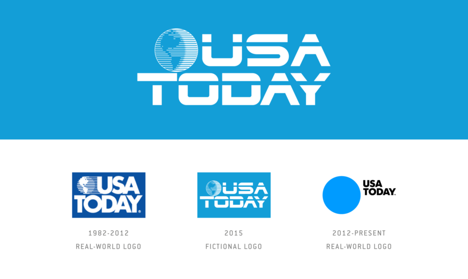
Logo Usage
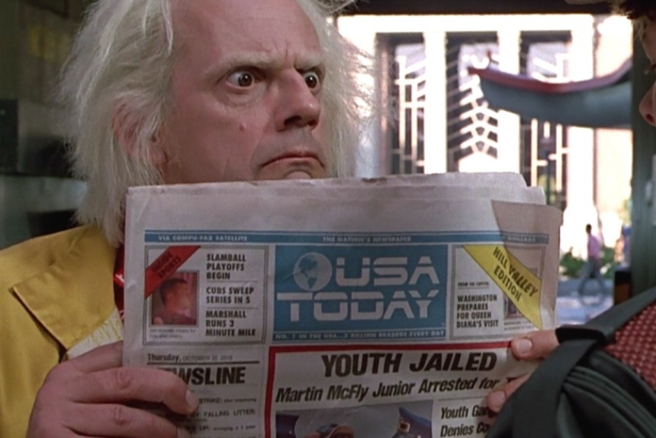
Figure 1.1 The first time we see the USA Today logo, it is on the newspaper Doc Brown shares with Marty, which shows his son being arrested.
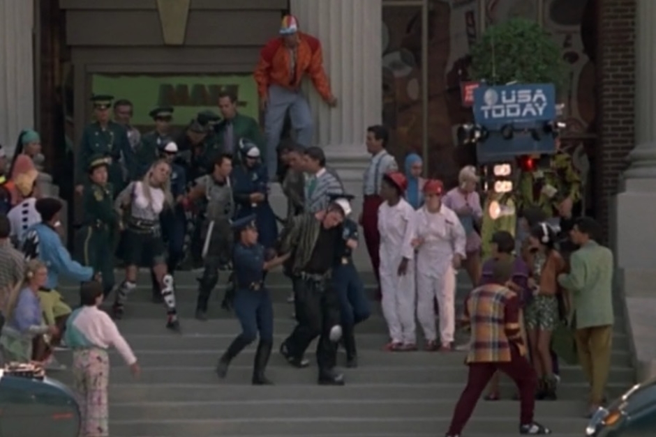
Figure 1.2 As Griff and his gang are being arrested, we see the USA Today logo on a hovering news camera drone that is capturing the event.
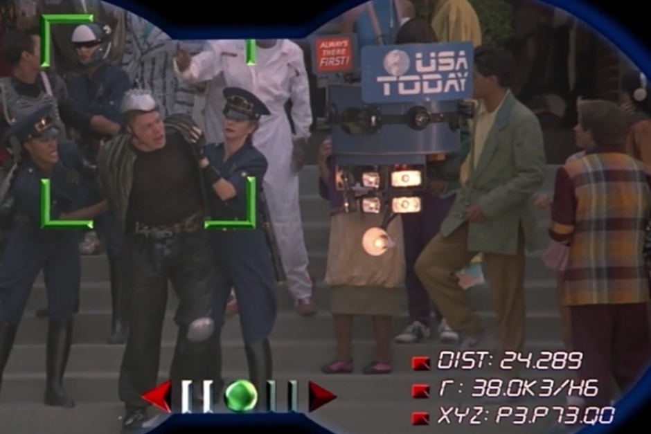
Figure 1.3 Doc Brown takes a closer look through his futuristic binoculars, and we can see the drone and logo in more detail. It also bears a read sign that reads “Always There First!” in all uppercase, white lettering.
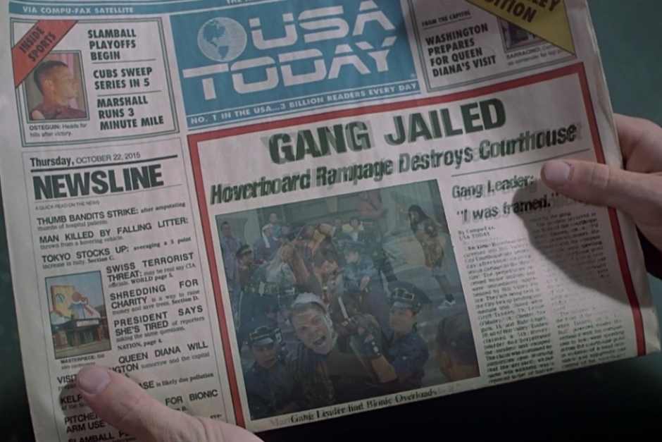
Figure 1.4 We see the logo a final time, on the same newspaper as before, when their successful mission alters the timeline and changes the undesirable events that had earlier appeared in the news.
Analysis
When Doc Brown and Marty are in the futuristic year 2015, Doc reveals the reason they are there by showing him the front page for an issue of USA Today, where Marty’s future son has been arrested.
While the paper’s masthead looks like the design used by USA Today in the 1980s, the logo immediately jumps out as having changed. Closer examination reveals that the newspaper is brought to you “Via Compu-fax Satellite” and that it is “No. 1 In the USA…” with 3 billion readers daily — indicating future population growth.
Returning to the logo (Figure 2.1), we can see that the type is no longer set in Futura as it was in the 1980s. Instead, it appears in custom sans serif lettering, with geometric qualities like uniform character weights, and 90 degree turns with rounded corners taking the place of smoother, rounder curves. Across the upper half of all of the characters, there is a line that cuts through them at a uniform height. In the case of the A characters, this line takes on the role of a counter. This is a pretty common typographic treatment in science fiction. I’m not sure where it started, but the first instance that comes to mind for me is the Blade Runner logo from 1983 (Figure 2.2). We also see it employed again in the film, in type that appears on the Hill Valley police vehicles (Figure 2.3).
For the USA Today globe (Figure 2.4), gone are the lines that would have extended from it to the type. And in the interior line work, the thick and thin arrangement has been flipped, changing how the shading appears. There was also a thin outline added around the perimeter of the globe.
Regarding color, they still use blue, though it is maybe a little different from what was used by the real-world USA Today of the 1980s.
As for the logo’s usage in the film, what we see are reasonable predictions of how it would be applied in a future world. Newspapers still appear on paper to this day, and while nonexistent in our real-world 2015, a news media drone carrying company branding might still be something we see in our own future, given the direction things are going.
Really, the thing that lands farthest from the mark is the logo design itself, which was reduced to a simple blue circle in the 2012 redesign by Wolff Olins. But in the context of the story, and to the 1980s audience for which it was intended, this probably wouldn’t have conveyed the technological look and feel the filmmakers were after with their particular depiction of the future. As they’ve noted in interviews, they weren’t trying to predict the future, but were instead trying to depict an optimistic and entertaining future that played up recognizable elements of the present for their audience.
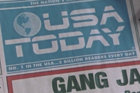
Figure 2.1 A closer look at the USA Today logo in the masthead, as it appeared in the film.
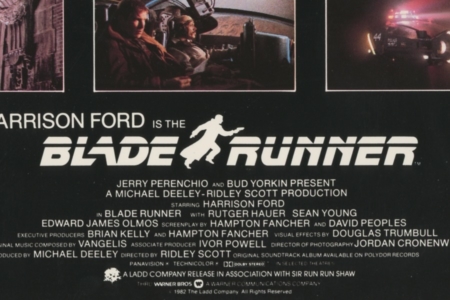
Figure 2.2 The typographic treatment we see in the USA Today logo, using a strikethrough line, calls to mind the Blade Runner logotype from 1983.
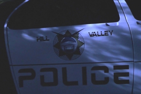
Figure 2.3 In addition to the USA Today logo, similar type treatments are seen in graphics that identify Hill Valley Police vehicles.
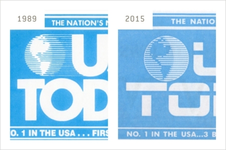
Figure 2.4 A side-by-side comparison of the USA Today globes — real-world 1989 version on the left, and fictional 2015 version on the right.
USA Today Prop Replica
On October 22, 2015, the same date that appeared on the paper in Back to the Future Part II, USA Today released a special edition of their newspaper, where they wrapped the regular daily in a prop replica of what was seen in the film (Figure 3.1). In addition to front page news showing the arrest of Marty's son, the wrap included all of the wacky headlines and other front page details that were visible in the film’s prop, along with interior full-page ads for Jaws 19 and the USA Today app. The back had an ad for the Back to the Future Trilogy Anniversary Blu Rays and DVDs, and the Michael J. Fox Foundation for Parkinson’s Research.
There were also related stories and graphics scattered throughout the actual paper. One example is an illustration depicting the news drone that filmed the arrest of Griff and his gang, modified to take the place of the current blue circle logo in the masthead of the actual paper’s front page (Figure 3.2).
In addition to paying homage to the film’s depiction of their newspaper in physical newsstands, USA Today also changed their website for a short time, using the science fiction version of their logo in the site’s header.
All in all, an interesting example of a science fiction visual identity finding its way into the real-world.
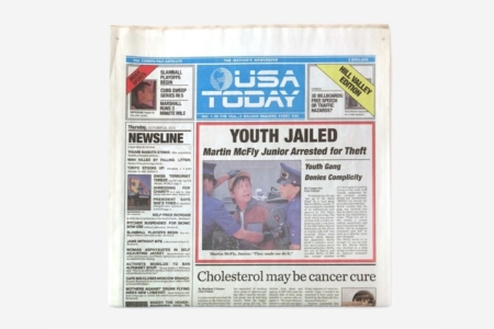
Figure 3.1 A photo of the paper sold by USA Today on October 22, 2015.
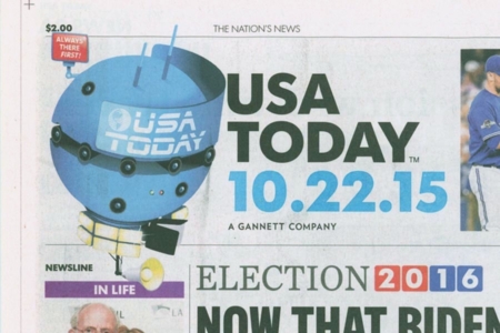
Figure 3.2 An illustration of the news drone appears in the masthead of the actual front page of the paper, found within the replica wrap.