Texaco
Fuel, Service
Year 2015
“You can trust your car to the system with the star.”
In the year 2015, Texaco service stations are multi-level, offering fully-automated refueling, maintenance and inspection of hover-equipped vehicles on the upper level, with vehicle retrofitting services and customer conveniences on the lower level.
Overview
Logo Usage
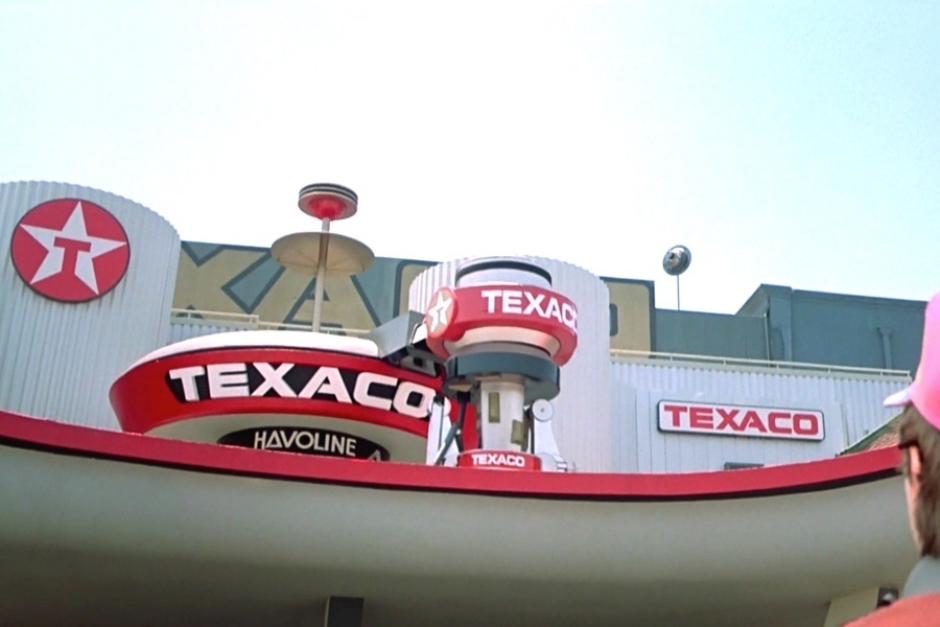
Figure 1.1 As Marty takes in the town square of the future, he looks up to find a Texaco service station covered in logos — I count seven in this view alone.
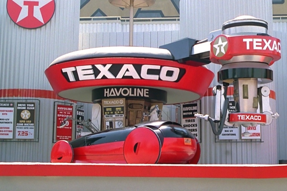
Figure 1.2 As robotic arms go to work servicing the car, a machine voiced slogan states “You can trust your car to the system with the star.”
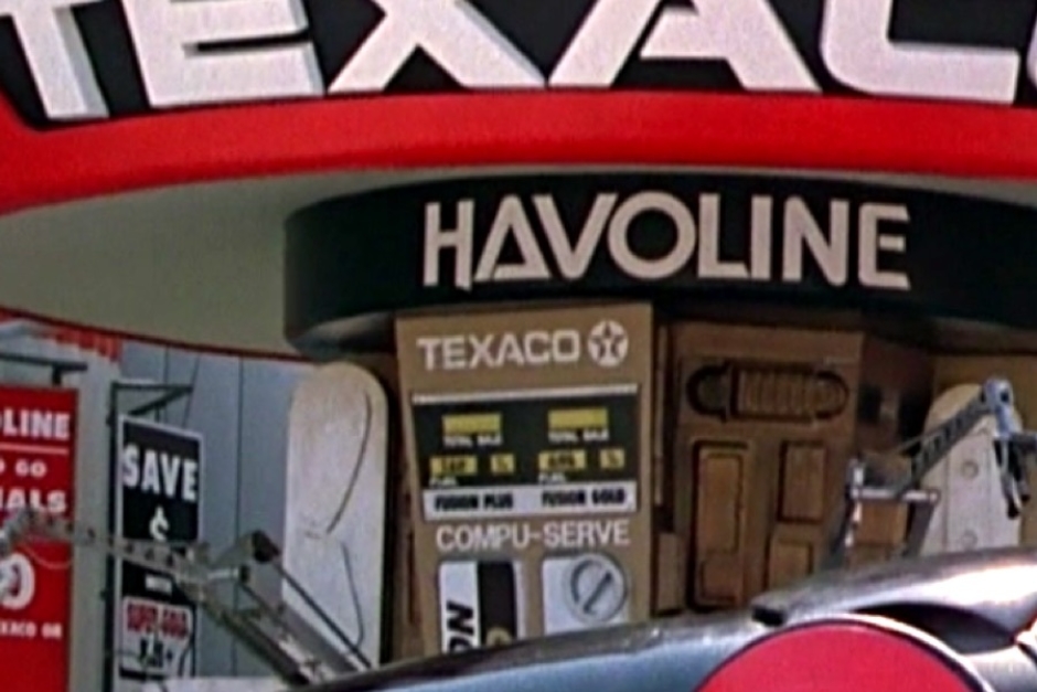
Figure 1.3 A closer look at the Havoline oil logotype and the horizontal logo lockup for Texaco, that appear above the fuel pump meters.
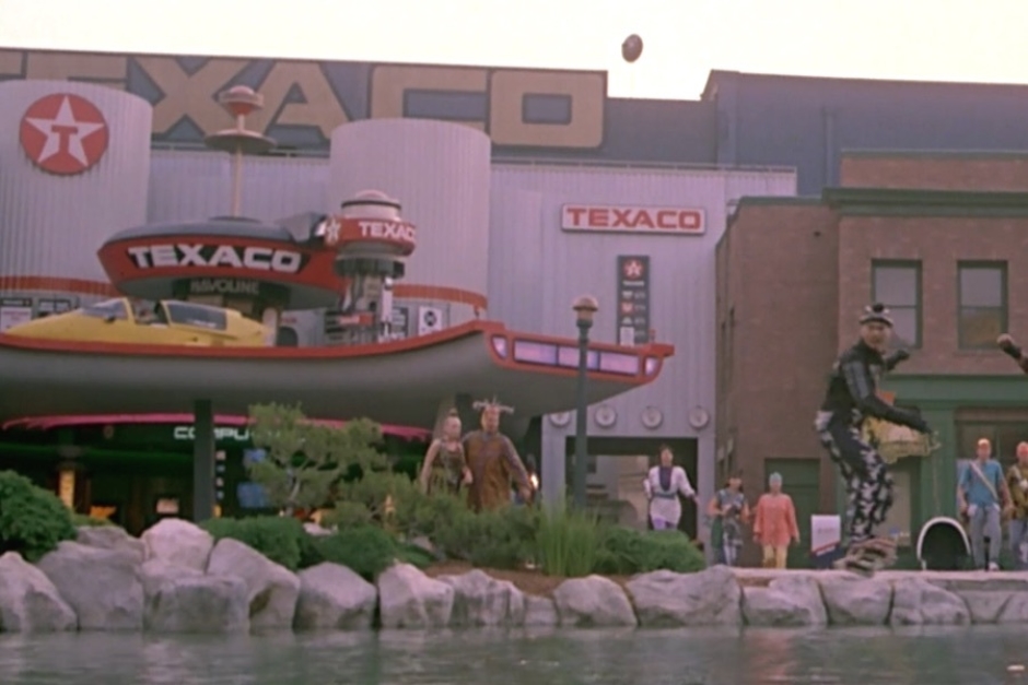
Figure 1.4 During the chase scene, we can catch the Texaco station in the background, offering a view of logos appearing on the building’s facade.
Concept Art
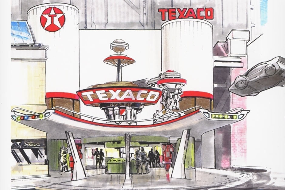
Figure 2.1 Ed Verreaux’s design for the futuristic Texaco service station, which features large logo placements that separate the symbol and the logotype. Source: Back to the Future: The Ultimate Visual History
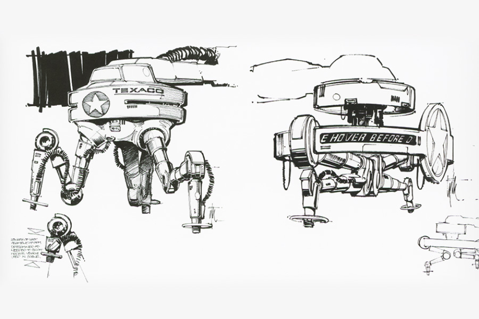
Figure 2.2 Concept drawings by Ed Eyth, showing different takes on the Texaco service robot. Note the different approaches to logo placement. Source: Back to the Future: The Ultimate Visual History
Analysis: The Past That Echoes Into the Future of Texaco
In the Back to the Future Trilogy, we witness with Texaco an interesting evolution of a brand as it spans three time periods, evolving alongside the technologies and customs associated with the business of American service stations.
Looking at its history in a broader context, Texaco was the first company to sell gasoline under the same name in all 50 US states, starting in 1928, earning it longstanding and widespread recognition as one of the first national brands in its industry.
In Marty’s present of 1985 (Figure 3.1), we see the first instance of a Texaco station. At this time, as it still is today, the pumps are self-service. We see one employee milling around, but gone are the days when fluids, wipers, tire pressure, etc. were checked as your fuel was pumped. And the attendant doesn’t collect payment at the pump, so the customers have to go into the store to pay.
As for the brand, Texaco was using a logo redesigned in 1981, featuring a white star with red T imposed over it, all within a red circle container — the same version of the symbol that is still in use today. The star is a reference to the “lone star” of Texas, where the company was started. As for the logotype, which appeared with the symbol or on its own depending upon the application, Fonts In Use describes it as being set in “Helvetica Black, with an extended middle crossbar on the ‘E’.”
Taking in the scene, the logo appears in a number of places (Figure 3.1). First and foremost, you can see the Texaco logo displayed large on the the pump canopy and roof of the station. What we see of the one attendant, it looks like he wears the Texaco logo on his blue mechanic’s jacket and gray trucker’s cap. We also see a 1-color version of the logo on the front of fuel pumps, in white. Another aspect of the visual identity are the colors red, black, white and gray, applied to the building, pumps and signage. And the messaging on the signage touts the trustworthiness of their products — at the time, their slogan or jingle was “You can trust your car to the man who wears the star."
In 1955, where Marty ends up when he travels into the past, we see a different Texaco (Figure 3.2), both in the nature of its service, and in its visual identity and how it is applied. At this earlier time, the station was full service, and in the film we see four male attendants rush out to meet a customer’s vehicle, all wearing the same olive drab uniforms. They have patches bearing the logo on their shirt fronts and caps (Figure 3.3–3.4), and in ads as they do at the stations, these employees serve as representatives of the brand. This is where we first see “the man who wears the star,” that is referenced in the company slogan.
In the 1950s, the logo still features the iconic star, but in this version it was red, framing a green T. The logotype also features across the top of the star, with all of this contained within a white circle. The type appears to be a geometric sans serif, though I’m not sure what typeface would date back far enough. Several of the characters, with the exception of the E, look like Neuzit-Grotesk. But that was a typeface designed in 1928, and this logo was supposedly put into use starting in 1913. It’s also possible that the logotype used custom lettering.
As far as usage beyond what the attendants wear, we see the logo featured large on a pole mounted sign, and on pump toppers, while the wordmark is featured independent of the logo on the service station’s front canopy, and on the side of fuel trucks. The brand colors are different in the 50s, and consist of the logo’s red, green, black and white, which are carried into signage and the building’s exterior design. We also see references to Sky Chief and Fire Chief, which were Texaco brand gasoline offerings.
These two stages of Texaco are interesting, because they both inform what we see when we reach Marty’s future in 2015. There is the expected evolution of the visual identity, from what we see in the 1980s, but we see a shift in the services, echoing the customer experience of the 1950s.
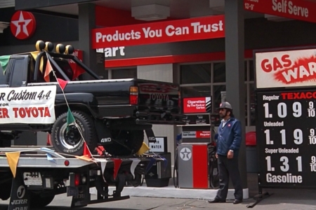
Figure 3.1 The Texaco station as it appeared in Back to the Future, in Marty’s present in the year 1985. Note the star logos, which remain in use in 2015.
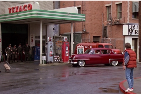
Figure 3.2 When Marty travels back in time to 1955, in Back to the Future, we see the Texaco station again.
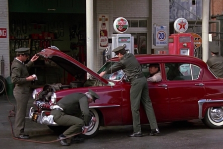
Figure 3.3 The 1955 Texaco is a full service experience, with attendants checking things like oil and tire pressure, and cleaning the windshield, in addition to pumping a customer’s fuel purchase.
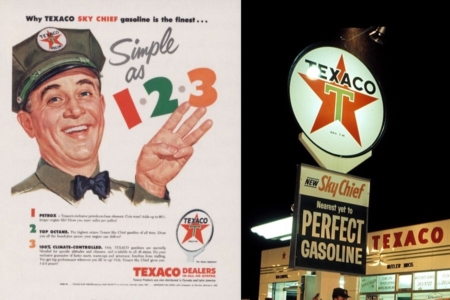
Figure 3.4 From the 1950s, a Texaco ad featuring their iconic uniformed attendant (left), and the logo as it appeared appeared on signage at the time (right). Source: www.texaco.com
Analysis: The Texaco of the Future
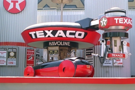
In the future fictional 2015, as we share Marty’s view looking up at the second story Texaco, we see a service station that can accommodate flying cars, and are confronted with a multitude of logos, on the building facade, signage and fuel pump (Figure 4.1). The star symbol for Texaco remains the same as we saw in 1985, which had also gone unchanged in our real-world 2015. The logotype though, has undergone a design update. And looking closely, we see that they are not all the same, giving us two futuristic versions that I will refer to as logotypes A and B.
The largest, what I call version A, is prominently featured in white over a black background, recessed into the top of the large fuel pump hub (Figure 4.2, Version A). It also appears on signs in red, and in gold, painted giant across the top of the building where it would be visible from above. (Figure 3.4, Version A). The type is very similar to what we see in the concept drawings, which is probably custom hand-lettering.
Version B, we find in all the smaller instances on the pump, on the swinging robot arm, and on signage (Figure 4.2, Version B). This logotype is typeset in modified Eurostile Black — a typeface designed by Aldo Novarese in 1962, and a popular type choice for science fiction designs. Comparing logotype B to A, a notable common element is the modification of the A, where the cross bar is cut as it meets the left leg. The type in version A is more extended and geometric than that of version B, which probably reads easier at a distance — hence the larger usage, in places that would advertise the location to passing flying cars.
Some inconsistencies can be noted within the versions, from one use to another. For instance, in Version A the X is slightly different and the leading changes for the “XA” letter pair, when comparing the main pump signage to signage on the wall.
And if you look closely, you’ll also see some signs using the old wordmark from Marty’s present, paired with the Texaco symbol (Figure 4.2, 1980s Version). A sign that something is going wrong with the space-time continuum maybe?
Gone are the human attendants we had seen in the past, the men with the star, whose numbers were decreasing as self service became the norm. Though thanks to the advances of technology, we see the service station experience has come full circle. In the future, Texaco is once again full service, where a multi-armed robot attends to your vehicle and voices a new slogan for the times, “You can trust your car to the system with the star.” Like the attendants of the 50s, we see one arm cleaning the windshield and another checking the landing gear, while at the same time a third is pumping fuel. And just as the attendants in the past wore logos, so does the main robotic arm that swings around a central hub, delivering fuel to the vehicle (Figure 4.3).
With no need to get out of the vehicle, and no human attendant to worry about, the service station has no large canopy to protect it from the elements. Payment is collected via someting called out below the pump meters as “Compu-Serve” (Figure 1.3). Presumably this is a payment process that is handled automatically or from within the vehicle by the customer.
As far as colors go, the overall visual identity stays relatively true to what we saw in the 1980s present, being mostly red, black, white and gray. We also see the addition of gold, which was previously a color associated with Texaco’s Havoline brand oil. We see gold used in a number of places, in the star symbol, as a reference to the new “Super Gold" fuel offering, and then on the robotic pump as well.
The Havoline logotype makes an appearance, featured large above the fuel pump meters (Figure 1.3). It’s undergone a redesign as well, making it all uppercase and treating it with some futuristic geometry. You can see the original logo contemporary to Marty’s present and the making of the film, in television commercials on YouTube (examples from 1986 and 1989), which also give you an idea of why it featured so prominently on the pump.
Signage featuring services and pricing, with logos on them, are attached to the facade of the building in numerous places. Some of this is mounted high up on the walls, ideally placed for approaching flying vehicles (Figures 1.4 and 4.4) .
One aspect of the updated visual identity that really caught my attention, was the type used for pricing (Highlighted in Figure 4.5). It uses bold, geometric and highly abstracted letterforms, built in a way that implies a negative line cutting through the numbers, which is very similar to what we saw in the PAC-FAX identity also seen in the film. What we are seeing is actually a typeface that was released in 1970, called Stop (Figure 4.6), making it the second face we see that was designed by Aldo Novarese (also responsible for Eurostile). In the resources section, I’ll link to some great original type specimens for this, which are worth a look.
Aside from the odd use of multiple logotypes within the brand, overall, this was a pretty well handled visual identity and they put some good thought into its future application. The parallels with the past are there where it counts, but there are also plenty of design changes that make sense for the new technology and services they apply to. And there was attention given to how the visual identity advertised the service station to customers of the future, that were now approaching from above in flying cars, as opposed to approaching a street-level station from the road.
The only other thing that can be said is maybe it was all ahead of its time, since 2015 came and went in the real-world without the radical changes in vehicle and service technology we see in the film. Of course, this was a lot more fun and entertaining than what we were given in the real-world too.
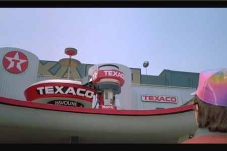
Figure 4.1 In the year 2015, we see the Texaco symbol remains the same (left) but the logotype has received a redesign — there are in fact, multiple logotypes in use now.
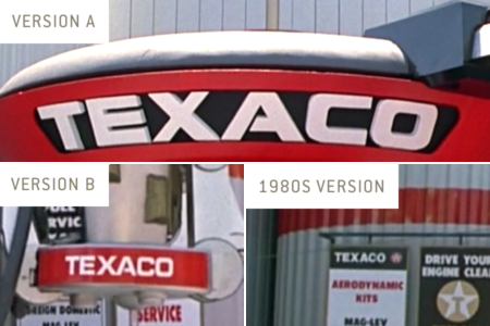
Figure 4.2 In the year 2015, we see three different logotypes used around the Texaco service station. Two are new to Marty, and one is a familiar design from the 1980s.
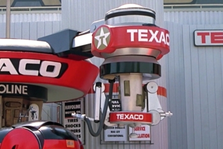
Figure 4.3 The robotic Texaco attendant of the future, wears the star symbol and logotype up top on its cap, along with an additional logotype on the bottom around vehicle level.
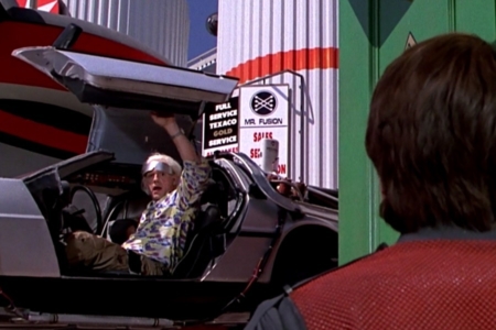
Figure 4.4 Some of the signage placements are optimized for viewing from an approaching flying vehicle.
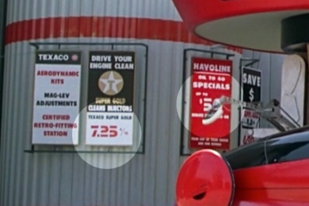
Figure 4.5 The standout change we see in signage is the typeface used for pricing (highlighted) — this is Stop, by type designer Aldo Novarese.
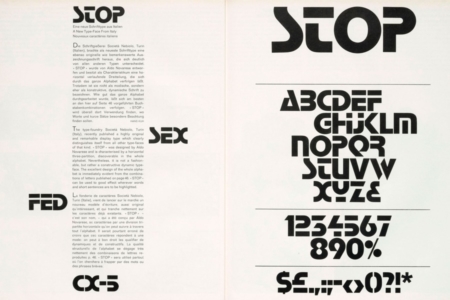
Figure 4.6 Released by the type foundry Nebiolo in 1970, Stop is a capitals-only geometric san serif typeface that calls to mind technology and computing with its abstracted letterforms. Image Source: Index Grafik