Pac Fax
Communications
YEAR 2015
Pac Fax is a fax service run by the U.S. Mail in 2015, offered by public mailboxes equipped with built-in fax machines.
Overview
Intro
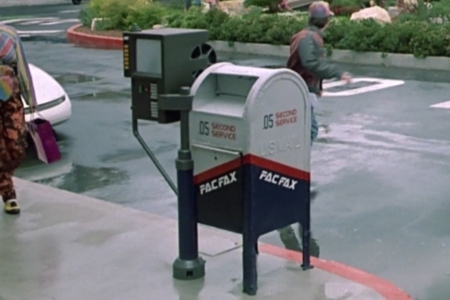
As Marty exits the alley and enters the futuristic Hill Valley town square of 2015, one of the first things we see is a public mailbox (Figure 1.1), with a large screen console hanging off of its side. Closer examination reveals it to be a U.S. Mail fax machine, offering a “PAC FAX” service that delivers in .05 seconds.
Not foreseeing internet or email, the future we see in the film has an abundance of fax machines, between these mailboxes and what we see in the McFly household later.
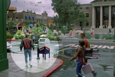
Figure 1.1 As Marty takes in the future Hill Valley town square, he walks past a public mailbox offering PAC FAX service.
Usage
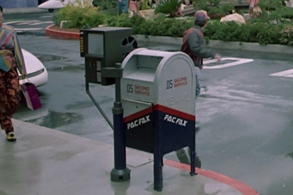
Figure 2.1 The first instance we see show the front of the PAC FAX mailbox.
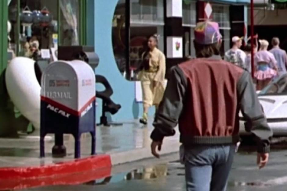
Figure 2.2 As Marty approaches Cafe 80s, wee see another from the back.
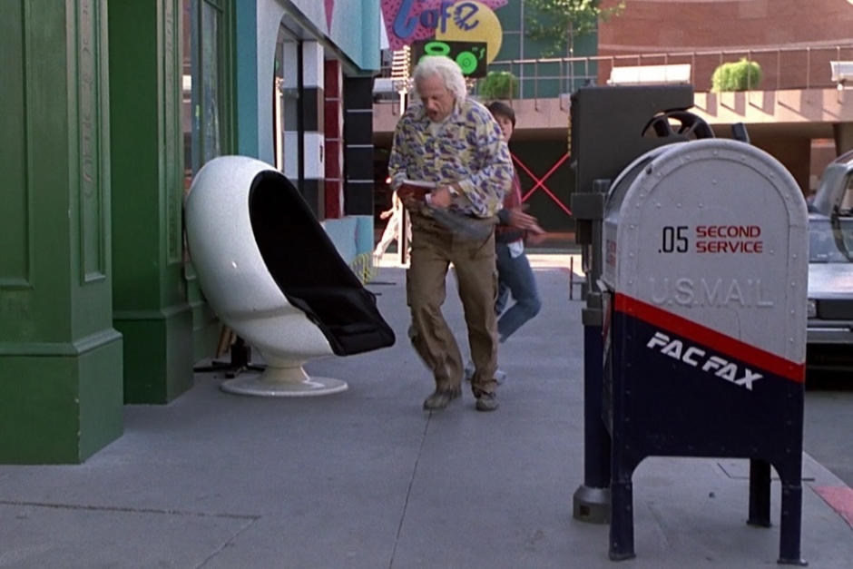
Figure 2.3 The best view of the PAC FAX logotype and other typographic details is when Doc is taking Marty’s sports almanac to the trash.
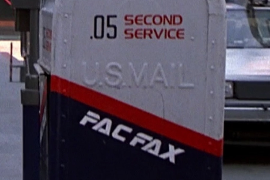
Figure 2.4 Zooming in on the previous image — from here, I was able to identify specific typefaces and real-world inspiration for the logotype.
Analysis
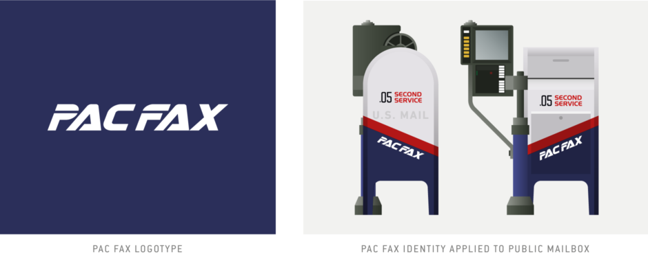
In examining the PAC FAX visual identity, my first steps involved going through the film’s scenes for a good close look at it. Luckily, there was one shot that gave a nearly straight-on view of the mailbox’s side (Figure 2.4). This allowed me to identify the typographic details, as well as the logotype I would be approximating for the overview section.
For the “.05 SECOND SERVICE” callout, I determined the “SECOND SERVICE” type to be Handel Gothic, designed by Don Handel in the mid-1960s (Figure 3.1). The typeface is probably best known for its use by designer Saul Bass when he created the wordmark for United Airlines in the early 1970s. The “.05” is one that I couldn’t find an exact match for, though it looks like a slightly condensed version of City, a slab serif typeface designed around 1930.
Moving on to the PAC FAX logo, I noted that the type had a slant to it, as well as negative lines cutting through some of the characters, both of which get a lot of use as futuristic type treatments. While there were no images of the concept art for the PAC FAX in the “making of” books I acquired for my research, I did find two different sketches online that point to design influences for the wordmark and the overall branding of the mailbox. I recognize the signature on each as being that of concept artist John Bell.
The first (Figure 3.2), had the fax/mailbox combo branded as a a Federal Express service, using the original FedEx colors and logo (redesigned in 1994). We see the familiar “.05 SECOND SERVICE” line. In the second concept drawing (Figure 3.3), we see a version where the mailbox is branded as Express Mail, and offering a 30 second delivery time. Above all that, we see a large FAX wordmark.
What we see used in the film, seems to have combined the two concepts — keeping the “.05 SECOND SERVICE” from the first and using the blue and red US Postal Service colors from the second. The PAC FAX logotype introduced a whole new fictional brand, and the mark carries traits from both the Federal Express and Express Mail logos (Figure 3.4). We see the US Postal Service influence in the A characters, which look very similar. And F in Federal Express looks similar to what we see in PAC FAX.
All things considered, while the tech might be something that wasn’t realized on our real-world timeline, the visual identity is believable enough, both in the context of the film and as something we could expect to see in 2015.
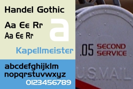
Figure 3.1 On the PAC FAX mailbox, I wasn’t able to identify the typeface used for the numbers, but “SECOND SERVICE” is typeset in Handel Gothic. Specimen Source: Wikipedia
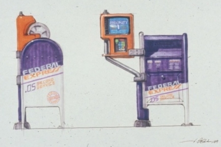
Figure 3.2 In this concept sketch from John Bell, we see the mailboxes branded as Federal Express. Source: Vanity Fair
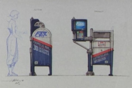
Figure 3.3 Another sketch was generated by John Bell, showing the same mailbox with US Postal Service Express Mail branding. Source: Futurepedia
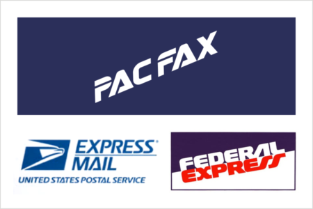
Figure 3.4 The final PAC FAX logo shares characteristics from both of the visual identities explored in the concept sketches.